> Family History: Adams: A Family Album
> Travel Book: Facing Route 66
> Children’s Book: The Adventures of Captain Rob
> iPad Photo Book: Luna’s First Year
In this chapter, real-world photo books illustrate how to put the lessons of the previous chapters into practice. Each project is described in detail from beginning to end with tips that you can adapt for use in your own books. I hope that you find these projects as inspiring as I did.
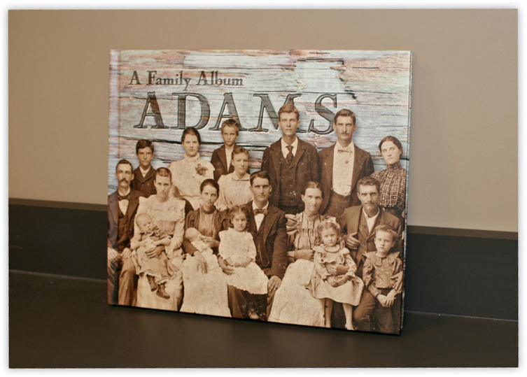
THE PROJECT ADAMS: A FAMILY ALBUM
Designer: Clyde Adams
Service provider: Blurb
Print process: Digital offset
Number of pages: 114
Format: 13″ × 11″
Paper: Premium paper, matte finish
Cover: Hard cover with image wrap
Price: $104.59

Figure 13.1: Clyde Adams is a graphic artist
Clyde Adams is the proud heir of a photo archive given to him by his father, who inherited it from his father. The oldest prints date back to the 1860s, just before the American Civil War. Fortunately for the Adams clan, Clyde is a graphic artist with 30 years of experience in report production, logo design, and many other things besides. At some point, he decided it was time to share this rich photo legacy with the rest of his family and began to put together a book.
The first edition took Clyde almost five months of part-time work to assemble and covered branches of the family that extended back to Germany in the 1600s. He continued the genealogical work begun by his father and grandfather and used the Heredis software package to store and share the data in a structured format. The resulting family tree currently includes more than 200 people and 77 families.
Clyde’s aim was not only to display the photos and put together names and dates, but also to spark an interest in bygone times. His previous book, Always a Marine, documents the life of his father, George P. Adams, and proves that Clyde’s work is very good at conjuring up the spirit of an era.
The inherited archive comprises about 300 photos. Most of these are typical cardboard prints, although there are a few tintypes as well. The shape and condition of the images vary widely; interestingly, many of the newer ones are in worse condition than the older ones.
Being a graphic artist, Clyde is well versed in scanning techniques, and he had already digitized the images long before he decided to use them in a book. His initial motivation was to create a backup archive for his family, and the result of his professional foresight is a high-quality archive scanned at around 400 dpi and sized between 150 % and 200 % of the originals. His efforts paid off when he started this book, as there was no need to re-scan any of the originals.
High-quality scanning is definitely a good idea for anyone planning a family history project. Clyde also gave us the following tip: if you want to print a small image larger than its original size, scan it at a resolution greater than the usual 300 dpi (see also section 3.2, “Scanning Images and Other Printed Materials”). Although most of the photos were black-and-white, he scanned them in RGB format to preserve their unique duotone appearance.
Clyde also added metadata during the digitizing process. His filenames include the family name and the presumed date of each photo, resulting in filenames such as adams1890s-05. jpg. He also included a description and any other information that he could glean from the backs of the photos. Clyde used the Adobe product suite and the data management features built into Adobe Bridge to handle all this information. In the end, many of the metadata entries looked something like this:
Written on the back is “Grand Pa Harmon‘s Mother.“ And in my father‘s handwriting is the following inscription: “Martha Jane (Graham) Harmon, Born: August 10, 1849, Died: October 19, 1925, No date of this picture but taken around 1920. This is my Great-Great-Grandmother. George Adams.”
While scanning the images was relatively easy, retouching was a broad-ranging and time-consuming task. Clyde weighed the attractive “original” look of the aging photos against the visual information lost due to creases and bends. Although he is a Photoshop pro, Clyde’s dislike of an obviously “Photoshopped” look made him try hard to retain the right balance and only retouch individual details when absolutely necessary. This approach also saved him a lot of time.
Figure 13.2: Clyde Adams’s family photo archive predates the American Civil War and includes mainly portraits as well as group photos, like the one shown here
Clyde’s well-prepared images meant that the time-consuming tasks of image editing simply weren’t necessary, allowing him to get started with his layout right away. While some people spend a lot of time considering which images to use, Clyde simply decided to use them all, thereby sticking to his original idea of sharing the entire archive with his family.
Because Clyde used InDesign for his layout, he could leave the images in their scanned TIFF format rather than converting them to JPEGs. This not only saved the effort involved in file conversion, but also allowed him to use transparent backgrounds to preserve the original shapes of the photos. Some had rounded corners or scalloped edges, while some simply had a few corners knocked off over the years. These unique shapes and the object styles applied in InDesign gave the photos an authentic look. He saved the results as RGB files, as he knew the final product would be printed digitally and not offset. This also produces smaller PSD image files and, as a consequence, a smaller PDF layout file without sacrificing overall image quality.
Clyde used Adobe Bridge to access his external hard drive, giving him direct access to all of his metadata. This meant that he only had to sort out the sequence of the images before starting to create his layout. Clyde decided that a simple chronological order was the most natural sequence for the project. His secondary sequencing criterion was based on the various branches of the family. [Fig. 13.3]
Clyde had already established a good working relationship with Blurb by the time he started the Adams project. He produced his first big book project, Always a Marine, using Blurb in 2007, and he has created a number of other books at the site since. He has always been pleased with the quality, so it was a natural choice to stick with Blurb for his family project.
Blurb’s InDesign layout and PDF upload support meshed well with Clyde’s working style. During the production of Always a Marine, Clyde had to export each page as a JPEG and import the layout page by page into Blurb’s BookSmart software—a task he wasn’t keen on repeating. Fortunately, by the time he started the Adams book, Blurb had already established a PDF upload process. He particularly likes the new InDesign plug-in and Blurb’s book-sharing functionality, which is a big bonus for a family project with potential readers all over the nation. Any family member who wants a copy of the book can simply order it and have it printed on demand. This approach also saves the investment in advance printing that using a traditional printer requires.
Blurb’s color management and color profile support weren’t issues for Clyde, as he had never had any color problems at Blurb.
In addition, Blurb’s lack of ISBN support and large-chain reselling capability wasn’t an issue either, as his original intention was to give just immediate family members access to his work. The only reason for acquiring an ISBN would have been to make the book available at local libraries. Clyde doubts that there’s a large enough audience for a book like this at Amazon, and he plans to update the volume regularly anyway as he obtains more genealogical information.
Figure 13.3: Clyde stored a mass of metadata with his images and used Adobe Bridge to access it
Having tried Blurb’s BookSmart software for his first major book project, Always a Marine, Clyde found that pro software like InDesign is a better choice for large projects that involve multiple layouts. This meant that there was no long decision-making process involved in selecting InDesign for the Adams project. Blurb provides InDesign templates for its standard book sizes, so Clyde didn’t have to build his own. Blurb also offers a plug-in for creating templates directly in InDesign.
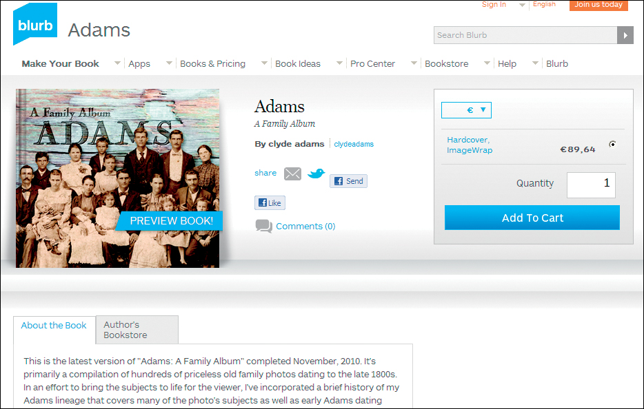
Figure 13.4: A strong argument for using Blurb was the option of sharing and selling the book via the vendor’s website. This approach saved the author a lot of time and trouble.
Figure 13.5: Clyde created an object style with a light drop shadow and a small bevel for his photos
To give the book a unified look, Clyde decided to use just two different master page backgrounds: one for the text and one for the photo spreads. He loves antique books and the look of old, worn paper, so he used paper scans processed using various Photoshop effects. He doesn’t like to use too many different fonts, so he created a text template with three typefaces. The Caslon Antique font he used for the title captured the historical feel he was after, and Garamond complemented it nicely for the text. For the captions, he used Chesterfield Antique, a semi-bold font which complements but nevertheless stands out from the main text. Both Garamond and Chesterfield Antique are easier to read than Caslon Antique in large text blocks.
The random shapes and sizes of the photos quickly put the idea of a consistent page layout to rest. Clyde explains, “When I got to a spread, it was like putting a puzzle together.“ This forced him to take a “one spread at a time” approach. He used consistent shadow and bevel effects to make the photos stand out against the background. The flexibility that pro software like InDesign offers when designing these details is a great advantage compared to the relatively limited functionality of Blurb’s BookSmart software. He used InDesign “object styles” to ensure that his design effects remained consistent and to save time while formatting. Object styles and text styles are big time savers, and Clyde recommends them to anybody working on complex projects like this one. [Fig. 13.5]
After working on the book for nearly five months, Clyde finally felt that it was ready for print. He used the InDesign “preflight” check to make sure that there were no text overflow issues. (For more information on preflight checks, see section 11.2, “Final Corrections.”)
Finally, he created a PDF using the Blurb PDF preset and uploaded the file. Blurb runs its own checks to make sure that there are no problems with page sizes or other technical aspects of the layout.

Clyde received his book less than two weeks later. That was a big day, having spent so much time on the project. He was very pleased with the results and found the quality “spot on.” His professional designer’s eye found a few details that he earmarked for tweaking in the next edition, and he discovered a few typographical errors, too—a factor that is almost inevitable in projects involving large amounts of text.
Since then, he has received a lot of positive feedback and additional photos and historical information from his family. The book continues to expand, and he is about to embark on a fourth edition that will include a new batch of photos sent to him by another family member.
The book hasn’t yet turned up a rich, long-lost uncle in China or any dark family secrets, but it has brought Clyde into contact with previously unknown relatives who actually live quite close. Clyde says, “They were all around me, and I just didn’t know it.”
Figure 13.6: Clyde was very pleased with the printed book and found the quality to be spot on
For a project as extensive as this, using pro layout software proved its worth. InDesign allowed the author to work more efficiently and effectively than he could have done using his provider’s free software. Software stability during large projects is another plus offered by pro-grade tools.
Clyde is very happy with his choice of provider, as Blurb’s approach makes it quick and easy for family members to order copies of the book wherever they live. He can also update the book on an ongoing basis and upload a new PDF file whenever it is ready. He highly commends Blurb’s consistent colors and overall quality.
Another important lesson learned during this project was the value of planning ahead, especially given how much reworking the early versions of the book required. Clyde comments, “In hindsight, I would have spent more time planning the overall project, particularly in light of the fact that I want to update it on a regular basis.“ He concludes, “Though I’m pleased with the overall look, it’s not a design that’s easily manipulated for additional information or images.“
THE PROJECT FACING ROUTE 66
Photographer: Christian Popkes
Service provider: Viovio
Print process: Digital offset
Number of pages: 140
Format: 12″ × 12″
Paper: Premium photo printing
Cover: Hard cover with image wrap
Price: $157.99

Figure 13.7: Christian Popkes during one of his trips to the United States

Figure 13.8: Portraits of the people Christian met along the way are an important element of this project
Christian Popkes is a pro photographer who is well known for his advertising work and photojournalism in German magazines such as Stern, GEO, and Spiegel. In addition to his career, he continually works on photo sequences that interest him personally, especially when he is on the road in the United States. One of these projects resulted in a picture book about Native Americans on the Pine Ridge Reservation, but the one we will look at here concerns the “Mother Road,” Route 66—a subject that has fascinated Christian since his first tour of the U.S. In 2009, he spent three months travelling from Chicago to Los Angeles following in the footsteps of the legendary Erwin G. Baker. On arriving in Los Angeles, he had a much better idea of what Nat King Cole meant when he sang, “Get your kicks on Route 66.“ Christian says, “The people you meet along the way are the most fascinating part of the journey, and they really do give you a kick.” It’s no surprise that portraits make up a large part of the photos in the book.
Figure 13.9: The book also includes landscapes and tableaus of life along the route
In contrast to his commercial books and calendars, Christian wanted to retain as much artistic control as possible while creating this project, which is why he decided to take the self-publishing route.
Although Christian generally spends time composing his images in his head before picking up a camera, he ended up with thousands of images to choose from at the end of his trip.
The primary aim of the book is to illustrate the reality of life along this legendary road, and the portraits it contains often tell entire life stories in a single photo.
While viewing his images, Christian noticed that they divided themselves naturally into two groups: portraits and landscapes/surroundings. [Fig. 13.10]
Figure 13.10: The two main groups of images are portraits and landscapes/surroundings
Although the photos were all shot in color in natural light, Christian decided to print the portraits in black-and-white to make them more “intense.” Retaining color in the landscape photos also produced a degree of inner tension in the finished layout. The selected images were heavily processed. Christian reckons, “Ten percent of the work is the shooting, and the other 90 percent is processing.” He used Photoshop to manipulate the color channels separately during the black-and-white conversion process as well as to apply a variety of other processing steps, such as dodging and burning.
The huge amounts of image data contained in Christian’s original Hasselblad image files were way beyond the actual print requirements for the chosen 12″ × 12″ format, so he scaled them down once processing was finished. He also converted them from 16-bit to 8-bit color depth and to the target sRGB color space. He left them in TIFF format for the layout work in InDesign.
This book was intended for public sale from the start, so it was important to find a provider that supports pro fulfillment services. Most providers require you to print and pay for as many books as you think you can sell in advance and to distribute and sell them yourself. This is not what Christian had in mind—his daily business is taking photos, not delivering books. Being located in Germany but aiming to sell in the U.S. was an additional argument for a provider offering fulfillment, so the only real choice was one of the few providers that offer their own sales platform or resale support via conventional book retail channels.
The choice boiled down to Blurb, Lulu, and Viovio. Blurb and Lulu are U.S. companies with global web access and delivery options. Lulu also offers ISBNs for sale, giving their customers access to store-based retail.
Blurb initially appeared quite interesting, with its access to U.S. markets and proven track record of high-quality photo book production. Many pro photographers market their books through Blurb, where the standard sizes include a number of coffee-table book formats. On the other hand, Lulu’s target audience appears to be the literary market, and the options for creating photo books are quite limited and disproportionately expensive. The final choice fell to Viovio, with its dedicated photo book formats and sales platform. The site also offers ISBNs for selling your work via commercial resellers like Amazon. [Fig. 13.11]
Figure 13.11: Viovio has its own online bookstore and also offers listings at other booksellers, including Amazon
In spite of the services offered, Viovio’s prices were higher than Christian would have liked. A 140-page hard cover book with a die-cut cover costs about $120 if ordered with express printing, and the price increases to about $160 if ordered with premium paper and an image wrap cover. Delivery costs are extra in both cases. These price levels make it tricky to find buyers, especially if you want to make a profit. Once again, using an offset print shop to print a project like this is much cheaper, but requires you to finance the entire print run in advance (see section 2.3, “Print Processes”).
These high prices led Christian to consider using his InDesign layout in a smaller format to make the book affordable to a wider audience. Producing a book in different sizes doesn’t produce additional costs in itself, but it does require you to purchase an individual ISBN for each format you want to sell.
Christian had a very clear idea of the high-quality artistic look he wanted to achieve, and an evaluation of his own favorite coffee-table books confirmed that white space was a dominant factor in the layouts he particularly liked.
The initial idea was to position a 12″ × 12″ portrait on the right-hand page of each spread and to print just the name and age of the person in the photo on the left. However, there were so many images to include that Christian ended up placing an image of the surroundings opposite each portrait. Scenic photos of impressions along the way were printed two to a page with plenty of white space around them, and landscapes were treated as format-filling double-page spreads. To help streamline the book creation process, Christian created templates for each page type using InDesign. [Fig. 13.12]
Figure 13.12: Templates for each page type helped speed up the process of integrating images into the layout

Figure 13.13: The two final candidates for the cover shot were very different indeed. In the end, the portrait won.
The sequence of the images followed the geographical route. Christian decided to tell the story from east to west, tracing the footsteps of the farmers and laborers who headed west years ago in search of a better life.
Once the contents of the book had been finalized, the author had to decide on a cover image. His original idea was to use a detail shot of a shopping cart that beautifully illustrated the great distances involved and the sometimes deadly nature of the road. However, on reviewing his portraits, he decided that they were the real heart of the project and that one of them should be his cover shot. The portrait he chose is a stronger eye-catcher for potential buyers browsing the Internet, so the shopping cart ended up on the back cover instead. [Fig. 13.13]
Figure 13.14: The finished book can be ordered online at the Viovio bookstore or from conventional book sellers such as Amazon
The finished book was then saved in PDF format, with one file for the cover and one for the contents. Christian also used InDesign’s preflight functionality to make sure he had incorporated all the right images at the correct resolution. Viovio provides a clear web upload form with options such as color or black-and-white printing. Viovio’s ISBN functionality was still quite new at the time the project was completed, so some of the details had to be sorted out by the provider’s support team. As recommended in section 12.4, “Selling Your Work,” the author ordered a trial copy of the book before purchasing an ISBN.
The finished book arrived nine days later.
Overall, Christian Popkes is very happy with his book. He tells us, “It was fantastic to retain complete artistic control of the book production process.” He is thrilled at just how easy it is to use online services to publish his work.
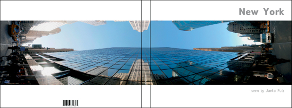
THE PROJECT NEW YORK
Photographer: Janko Puls
Service provider: SmileBooks
Printed on: “Real” Photo Paper
Number of pages: 82
Format: 11″ × 8″
Cover: Hard cover
Price: $133.95

Figure 13.15: Janko Puls is an avid panorama photographer
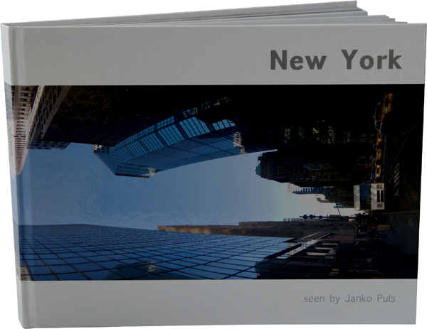
Figure 13.16: Janko takes many of his panoramas in New York, where he lives and works. This image shows a night scene in Central Park—″The Lake″ in front of the San Remo.
Janko Puls is a journalist and photographer living in New York City. After working in an online environment for a number of years, he now earns a living as a freelancer. He has been an avid photographer since the old analog days and still uses his 1956 Leica M3 DS and 1952 Rolleiflex 3.5 E II. He produced his first photo book, Guess Where In New York?, in 2008 using Blurb, and revised and republished it with an ISBN in 2009.
Panoramas are his passion. Janko began shooting panoramas with an analog SLR in 2000 and scanned the resulting images before merging them on a computer. He has now switched to shooting digitally with a Nikon D200. His favorite subject is New York, where he has lived since 2006; so, it was a logical choice to create a new photo book using his best photos of the city. This book is designed to serve as a portfolio for prospective clients, and Janko says, “It always makes a better impression if you have a properly bound portfolio to show people.”
Janko has captured a wide range of well-known and lesser-known views of the Big Apple in his fascinating panoramas. They include shots made at various times of day and in different seasons, both indoors and outdoors, with diverse colors and lighting moods.
Panorama photos are constructed from multiple source images that are “stitched” together using computer software. Janko uses Autopano Giga 2 or Photoshop to stitch his panoramas. Panoramas are usually much wider than they are high, with aspect ratios as broad as 1:9. This presents a special challenge to photo book makers, as 3:2 is usually the widest standard format. [Fig. 13.16, 3.17]
Another challenge is the very large size of most panorama image files. A finished panorama constructed from 10 individual 16-mega-pixel images (each comprising about 20 MB in RAW format) can be as large as 100 MB. The advantage of such large image files is that you are guaranteed sufficient print resolution, even if you are building a layout with full-page, 16.5″ × 12″ images. However, some providers limit the size of the images you can use without actually saying what those limits are.
Janko used Lightroom to view and sort his images. Since he uses keywords to make it easy to find images for stock agencies and other customers, he was able to make his initial selection at the click of a button. Janko already had a clear idea of which images he felt were his best and therefore most suited for inclusion in the book, so it didn’t take long to make the final selection. He then exported the selected images to a separate “photo book” folder to give him a clear overview of the project and to ensure that his original image data remained completely untouched during the book creation process.
Figure 13.17: An overview of the selected panoramas
The next step involved finding a suitable sequence for the images. Portfolios are often sorted according to dominant colors or recurring subjects. The obvious theme in Janko’s panoramas was their geographical location, resulting in a virtual journey from north to south in the city. However, the highly varied moods of the individual images would have made the overall look of such a setup too varied. Janko therefore followed one of our tips from section 4.6, “How to Develop a Storyboard,” printing all of his images in a small format and spreading them out on the floor. This technique helped him to find the relationships and natural groupings. He ended up with four sets of images: streets and buildings, parks, night shots, and vertical-format panoramas. The parks and night shots have similar lighting moods, giving them a natural visual relationship, while the vertically-shot panoramas form an obvious group of their own and force the reader to rotate the book 90 degrees to view them.
In order to avoid image files that were too large to upload, Janko reduced each panorama to a suitable size for printing before starting work on the layout. He used the techniques described in section 3.5, “Optimizing Your Image Settings,” to calculate the maximum required pixel dimensions for the correct 300 dpi print resolution. In this special case, the calculations were based on the length of each 22-inch double-page spread. [Fig. 13.19]
Figure 13.18: Panoramas are “stitched” together from sequences of source images using specialized software, such as Auto-pano Pro (shown here)
As described in Chapter 2, “Choosing a Service Provider,” the initial consideration was the print process the author wanted to use. The double-page spreads required by panoramas made printing on photo paper the obvious choice, as this particular format doesn’t hide any visual information in the center fold. Photo paper books are also easier to handle than the lay-flat bindings offered for most books printed using the conventional digital offset process. The larger color space used by the photo paper printing process added luster to the highly processed images. [Fig. 13.20]

Figure 13.19: It is simple to reduce the size of an image using Photoshop
Figure 13.20: A book printed on photo paper lies completely flat, as seen in this example showing an image of the observatory at the 1964 New York World’s Fair
One of the major disadvantages of books printed on photo paper is that they can contain only a limited number of pages. For Janko, this was less of an issue since a portfolio should be of limited size anyway.
The choice of photo paper reduced the number of potential providers—Blurb and MyPublisher don’t offer this type of book at all. Generally speaking, providers offering photo paper options are much more widespread in Europe than they are in the United States. SmileBooks and AdoramaPix are among the few that do. The next step was to research prices and formats. The author wanted custom fonts for the cover and the chapter title pages, but the rest of the layout was quite simple, so software functionality and compatibility were not important issues. Although AdoramaPix software is one of the more sophisticated online tools available, it doesn’t offer custom fonts, making Smile-Books the only realistic choice. As it turned out, SmileBooks was also a better value than AdoramaPix, offering more pages in a larger format for less money. Janko was tempted to go for the SmileBooks “Panorama Professional” 16.5″ × 12″ format, but decided in the end that $240 was beyond his budget and that the format simply wasn’t practical to handle.
The page layout was based on a simple formula that allowed for a single image centered on each double-page spread. The images’ extreme width nevertheless made it impossible to print most of the panoramas at full-page size without cropping both ends. As a result, each image was printed, uncropped, with a fair amount of empty space above and below. The image titles were then used to fill some of the empty space at the bottom of each page. [Fig. 13.21]
The decision regarding the background color was a tricky one. The images were too varied for using a single color throughout the book, and more than one color on a double-page spread would have been jarring. It quickly became apparent that the background would either have to be black or white. At the end of the day, Janko decided that white was better suited to his readers’ visual expectations.
He also decided to use individual chapter title pages to underscore the differences among the groups of images and to guide the reader through the book. Some working chapter titles had already suggested themselves during the sorting process, so all Janko had to do was rephrase them for the final print version. He also used a black background to clearly distinguish the chapter title pages from the other pages and put a small preview panorama on each. [Fig. 13.22]
Figure 13.21: The basic page layout consists of a double-page panorama and the image title

Figure 13.22: Individual chapter title pages give the book form and help orient the reader within the narrative
The cover, too, shows a double-page panorama, and the white space on the front was filled with the book’s title and the author’s name. [Fig. 13.23]
As is nearly always the case with projects like this, choosing the cover image was the hardest part. Janko finally decided to use an image that can be interpreted as a horizontal or vertical panorama, thus alluding to both of the types used in the book. It shows a typical New York scene, viewed from a fresh angle.
Once a final round of corrections had been made, he uploaded the book for printing. The reduced-size images ensured that the provider’s software didn’t generate any incompatibility warnings.
Figure 13.23: The cover is true to form, showing a double-page panorama spread
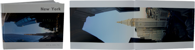
Figure 13.24: The finished book
The finished book turned up in Janko’s mailbox five days later. The choice of photo paper was obviously the right one—it not only gave the book a high-quality look, but also emphasized the unique nature of the panorama images with its lay-flat binding. Janko was really excited at finally being able to hold his collected works in his hands.
Photo paper is a great choice for a portfolio of panorama images, and reducing the size of the images prior to creating the layout saved a lot of hassle. Janko is considering reprinting the book at a larger size. AdoramaPix offers a 12″ × 9″ “pure” photo paper format, and MyPhoto-Creations offers a 14″ × 11″ format, although it is more expensive than the AdoramaPix book and contains fewer pages.
THE PROJECT CAPTAIN ROB
Photographers: Petra Vogt and Werner Pluta
Service providers: AdoramaPix and RitzPix
Print process: “Real” Photo Paper/Digital Offset
Number of pages: 14 (AdoramaPix)/20 (RitzPix)
Format: 6″ × 6″
Paper: Pure Photo Paper (AdoramaPix), Standard (RitzPix)
Cover: Hard cover image wrap (AdoramaPix), Saddle-stitched soft cover (RitzPix)
Price: $15.95 (AdoramaPix), $14.44 (RitzPix)

Figure 13.25: The main character is a cuddly teddy made by NICI
(Photo courtesy of NICI GmbH)

Figure 13.26: Image selection was simple for this particular project
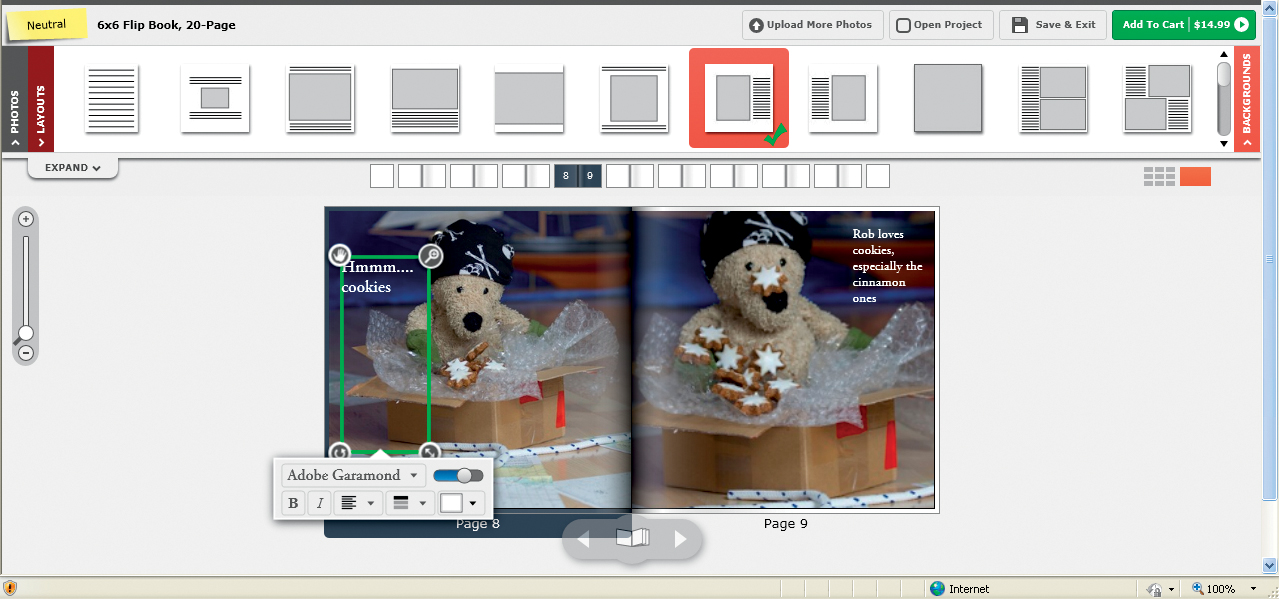
Children are a typical subject for a photo book project. As a different take on a familiar theme, my husband and I decided to produce a photo book for kids. The idea came up spontaneously one day when we received a package from a friend, and the idea for a teddy bear with the character of a pirate receiving a package through the mail was born. Our teddy’s name: Captain Rob.
The main character is a teddy bear with a woolen cap, scarf, and gloves from our own collection. To help our teddy “Robby” slip into the role of Captain Rob, we tied a neckerchief with skull and crossbones around his head and removed his original gloves and cuffs. The teddy’s slightly worn look lent authenticity to his pirate identity.
We built a simple, improvised mini-studio at home with a piece of bright blue cloth hung over a broom handle for the background.
A model sailboat, a piece of rope, a nautical chart, a compass, and a crew member in the form of another teddy completed the picture. Last but not least came our package. We shot the photos late on a winter afternoon and had to use flash to provide sufficient light—although, in fact, this helped to keep the lighting consistent throughout the sequence. We used a semi-transparent umbrella to soften the light from the flash. We didn’t require a pro flash system for our tiny stage, and we were even able to reduce flash power a little during the shoot.
Once we had set up the stage, we shot the story sequentially from beginning to end. We didn’t use a storyboard, and instead gathered our inspiration spontaneously from the props we were using. We fed off each other’s ideas as we got deeper into the story, and we had just as much fun shooting it as others have had reading it. At the end of our shoot, we had about 100 photos to choose from, including several variations of individual scenes.
Our in-depth groundwork meant that we didn’t need to prepare much at all to start our book. We had pretty well decided during the shoot which images we wanted to use for the final story. However, we did find that we had failed to focus correctly on our characters’ eyes in some photos, so we had to use some of the variations as substitutes. The consistent flash lighting meant that virtually no image processing was necessary; we used most of the photos “as is.” [Fig. 13.26]
Our decision-making process began with the size of the book we wanted to produce. We ended up going for 6″ × 6″ to make it easy for small hands to grasp; 8″ × 8″ is simply too big for some kids. We also wanted to make it cheap and sturdy, to minimize the rigors that kids often put books through. These criteria made our choice a little tricky. Books printed on “real” photo paper are harder-wearing and easier to leaf through, but they are also significantly more expensive than their digitally printed counterparts and are only available from a few providers in a narrow range of sizes. Books printed using digital offset techniques are available for as little as $10, although they are not always particularly hard-wearing.
In the end, we decided to try out one book of each type to get a feel for the differences involved. We began our search at www.photobookgirl.com. This site provides a Photo Book Wizard to help you find providers that meet your criteria. The search engine recommended MPix and RitzPix for our soft cover version. MPix offers a digitally printed 5.5″ × 5.5″ soft cover book with 12 pages for $15, while RitzPix has a 20-page 6″ × 6″ book for $14.99 including one-hour store pick-up.
The Photo Book Wizard also turned up AdoramaPix and MyPhotoCreations if we left out our soft cover preference. Both of these books were printed on photo paper with hard covers. At AdoramaPix, a 6″ × 6″ book with 14 pages starts at $15.95, while MyPhoto-Creations offers 20 5″ × 5″ pages for $34.99. We checked to see whether other providers offer such small books, but they are actually quite rare; most providers only offer square books starting at 8″ × 8″. Really small books are usually only offered in rectangular formats, if at all. Because of the rough handling we expected the book to get, we decided to stick with the cheaper two of the four options, RitzPix and AdoramaPix. The RitzPix one-hour pick-up option also helped tip the balance.
Because we were using a simple layout with page-filling images and little text, sophisticated software was a secondary consideration. Also, because of the book’s small size, upload times were kept to a minimum, making it unimportant whether we used the online software provided by our selected vendors or the more sophisticated download software offered by others.
The layout was simple to create. Like many kids’ books, it consisted of bright, page-filling images and small amounts of text in large type. Both AdoramaPix and RitzPix offer online software rather than download software. While the layout options from RitzPix are not as comprehensive as those from AdoramaPix, they were still sufficient for our simple needs.
The initial steps involved setting up a page-filling image box and a text box for each page. This was easy to do using both programs, and the AdoramaPix Fit to page option is a great help in such situations. We then had to create the text box individually for each page and fine-tune the completed layout with both the image and text boxes selected. RitzPix only allows you to use preset templates, so we couldn’t add individual text and image boxes. Additionally, neither of these providers allowed us to copy complete pages of a layout, so we had to set up each page separately. The range of title fonts was fairly limited, but we eventually found ones we liked, even if we weren’t able to use a custom font as we would have preferred.
Figure 13.27: RitzPix provides preset page layouts that you can simply drag onto the pages of your book

Figure 13.28: AdoramaPix software provides a wide range of layout options
The entire process was quick and easy to execute. In both cases, we used the minimum number of pages offered (20 at RitzPix and 14 at AdoramaPix). As detailed in section 11.2, “Final Corrections,” we checked the text separately before ordering our books. The automatic image correction options at AdoramaPix must be selected during the ordering process, but we decided to do without for this particular project.
Figure 13.29: The AdoramaPix real photo paper book looks like a commercially produced children’s book from a bookstore
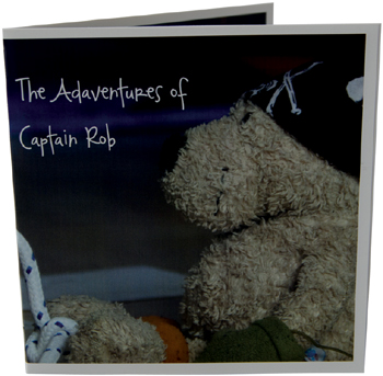
Figure 13.30: The RitzPix booklet is thin and easy to handle

Figure 13.31: The AdoramaPix book has typical thick photo paper pages
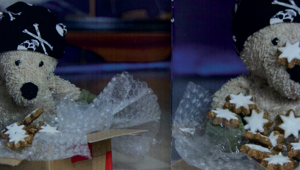
Figure 13.32: The RitzPix printing process left a visible grid pattern on the pages
We had our RitzPix “1 Hour Classic” book delivered, and it arrived in the mail inside of six days. AdoramaPix warned us during ordering that production and delivery would take a total of 16 days. In fact, the book arrived after 12 days. As expected, the differences in quality between the two books were obvious: the AdoramaPix photo paper looked a lot more like a “real” book and was sturdy enough for kids, whereas the RitzPix book, with its soft cover and stapled binding, didn’t look like it would last long in toddlers’ hands. A closer look at the RitzPix book also revealed an obvious residual grid pattern on the pages that made them look as though they had been printed on canvas. Additionally, the images were printed with a white outline that we weren’t aware of during the book creation process. In the end, we realized that we should have chosen a different template for full bleed images.
Figure 13.33: “Captain Rob” in a real-world, hands-on test
We were surprised at how quick and easy our children’s book project turned out to be, and our improvised mini-studio was perfectly adequate for producing high-quality results. Don’t let potential technical hurdles keep you from trying something like this yourself. If there is enough daylight, you might not even have to use flash during your photo shoot. However, direct sunlight is not ideal for producing balanced results, so use a bed sheet or something similar to diffuse the light if you can. We had a lot of fun making the book, and I have promised my nieces it won’t be the last! By the way: my youngest niece enjoys looking at a photo book I made for her parents about her own first year just as much as she enjoys our storybook.
You will have to decide for yourself whether you prefer the quality and longer delivery times offered by a provider like AdoramaPix, or whether the speed of the RitzPix service is more of a priority.
THE PROJECT LUNA: MY FIRST YEAR
Photographer: Petra Vogt
Service provider: Blurb/Adobe InDesign
Print process: None (iPad screen)
Number of pages: 18
Format: iPad resolution (1024×768 pixels)
Paper: None
Price: $1.99 (“conversion cost” with Blurb)

Figure 13.34: A slide show would be the perfect medium for displaying funny pictures of a baby learning to eat
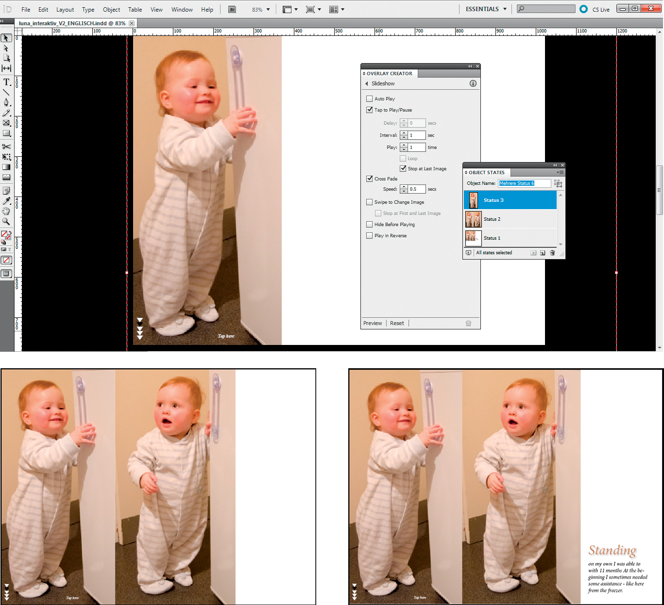
This was not a “normal” book project, but rather one designed to test a new development in photo book technology. The starting point was a group of images of my niece Luna’s first year and first birthday. The multimedia capabilities of my Nikon D7000 left me not only with lots of still photos but also plentiful video material. Tablet computers were gaining in popularity around the time I began to plan the project, and my iPad seemed like the perfect platform for next-generation photo book experiments. The electronic interface made it possible to integrate traditional text and images with interactive slideshows and video.
Slideshows especially appeared as a great way to display pictures of a small child. This sequence of photos of Luna eating makes a great slideshow. To integrate the same sequence in a conventional photo book, I would have had to print each photo at a very small size or simply select a smaller number of images. [Fig. 13.34]
Luna’s parents and I had taken a lot of photos and recorded a lot of video and sound bites during her first year, and I used Lightroom to manage our material. As described in section 3.4, “Preselecting Your Images,” Lightroom has built-in tools for rating and keywording digital images that make it simple to select the source material for a photo book. I hadn’t been particularly meticulous about adding keywords for the people in my photos, so first I had to select all my family photos and check them manually to see which ones included Luna. See section 3.4 to find out how to make life easier for yourself!

Figure 13.35: I collected and processed all the photos of Luna’s first year in Lightroom
I viewed my preselected images at 1:1 magnification to make sure they were in focus. This is a particularly important step for photos of kids, because they are often shot without flash and can easily end up blurred. Blur is virtually impossible to retouch, so I junked any questionable images right from the start. [Fig. 13.35]
Some of the images I had selected required processing. Many of them were shot indoors in daylight or artificial light and often at high ISO values, making some of them quite noisy and producing color casts due to incorrect white balance settings. White balance settings and noise artifacts are relatively simple to correct in Light-room. I also created a crop preset with the same aspect ratio as the iPad screen, as this is slightly different from the aspect ratio of conventional digital images. This enabled me to crop my images to size directly, although I could have achieved the same effect by placing each image in an appropriately sized frame in InDesign.
Once I had processed my images, I set about scaling them. The iPad’s screen measures 1024 × 768 pixels but allows you to load images that are larger than that and navigate within them using swipe and pinch gestures. However, zoomed details weren’t appropriate for most of the images in my selection, so I decided to simply scale all my images down to 1024 × 768. This is simple to do using the Lightroom export dialog, although some iPad-compatible provider software scales images automatically anyway (see below). [Fig. 13.36, 13.37]
There are various ways to display a photo book on an iPad. The simplest of these is to create a layout using design software such as InDesign and to save the results as a PDF. However, this approach doesn’t allow for interactive elements such as slideshows or panoramas. Using Flash is not an option due to its well-documented incompatibility with the Apple interface. An alternative approach is to create the book in the form of a website that can be viewed using a browser, although this means that you will have to learn web page creation and that the finished product will only be available online. Additionally, iPad gestures cannot be used as an integral part of the layout.

Figure 13.36: You can create an aspect ratio preset for the iPad’s screen size in Lightroom
Figure 13.37: I reduced the size of the images for display on my iPad
Figure 13.38: Blurb Mobile provides advanced slideshow functionality for the iPhone and the iPad

Figure 13.39: The Adobe Digital Publishing Suite enables you to include iPad-specific elements, such as gesture-driven panoramas, in your layout
None of these methods really does justice to the unique capabilities of the iPad. However, Blurb now offers the Blurb Mobile app and iPad output as standard options, and Adobe has released its Digital Publishing Suite as an InDesign extension. We also found the Photo Book Pro app, but since it only allows direct viewing on your own iPad and isn’t designed for sharing, it was not an option for our purposes.
We started by taking a closer look at Blurb. The Blurb Mobile app was originally developed for the iPhone and basically creates an enhanced slideshow for dedicated viewing in the iPhone interface. It also enables the addition of sound and video files, which is just what we needed for our Luna project. Other options, such as the display of multiple images on a single screen, weren’t available at the time of this writing. Blurb mobile content is not intended for printing, but you can share a Blurb Mobile “story” via Facebook and Twitter. [Fig. 13.38]
The second option at Blurb is to output photo books created using Bookify or BookSmart software to your iPad. The resulting book file doesn’t require a dedicated app and can be viewed using iBooks or any other ebook reader. At the time of writing, there were no video or slideshow features available. Blurb’s CEO Eileen Gittens has promised to add multimedia support, so check the Blurb website for the latest information if this is an important aspect of your project. Blurb ebooks are easy to share and can even be sold publicly via the company’s website, although this played no role in our decision. Blurb ebooks can also be saved in the popular EPUB format and shared that way. Due to its flexibility and advanced layout options, I preferred Blurb ebook output over the Blurb Mobile app for this project.
The multimedia aspect of iPad publishing interests me a great deal, so I also decided to take a closer look at the Adobe Digital Publishing Suite, which is included in InDesign 5.5. In addition to all the usual layout options, the publishing suite includes features designed exclusively for use with the iPad. For example, you can include panorama images that you can navigate with touch gestures, as well as slideshows and videos. [Fig. 13.39]
But remember: the Adobe Digital Publishing Suite is a pro tool with a pro price! However, I regularly use InDesign for other projects anyway, so it was a no-brainer to try out the program’s digital publishing features on the Luna project. The following sections are nevertheless largely based on the Blurb approach to photo ebooks, as it is free and simple to share.
I decided to use Blurb’s iPad output option rather than the Blurb Mobile approach to give myself the greatest possible range of layout options. This meant it didn’t matter whether I used the online Bookify tool or the download BookSmart software to create my ebook. I went for the download option because I didn’t want to have to upload my images before starting work on my layout.
The first step in designing the layout was to choose the size of the book. At this point, there are no dedicated iPad options available, although all sizes can be converted for iPad use later. The only thing to remember is that if you choose a book size with a different aspect ratio from the iPad screen, you will end up with a lot of unused space at the edges of the frame. Because I was planning an iPad-only project, I selected the 6″ × 9″ trade format, which most closely resembles the size of an iPad’s screen when opened out. However, this type of book is only available on one type of paper, so it is not necessarily the right choice if you want to print your book as well as publish it digitally. Blurb’s 8″ × 10″ Standard Portrait format is available in a range of paper types and has an aspect ratio of 10 : 16, which is similar to the iPad screen. [Fig. 13.40]

Figure 13.40: iPad is not one of Blurb’s standard format options
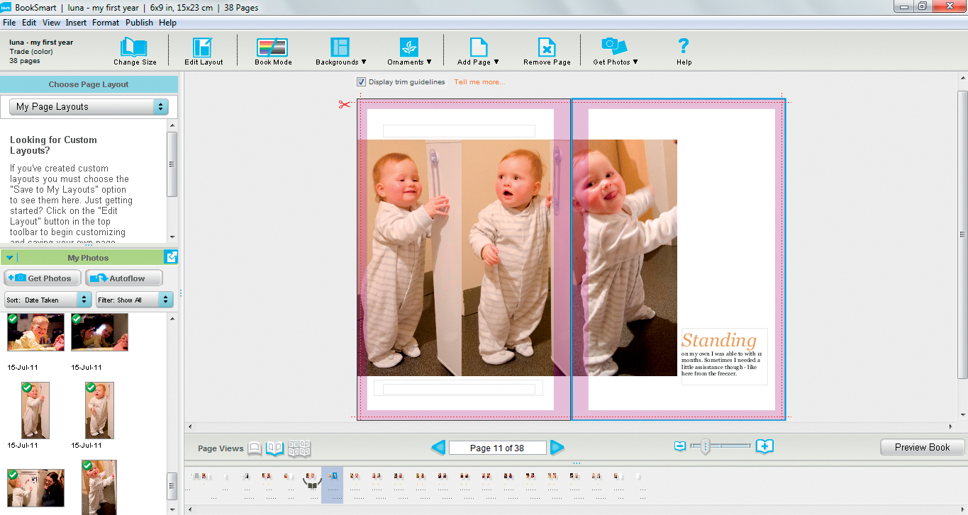
Figure 13.41: At the time of this writing, there were no dedicated features, such as embedded video, available for the iPad version of a Blurb book
Figure 13.42: In the Adobe Digital Publishing Suite, the Object States panel and the Window > Extensions > Overlay Creator command can be used to create animations or even a slide show. In this example, tapping the first image displays an animated sequence of additional images.
Once I had selected a format, I could begin to create my layout.
The process was largely the same as described in previous chapters, although I did come across two unexpected issues. First, the Blurb software accepted all the fonts I used but didn’t display them all correctly in the finished ebook. Blurb supported 17 different ebook fonts while I was working on the project, but it is highly likely that this number will have increased by the time you read this. It is best to check in advance if you want to avoid surprises, as the site accepts unsupported fonts and simply converts them into other fonts at the production stage. The other issue I discovered is that the back cover of a Blurb ebook isn’t displayed in iBooks, so don’t put too much effort into designing it if this is the route you plan to take.
Figure 13.43: The Blurb version of the Luna book on an iPad

Figure 13.44: The InDesign version of the book includes interactive elements like this video clip
Because of the limited iPad feature set available at Blurb while I was working on this project, I decided to experiment with InDesign’s Digital Publishing Suite features too. Video options can be found in the Overlay Creator panel in the Window > Extensions menu, and you can create slideshows (see screenshots) by defining the state of individual images using the Object States panel in the Window > Interactive menu. You can then add buttons to activate a state using the Buttons command in the same menu.
The Preview command in the Overlay Creator menu enables you to check the effects you have created in Adobe Viewer (now also available for Windows) without first uploading it to your iPad. However, some gestures cannot be adequately simulated using a mouse, so a final check in the real iPad environment is a good idea, too.
In order to load my book onto my iPad, I first had to upload it to the Blurb website just as if I were ordering a conventional photo book. The order page contained an iPad option, which incurred a “conversion cost” of $1.99, and the rest of the Blurb order process followed a typical online shopping flow (not via the Apple App Store). Once I completed the purchase, a download link was displayed and simultaneously sent to my email address to enable me to save my book directly to my iPad for subsequent viewing.
Getting a book onto your iPad using the Adobe Digital Publishing Suite is a bit more complex. You need to upload your layout to the Adobe Acrobat.com website using the Window > Extensions > Folio Builder command and your Adobe ID. You can then download it to your iPad and share it with others. Viewing requires a dedicated app, and at the time of writing it was not possible to use iBooks or similar ebook apps. If you want to upload more than one folio, you will need to open a fee-paying Acrobat.com account.
Like all other new technologies, the Digital Publishing Suite and Blurb’s iPad functionality are in a constant state of flux, so please check what’s currently on offer and whether you need to download any software updates before you start a new project.
Creating an interactive iPad photo book was actually a lot easier than I had expected. If you are already familiar with Blurb software, the additional tweaks necessary to create an electronic book are a snap. Things are a little more complex when using InDesign, but the software makes up for it with the wide range of interactive options it offers for use with the iPad. [Fig. 13.43, 13.44]