The final step in the book creation process should always be a check for errors and omissions. Most provider software includes a preview function that lets you view your layout in full-screen mode as double-page spreads, without the distraction of menus or tool panels. MyPublisher offers 3D preview functionality that shows the book in its closed state, thus helping you to judge the look of the cover and the spine. Most preview tools only show the open layout, which can make it more difficult to judge the cover separately from the first page. In such cases, it helps to hold a blank sheet of paper over the first page while you check the cover, and vice versa.
Once you are satisfied with the cover, check the color and sharpness of your images throughout the book. Insufficient print resolution is easier to detect in a preview than it is while you are working on a layout.
Figure 11.1: The preview option lets you view your layout in full-screen mode without distracting menus and tool panels. MyPublisher even offers a 3D preview.
TIPS & TRICKS Sometimes previews display slightly blurred, pixelated images, even when the images themselves are technically faultless. This can occur when providers use low-resolution images to increase the speed at which each preview page is drawn. If you aren’t sure whether an image is good enough, you can always open it in your favorite image processing program to make sure. If it displays correctly there, the issue is most likely connected with your provider’s low-resolution preview.
However, low image quality may also be a result of incorrect settings during image export. If this is the case, simply reprocess your images and re-import them into your book. If you still can’t find the right solution, get in touch with your provider’s support team. Software glitches are constantly being ironed out, so it often helps to download the latest version of your provider’s software. 
If an image is obviously defective, reprocess it or swap it for a different one. Insufficient image resolution is generally more obvious after a photo has been printed.
TIPS & TRICKS If you can’t avoid using a technically poor image (perhaps because the only photo you have of the bride and groom kissing was shot on a mobile phone), scale it down to a smaller size. This helps to conceal any inadequacies.
Checking colors is a complex process and involves coming to grips with the ins and outs of color management.
TIPS & TRICKS If all of the photos in your book are a little too dark or too bright, this could be a result of incorrect monitor settings. Most monitors’ default settings are actually too bright for making accurate color judgments. In such cases, the solution is color management. Start by making a print, either using your own printer or a third-party print service. If it is too bright or too dark, it is extremely likely that your monitor settings are to blame. You can find information about calibrating your monitor to ensure proper settings later in this section.
If your own prints are good, but you are still not happy with the quality of your printed book, you can always make a complaint to your provider (see section 12.2, “Troubleshooting”).
Color management involves checking your colors for consistency so that your printed images have the look you intended. If you have already made a photo book, you can probably see differences between the images printed in your book and the same images displayed on your computer monitor. Different home printers produce varying results, too. The differences between monitor and print output are due to the different ways these devices reproduce colors (see section 3.5, “Optimizing Image Settings”). The color spaces involved also cover differing ranges of reproducible colors.
If you want to achieve high-quality printed results, or if you are experiencing color preproduction problems, it’s worth becoming familiar with color management processes. The following paragraphs serve as an introduction to the subject; if you need more detail, refer to specialized literature or work with a high-end provider.
Color management begins by determining the color space (i.e., the range of reproducible colors) your camera uses to capture images. The two most popular color spaces in current use are sRGB and Adobe RGB. The Adobe RGB color space is larger than sRGB and is thus (theoretically) capable of reproducing more colors. However, most photo book services don’t support Adobe RGB and automatically convert images to the sRGB color space before printing. To avoid complications, it’s advisable to work in the sRGB color space from the start (for more information, see section 3.5, “Optimizing Your Image Settings”). [Fig. 11.2]
Figure 11.2: Different output devices use different color spaces. The large, colored shape in the diagram above represents the sRGB color space that many digital cameras use to capture JPEG images, compared with the smaller color space used by Blurb’s digital offset printing process (left) and the AdoramaPix “real” photo print process (right).
(Illustrations produced at ICCView.de)
The next link in the chain is your computer monitor. The monitor is the only tool you have for checking your images during processing, so if its brightness or color settings are incorrect, applying changes can easily reduce the quality of your photos instead of improving it. This wouldn’t be a problem if the monitor were the only output device in the workflow, but in this case, the colors the monitor displays have to precisely match those that the printer will produce later on.
To ensure that your monitor is correctly set up, you need to calibrate it using specialized hardware. Calibrators are available for $100 or less, and you can rent them from some photo stores, too. Calibrating your monitor ensures that it produces consistent colors in line with certain preset parameters. Monitor settings drift over time, so it’s important to calibrate your monitor at regular intervals. Calibrating your monitor at least once before you start a new book project is definitely better than not calibrating it at all. [Fig. 11.3]
In order to calibrate your on-screen colors to match those of your provider, you will need to use a color profile. Color profiles are commonly stored in ICC format and are available for download from providers that support color management systems (Blurb and AdoramaPix, for example). To install a color profile on a PC, simply right-click the downloaded file and select the Install Profile option in the popup menu.

Figure 11.3: This illustration shows the Datacolor Spyder monitor calibrator. The X-Rite ColorMunki is a similar device that performs the same task.
(Photo: Datacolor)
Figure 11.4: You need to load your provider’s color profile into your image processing software to gain an impression of the effect it will have

Figure 11.5: The Photoshop Gamut Warning option indicates potential color reproduction problems by highlighting affected areas in gray
To install a color profile on a Mac, copy it to the Hard Disk/Library/ColorSync/Profiles/Recommended folder. Blurb’s Help menu has a video that explains the process in detail (Help > Color Management).
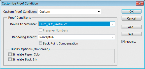
High-end image processing software, such as Photoshop or GIMP, lets you set up Soft proofing to help you judge the effects of a particular color profile on your images. In Photoshop, navigate to View > Proof Setup > Custom and select your provider’s profile from the list. It’s a good idea to switch the Rendering Intent option to Perceptual and to deactivate the Black Point Compensation check box. This helps preserve color accuracy when converting images from a larger color space (e.g., Adobe RGB) to a smaller color space (e.g., that used by the CMYK print process). [Fig. 11.4]
When you activate the Gamut Warning option in the View menu, Photoshop provides a visual indication of areas that might cause color errors during printing. [Fig. 11.5]
GIMP soft proofing options can be found under View > Color Display Filters, where you can select your provider’s color profile. [Fig. 11.6]
These simple steps will help you to get an impression of how your images will appear in print. But remember, it’s still only an approximation—in contrast to paper, monitors are backlit and use very different techniques to display colors.
TIPS & TRICKS A few high-end providers offer sample prints of individual pages, called “proofs,” to help you make the right settings for your images. This method is more reliable than soft proofing, which relies on simulated print output rather than giving you a real printed page to hold and view under different lighting conditions. Alternatively, if your provider doesn’t offer proofs, you can simply order a small sample book with a low number of photos. This is a sensible precaution if you are planning a large, expensive book project or if you are using a new provider for the first time.

Figure 11.6: The GIMP Color Proof option is located in the Configure Color Display Filters dialog
Once you are happy with the look of your images, check your text and layout for errors.
Start by checking spelling, punctuation, and style. If your book contains a lot of text, it’s a good idea to use an automatic spell checker (see chapter 10). Pay special attention to the accuracy of names and dates. Typing errors are all too easy to make and can be tricky to spot, so get someone else to check your text if you can.
TIPS & TRICKS An old journalist’s trick can help if you don’t have someone who can check your text. Read your text word for word in reverse order—it’s often easier to see mistakes if you look at each word individually rather than within the context of a sentence.
Figure 11.7: High-quality provider software includes trim preview functionality. Blurb’s version is called Trim Guidelines and must be activated manually.

Figure 11.8: If a double-page spread contains multiple text or image boxes, they should either be arranged along a single orientation line or have obvious differences in size and shape. Slight differences simply look sloppy.
Once you have finished checking your text, you can move on to the layout. The first thing to do is check the margins. Make sure that the print version doesn’t crop any important image elements and that full-page images actually do reach the edges of the layout.
TIPS & TRICKS Check your text and your layout in separate steps. It’s easier to miss errors if you try to check several factors at once for each page, so check the entire text first before checking your layout.
Book printing processes involve trimming large sheets of printed paper to size before they are bound into book form. The thick blades used by trimming machines and the tolerances involved in the process can cause a slight loss of detail at the very edges of a page (see section 4.5, “The Right Number of Pages”). This means that you have to make sure no text is positioned where it might get cropped off during trimming, and that images that are meant to reach the edge of the printed page overlap the edge slightly so that no unintended white space is left after trimming (this is known as “bleeding” your image off the edge of the page). It’s also important to keep in mind that the edges of an image meant to fill an entire page will be cropped slightly, so you must make sure there are no important details at the very edges of the image. If uncorrected, these types of errors can spoil the overall look of a page or even the whole book.
Some providers, such as Picaboo, automatically indicate trim areas in the Preview window, while Blurb has an optional Trim Guidelines function that you can switch on manually. [Fig. 11.7]
SmileBooks and others don’t offer trim previews, but you still have to allow for trimming in your layout. Three to five millimeters of extra space (for text) or overhang (for full-page images) is a good ballpark figure.
It’s also important to check the alignment of your text and image boxes. Boxes arranged along a single line often produce a pleasing overall effect, as do boxes with obvious differences in size and shape. Slight differences in alignment tend to look like mistakes; they are often not obvious when viewed on a monitor, but become conspicuous in a printed book. Always check your preview carefully at high magnification. [Fig. 11.8]
Blurb and SmileBooks let you align objects with a single line. At Blurb, switch to Layout mode and select the elements you wish to align by clicking them with the Shift key pressed. You can then align the selected objects using the Align left edges/horizontal centers/right edges or Align top edges/vertical centers/bottom edges buttons in the menu bar. This tool doesn’t automatically scale the aligned objects, so you might have to adjust their sizes manually first. [Fig. 11.9]

Figure 11.9: Blurb’s software helps you to align objects with a single line
TIPS & TRICKS If your software has guides, keeping them switched on is a great aid when aligning multiple boxes. If your software doesn’t have guides, you can always create a large, empty text box and use its edges to align other objects. Once everything is in it proper place, you can simply delete the extra box. [Fig. 11.10]

Figure 11.10: Using an empty text box is one way to check the alignment of other objects
PRO-GRADE SOFTWARE InDesign and Scribus both have comprehensive object alignment functionality with a fine baseline grid and individually adjustable “snap to” guides. 

Figure 11.11: InDesign includes freely movable guides for aligning elements within a layout

Figure 11.12: InDesign allows you to align images easily
If you’re using custom fonts, make sure they don’t look pixelated in the preview window. Use only TrueType fonts. If you aren’t sure whether your chosen font is up to the job, magnify a few letters to their maximum size and check their appearance carefully.
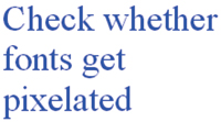
Figure 11.13: Make sure that custom fonts don’t look pixelated at high magnifications
If you intend to sell your book commercially, make sure that you have written permission to print from all the people who appear in your photos and from the owners/authors of any text you use.
PRO-GRADE SOFTWARE High-end software includes a function called Preflight to help you check the attributes of all the elements in your layout. The Scribus version is called Preflight Verifier and is located in the Windows menu. The InDesign Preflight command is found in the File menu. This tool checks the availability of linked files and fonts, the color spaces of your images, and the text to make sure it’s not positioned outside the printable area. Once the check is finished, Preflight lists all errors and their page locations, which you can then navigate to by clicking them.
Always use a custom Preflight profile if you can; a basic profile doesn’t always check for resolution errors. [11.14]

Figure 11.14: The InDesign Preflight tool makes sure that all elements displayed in a layout are actually available
These are the main things to check for during your final quality control run:
 Spelling, Punctuation, and Overall Style
 Use a spell checker while you are writing and have your text checked by someone else if possible.
Are all names and dates correct?
Page Numbers
Are they included on every page?
Is the sequence correct?
Margins and Trim Tolerances
Show trim margins in the Preview window if possible, or consult your provider’s Help pages for information.
Are any important elements cropped at the edges of the page?
Have you extended all bleed boxes to the edge of the page?
Quality
Does the preview show photos that are obviously substandard—e.g., blurred, grainy, or containing color errors? These errors become more obvious in print, so consider swapping these images or decreasing their size.
Image/Text Box and Content Alignment
Check the alignment of multiple boxes, especially if you’re using a custom layout. Alignment along a single line always looks better than small, random differences in position.
If a page contains images with strong, elemental lines (horizons, for example), either align them or arrange them to eliminate slight variations.
If You Are Using Custom Fonts
Are these fonts reproduced correctly, or do they appear pixelated? Check some large characters to make sure. Always use True-Type fonts.
For PDF-based Projects
Are your images saved in the correct color space (usually sRGB), and do they have sufficient print resolution? Use a preflight check to make sure.
Is the document’s size the same as your intended book size?
Have you checked your provider’s PDF guidelines? Some have specific requirements or (like Blurb) use special plug-ins.
Does your document include trim and bleed boxes? If present, these are usually printed.
Is your chosen number of pages printable? Most providers have specific requirements, and page counts often have to be divisible by four.
The inside of the front and back covers cannot usually be printed. Most books start with a single right-hand page and end with a single left-hand page.
If You Intend to Sell Your Work Commercially
Do you have permission to print pictures of all the people portrayed and to use the included text?
If you are using an ISBN, is it included in your layout (on the copyright page and back cover, for example)?
Check with the outlet through which you are planning to sell your book to see whether you are required to include a barcode.
Perform a final check using your provider’s preview function on the largest monitor you can find.