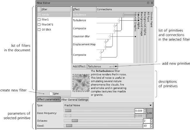
Now, let’s have a look at the principal filter powerhouse of Inkscape: the Filter Editor dialog (shown in Figure 17-18). Open it with the Filters ▸ Filter Editor . . . command.
The list in the top-left corner of the dialog contains all filters defined in your document. You can highlight any filter and edit its structure and parameters in the dialog. If the currently selected object has a filter applied, that filter will have a checkmark in the list; so, by setting or removing the checkmark, you can apply or unapply any filter to any object. (Note that even unused filters remain in the list; to remove them from the document, use the File ▸ Vacuum Defs command.)
Under the list, there is a New button for adding a new filter. If you opened this dialog in an empty document, the list of filters is also empty; now, press New to create a new empty filter, usually called filter1 (to rename it to something else, just click the selected name in the list and type). You can also duplicate or delete a filter in the list by right-clicking it and using the corresponding pop-up menu commands.
After that, you can create or select some object in the document and check the checkbox for your new filter. Nothing changes—an empty filter does not affect the rendering of an object. For the filter to actually do something, we need to add some primitives to it.
Turn your attention to the area to the right of the filter list. This is the main filter construction board where you list, arrange, and connect the stack of primitives that constitute a filter. Initially, it is empty because we haven’t yet added any primitives to our filter.
The 14 different primitives supported by Inkscape are listed in a drop-down list below the construction board. When you choose a primitive in the list, it displays a brief description and illustration below. You can read the description in the dialog to get an initial idea of what each primitive does. A detailed explanation of all primitives is beyond the scope of this book; if you want all the gory technical details, refer to the SVG specification (http://w3.org/TR/SVG11).
Instead, let’s go through the step-by-step process of creating a fairly complex filter that uses several different primitives to get an integral idea of how it all works. The filter we’ll construct is called Sandy Blur; I designed it for the background coloring of the Rose image (see Figure 24-5). This filter aims to imitate blurry watercolor strokes on a rough paper.
Plain Gaussian blur is not satisfactory: It is too smooth, too computer-generated, too boring. For an acceptable watercolor imitation, we need to model both the small-scale roughness of the paper texture and the larger-scale “blotches” resulting from the watercolor paint flowing and sticking differently in different places. For both these sources of unevenness, we will use the Turbulence primitive, which creates random fractal “noise” at the given scale.
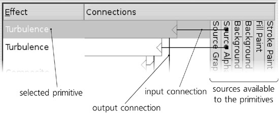
The two Turbulence primitives are the first two components of our filter—the two topmost boxes in the stack. Each filter primitive has one or more inputs and one output; in the list, the input is depicted by a line coming into the primitive box horizontally from the right, and the output is the line going from the box vertically downward. As you can see, the outputs of some primitives are the inputs for others.
You can wire the connections yourself by dragging; start by dragging from the input triangle at the right-hand edge of a primitive’s box. Generally, information flows from top to bottom in the stack of primitives; the output of the bottommost primitive is what you see rendered in the document window. You can also rearrange the primitives by dragging; a right-click menu allows you to duplicate or delete a primitive.
What are the vertically stacked boxes on the right? These are the predefined sources that any primitive can use as input. The most useful (and, as of version 0.47, the only ones fully implemented) are Source Graphic and Source Alpha. Source Graphic, as the name implies, supplies the original rendered image of the object we’re filtering, at the current zoom’s resolution. The Source Alpha is different in that it provides a grayscale representation of the original object’s opacity (alpha) mask; so, points that are fully opaque (regardless of color) in the Source Graphic will be opaque black on the Source Alpha image, and points that are transparent will be transparent black.
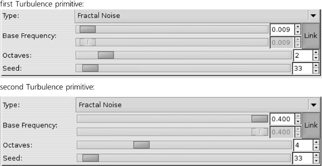
Let’s look again at the two Turbulence primitives at the top of the stack. They both take Source Alpha as input and pass their result—random noise—down to other primitives. What differentiates them are the parameters of these filters.
When you select a filter primitive in the stack, its parameters are displayed in the bottom area of the dialog. Here are the parameters of the two Turbulence primitives:
As you see, these two primitives have the same Type (Fractal Noise, which looks better in our case than the other option, Turbulence) but differ in Base Frequency and Octaves. The Base Frequency parameter determines the scale of the turbulence; higher frequency results in smaller, sand-like texture, while lower frequency produces larger clouds. The number of Octaves specifies, in fractal terminology, how deep is the recursion in the algorithm: Increasing Octaves produces sharper unevenness with more small details; decreasing this value gives a smoother, more nebulous image.
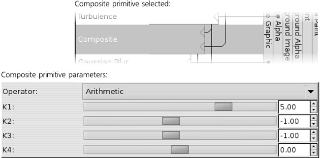
Now, we need to composite our turbulence outputs together. For this, we will use another primitive, aptly named Composite:
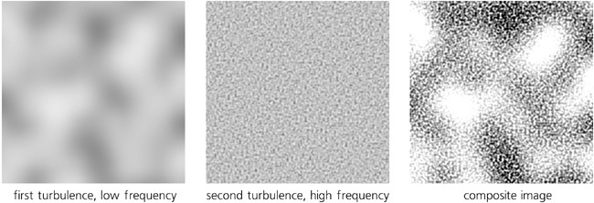
It has two inputs and combines them, pixel by pixel, using one of a number of methods. Here, I used the Arithmetic method; with the provided numeric values for the coefficients (K1 to K4), it results in the large-scale wave and small-scale ripples being combined into a composite with somewhat increased contrast, as shown in Figure 17-22.
Note
Refer to the SVG specification (http://w3.org/TR/SVG11) for the detailed formulas used by the Composite filter in various modes.
So far, we didn’t use the image of the object itself to which we will apply the filter—that is, didn’t use the Source Graphic. Supposedly, that object would be some kind of broad brush-like path, likely created with the Calligraphic pen tool (14.3 The Calligraphic Pen Tool). Of course, the first thing we need do to a flat-color, crisp-edged path to make it more like a watercolor stroke is to blur it:
The Standard Deviation parameter of Gaussian Blur is similar to the blur amount you would adjust in the Fill and Stroke dialog (Figure 17-1), except that here it is measured in absolute px units (A.6 Coordinates and Units) instead of percentages of the object’s size.
How do we combine the blurred stroke with the turbulence? Composite won’t work here. Any of its modes will just result in a smooth blur being overlaid with the turbulent ripples, but the underlying smoothness will not go anywhere (try it). It won’t look like watercolor on a rough paper at all—it will look more like computer-produced blur viewed through a spotted glass.
Let’s consider what happens when you paint with a real brush on a real paper. The blurriness of your stroke results from the softness of the brush—you apply more pressure in the middle than on the edges of the brush. When a brush meets a dimple in the paper, that pressure is changed; if this area of the paper is a rise, it will get painted more intensively, as if it were closer to the maximum-pressure point of the brush; if it is a depression, it will get less paint. In other words, the roughness of the paper jitters the blurred stroke in the plane of the drawing, as if randomly displacing parts of the stroke sideways. How do we achieve this with filters?
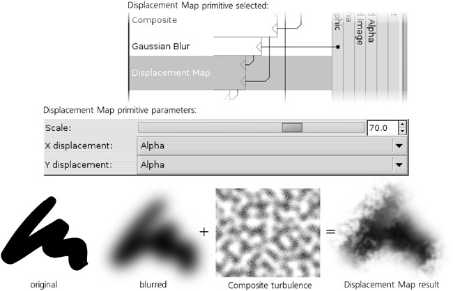
The Displacement Map primitive is a perfect match for the job. It takes its first input and moves its pixels around according to its second input. You can choose which of the channels (Red, Green, Blue, or Alpha) of the second input will move the first in each of the two axis directions (X and Y), as well as scale this displacement. In our case, the first input is the blurred object, and the second input is the composite turbulence field, of which we take the Alpha channel for both axes:
As an added bonus, the result looks rougher in some areas and smoother in others. This is because in the smooth areas, the displacement map hits the almost-flat inner parts of the blurred stroke, and there, the high-frequency jitter just moves around pixels of almost the same color without disturbing the smoothness. On the edges of the stroke, however, different-color pixels are mixed and jittered, producing visible roughness. All this is additionally modulated by the low-frequency noise, producing a very convincing watercolor simulation.
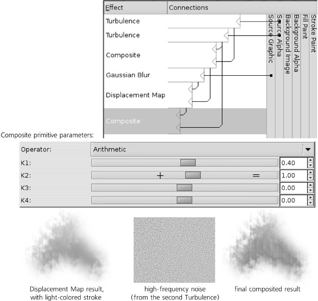
However, if you apply this filter to a light-colored stroke (and not black as in Figure 17-24), the result is still not quite perfect. When you’re looking at a real rough paper with watercolor strokes on it, what you see is not just the distribution of the paint; you also see the roughness itself, which looks like a pattern of shades. Without this shading, light-colored strokes with our filter still look too unnaturally flat. Fortunately, that is easy to fix; we already have the high-frequency turbulence source, which will work nicely as shading if we just compose it with our displacement-mapped blur, as shown in Figure 17-25.
Now the filter looks pretty decent, and we can declare it complete. You could continue working on it, adding various smears, water leaks, diffusion, and so on; however, since my demo image used this filter only for the background, I thought it was already good enough for the purpose.
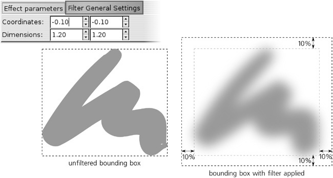
The second tab in the filter parameter area in the Filter Editor dialog is called Filter General Settings. It contains parameters that apply to the entire filter stack, not any single primitive. Currently, the only thing you can change here is the filter area—the area which the filter will render into, measured in the units of the bounding box of the object to which the filter is applied.
The Coordinates line specifies the top-left corner of the area, and the Dimensions line specifies the bottom-right corner. For example, if you set the Coordinates to 0/0 in and the Dimensions to 1/1, the area will be exactly equal to the bounding box. This will work fine if your filter does not reach beyond the object in any way—for example, if you’re just performing a color change with a Color Matrix primitive. However, if you are using something like blur in your filter, it will need to paint outside the bounding box, and you must provide sufficient margins for this to prevent cropping. When you apply blur via the Fill and Stroke dialog, these margins are set for you automatically; however, when creating a new filter stack from scratch, you must take care of it yourself. The default is 0.1/0.1 for Coordinates and 1.2/1.2 for Dimensions, which results in 10 percent margins on all sides of the object, as shown in Figure 17-26.
If the visual bounding box option is used (which is the default, see 4.2 The Bounding Box), the bounding box of a filtered object—the frame you see when you select it in Selector—is the enlarged filter area. Among other things, this means that, when exporting a selected object to bitmap (18.9 Bitmap Export), Inkscape will make sure the bitmap contains the blurred edges without cropping.
