This complex image (see cover) was created to be a showcase of Inkscape’s power and versatility. A single drawing of a rose is rendered in a different way in each of the five square windows as well as in the background. Thus, a single tutorial showing all stages of creating this image is equivalent to at least six different tutorials teaching you six different ways to draw a rose—or anything else, for that matter.
We will start with a photo. You don’t have to, of course; if you can draw better than me, you can just draw anything you like on an empty canvas. Tracing a photo, however, is a useful technique by itself.
File ▸ Import ( ) the photo, scale and position it as convenient. Rename the layer where the image is
 background and create a new layer, ink; we will need to hide and show the photo a lot, and it’s much easier to do when it’s in a layer of its own. It makes sense to reduce the opacity of the photo and lock its layer so you don’t move it accidentally. After that, just start to trace over the outlines and the boundaries between colors in the photo (Figure 24-1).
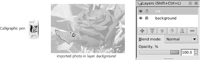
Which tool to use for tracing an image depends on the nature of the image and the result you want to get. If you’re tracing geometric shapes, easily representable by straight lines and Bézier segments, use the Pen tool. If you need more freeform and artistic shapes while still minimizing the number of paths and nodes, the Pencil tool is a better choice. Finally, if you are after an especially expressive, possibly even “untidy” style, use the Calligraphic pen. I wanted my drawing to be laconic but artistic and natural, and I had no reason to save on the number of nodes, so I used the Calligraphic pen:
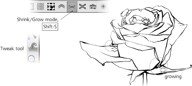
I used a pressure-sensitive tablet pen that allowed me to vary the width of the brush stroke depending on how hard I pressed the pen. However, you can achieve a similar result with nothing but a regular mouse. Why? Because controlling the stroke thickness with pen pressure, while easy in theory, rarely comes out exactly as desired on the first try. A much more efficient approach is to draw with a limited range of width in the Calligraphic pen and then apply the Tweak tool’s Shrink/Grow mode (12.6.4 Shrink/Grow Mode) to thicken or thin your strokes where appropriate:
The black and white outline is ready—now we need to add color to it. With a crisp ink outline, it makes sense to try a softer method of coloring. First, hide the background layer. Then, create a new layer, watercolor, and put it below your ink layer. After that, with wide calligraphic strokes, make a few wild brush strokes: red under the rose, green under the stalk and leaf, and various shades of blue around those. Finally, blur these strokes by a large enough radius that they begin to blend together:
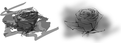
This already looks nice—but not nice enough. The smoothly blurred blotches are too smooth—and boring. In a quest to make them look more natural, I tried to expand the simple Gaussian Blur filter which I had applied to the background by adding more primitives. First, I added a Turbulence primitive, composited with the blur, to imitate paper grain. This looked better but still too uniform, too obviously computer-generated. I then added another Turbulence component with a much larger period, which I used twice: once, via a Displacement Map, for making the overall watercolor more blotchy and splotchy; and then, via a Composite operator, for modulating the small-scale paper grain to imitate a more realistic paper where some areas are smoother and others are more rough and grainy:
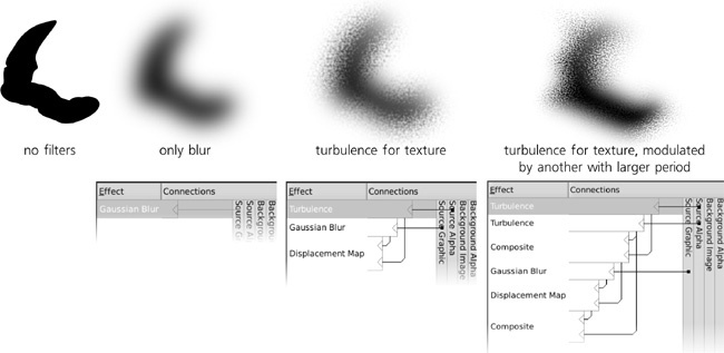
The final composite filter, which I called Sandy Blur (see 17.4.2 The Stack of Primitives for more on it), looked a lot more realistic—although much slower to render. At this point I had to switch to working mostly in the Outline (3.11 Rendering Modes) or No Filters modes (17.4.4 The Filter Area).
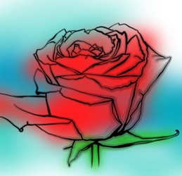
As a final step (see the cover for the end result), according to taste, you could duplicate the content of the ink layer and blur it to form a shadow, or (as I did) soften the ink lines slightly by outsetting (thickening) the duplicated ink paths and making them semitransparent.