The name Inkscape is a quite apt one: The most sophisticated drawing tool in the program, the Calligraphic pen, indeed feels very inky. This tool, as its name implies, was initially intended for calligraphy—that is, beautiful handcrafted lettering. But over time, it grew versatile enough for general artistic sketching, drawing, and inking.
Switch to the Calligraphic pen ( or
or  ) and drag on the canvas. You will see a filled path being created as you draw, the width and shape of which depend on the angle of the stroke, the speed of dragging, and the pressure of your pen (if you are using a tablet). The result is similar to the Pencil tool with a stroke shape (Figure 14-11), but the calligraphic stroke looks much more natural. The result of this tool is always a plain, filled path without any path effects.
Let’s see how we can change the output of the Calligraphic pen. The most important setting on the tool’s controls bar is Width, specifying the width of the stroke (or more precisely, its maximum width; many other factors may also affect width, but it will never exceed the value you set here). This width value can be adjusted by the  and
and  keys at any time while using the Calligraphic pen tool.
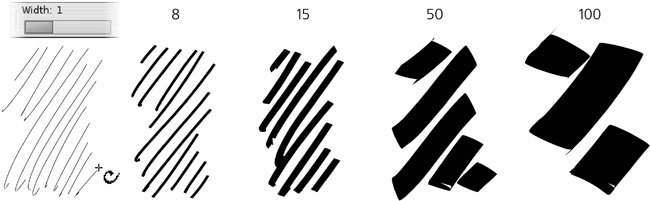
By default, width is measured in relative units from 1 to 100. This means that this value of width is relative to the size of your document window, not to any objects or measurements in the document. In other words, if you zoom out, your stroke will be wider in absolute units but will look exactly the same to you. The value of 1 always gives hairline, and 100 always gives a stroke about 2 centimeters wide, as measured on your screen.
This allows you to have always the same feel for the tool, regardless of the current zoom level, and provides for intuitive workflow: First, while zoomed out, sketch out the broad strokes; then, zoom in to add finer and finer patches—all without shifting the Width back and forth. If you don’t like this approach, go to the Inkscape Preferences for the tool (as with any tool, you can access it by double-clicking the tool icon on the toolbar) and check the Width in absolute units checkbox; now the Width control will set the absolute width of the stroke in px units.
If you have a pressure-sensitive tablet as your input device, Inkscape allows you to use the pressure information to change the width of the stroke—press lightly for a thin line, press harder for a wider brush:
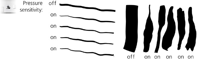
To enable pressure sensitivity, click the toggle button to the right of the Width control. Without pressure sensitivity, the tool draws as if maximum pressure is applied.
Note
Before you can use pressure sensitivity, you may need to configure your tablet as your input device. Usually, all you have to do is choose Input Devices from the File menu, then choose the Screen mode for each of the available Devices. The rest of controls in this dialog can be left in their default state.
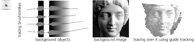
Another factor that can affect the width of the Calligraphic pen stroke (if you enable this feature) is the darkness of the color of the background objects over which you are drawing. That is, your brush is thinnest when you draw over white and broadest when you draw over black. This is most useful when you use guide tracking (14.3.7 Tracking a Guide Path) to create hatching in a background drawing or bitmap and want to achieve a shading effect with strokes of smoothly varying width:
To enable tracing the background, click the second toggle button to the right of the Width control. This setting can be combined with pressure sensitivity though it usually makes sense to turn pressure sensitivity off when you are tracing.
Finally, the speed of your drawing—how fast you’re dragging the mouse or pen—may also affect the width of your stroke. This is controlled by the Thinning value, which takes values from –100 to 100 (Figure 14-15). Positive values make your stroke wider as you go faster; negative values make it thinner. If you set this parameter to 0, thinning by speed is disabled.

Since a stroking movement is usually faster in the middle of a drag, the result is a shape with the fixed width at the ends and a “breathing” middle, thinner for positive values of this parameter. Pressure sensitivity usually has the opposite effect, as pressure in the middle of a stroke is typically higher than at the ends. An interplay of these two factors gives a very natural feel to the stroke.
A real-world felt pen or pencil usually leaves a thinner trail when you move it faster; the default value for this parameter is set to 10 to emulate this behavior. However, you can also push it all the way to –100 or to 100, which produces curious effects of an “exploding” or “imploding” brush very much unlike anything in the real world!
The Angle and Fixation parameters treat the Calligraphic pen according to its name—that is, as a flat-tipped calligraphic pen that can be held at varying angles. The Angle sets the angle of the pen’s tip to the horizontal: 0 means the tip is horizontal, +90 means it is rotated all the way to the vertical counterclockwise, and –90 means it is rotated clockwise. This value can be also be changed by pressing the  (increase) or
  (decrease) arrow keys.
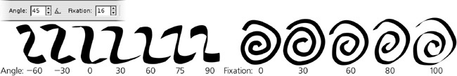
Setting an angle with a nonzero fixation is most useful for producing calligraphic lettering. For most styles of calligraphy, the angle should be somewhere between 30 and 60 degrees.
Note
If your tablet supports pen angle detection, you can, for extra realism, bind the Angle parameter of the tool to the actual physical angle of your pen. For this, just press the toggle button next to the Angle slider.
The Fixation (in the range of 0 to 100) controls how strictly this angle is enforced. When fixation is at its maximum, the tip is always rotated at the set angle, regardless of the direction in which you draw, so that drawing in parallel to the pen angle always gives a hairline stroke, whereas drawing perpendicular to it produces maximum width. With zero fixation, the direction of the pen is always perpendicular to the direction of movement, which makes angle irrelevant and gives you the effect of a felt-tip pen or a round brush. Intermediate values of fixation produce a stroke that is affected by both angle and the direction of movement, in varying proportions.
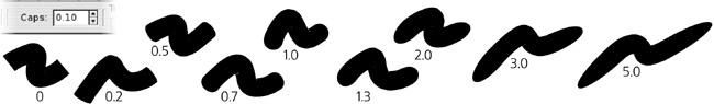
By default, Calligraphic pen strokes are cut blunt at the ends. This is appropriate for calligraphy work, but at other times you may want a more rounded appearance. Increase the Caps parameter to about 0.5 for slight bulges at the ends, to 1.3 for approximately round caps, and up to 5 for long, protruding caps:
What we’ve seen so far of the Calligraphic pen tool is useful, even if maybe a little boring. Now it’s time to add some fun! The last three parameters—Tremor, Wiggle, and Mass (all in the range of 0 to 100)—modify the behavior of the tool in some wild ways.
Even when using a graphics tablet with pressure sensitivity, the Calligraphy pen’s brush strokes often look too smooth and computer-ish. Increasing tremor adds small-scale disturbances to the stroke for a more natural look—rough, trembling, or even splotchy. The frequency of the tremor is temporal, rather than spatial, which means that if you draw faster, the roughness will be stretched along the stroke and therefore look smoother.
The Wiggle parameter also disturbs the stroke but at a larger scale, making it waver in wavy or loopy patterns, departing sometimes quite far from the actual position of the cursor, especially at sharp turns:
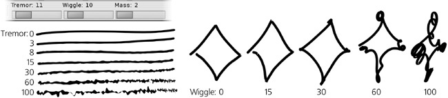
Mass makes the brush lag behind the cursor, as if slowed down by inertia, resulting in smoothing of sharp corners and shortening of the fast flights of your pen. The default settings for tremor and wiggle are 0, but mass has a small nonzero default value (0.02) so that the Calligraphic pen feels light and responsive but not entirely weightless.
The Calligraphic pen is the most settings-rich tool in Inkscape—and at times, it can be overwhelming. Even if you know all of its controls by heart, tweaking several sliders and buttons every time you want to switch from a smooth marker pen to a wiggly brush is time-consuming. Presets are a solution to this problem: By choosing one of the presets from a drop-down menu on the left end of the bar, you can set multiple parameters at once. Several presets come with the program:
Dip pen is an imitation of a soft calligraphy pen: smooth (no tremor or wiggle), pressure-sensitive, angle fixed at 30 degrees, no caps rounding.
Marker is a plain, constant-width, felt-tip marker: smooth, no pressure sensitivity, no speed thinning, no angle fixation, round caps.
Brush, compared to Marker, adds pressure sensitivity, negative thinning (i.e., the stroke is wider when you move faster), and some wiggle.
Wiggly, as its name implies, features high wiggle and some tremor for a characteristic “dirty” look.
Splotchy is a very wide brush with high tremor and high negative thinning, which can produce a series of “splotches” connected by thin streaks (see Figure 14-15, right).
Tracing is similar to Marker but with the background tracing feature turned on (14.3.1.2 Tracing Background).
Note
Unfortunately, as of version 0.47 there’s no way to add more presets to the list via the GUI—but if you really need to, you can add them by editing your preferences.xml file (3.1.1 Inkscape Preferences). In the group element with id="preset", add something like this:
<group name="My style" width="50" mass="0" wiggle="25" angle="30"
  thinning="-40" tremor="10" flatness="50" cap_rounding="1"
  tracebackground="1" usepressure="1"/>
If a single path was selected before you started drawing, and you had  pressed when you released the mouse button or lifted the pen, the new object you have created will automatically be added (via the Union path operation, 12.2 Boolean Operations) to the selected path, forming a new single path.
Analogously, if you had  pressed, the new object will be subtracted (via the Difference operation) from the selected path. (The Cut mode of the Eraser tool works the same, if you want to use this functionality as a separate tool without having to hold .) This makes it easy to quickly “patch” or “carve” any path.
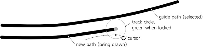
Drawing in Calligraphic pen with  pressed activates the guide tracking feature, which causes your pen to “slide” at some constant distance from the edge of a selected “guide” path and lets you trace around or along that guide.
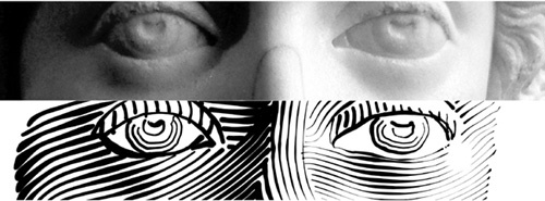
The inspiration for this feature came from the traditional line engraving techniques that were, for a long time, the only practical way of reproducing lifelike images in black-and-white print; about a century ago, line engravings were almost completely displaced by automatic halftone screens. Hatching—filling space with many parallel straight or variously curved lines of varying width to represent gradual shading—is a very labor-intensive process. Inkscape’s guide tracking, along with background tracing (14.3.1.2 Tracing Background) and the Tweak tool (12.6 Path Tweaking), take the pain and boredom out of this ancient art. While you still need a keen eye and assiduousness, with Inkscape it is at least possible to create authentic-looking line engravings, entirely in vector, in a reasonable amount of time.
One way to approximate a hatching grid is by using path interpolation (blending, 17.2 Blend Modes), but this method is not too flexible and produces too obviously computer-generated output without the “human touch.” Manual drawing of hatch lines, on the other hand, is tedious and nearly impossible to do uniformly. However, the guide tracking capability allows you to hatch quickly and uniformly, at the same time giving you sufficient manual control over the process.
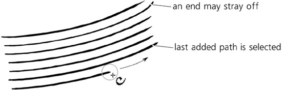
Here’s how to do it. First, select the guide path that you will track. It may be another calligraphic stroke, any path or shape, or even a letter of a text object. Then switch to the Calligraphic pen tool (if you haven’t already) and, before starting to draw, press . You will see a gray track circle centered at your mouse pointer and touching the closest point on the selected guide path. (If you have no guide path selected, a status bar message will tell you to select it.)
Now move your mouse closer to the guide path, so that the track circle radius is equal to the desired spacing of your hatch pattern, and start drawing along the guide path. As soon as you start drawing, the radius of the circle locks and the circle turns green; now the circle slides along the guide path—and the actual stroke is drawn by the center of the tracking circle, not by your mouse point. As a result, you are getting a smooth stroke going parallel to the guide path, always at the same distance from it.
When the stroke is ready, release your mouse button (or lift your tablet pen). However, do not let go of yet, because as long as you have it pressed, the tool remembers the hatch spacing you set when you started drawing. Since you have just created a new stroke, that stroke object is selected instead of what was selected before—which means it now becomes the new guide path. Next, draw a second stroke along the first one, then a third one along the second, and so on. Eventually, you can fill any desired space with nice uniform hatching, as shown in Figure 14-20.
The attachment to the guide path is not absolute. If you stray your mouse pointer far enough from the guide path, you will be able to tear it off (the track circle will turn from green to red) and move away (but not quite freely: The pen will have a heavy inertia from the guide tracking). This is intentional; for example, in this way you can continue drawing a stroke past the end of a guide path, in order to cover a wider area than the initial guide path would allow. With inertia, this tearing off is usually pretty smooth, but it is not possible to completely suppress jerks. If jerking and unintended tear-offs still bother you, try increasing the Mass parameter.
Note
Since tracking is designed for smooth engraving patterns, it does not work on guide tracks with too sharp turns or those that are too uneven (e.g., calligraphic strokes with high tremor).
Tracking a guide also allows for some feedback by gradually changing the tracking distance in response to your drawing behavior. If you’re consistently trying to draw closer or farther from the guide than the current tracking distance, the distance will decrease or increase a bit, so you will get a hatching that is spaced slightly closer or wider. Also, note that since tracking follows the edge of the stroke, strokes of varying width (such as those tracing background, see below) will result in gradual bending of the hatching pattern as you proceed.
If you’ve accidentally deselected your last created stroke (e.g., by performing an undo of a bad stroke), you can reselect it without leaving the Calligraphic pen tool by pressing  (5.11 Selecting with Keyboard Shortcuts). Guide tracking can be combined with adding or subtracting (i.e., you can press
  to add the new stroke to the selected guide path or
  to subtract from it).
It is natural to combine guide tracking in the Calligraphic pen tool with the Tweak tool. A hatching rarely comes out perfectly; loose stray-off ends, the wrong slant or curvature, and incorrect stroke widths (i.e., too dark or too light hatching) are the most common problems. The Tweak tool can fix all of these problems so you don’t have to redo the hatching. Use the Shrink/Grow mode to clear the loose ends as if with an eraser and to adjust stroke widths, and the Push mode to bend or shape the hatching. With these powerful tools, it is possible to create a complex and believable hatching by tracing a bitmap original: