
From Chapter 3, you should now be familiar with the methods of sampling and collecting both primary and secondary data. If we refer to Chatfield's (1995) schema of the stages of a statistical investigation (Box 4.1), these stages correspond to points 1 and 2. This chapter is concerned with the next two stages in analysis, summarised by points 3 and 4, as well as introducing the use of MINITAB, a computer package which performs statistical analysis, which we shall use both in this chapter and in Chapter 5.
Box 4.1 Stages of a statistical investigation
Source: Adapted from Chatfield 1995.
The process of initial examination or analysis of data is referred to as Exploratory Data Analysis (EDA) or Initial Data Analysis (IDA) (Chatfield, 1995). The preliminary part of IDA is concerned with the preprocessing of the data, checking on data quality, errors and missing observations, with the latter part more concerned with the description of data using visualisation techniques (e.g., graphs) and descriptive statistics.
Data pre-processing consists of a number of components including coding, data entry (usually entering values into a file for use by a computer package), error checking and any subsequent data editing.
Prior to any formal analysis, your data will need to be coded into meaningful values. If your data are in the form of digital data, or are already pre-coded (see Section 3.3), you can probably skip this section and move to the section considering data entry below. If, however, your data exist as a pile of completed questionnaires, full of ticked answers to closed questions or textual answers to open questions, the task will be to assign numbers to the range of responses you have obtained for each question. Where you have used closed questions (see Box 3.4) the task is relatively straightforward. For example, if your question was of the form:

we can assign numbers 1 to 7 for the seven options listed (although you might want to add extra codes to cover specific reasons revealed in the 'other' category returns). Where you have used open questions within the structure of your questionnaire, the coding task is more difficult. Here, you have to first identify appropriate categories within the data and then classify each response prior to numerical assignment. In this case, you will need to construct both a coding frame of the codes or classification used for each open question in the questionnaire, and then an accompanying code book which lists all the codes used in your study. The number of categories used, and the form of your classification, will be determined by the objectives of your research (i.e., the problem that you are trying to solve), the variation in your responses, and the size of your sample. For example, we could have asked the above question using an open form:

If the objective of your research was to examine the various types of economic factors underlying the selection of a house, then you may wish to focus on categories such as price, as an investment, to be near to job, etc., consigning any response which does not fall into one of these categories into a non-economic category. Alternatively, you may be more concerned with personal factors, such as more suitable residence, children's school, better location, etc., with other categories classed as non-personal. Of course, it is important to take into consideration the variability displayed in your responses: if you are getting a wide range of different personal factors for buying a house, you may wish to increase the number of corresponding categories. This explains why it is generally more useful to design your coding frame after collecting your data. For example, with a question such as:

you might find that the majority of responses are falling well outside your anticipated range, and beyond the magnitude of any pre-sample coding frame. The number of categories will also be dictated by the overall size of your sample: too many categories with a small data set will allow small numbers for each category, which may make the data inappropriate for statistical analysis. Oppenheim (1992) notes that 12-15 categories will usually be sufficient for most purposes, allowing for the inclusion of codes such as don 't know or other. Once you have designed a coding frame for each open question, you should test it on a further subsample of your returns, and then assemble the codes into a code book which you then use as the basis to code all remaining questionnaire returns.
Once your data have been coded, if you are going to perform your analysis using a computer package such as MINITAB (see Section 4.4), you will need to enter them into the computer. There are three main possibilities for entering such data: typing the values into an ASCII file; typing the values into a spreadsheet; and using an optical mark reader. Of these options, an optical mark reader is the quickest. This consists of a machine that will scan your questionnaires, automatically coding checked boxes. If you do not have access to such a machine, then you will have to type your data into the computer. The first option is to enter your data into an ASCll text file using the text editor on your computer. If you are using a PC, Windows 95 supports either the Notepad editor, or the older DOS Edit editor. If you are running on an Apple Mac, then you can use the SimpleText editor. UNIX workstations have a variety of text editors depending on the hardware/operating system, ranging from fairly simple (e.g., Solaris Openwindows text-edit) to quite specialised (e.g., VI and GNU EMACS).
The advantage of. using a text editor is that you can enter data in a simple format which can be read by most statistical packages.
When typing in your data you will need to adopt a standard format. Common data formats include the free format (or list), and the space delimited (values separated by spaces), comma delimited (values separated by commas), and tab delimited (values separated by tabs) formats. Entering data in free format is very simple, but perhaps less useful in that we can enter the records (row) only for one field (column) at a time. More useful are the space and comma delimited formats, since we are able to enter several fields against each record. Here, each record might be a questionnaire respondent, or some other sample unit such as a ward or city. The fields correspond to the variables we have for each record. This might be the count of people in each ward or city, or the coded response the person gave to a particular question.
Consider the sample of hypothetical data in Table 4.1. Each record (row) corresponds to a respondent to whom you have administered a questionnaire, whereas each field (column) corresponds to the responses to different questions. In this case we have 63 respondents and 20 questions, of which only a portion are reproduced in the table.
If we were to enter the first three lines of these data codes into a file using a text editor in the space-delimited, comma-delimited, tab and free formats, we might end up with the displays in Figure 4.1.
The alternative to generating your own delimited ASCII text file is to input your data into a spreadsheet.
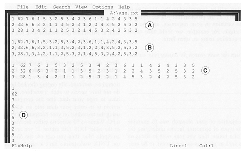
Figure 4.1 Different formats of ASCII text: space delimited (A), comma delimited (B), tab delimited (C), free format (D).
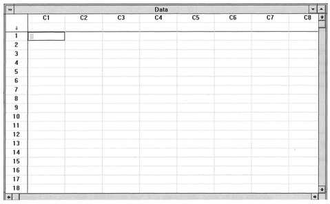
Figure 4.2 MINITAB spreadsheet.
A spreadsheet consists of a set of boxes in rows and columns, in which we can enter numeric data. Both the rows and columns are numbered conveniently, and will allow the entry of text headings so we can end up with a display very similar to that in Table 4.1. There are many varieties of spreadsheet ranging from Microsoft Excel to the simple spreadsheet available in statistical packages such as MINITAB. An example of MINITAB's internal spreadsheet can be seen in Figure 4.2.
Usually, statistical packages such as MINITAB will allow you to import data in a variety of ASCII text and spreadsheet formats, though it is probably advisable to check what formats you can import before choosing to use a particular spreadsheet package. Spreadsheets (and for that matter some PC text editors) often impose an upper limit for the maximum number of records they will allow in a file. If you are intending to use very large data sets with thousands of records (e.g., census data) you may well find that you can hold these only in a text editor or other software program on a powerful computer such as a UNIX workstation. Generally, such data sets can be entered into a computer package with any degree of efficiency only if they are already in a digital form. Whether your data set is big or small, if it is not in a digital form, you must consider carefully the amount of time needed to input the data into the computer. There is no point in collecting a large and complex data set if it is impossible to enter the data physically into a computer package, given time and labour constraints.
The input of data into a computer is a relatively straightforward process, but errors can and do occur, particularly if you are dealing with large and complex data sets. There are a variety of reasons why you might have errors in your data. These are summarised in Box 4.2.
Some of these errors can be spotted fairly easily during checking and preliminary analysis: these are the more mechanical typing, transcription, inversion and repetition errors. However, recording and deliberate errors can be nearly impossible to detect. Although we can spot errors such as data outliers (extreme values) using some of the initial data analysis methods (IDA) considered in Section 4.5 below, there are a variety of checks we can perform at the entry stage. These steps are often known collectively as data cleaning and are summarised in Box 4.3.
The majority of the steps in Box 4.3 will be useful only for spotting gross errors, and will not catch those errors where there is only a slight change (e.g., a '10' entered when a '19' should have been). To perform more rigorous checking, you will have to duplicate the data by typing it into the computer a second time,
| Case numbers | Try to introduce some simple redundancy. Include the case number or count with each data row. This will make it easier to check for omissions (e.g., a ‘1’ against the first record, ‘2’ against the second, etc.). |
| Consistency checks | For example, if you know the total number of cases which should be in your data set, try to calculate this by some other means (e.g., use intermediate subtotals which should add up to the required total). Alternatively, check the number of lines in your data file if you have one case per line. |
| Magnitude checks | If your codes range from 1 to 20, check that you don't have any numbers included outside this range. |
| Variable consistency | Check pairs of variables for approximate consistency, if this is to be expected. For example, you might expect that income and house size might be related, or those who answered ‘no’ to Q. 10 should not have answered Q. 11 but skipped to Q. 12. |
| Duplicate your data | Enter your data set into the computer twice, and check that both sets correspond. |
Sources: Adapted from Beasley 1988 and Bourque and Clark 1992.
and verify that both sets are the same. In this case, a simple method to check for errors is to subtract one data set from the other, which should of course lead to a set of zero values (Bourque and Clark, 1992). Alternatively you can use a computer system utility to compare files. If you are using a computer that operates using Windows 95 you will have access to an old DOS utility 'FC.EXE' which will detect differences between two files. For example, if we have two data files, ONE.DAT and TWO.DAT, which should be identical, we can check for differences by issuing the command at the DOS prompt (C:\windows>):
C:\windows>FC ONE.DAT TWO.DAT
Corresponding parts of each file which are different will then be flagged on the computer screen. On UNIX systems, there is a more powerful utility 'diff', which allows the detection and listing of differences between two files. To run this, issue the following command at the UNIX prompt(%):
% diff one.dat two.dat
Any corresponding rows in each file which contain different values will be flagged on the screen. Such utilities are invaluable during any subsequent processing of your data, since you can usually output the data that the computer program is using as part of your analysis. With large data sets, and complex processing, it is always worth checking that the data you think the computer is processing are the same as the data which are actually being processed, particularly if you make use of your own purpose-written programs in a higher language (see Section 4.3).
Once you have entered your data, do not stop checking for errors! Sometimes errors come to light only after you have started your analysis, forcing you to scrutinise the data you have typed in. The methods of IDA which we will consider below are particularly useful for spotting certain data errors. However, as a preliminary, there are several simple checks you can make. Depending on your computer platform (e.g., PC or UNIX box), there are a variety of operating systems tools which you can use to interrogate any ASCII text file you have created. This could be simply a matter of typing the data to the screen or to the printer, or performing some simple checks on the size of the data file. For example, in a UNIX environment we can check the number of records (rows) in a file by using the word count command 'we -l', and we can also check the number of characters and size in bytes using the 'we -c' and 'we -m' commands respectively. The command 'wc' with no qualifiers will give the number of lines, characters and bytes. For example, for a file 'three.dat':
| % | wc three.dat | |||
| % | 734 | 1153 | 17862 | three.dat |
| ↑ | ↑ | ↑ | ||
| lines | characters | bytes | ||
If you obtain the data in a digital form, it is useful to compare the size of the data file in terms of the number of bytes before and after you have transferred the file to your computer. This will ensure that you have copied the entire data set.
Once you have entered and checked your data, it is always advisable to do two things: print out a copy, and save a copy to a floppy disk or other storage medium such as a DAT tape or ZIP/JAZZ drive disk (which you keep in a safe place). It is often difficult to see some errors on screen, but these are much more apparent when you print out your file. Accidents leading to data and disk corruption do happen; it is always wise to take precautions - particularly with irreplaceable data! Hard disks can (and do) fail, floppy disks can attract all sorts of physical errors, particularly if you have been carrying them around loose in a pocket, and a fire will take care of even the most carefully stored data. When one of the authors was a research student, he had the stressful experience of a computer tape containing his data being overwritten by a member of the university's computer centre who had mistakenly confused two tapes! Fortunately in this case the bulk of the data was soon replaced. But the moral is that even if you are relying on someone else to look after your computer data, you should make it your business to keep regular backup copies, preferably at home or in a fireproof safe.
As with all statistical analysis, the confidence in any results will be increased if the data have been carefully checked, but for large data sets this may require a considerable amount of time. Perhaps the best advice here, particularly if you are doing a research project for the first time, is not to underestimate the amount of time needed to error-check your data. Chatfield (1995) estimates that the process of collecting, examining, processing and cleaning data prior to analysis can take anywhere up to 70% of total effort expended in the project!
In contrast to the examples displayed in textbooks on statistics, you may find that your data sample contains missing entries. You will have to decide on an approach to deal with this problem, which will largely depend on the nature of the missing values, the overall size of your data set and the types of statistical analysis you wish to perform. The first question which you must try to answer is: Why is a particular observation missing? If your data sample is composed of interview results, you may find that there are gaps in an otherwise complete record for a respondent. This could be due to the respondent (or interviewer) having forgotten to enter certain data or some other random effect. If missing values are distributed randomly across all respondents, then the data are missing completely at random (MCAR) (Bourque and Clark, 1992). If missing data are not randomly distributed across all respondents, but randomly distributed within a group or several groups, then such data are missing at random (MAR). Alternatively (and more importantly), missing data could be non-random, owing to some correlated bias in the data set (Oppenheim, 1992) particularly arising from non-response (see Section 3.3). Is the reason for non-response due to the nature of the questions or the characteristics of the individual being polled? If so, then this is a serious problem which could undermine the validity of the data sample.
The deletion of the record containing the missing data is one approach to dealing with the problem. We can delete all records which contain missing data, so that the only data used for analysis consist of records with no missing values. For example, if we have sampled 100 respondents, where the data for each respondent form a row (record), we might find that there are one or more missing fields for 35 respondents. We would then delete all 35 from our sample. The alternative is to delete only the record for those pairs of variables which have missing values. For example, from the same 100 respondents we find that fields 1 and 2 have only 14 rows with missing values. We would therefore delete only the corresponding 14 records from any bivariate analysis between these
Box 4.4 Methods for the imputation of data
| Mean substitution | MCAR | The arithmetic mean of non-missing data is substituted into the missing case(s) usually if the variable is uncorrelated. |
| Least squares | MCAR | Missing data are estimated using least-squares regression if two variables are correlated. |
| Least squares + residual | MCAR | Residual component is added to the least-squares method (can also be applied to the mean substitution method). |
| Hot deck | MAR | Data from a similar case are substituted into the missing case(s). |
| Maximum likelihood | MAR | A likelihood function is derived from a model for the missing data set using a maximum likelihood technique, but this is beyond the scope of this book. The reader is referred to Chatfield (1995) and Little and Rubin (1987) for details. |
Sources: Bourque and Clark 1992; Chatfield 1995.
fields. These methods are known as listwise deletion and pairwise deletion respectively (Oppenheim, 1992). The former is usually the preferred strategy unless the data set is very small (Bourque and Clark, 1992).
An alternative to deleting cases is to try to 'guesstimate' or impute the missing data values from the data (Chatfield, 1995). There are a variety of methods which can be used depending on the structure of the missing data (MCAR or MAR), which are listed in Box 4.4.
Missing data are also a problem at the practical analysis stage. If you have collected your own data, you will need to insert an appropriate missing data code prior to using a computer package (e.g., a '*' for MINITAB). If you are using a secondary data source you should have information on whether any missing data has been re-coded and what codes have been used. Occasionally this is not the case, and in such a situation you should be suspicious of any repetitive or very large or very small values in the data set. For example, Chatfield (1995) notes a number of examples where data sets had already been coded with a missing data code of 999 or 0 before the stat istical analysis stage, but were not documented as such. In this context it is important that you look at the distribution of the data using an IDA, and be suspicious of any very large or very small data values.
It is almost inevitable that you will require some exposure to computers if you are going to perform quantitative analysis of your data. This may vary from the simple use of built-in functions in spreadsheets such as Microsoft Excel, and the use of statistical packages such as MINITAB, SPSS and SAS, to programming your own analysis. Where quantitative analysis is concerned, there is no doubt that the skill of being able to write computer programs can be extremely valuable (although as our step-by-step guides illustrate, not essential). This can range from the use of a structured high-level language such as BASIC, FORTRAN, C or C++, to the use of UNIX shell-scripting. Although increasingly you can make do with statistical packages (we will consider the MINITAB package below), the process of writing a computer program to analyse data does convey certain advantages (as well as disadvantages!). These are listed in Box 4.5.
Box 4.5 Pros and cons of computer programming your statistical analysis
| Pros | Cons |
|---|---|
| Programming is a useful skill to learn. | Difficult: you need to be able to program |
| Analysis tailored to your needs. | Commercial software is almost as good. |
| Improves your understanding of the statistics. | Program will need thorough testing. |
| Time saved in automating processing. | Time consumed to write program. |
It is beyond the scope of this book to cover in detail the programming languages and the details for both compiling and debugging such programmes. How ever, there are an ever-increasing number of simple guides to programming, which range from the simple 'how to' guides (e.g., Aitken and Jones, 1997) to the more specific programming of statistics and numerical analysis (e.g., Press et al., 1989; Cooke et al., 1992).
As an illustration, the C code for the calculation of standard deviation is listed in Box 4.6. This will look complicated - particularly if you don't understand the C programming language! However, armed with an introductory text, a computer, a C compiler (and a lot oftime!) you should soon be able to understand the elements of Box 4.6 and produce your own programs.
The MINITAB statistical package was first released in 1972, and was designed to help teach students a variety of basic statistics. There are a variety of versions of the software available, on several different computer hardware platforms. The version that we will use is version 10.1, running on a PC with a Windows operating system. The original versions of MINITAB were based on entering commands at a command line. Version 10.1 can be used either by entering commands or by accessing pull-down menus. In the examples throughout this book we will use both
Box 4.6 C code for the calculation of standard deviation
/* Program to illustrate how to calculate */
/* standard deviation using C */
/* main calls a function called 'standard_ d' to */
/* calculate the standard deviation. It takes an */
/* array of integers as its argument and returns */
/* a float as the standard deviation */
/* included header files */
#include <stdlib.h>
#include <stdio.h>
#include <math.h>
/* function prototypes */
float standard_d(int *data);
/* main (which calls standard_d) */
main()
{
int data [100];
int count = 0;
float standard_deviation 0.0;
FILE * inputfile;
/* open File pointer */
source ("shell");
inputfile = fopen('data.txt', 'r+');
/* check inputfile exists */
/* if it does not exist print error and quit */
if (inputfile == NULL) {
printf("\n File does not exist");
goto quit; }
/* set data values to -999 (or any unused value) */
while(count <100) {
data[count] = -1;
++count; }
/* read in the data from the file */
/* assumes you want all the data */
count = 0;
while(!feof(inputfile)) {
fscanf(inputfile,"%d", &data[count]);
++count; }
/* call standard_d () */
standard_deviation = standard_d(data);
/* print out the result */
printf ("\n standard deviation = %f\n", standard_deviation);
quit:
/* main should return an int */
return(0);
}
/* standard_d function */
float standard_d (int data [])
{
int count = 0;
int sum = 0;
float mean = 0.0;
float var_sum = 0.0;
float variance = 0.0;
float sd = 0.0;
while ((count <100) & (data[count]! =-999)) {
sum = sum+data[count];
++count; }
mean = sum/ count;
count = 0;
while ((count <100) & (data[count]! =-999)) {
var_ sum = var_sum+ ((data[count]-mean) * (data[count] - mean));
++count; }
variance = var_sum/count;
sd = sqrt (variance);
return(sd);
}
(Code courtesy John Spain)
methods, and leave the choice of which to use to you. When you start up MINITAB on a PC, you will be presented with a screen similar to that in Figure 4.3, which comprises two windows and a command bar.
The command bar consists of a row of keywords which when selected display one or more pull-down menus. To select a keyword, you can either use the mouse to simply point and click (with the left mouse button), or press the ALT key on the keyboard, and keeping this pressed, press the letter which is under lined in the keyword. For example, to pull down the File menu, you would need to type the ALT and F keys.
If you prefer to use the command line interface, the Session window acts as the location in which you type your commands and provides a command line prompt in the form of MTB >. This window also lists
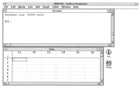
Figure 4.3 MINITAB initial screen.
the results of any MINITAB commands which you execute on your data. This could be a simple operation such as loading data from, or saving to, a floppy disk. Alternatively, this could be the result of a statistical operation. The Data window is where you enter your data. This consists of a set of columns labelled C1- C100 across the top and a set ofrows labelled 1-n (where n is the number of possible data entries) on the left-hand side. If you are familiar with the use of spreadsheets, you will note that the data window is a simple spreadsheet. Each variable can be entered in a separate column (e.g., C1), with each row corresponding to an individual record.
The simplest method to input data into MINITAB is to enter a number into the appropriate row/column in the Data window. However, this can be time consuming, particularly if you have a large data set with many variables and/or records. In this case, it is more efficient if you can obtain your data already in a digital form. This could be either a simple ASCII text file as discussed above in Section 4.2.2, or data in some other proprietary file format. MINITAB will allow the import of data files saved by a variety of other computer packages. For example, in version 10.1 import filters include Microsoft Excel, Quattro Pro, Lotus 1-2-3 and dBase. As an example, we will assume that our data are in two columns in a space-delimited ASCII text file with the name 'INTERNET.DAT' stored on the C:\ drive. You can use either the pull down menu (under File) or the READ command at the command line:

It will be useful to explain some of the elements of the shorthand written under the pull-down menu
section, as these will be used below and in subsequent sections of the book. We use the symbol  to indicate either a selection from a menu or a button, which needs to be clicked on with the mouse cursor. Where this is followed by a name and two square brackets, i.e.,
  Variable Names [ ], this means that you should click on a box/section with the name 'Variable Names'. Other information to be entered not in the form of menus, boxes and buttons is requested explicitly (e.g., 'Click on none' or 'Type in C4') at the appropriate place in the sequence of instructions. For example, in the above list you are required to click on the box called 'Variable Names', and then select the 'none' option to indicate that you have not included the names of your variables in your data file. You should always end commands entered on the command line with a full stop '.' or a semi-colon ';'. A full stop signifies the end of a command, whereas a semi-colon indicates an optional sub-command. If you end with a semi-colon MINITAB will issue a new prompt SUBC > at which you should enter a command, and then end with a full stop.
The above example loads two columns of data from a text file INTERNET.DAT (see Table 4.2) which are then entered into two corresponding columns in the MINITAB Data window. You will see that the columns are referred to in MINITAB simply as Cl and C2. Although you can maintain this simple naming strategy, it is probably more efficient to give each column the name of the variable, particularly where the variables are more numerous than in this example. In this case we can enter the following commands:
| Using pull-down menus: | Using command line: |
|---|---|
| Select box in Data window immediately below ‘C1’. | MTB > NAME C1 ‘1992’. MTB > NAME C2 |
| Type ‘1992’. Repeat for ‘C2’ | ‘1995’. |
Once your data are entered into the Data window, you can navigate around them in a number of ways. The slider bar at the extreme right of the window can be moved up and down to move either forwards or backwards through the data. Alternatively, you can use the Page Up and Page Down keys on your keyboard. Pressing the Ctrl and End keys together will send you to the bottom of the Data window, and pressing the Ctrl and Home keys will send you to the top. You can also use the arrow keys to move around the worksheet in a cell-by-cell manner.
You may also want to print out your data and then save it to a floppy disk. You can print out your data either from the Data window or as a text file from MINITAB. The former is the simpler, and requires you to first select the Data window with the mouse Then pressing Ctrl P will bring up the MINITAB Print window, to which you should select the defaults and click on the OK button. For saving data, there are again a variety of options which range from simple ASCII text files to files in a MINITAB worksheet format. In this case we will save the data as a standard MINITAB worksheet, although MINITAB will allow you to save data in a portable format to transfer to other versions of MINITAB on different types of computers. To save the data we have used above, you should use either the menu command Save Worksheet As (found under File on the command bar) or the appropriate SAVE command at the command line:

Once you have entered your data, it is a good idea to perform some basic checks to ensure that you have both the number of cases and the number of variables you expected. The command INFO can be typed in at the prompt, or alternatively you can select the command Get Worksheet Info (found under File) on the command bar.

This will produce a list of the variables in your data set, with the name of each variable, the number of cases and the number of missing values (if any). For example, for the data set from Table 4.2 we would obtain the following output:
| MTB > INFO. | ||
|---|---|---|
| Column | Name | Count |
| C1 | 1992 | 14 |
| C2 | 1995 | 14 |
This confirms the correct name and count for each variable. MINITAB denotes each missing value with an '*' symbol. If the data value for USA in 1995 was missing, we would insert an '*' in the appropriate cell for C2, and the results of the INFO command would be as follows:
| MTB > INFO. | |||
|---|---|---|---|
| Column | Name | Count | Missing |
| C1 | 1992 | 14 | 0 |
| C2 | 1995 | 14 | 1 |
Note that we now have one missing value. If you were not expecting any missing data values and have some listed, or you know you have missing data but none have been listed, then you will need to check and edit your data in the Data window.
Each column of data can be managed within the MINITAB environment. For example, the COPY com mand will copy a column of data and put the replica in a new column.

If you now return to the Data window you will see that the data in Cl are now replicated in C4. Alternat ively, you can remove unwanted columns. For example, to remove C4:

In some of the statistical calculations considered below and in Chapter 5, you may find it useful to stack (add) two columns of data into one column. You can do this as follows:
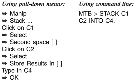
If you go to the Data window you will see that the data in Cl and C2 are now in the same column (C4). You can also manipulate the data using mathematical formulae. For example, if we wanted to sum the number of networks in one year (e.g., 1995) (say, as a preliminary step to calculating the mean number of networks), then we might do the following:

We can also manipulate whole columns. For example, if you want to add 10 to each network estimate in 1992, and store the results in C3, you can use the Let command:

A useful feature of MINITAB is that you can save all your work automatically to a text file which you can then load into a word processor to edit and print out. To do this, you create an outfile with the name 'INTERNET.LIS', and save to the floppy disk (A:\):

Everything you do in the MINITAB session is recorded to this file. Once you decide that you want to stop the recording session then:

We have only scratched the surface of some of the general data manipulation features available in MIN ITAB. For further details you should refer to one of the various texts available for general use (e.g., Ryan and Joiner, 1985) or more directly in the context of social science data (e.g., Cramer, 1997). We will return to some of the statistical features of MINITAB in the section below and in Chapter 5.
Once you have your data coded, performed preliminary checks, and if appropriate entered the data into a computer, it is useful to begin exploring your data through the process of Initial Data Analysis (IDA) (Chatfield, 1995). Throughout the section below, we will describe the mechanics of some of the main methods of IDA using worked examples by hand, and also using the MINITAB statistical package. We adopt a standardised format:

The 'Explanation and procedure' section will describe the statistic, and then explain the procedure of calculation referring to a number of steps (e.g., Step 1) which are described in the 'Handworked example' box. Although for the purposes of your research you are more likely to use the 'MINITAB example' (or equivalent in a different computer package), we advise that you read through the ' Handworked example' to familiarise yourself with the mechanics of each statistic.
We will concern ourselves here only with IDA statistics for one variable. Although we have deliberately adopted a 'cook book' approach, we would like to stress that there is no substitute for a thorough
Box 4. 7 Statistics for one variable
understanding of the method, including some appreciation of any limitations of use. In particular, it is important to consider whether a certain method is appropriate in the context of your research. The treatment within this chapter is designed to give you a basic overview. The book by Erickson and Nosanchuk (1992) provides further detail on some of the exploratory methods considered below. For additional details, you are referred to the textbooks listed in the further reading section at the end of this chapter.
There are two main characteristics of a set of data which we can describe: a summary measure of location (central tendency), and a measure of variability (spread) of the data values. Box 4.7 summarises the statistics described in this section.
Level of data: Interval or ratio.
Function of methods: Measures of central tendency in a data set.
What the methods do: The mean, mode and median all calculate the 'centre' of the data set, but use different strategies to achieve such an end.
Explanation and procedure: The mean, mode and median are measures of the central tendency of a distribution. There are a variety of means, which include the arithmetic mean, the geometric mean and the harmonic mean. We will concern ourselves only with the arithmetic mean. This is the average of the values in a data set. The median is the number exactly in the middle of the data set, i.e., there are an equal number of values before and after it in an ordered sequence. The mode is the data value which occurs most frequently in the data set, or alternatively the category, or class in a histogram, with the greatest frequency of observations. Where the distribution of values in a data set is symmetric (e.g., a normal distribution: see Section 3.4), the mean, median and mode will coincide. However, where the distributions are not symmetric (skewed) they will differ. The mean is often calculated for use in statistical tests, though it is not resistant to extreme data values (outliers) which can influence its value greatly. Some statistical packages allow the calculation of a trimmed mean, which excludes the largest and smallest values from the calculation. In contrast to the mean, the median is resistant to extreme data values and will give a 'truer' measurement of central tendency in data containing outliers. The mode merely reports the most popular data value. If possible, calculation of the 95% confidence interval around the mean (see Section 3.4.2) is a useful accompanying statistic, although we will not attempt this here. You should refer to Gardner and Altman (1989) for details.
To calculate an arithmetic mean, place all the data in a table (Step 1) and then add all your data values together (Σx1, . . ., xn) to obtain the overall sum (Σxi) (Step 2). Next, divide the overall sum by the number of data values n (Step 3):

The procedure for calculating the median will de pend on whether the number of observations is even or odd. First, rank your data in sequence from the largest to the smallest value (Step 4). Where n is an odd number, the median is the single data value in the middle of the data set. Where n is an even number, take the sum of the two data values in the middle of the data set and divide by two to obtain the midpoint between them. This value is taken as the median (Step 5). To calculate the mode determine which value appears most often in your data set (Step 6). We will make use of data on sheep numbers in County Down to illustrate the calculations (Table 4.3) which are set out in Boxes 4.8 and 4.9.
Level of data: Interval or ratio.
Function of method: Frequency description.
What the method does: A histogram communicates information on the frequency of occurrence of values within a data set. These are displayed in a block dia gram consisting of a number of equal sized groups.

Box 4.8 Handworked example: mean, mode and median
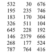


Box 4.9 MINITAB example: mean, mode and median
Place the numbers of sheep in a single column (C1).
There are two methods of calculating descriptive statistics in MINITAB. (1) The command 'describe' can be used to obtain a summary of simple descriptive statistics which include the mean, median, trimmed mean (which excludes the largest 5% and smallest 5%) and standard deviation, which we consider below. (2) Individual commands can be used.
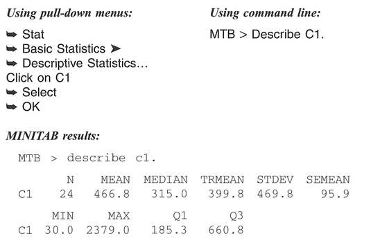


Explanation and procedure: The construction of a histogram provides us with a graphical representation of the frequency distribution of our data. It does this by simply displaying the data, grouped into equal sized classes. There are other graphical methods available to view the frequency distribution which are closely related to the histogram; these include the dotplot (not described here), the stem-and-leaf plot and box-and-whisker plot which we describe below. The mechanics of constructing a histogram are quite simple and straightforward. The only areas of difficulty involve the selection of the number of classes and the selection of the class intervals themselves.
First assemble your data values into a table, making a note of the maximum and minimum values (Step 1). Next, decide on the number of equal inter val classes in your histogram. There are a variety of ways to select the number of classes. For example, you can select this number subjectively or by using a simple calculation such as 5(log10 n), where n = the
number of data values (Step 2). The 5(log10 n) calculation is meant only as a guide, to avoid the selection of either too large or too small a number of classes. The classes chosen must be exhaustive (i .e., include the full range of values in the data set) and mutually exclusive (values cannot belong to more than one class). We find that the latter point can often be missed by students, who might select limits for the example in Boxes 4.10 and 4.11 as 0-30, 30-60, 60-90, etc. In which class do we place a value of 30? We have a choice of two - the classes used in this case are not mutually exclusive, as this class choice would be incorrect. A correct set of class intervals is shown below (Step 3). Next, record the class in which each observation falls, and sum for each class to obtain the class frequency (Step 4). Construct the histogram, plotting class frequency on the vertical axis, and class magnitude on the horizontal axis (Step 5).
It is important to be aware that changing the number of classes, and the class intervals used, can have an important influence on the way the histogram appears. We can influence the message that a histogram communicates, by the way in which it is drawn. The book by Tufte (1983) is worth referring to as a summary of the ways that the drawing of a graph can emphasise, confuse or completely change the message from a data set. We will make use of data on the number of milch cows in Ireland to illustrate the calculations (Table 4.4).
Level of data: Interval or ratio
Function of method: Frequency description.
What the method does: A stem-and-leaf plot, similar to a histogram, communicates information on the frequency of occurrence of values within a data set. Unlike a histogram, the plot uses all the data values to create the display.
Explanation and procedure: A stem-and-leaf plot is a visual representation of tally counts, and is constructed on the basis of determining a base - termed a stem value - and tallying other values called leaves in relation to this. In many ways, the stem-and-leaf works similarly to the categorisation process for a histogram, but uses the data structure to determine the. stem values (equivalent to the bar in a histogram). This negates the problem of determining category classes required for histogram construction. The easiest way to understand the use of a stem-and-leaf plot is to examine its construction. First, assemble your data values into a table, making a note of the ~aximum and minimum values (Step 1). Next, divide up each data value into a stem and leaf, where a st.em m~g?t be in tens of units, and a leaf might be m mdividual units. If there are extreme values (outliers) in the data set, consider transforming the data (see Section 4.7) (Step 2) and trimming any very large or very small values (Step 3). Make a clear note of the units used for both stem and leaf (Step 4) and draw the stem and leaf as follows (with the corresponding numbers included here for comparison) (Step 5):
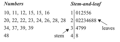
To illustrate the construction of a stem-and-leaf plot, we will make use of a data set on the population of Prince Edward Island settlements (Table 4.5). The calculations are set out in Boxes 4.12 and 4.13 (pp. 90-92).
Box 4.10 Handworked example: histogram


Figure 4.4 Histogram of milch cows in Ireland.
Box 4.11 MINITAB example: histogram
Place the numbers of cows in a single column (C1).
You can construct a histogram in MINITAB in two ways. The first (1) displays the histogram in graphical form, and the second (2) presents the findings in character form in the Session window. When using the graphical form, you must be careful to select the classes you require yourself, as MINITAB's default settings often class the data into too few classes to be meaningful.
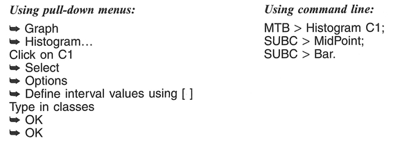
MINITAB results (Figure 4.5):
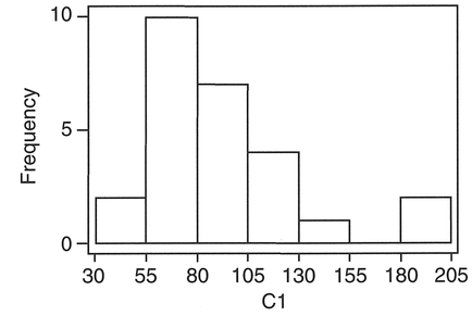
Figure 4.5 MINITAB output for milch cows in Ireland


Box 4.12 Handworked example: stem-and-leaf plot


Box 4.13 MINITAB example: stem-and-leaf plot
Place the population values into a single column (C1).
MINITAB provides an additional column of summary data to accompany the stem-and-leaf plot. This is the first column displayed, which provides a summary of the distribution around the median, and is known as the depth (McCloskey et al., 1997). Where the number is contained in brackets, e.g., (41) or (11), this is the group which contains the median value. The numbers above and below detail the number of entries above or below that value. For example, in the second plot below, (12) identifies the class containing the median, the '16' indicates 16 values at this level and above, and the '6' indicates 6 values at this level and above.

MINITAB results:
If we adopt the MINITAB defaults, the stem is defined in units of 10,000 which will give us four stems 0, 1, 2, 3 - and leaf units of 1000, i.e.:
MTB > Stem-and-Leaf C1.
Character Stem-and-Leaf Display

This is unsatisfactory, given that the stem-and-leaf plot of C1 has an extreme positive skew (41 in one category). If we reduce the size of the stem unit by specifying an increment (100), and trim the extreme values, we obtain a more satisfactory plot:
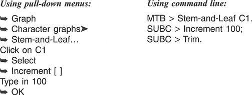
MINITAB results:
Character Stem-and-Leaf Display


The 'HI' values are those that have been trimmed from the plot.
Level of data: Interval or ratio.
Function of method: Determine data spread.
What the method does: The range, variance and standard deviation examine the variability of data, which for variance and standard deviation is expressed as a spread around the mean.
Explanation and procedure: The range is a simple measure of variability, calculated by subtracting the smallest value from the largest value. Although simple to calculate, the range tells us about only two values which may be atypical of the rest of the data set. The variance and standard deviation in a data set are both measures of dispersion of all the data around the mean. The base of both statistics is the mean deviation defined as:

where x̄ is the mean, and |xi-x̄| refers to the absolute value of xi-x̄. The variance is defined as the sum of the squared deviations (xi-x̄)2 divided by the number of data values, i.e.:

Variance as calculated in this equation is usually represented by the symbol σ2. This is used with a large number of data values usually representing a population. However, when the variance is calculated for a small number of values, as we would have in a sample, the denominator of the above equation is modified to n - 1, and the variance is represented by s2. Unfortunately, reporting the variance of a data set leaves the units squared. Taking the square root of the variance removes this problem, and produces what is known as the standard deviation, represented by σ or s depending on whether our data is a sample or not:

The variance/standard deviation are both measures of the average distance the data values are from the mean. The larger the value of σ2 or σ(or s2 or s), the more spread out is the set of data values. The stand ard deviation is often reported with a ± symbol, e.g., ±3.2. This signifies that the spread is the same on either side (±) of the mean. We can often visualise the spread in a data set by constructing a histogram or a stem-and-leaf plot in addition to calculating the variance or standard deviation.
Since the range is easy to calculate, and the standard deviation is only the square root of the variance, we will illustrate all three together. To obtain the range, we subtract the smallest value from the largest (Step 1). To obtain the standard deviation and variance, we will make use of a slightly different computational form of the equation used above:
Box 4.14 Handworked example: range, variance and standard deviation


 of each observation, and sum the squares together to obtain

The variance s2 is 1366.90, and the standard deviation s is 36.97.


This equation is used to avoid rounding error arising from repeated mean subtractions. First, obtain the sum of the observations Σxi and then the mean x̄ by dividing by the number of observations n (Step 2). Next, calculate the square of each observation,  and sum the squares together to give
  (Step 3). Square the sum of the observations Σxi to obtain (Σxi)2 (Step 4). Substitute into the above equation (Step 5) to obtain the variance and then take the square root to obtain the standard deviation.
We will again make use of the data on numbers of milch cows in Ireland (Table 4.4) to illustrate the calculation of the range, variance and standard deviation (see Boxes 4.14 and 4.15) .
Level of data: Interval or ratio.
Function of method: Visualisation of variance around the median.
What the method does: A box-and-whisker plot provides a summary plot of the variance of the data. In contrast to the standard deviation, it does this by using the median and the data quartiles (a quartile is the median of the data either below or above the median of the whole data set) and plotting them.
Box 4.15 MINITAB example: range, variance and standard deviation
Place the numbers of cows in a single column (C1).

Variance
MINITAB does not perform a direct calculation of the variance similar to the above. There are various methods which can be used; the simplest is obtained by taking the square of the standard deviation calculated above. You can get MINITAB to do this as follows:

MINITAB results:
Range
MTB > Range C1.
RANGE = 151.00
Standard Deviation
MTB > StDev C1.
ST.DEV. = 36.972
MINITAB will place the calculation for the variance of C1 in the first cell in C3.
Explanation and procedure: A box-and-whisker plot examines the variance in the data through the median and quartile values. It therefore examines the variance in a data set accounting for data values that deviate strongly from the rest of the data. These out- lier values would have a significant effect upon both the mean and standard deviation. Moreover, the plot allows us to determine the amount of variance either side of the median, whereas a standard deviation returns one value representing variance on both sides
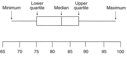
Figure 4.6 Box-and-whisker plot.
of the mean. In this manner we can determine the skewness of a data set. It is therefore a useful summary statistic, especially when we have a data set with extreme values. The construction of a box-and-whisker plot is based on five numbers: the median, the upper and lower quartiles, and the maximum and minimum (Figure 4.6).
A disadvantage of the box-and-whisker plot is that it is based only upon these five numbers, unlike the histogram or stem and leaf which are based on all the values in a data set.
To construct a box-and-whisker plot first rank all your data (Step 1). Next, determine the median (as described above) (Step 2). Now calculate the quar- tile values. The upper quartile (also known as the upper hinge) is obtained from the value which is midway between the median and the highest value, and the lower quartile (lower hinge) is obtained from the value which is midway between the median and the lowest value. Similar to the calculation of the median, this may not coincide with an actual data value, but may be in between two values (Step 3). Using these values, we can define the interquartile range (also known as the midspread) as the difference between the upper and lower quartiles. This is often used to identify the farthest points of the whiskers in the plot, and any extreme values (termed outliers) beyond these points (Hartwig and Dearing, 1979). Then, multiplication of the midspread by 1.5 produces a quantity known as the step (Erickson and Nosanchuk, 1992) (Step 4). Observations larger than the upper quartile plus the step, or smaller than the lower quartile minus the step, are identified as outliers. The largest and smallest values in the data set which are not beyond these limits are the end-points for the whiskers in the plot (Step 5). The final stage is to draw the box plot. Each end of the box is marked by the upper and lower quartiles, with the median drawn as a line across the box. The whiskers extend to the smallest and largest values identified in Step 5, with any outliers identified by a symbol. This is often a dot, or as in the MINITAB software, an 'O' instead. Different data sets can be compared by con structing a series of adjacent box-and-whisker plots, and this often provides a useful comparison prior to a statistical test to test for differences between data sets such as the analysis of variance or t-test, which we will encounter in Chapter 5. As an example we will plot the sheep from Table 4.3: see Boxes 4.16 and 4.17.
Probability is concerned with the likelihood or chance of occurrence of a certain event. An event can be defined as an outcome of sampling a set of data. Events may be very simple, such as tossing a coin with two possible outcomes (heads or tails), or more complex, such as a sample of questionnaire respondents with certain characteristics defined in terms of a variety of variables. In both cases, by using simple concepts of probability, we can estimate the chances of these events occurring. Probability forms the basis of inferential statistics and hypothesis testing which we will consider in detail in Chapter 5. We will outline only the basics of probability here: the reader is directed to Callender and Jackson (1995) for further details. There are a variety of definitions of probability in use in geographical contexts, but all make the distinction between objective (or a priori) probabilities, which are based on the true probabilities in the state of complete information, and subjective (or a posteriori) probabilities derived from experimental or empirical study in a state of limited/incomplete information. It is the latter which is of most use in geographical research, since we usually have access only to a sample of limited size, and simply do not know the characteristics/size of the population we wish to study. However, the various probability laws are best described using simple objective probabilities.
Before we talk about probabilities and events, it will be useful to outline some very simple elements of set theory. As an example, we have a class of eight geography students who are divided into groups depending on their gender, and whether they are more interested in physical or human geography. If we consider group A to contain all female students of whom there are four, we can define this as set A:
Box 4.16 Handworked example: box-and-whisker plot


Figure 4.7 Box-and-whisker plot for sheep in Ireland
Box 4.17 MINITAB example: box-and-whisker plot
Place the numbers of sheep in a single column (C1). In this instance, we are plotting the box-and-whisker plot across the page (Transpose). Omission of this command will orient the plot from top to bottom of the page. Several variables may be selected and plotted side by side to compare distributions between groups (e.g., prior to an ANOVA or Kruskal- Wallis test for differences).

MINITAB results (Figure 4.8):
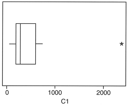
Figure 4.8 MINITAB output for sheep in Ireland.


We can also define another set B to contain all those students (male or female) who are more interested in human geography:

Two important operations we can perform on these sets is to add them together or take the product (multiply). For the former, termed a union operation, which we represent by the symbol 

which consists of students in set A OR in set B, i.e., female or more interested in human geography (or both). If we take the product of set A and set B, termed an intersection and represented by the symbol  we obtain those students who are in both set A AND set B:

i.e., just those female students who are more interested in human geography. In the examples above, there are elements of set A and set B which are not mutually exclusive. The concept of mutual exclusivity is an important one for probability as we will see later. If we add a set C of the form:


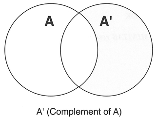
Figure 4.9 Venn-Euler diagrams of geography students.
then sets A and C would not contain any common elements. In set theory, sets A and C would be termed disjoint. We can visualise the exact elements these include in terms of shading the appropriate parts of Venn-Euler diagrams (Figure 4.9).
We can also think of events in terms of sets. If we have a group of ten students in a class, with six males and four females, and we are intending to sample students on the basis of gender, we will create two subsets, and therefore two possible events/outcomes:

In this case the events would form disjoint subsets; they are mutually exclusive: i.e., if E1 occurs then E2 cannot occur. However, if we included a third outcome, such as 'tall', with three tall male students and two tall female students out of the group of ten:

then this would create events which are not mutually exclusive, since clearly E1 and E3 can occur together, as can E2 and E3. The two most common logical combinations of these events are OR, i.e., the probability of E1 OR E2  occurring, and AND, i.e., the probability of E1 AND E3
  occurring. The visualisation of such sets in probability space is similar to the shaded areas of the diagrams in Figure 4.9.
If we take a random sample of one student from the group of ten discussed above, we can calculate the probability p(E1) as the fraction of males in the total group, i.e., 6/10 = 0.6. In other words, we are basing our probability estimate on the relative frequency with which males occur in our group. For females, p(E2) = 4/10 = 0.4. In this case, both E1 and E2 are mutually exclusive and exhaustive; the complement of E1, denoted by  refers to the alternative of event E1, and here

In fact, we can say that

and
| Addition law for mutually exclusive events: | p(E1 ∪ E2) = p(E1) + p(E2) |
| Addition law for non-mutually exclusive events: | p(E1 ∪ E3) = p(E1) + p(E2) - p(E1 ∩ E3) |
| Multiplication rule for independent events: | p(E1 ∩ E3) = p(E1) × p(E3) |
| Multiplication rule for non-independent events: | p(E1 ∩ E3) = p(E1) × p(E3 | E1) |

This introduces the first probability law: the addition law for mutually exclusive events (Box 4.18).
If we consider the probability of the student in our sample being male or tall, i.e.,  then since p(E3) = 5/10 = 0.5:

Probabilities cannot exceed 1, so we cannot apply the simple addition formula in this case. This has to be adjusted for those people who are both tall and male. These events are not mutually exclusive, since clearly a student could be both, and would be counted twice in the simple addition formula. We have to subtract those who are both tall and male. In fact, the adjusted formula becomes the addition law for non-mutually exclusive events:

We have introduced the multiplication rule for inde pendent events into this formula:

This is saying that p(E1 AND E3) = p(E1) x p(E3). Therefore, since being tall and being male are independent of each other:

which we can check since there are a total of three tall male students out of a total of ten, i.e., a probability of 3/10 = 0.3. If our two events were not independent, we would say that the probability of the second event was conditional upon the first, and the multiplication rule for non-independent events would be used instead.
So far, the calculation of the relative frequencies and probabilities of events has been relatively straightforward since we have been selecting a sample of only a single individual. Since any of our ten students could be selected, we have a total of ten choices. We can calculate the total number of choices using factorials. For example, selecting a single student from a group of ten:

where 10! = 10 X 9 X 8 X 7 X 6 X 5 X 4 X 3 X 2 X 1. Similarly, the total number of males which can be sampled is:

The probability of selecting one male from this group, i.e., p(one male) = 6/10 = 0.6. This is quite simple. However, if we were to select two students from this group, there are many more choices available. For any two students out of ten we would have 45 combinations:

So, if we wanted to calculate the probability of selecting some combination of one male and one female out of our group of students, we first calculate the choices of one male:

and similarly with one female:

Therefore, p(one male and one female) = 6 x 4/45 = 24/45 = 8/15. We can visualise the possible out comes of choosing two students in terms of a probability tree: (Callender and Jackson, 1995)
In this case, we can estimate the probability of any given path, by applying the multiplication law of probability, multiplying the probability of the individual branches. If more than one path leads to the same result, the probabilities of each of the paths are added. In the above example, we find that the second and third paths lead to the result of select ing one male and one female. Therefore, for the second path:

and similarly for the third path:

Therefore, p(one male and one female) is:

which is the same as the result using factorials above. Note that the probabilities in the probability tree above sum to 1. Calculating probabilities in this fashion for each combination allows us to plot the probability for each outcome (Figure 4.10).
The above is a very simplified example of a discrete probability distribution with very few outcomes. Probability distributions are based on the concept of a random variable (RV), which takes OJl numerical values according to the outcome of an experiment (Chatfield, 1995) and which may be discrete or continuous. There are a variety of probability distributions, of which the most common and useful in a geographic context are listed in Table 4.6. Discrete distributions are defined from a point probability
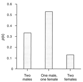
Figure 4.10 Probability distribution of male/female student selection.
function represented by p(x = X), whereas continuous distributions are defined from a probability dens- ity function (pdf) represented by f(x). The positive binomial distribution (often referred to simply as the binomial distribution) is a discrete distribution used for events which have two outcomes: heads or tails, yes or no, male or female.
The formula for the binomial distribution looks intimidating, but contains some familiar components. The first term is similar to the above factorial-based combinations formula to determine the possible combinations in the data set. Parameter n is the number ofthe outcome in which we are interested (e.g., heads in a coin toss), x is the total number of trials (e.g., the number of times an individual is sampled, or a coin is tossed), and p is the probability associated with the outcome we are interested in. For example, if we toss a coin eight times, we can calculate the probability of obtaining three heads:

If we calculate the probabilities for all other combinations of heads (i.e., 0, 1, 2, 4, 5, 6, 7, 8) we can graph the results to produce a histogram of the discrete probability distribution (Figure 4.11).

Table 4.6 Common probability distributions
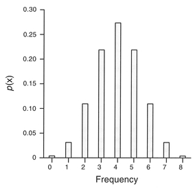
Figure 4.11 Binomial distribution of coin toss.
Note that the probabilities sum to 1, and are discrete. For p = 0.5, the binomial probability distribu tion, as in Figure 4.11, is symmetrical, but where p ≠ 0.5 the distribution becomes skewed.
The Poisson distribution is also a discrete distribution, and occurs when events occur independently, but with a constant average frequency. The classic example of a Poisson distribution is the numbers of soldiers in the Prussian army kicked to death by a horse over a 20-year period! In this case, we might expect each incidence of a horse-kick death to be rare and to occur independently. For 10 army corps over a 20-year period, 122 deaths were observed, with a population mean (μ) of 0.61. The data are presented in Table 4.7 and come from Ehrenberg (1975).
To fit the Poisson distribution to the observed data in Table 4.7, we substitute into the formula for the Poisson distribution above for each observation. For example:

We have a period over which 200 observations are possible (10 corps x 20 years), therefore to obtain the number of horse-kick deaths predicted by the Poisson distribution, we multiply 200 x 0.54335 = 109 (rounding up). We can graph the results to produce a histogram of the probability distribution in Figure 4.12(a). Note that the shape of the Poisson distribution will change depending on the magnitude of the mean. For example, if we change the mean in the above example from 0.61 to 1.61, the shape of the distribution changes to that in Figure 4.12(b).
The last probability distribution we shall consider is the normal (or Gaussian) distribution. This is an example of a continuous distribution. The probability distribution of a continuous random variable is in the form of a normal distribution, and is referred to
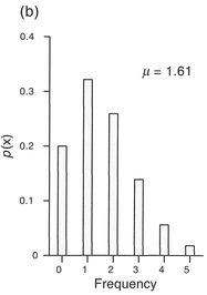
Figure 4.12 Poisson distributions of horse-kick deaths (μ = mean).
as a probability density function (pdf). The normal distribution is the most important and useful continuous distribution, particularly since the distribution of many continuous variables is similar to this form. Where data are sampled from a non-normal distribution, the central limit theorem states that the sampling distribution of the mean (see Section 3.3) becomes more like the normal distribution as the size of the sample increases (Pett, 1997: 14). The normal distribution pdf always has the same symmetrical bell-shaped form, which depends only on the value mean (μ) and standard deviation (σ). Example normal distribution pdfs are displayed in Figure 4.13.
For a given normal distribution pdf, we can calculate the probability that a value occurs within certain limits by calculating the area under the curve between the limits (Figure 4.14).
In fact, because of its symmetrical shape, the mean, mode and median are identical, and we can say that:
The calculation of areas and associated probabilities from a normal distribution pdf can be achieved by the use of a computer. An alternative is to make use of standard normal probability tables, which list the areas for different intervals under a certain type of normal distribution pdf termed a standard normal distribution, which has a mean of zero and a standard deviation of one. We can transform a normal distribution to a standard normal distribution by calculat ing the units of standard deviation, termed Z-scores (Table A.7):

Where the Z-score = 1, this is equivalent to one standard deviation. For example, as part of a medical geography study we may be interested in the pollutants emitted from a hospital incinerator located in a city. In this case, we are interested in the quantity of polychlorinated biphenyls (PCBs). If the average daily emission rate is 1.5 ppm (parts per million) with a standard deviation of 0.75 ppm, we can determine (Figure 4.15) the number of days per year on which emissiOns are:
Case 1 In this case, we do not need to estimate the Z-score, since we know that the total area under the normal distribution pdf must correspond to a prob ability of 1. The probability of the emission being above average is equivalent to the shaded portion of
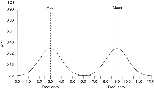
Figure 4.13 Normal distribution pdfs for different standard deviations and means: (a) same means, different standard deviations; (b) same standard deviations, different means.
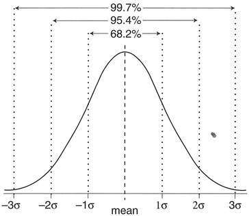
Figure 4.14 Normal distribution pdf and spread of observations around the mean.

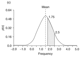
Figure 4.15 Area under the normal distribution.
Figure 4.15(a): this covers 50% of the normal distribution pdf, and therefore the probability is 0.5. The number of days per year would therefore be 182.5 (or 183 if we round up). In fact the Z-score in this case equals 0, which if we look at a table of cumulative probabilities for the normal distribution (Appendix A, Table A.7) gives a probability of 0.5.
Case 2 The probability of a daily emission being less than 2.25 ppm is given by the area shaded in Figure 4.1 5(b). If we calculate the Z-score we obtain:

From the table of cumulative probabilities, the probability associated with a Z-score of one is 0.8413. Therefore, for 84.13% of days per year (307 days) PCB emissions will be less than 2.25 ppm. In fact, again we don't really need to calculate the Z-score or look up the probability, since we know that 68.26% of observations lie within ±1 standard deviation from the mean. Hence, the shaded area in Figure 4.15(b) is 0.5 X (1 - 0.6826) + 0.6826 = 0.8413.
Case 3 Lastly, the probability of daily em1sswn being between 1.75 and 2.5 ppm is given by the area shaded in Figure 4.15(c). In this case we need to calculate two Z-scores:

The cumulative probability associated with a Z-score of 1.33 is 0.9082, and for 0.33 is 0.6293. The probability we require is therefore 0.9082 - 0. 6293 = 0.2789. Therefore, emissions will be between 1.75 and 2.5 ppm for 27.89% of days per year, or 101.7 days (102 days, rounding up).
Often, the tests which we will detail in Chapter 5 require the data to be normally distributed. If your data are not normally distributed, for example positively or negatively skewed, you can use a process of data transformation to convert your data into a form suitable for other types of analysis. You may also want to transform your data so that attention can be focused on features of particular interest, or to convert the data units into more relevant units (e.g., transforming data collected in miles to kilometres). As a rule you can transform data only within and down the measurement scale (see Section 3.2). For example, ratio data can be transformed to other ratio data and to interval, ordinal or nominal data, but ordinal data can be transformed only into other ordinal classes or nominal data. Nominal data can be transformed only by merging classes together to form other nominal classes.
Ratio and interval data can be transformed using a large number of methods - Robson (1994) reports on 35. We will concern ourselves with five.
Transforming the data towards that of a normal distribution. This can often be achieved by a non-linear transform such as the square root, logarithm or inverse (1 /x). Figure 4.16(a) displays data for the percentage of the population aged 0-4 years (Column C3 in Table 5.6). The data are positively skewed. As Figure 4.16(b) and (c) demonstrate, transforming the data by calculating the square root or log has the effect of removing the skew from the data to produce a more normal distribution.
A variable that is negatively skewed might be transformed towards a normal distribution with a square or antilog, and a distribution that is flat (platykurtic) can be made more normal with a 1/x transformation (Pett, 1997).
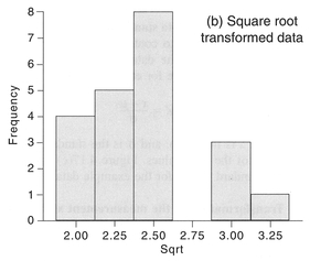
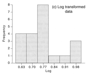
Figure 4.16 Transforming data using the square root or natural log.

Transforming data is not without its problems and you should be cautious in its use. For example, we could alter the data within Figure 4.4 by reassigning the values into classes of different sizes or by increasing or decreasing the number of classes. Not surprisingly, changing the classes data are assigned to, or using a non-linear transformation, can lead to an alternative conclusion once the data are analysed. Any interpretation must be of the transformed variable, which may not be straightforward. You should therefore transform data only with good reason and choose your method of transformation carefully. Under no circumstances should you 'massage' the data to give biased or untruthful messages. The prime safeguard

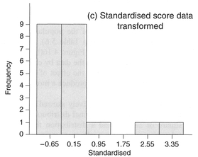
Figure 4.17 Transforming data range, standardisation and measurement scale.
against this is your honesty and integrity, although inadequate explanation as to why data were trans formed will draw suspicion from readers of the final report (see Chapter 10).
After reading this chapter you should:
In this chapter we have introduced the first steps in analysing quantitative data: preparation, exploration and description. Each is a vital component of quantitative analysis and should receive careful attention. Poor data preparation through hurried coding, rushed data entry or inadequate checking will produce data that contain errors and mistakes. Any further analysis of these data will retain these flaws and may well lead to invalid conclusions. Exploration and description of the data, whether statistical or graphical, provides some valuable background information that can be used to assess the viability of more sophisticated forms of analysis described in the next chapter. Again, failure to explore the data fully at this stage may lead to invalid analysis later. Whilst the discussion within this chapter has centred upon describing single variables, in the next chapter we turn to examining the associations and relationships between variables.
Bourque, L.B. and Clark, VA. (1992) Processing Data: The Survey Example. Sage University Papers Series on Quantitative Applications in the Social Sciences 07-085. Sage, Newbury Park, CA.
Callender, J.T. and Jackson, R. (1995) Exploring Probability and Statistics with Spreadsheets. Prentice Hall, London.
Cooke, D., Craven, A.H. and Clarke, G.M. (1992) Basic Statistical Computing. Edward Arnold, London.
Cramer, D. ( 1997) Basic Statistics for Social Research: Step by Step Calculations and Computer Techniques using MINITAB. Routledge, London.
Erickson, B.H. and Nosanchuk, T.A. (1992) Understanding Data. University ofToronto Press, Toronto.
Hartwig, F. and Dearing, B.E. (1979) Exploratory Data Analysis. Sage University Papers Series on Quantitative Applications in the Social Sciences 07-016. Sage, Newbury Park, CA.
Press, W.H., Flannery, B.P., Teukolsky, S.A. and Vetterling, W.T. (1989) Numerical Recipes - The Art of Scientific Computing. Cambridge University Press, Cambridge.
Ryan, B.F. and Joiner, B.L. (1994) MINITAB Hand book. Duxbury Press, Belmont, CA.