The web’s explosion into mass popularity was due in part to the fact that there were images on the page. Before images, the internet was a text-only tundra.
Images appear on web pages in two ways: embedded in the inline content or as background images. If the image is part of the editorial content, such as product shots, gallery images, ads, illustrations, and so on, then it should be placed in the flow of the HTML document. If the image is purely decorative, such as a stunning image in the background of the header or a patterned border around an element, then it should be added through Cascading Style Sheets. Not only does it make sense to put images that affect presentation in a style sheet, but it makes the document cleaner and more accessible and makes the design much easier to update later. I will talk about CSS background images at length in Chapter 13, Colors and Backgrounds.
This chapter focuses on embedding image content into the flow of the document, and it is divided into three parts. First, we’ll look at the tried-and-true img element for adding basic images to a page the way we’ve been doing it since 1992. It has worked just fine for over 25 years, and as a beginner, you’ll find it meets most of your needs as well.
The second part of this chapter introduces some of the methods available for embedding SVG images (Scalable Vector Graphics) in HTML documents. SVGs are a special case and demand special attention.
Finally, we’ll look at the way image markup has had to adapt to the wide variety of mobile devices with an introduction to new responsive image elements (picture and source) and attributes (srcset and sizes). As the number of types of devices used to view the web began to skyrocket, we realized that a single image may not meet the needs of all viewing environments, from palm-sized screens on slow cellular networks to high-density cinema displays. We needed a way to make images “responsive”—that is, to serve images appropriate for their browsing environments. After a few years of back and forth between the W3C and the development community, responsive image features were added to the HTML 5.1 specification and are beginning to see widespread browser support.
I want to point out up front that responsive image markup is not as straightforward as the examples we’ve seen so far in this book. It’s based on more advanced web development concepts, and the syntax may be tricky for someone just getting started writing HTML (heck, it’s a challenge for seasoned professionals!). I’ve included it in this chapter because it is relevant to adding inline images, but frankly, I wouldn’t blame you if you’d like to skip the “Responsive Image Markup” section and come back to it after we’ve done more work with Responsive Web Design and you have more HTML and CSS experience under your belt.
First, a Word on Image Formats
We’ll get to the img element and other markup examples in a moment, but first it’s important to know that you can’t put just any image on a web page; it needs to be in one of the web-supported formats.
In general, images that are made up of a grid of colored pixels (called bitmapped or raster images, as shown in Figure 7-1, top) must be saved in the PNG, JPEG, or GIF file formats in order to be placed inline in the content. Newer, more optimized WebP and JPEG-XR bitmapped image formats are slowly gaining in popularity, particularly now that we have markup to make them available to browsers that support them.
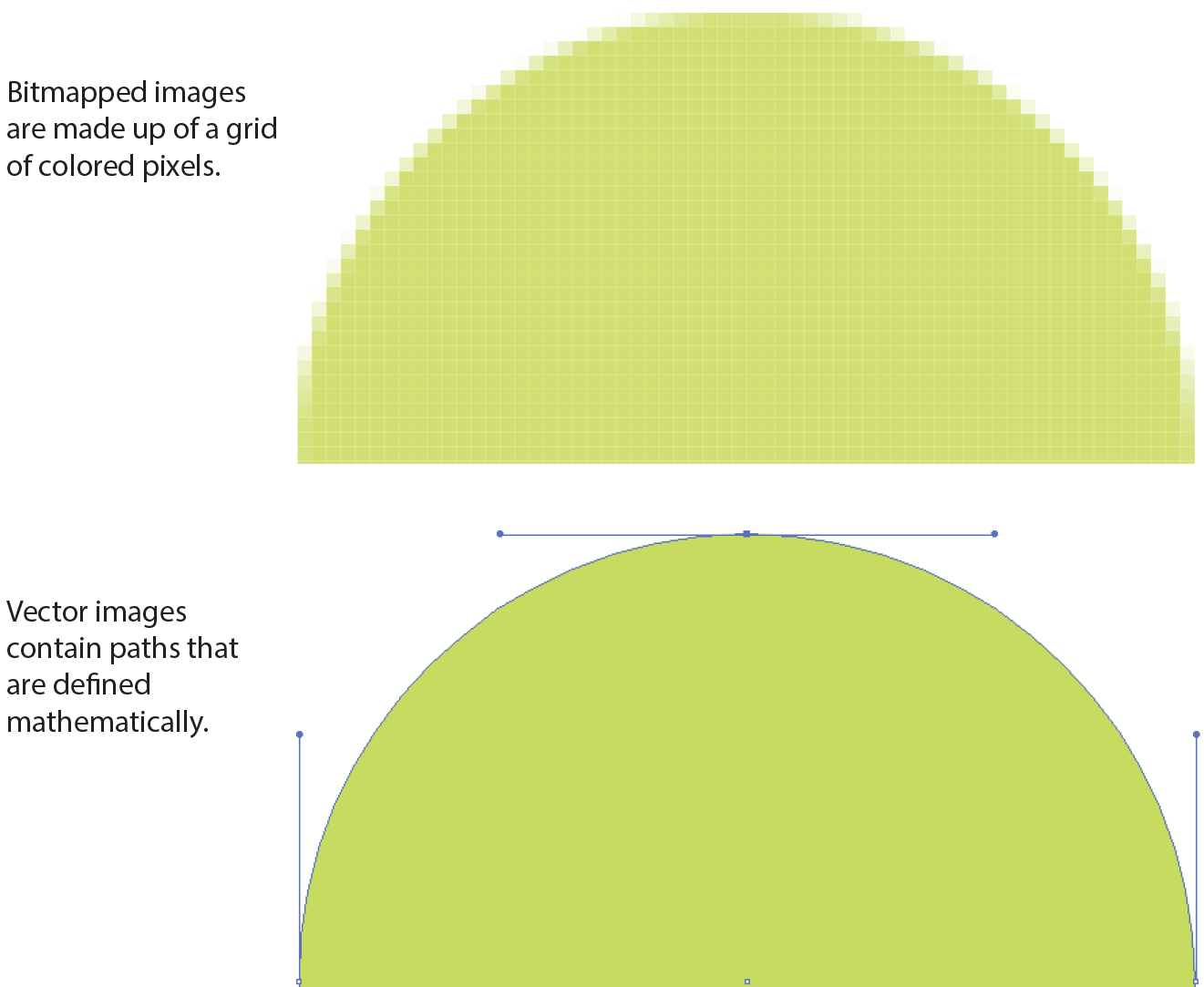
For vector images (Figure 7-1, bottom), such as the kind of icons and illustrations you create with drawing tools such as Adobe Illustrator, we have the SVG format. There is so much to say about SVGs and their features that I’ve given them their own chapter (Chapter 25, SVG), but we’ll look at how to add them to HTML documents later in this chapter.
If you have a source image that is in another popular format, such as TIFF, BMP, or EPS, you’ll need to convert it to a web format before you can add it to the page. If, for some reason, you must keep your graphic file in its original format (for example, a file for a CAD program), you can make it available as an external image by making a link directly to the image file, like this:
<a href="architecture.eps">Get the drawing</a>
You should name your image files with the proper suffixes—.png, .jpg (or .jpeg), .gif, .webp, and .jxr, respectively. In addition, your server must be configured to recognize and serve these various image types properly. All web server software today is configured to handle PNG, JPEG, and GIF out of the box, but if you are using SVG or one of the newer formats, you may need to deliberately add that media type to the server’s official list.
A little background information may be useful here. Image files, and indeed any media files that may reside on a server, have an official media type (also called a MIME type) and suffixes. For example, SVG has the MIME type image/svg+xml and the suffixes .svg and .svgz.
Server packages have different ways of handling MIME information. The popular Apache server software uses a file in the root directory called htaccess that contains a list of all the file types and their acceptable suffixes. Be sure to add (or ask your server administrator to add) the MIME types of new image formats so they may be served correctly. The server looks up the suffix (.webp, for example) of requested files in the list and matches it with the Content-Type (image/webp) that it includes in its HTTP response to the browser. That tells the browser what kind of data is coming and how to parse it.
Browsers use helper applications to display media they can’t handle alone. The browser matches the suffix of the file in the link to the appropriate helper application. The external image may open in a separate application window or within the browser window if the helper application is a browser plug-in. The browser may also ask the user to save the file or open an application manually. It is also possible that it won’t be able to be opened at all.
Without further ado, let’s take a look at the img element and its required and recommended attributes.
The img Element
<img>
Adds an inline image
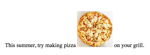
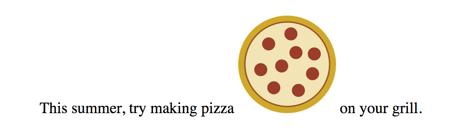
The img element tells the browser, “Place an image here.” You’ve already gotten a glimpse of it used to place banner graphics in the examples in Chapter 4, Creating a Simple Page. You can also place an image element right in the flow of the text at the point where you want the image to appear, as in the following example. Images stay in the flow of text, aligned with the baseline of the text, and do not cause any line breaks (HTML5 calls this a phrasing element), as shown in Figure 7-2:
<p>This summer, try making pizza <img src="pizza.png" alt="">
on your grill.</p>
When the browser sees the img element, it makes a request to the server and retrieves the image file before displaying it on the page. On a fast network with a fast computer or device, even though a separate request is made for each image file, the page usually appears to arrive instantaneously. On mobile devices with slow network connections, we may be well aware of the wait for images to be fetched one at a time. The same is true for users using dial-up internet connections or other slow networks, like the expensive WiFi at luxury hotels.
The src and alt attributes shown in the sample are required. The src (source) attribute provides the location of the image file (its URL). The alt attribute provides alternative text that displays if the image is not available. We’ll talk about src and alt a little more in upcoming sections.
There are a few other things of note about the img element:
- It is an empty element, which means it doesn’t have any content. You just place it in the flow of text where the image should go.
- It is an inline element, so it behaves like any other inline element in the text flow. Figure 7-3 demonstrates the inline nature of image elements. When the browser window is resized, a line of images reflows to fill the new width.
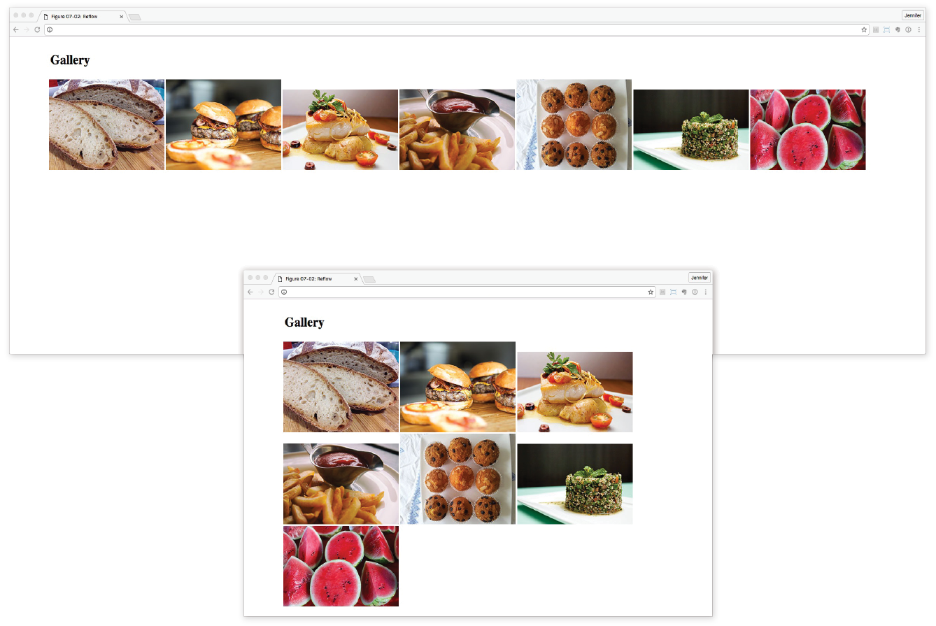
Figure 7-3. Inline images are part of the normal document flow. They reflow when the browser window is resized. - The img element is what’s known as a replaced element because it is replaced by an external file when the page is displayed. This makes it different from text elements that have their content right there in the source (and thus are non-replaced).
- By default, the bottom edge of an image aligns with the baseline of text, as shown in Figure 7-2. Using CSS, you can float the image to the right or left margin and allow text to flow around it, crop it to a shape, control the space and borders around the image, and change its vertical alignment. We’ll talk about those styles in Part III.
Providing the Location with src
src="URL"
Source (location) of the image
The value of the src attribute is the URL of the image file. In most cases, the images you use on your pages will reside on your own server, so you will use relative URLs to point to them.
If you just read Chapter 6, Adding Links, you should be pretty handy with writing relative URLs. In short, if the image is in the same directory as the HTML document, you can refer to the image by name in the src attribute:
<img src="icon.gif" alt="">
Developers usually organize the images for a site into a directory called images or img (in fact, it helps search engines when you do it that way). There may even be separate image directories for each section of the site. If an image is not in the same directory as the document, you need to provide the pathname to the image file:
<img src="/images/arrow.gif" alt="">
Of course, you could place images from other websites by using a full URL, like this, but it is not recommended (see Warning):
<img src="http://www.example.com/images/smile.gif" alt="">
Warning
Before you use any image on your web page, be sure that you own the image, that you have explicit written permission by the copyright holder, or that it is in the public domain. Linking to an image on another server (called ) is considered seriously uncool, so don’t do it unless there is a specific use case in which you have permission. Even then, be aware that you cannot control the image and risk having it moved or renamed, which would break your link.
Providing Alternative Text with alt
alt="text"
Alternative text
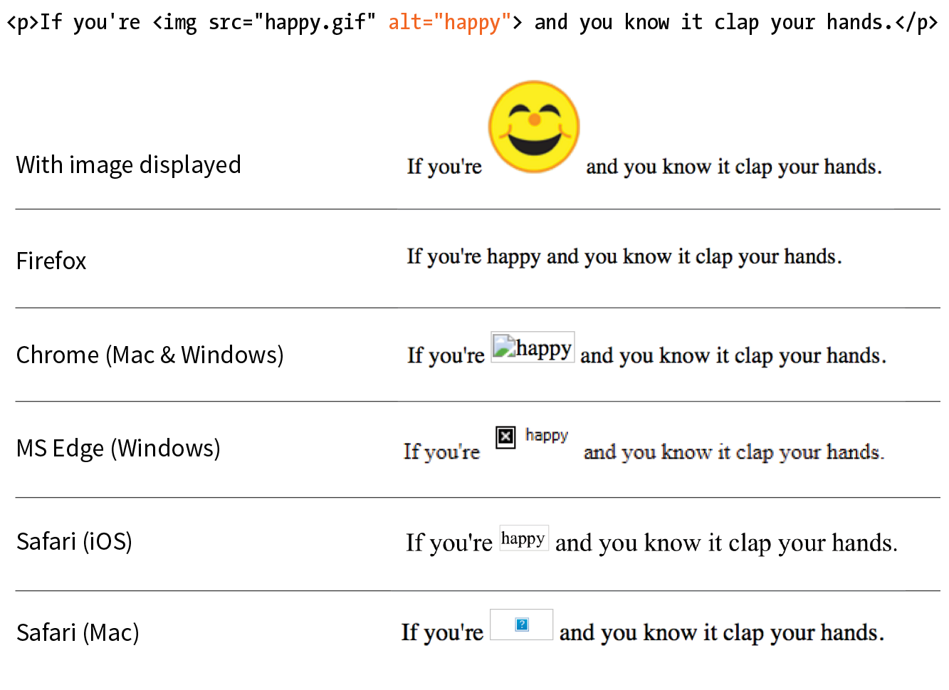
Every img element must also contain an alt attribute that provides a text alternative to the image for those who are not able to see it. Alternative text (also called alt text) should serve as a substitute for the image content—conveying the same information and function. Alternative text is used by screen readers, search engines, and graphical browsers when the image doesn’t load (Figure 7-4).
In this example, a PDF icon indicates that the linked text downloads a file in PDF format. In this case, the image is conveying valuable content that would be missing if the image cannot be seen. Providing the alt text “PDF file” replicates the purpose of the image:
<a href="application.pdf">High school application</a> <img src="images/pdflogo.png alt="PDF file">
A screen reader might indicate the image by reading its alt value this way:
“High school application. Image: PDF file”
Sometimes images function as links, in which case providing alternative text is critical because the screen reader needs something to read for the link. In the next example, an image of a book cover is used as a link to the book’s website. Its alt text does not describe the cover itself, but rather performs the same function as the cover image on the page (indicating a link to the site):
<a href="http://learningwebdesign.com"><img src="/images/LWD_cover.png" alt="Learning Web Design site"></a>
If an image does not add anything meaningful to the text content of the page, it is recommended that you leave the value of the alt attribute empty (null). In the following example, a decorative floral accent is not contributing to the content of the page, so its alt value is null. (You may also consider whether it is more appropriately handled as a background image in CSS, but I digress.) Note that there is no character space between the quotation marks:
<img src="/images/floralembellishment.png" alt="">
For each inline image on your page, consider what the alternative text would sound like when read aloud and whether that enhances the experience or might be obtrusive to a user with assistive technology.
Alternative text may benefit users with graphical browsers as well. If the user has opted to turn images off in the browser preferences or if the image simply fails to load, the browser may display the alternative text to give the user an idea of what is missing. The handling of alternative text is inconsistent among modern browsers, however, as shown in Figure 7-4.
Providing the Dimensions with width and height
width="number"
Image width in pixels
height="number"
Image height in pixels
The width and height attributes indicate the dimensions of the image in number of pixels. Browsers use the specified dimensions to hold the right amount of space in the layout while the images are loading rather than reconstructing the page each time a new image arrives, resulting in faster page display. If only one dimension is set, the image will scale proportionally.
These attributes have become less useful in the age of modern web development. They should never be used to resize an image (use your image-editing program or CSS for that), and they should be omitted entirely when you’re using one of the responsive image techniques introduced later in this chapter. They may be used with images that will appear at the same fixed size across all devices, such as a logo or an icon, to give the browser a layout hint.
Be sure that the pixel dimensions you specify are the actual dimensions of the image. If the pixel values differ from the actual dimensions of your image, the browser resizes the image to match the specified values (Figure 7-5). If you are using width and height attributes and your image looks distorted or even slightly blurry, check to make sure that the values are in sync.

Now that you know the basics of the img element, you should be ready to add a few photos to the Black Goose Bistro Gallery site in Exercise 7-1.
Exercise 7-1. Adding and linking images

<p><img src="thumbnails/bread-200.jpg" alt="close-up of sliced rustic bread" width="200" height="200"><br>We start our day at the…
That takes care of the basics of adding images to a page. Next we’ll take on adding SVG images, which are a special case, both in terms of the underlying format and the ways they can be added to HTML.
Adding SVG Images
No lesson on adding images to web pages would be complete without an introduction to adding SVGs (Scalable Vector Graphics). After all, the popularity of SVG images has been gaining momentum thanks to nearly ubiquitous browser support and the need for images that can resize without loss of quality. For illustration-style images, they are a responsive dream come true. I’m saving my deep-dive into all things SVG for Chapter 25, but for now I’ll give you a quick peek at what they’re made of so that the embedding markup makes sense.
As I mentioned at the beginning of this chapter, SVGs are an appropriate format for storing vector images (Figure 7-1). Instead of a grid of pixels, vectors are made up of shapes and paths that are defined mathematically. And even more interesting, in SVGs those shapes and paths are specified by instructions written out in a text file. Let that sink in: they are images that are written out in text! All of the shapes and paths as well as their properties are written out in the standardized SVG markup language (see Note). As HTML has elements for paragraphs (p) and tables (table), SVG has elements that define shapes like rectangle (rect), circle (circle), and paths (path).
Note
SVG is an example, or , of XML (Extensible Markup Language), which provides the rules and standards for how markup languages should be written and work together. As a result, SVG plays well alongside HTML content.
A simple example will give you the general idea. Here is the SVG code that describes a rectangle (rect) with rounded corners (rx and ry, for x-radius and y-radius) and the word “hello” set as text with attributes for the font and color (Figure 7-7). Browsers that support SVG read the instructions and draw the image exactly as I designed it:
<svg xmlns="http://www.w3.org/2000/svg" viewBox="0 0 300 180">
<rect width="300" height="180" fill="purple" rx="20" ry="20"/>
<text x="40" y="114" fill="yellow" font-family="'Verdana-Bold'" font-size="72">
hello!
</text>
</svg>

SVGs offer some significant advantages over their bitmapped counterparts for certain image types:
- Because they save only instructions for what to draw, they generally require less data than an image saved in a bitmapped format. That means faster downloads and better performance.
- Because they are vectors, they can resize as needed in a responsive layout without loss of quality. An SVG is always nice and crisp. No fuzzy edges.
- Because they are text, they integrate well with HTML/XML and can be compressed with tools like Gzip and Brotli, just like HTML files.
- They can be animated.
- You can change how they look with Cascading Style Sheets.
- You can add interactivity with JavaScript so things happen when users hover their mouse over or click the image.
Again, all of the ins and outs of creating SVGs, as well as their many features, are discussed in detail in Chapter 25. For now, I’d like to focus on the HTML required to place them in the flow of a web page. You have a few options: embedded with the img element, written out in code as an inline svg element, embedded with object, and used as a background image with CSS.
Embedded with the img Element
SVG text files saved with the .svg suffix (sometimes referred to as a standalone SVG) can be treated as any other image, including placing it in the document by using the img element. You’re an expert on the img element by now, so the following example should be clear:
<img src="/images/circle.svg" alt="">
Pros and cons
The advantage to embedding an SVG with img is that it is universally supported in browsers that support SVG.
This approach works fine when you are using a standalone SVG as a simple substitute for a GIF or a PNG, but there are a few disadvantages to embedding SVGs with img:
- You cannot apply styles to the items within the SVG by using an external style sheet, such as a .css file applied to the whole page. The .svg file may include its own internal style sheet using the style element, however, for styling the elements within it. You can also apply styles to the img element itself.
- You cannot manipulate the elements within the SVG with JavaScript, so you lose the option for interactivity. Scripts in your web document can’t see the content of the SVG, and scripts in the SVG file do not run at all. Other interactive effects, like links or :hover styles, are never triggered inside an SVG embedded with img as well.
- You can’t use any external files, such as embedded images or web fonts, within the SVG.
In other words, standalone SVGs behave as though they are in their own little, self-contained bubble. But for static illustrations, that is just fine.
Browser support for SVG with img
The good news is that all modern browsers support SVGs embedded with the img element. The two notable exceptions are Internet Explorer versions 8 and earlier, and the Android browser prior to version 3. As of this writing, users with those browsers may still show up in small but significant numbers in your user logs. If you see a reason for your site to support these older browsers, there are workarounds, which I address briefly in the upcoming “SVG Fallbacks” section.
Inline in the HTML Source
<svg>
An inline SVG image
Another option for putting an SVG on a web page is to copy the content of the SVG file and paste it directly into the HTML document. This is called using the SVG inline. Here is an example that looks a lot like the inline img example that we saw way back in Figure 7-2, only this time our pizza is a vector image drawn with circles and inserted with the svg element (Figure 7-8). Each circle element has attributes that describe the fill color, the position of its center point (cx and cy), and the length of its radius (r):
<p>This summer, try making pizza
<svgxmlns="http://www.w3.org/2000/svg" viewBox="0 0 72 72" width="100" height="100">
<circle fill="#D4AB00" cx="36" cy="36" r="36"/>
<circle opacity=".7" fill="#FFF" stroke="#8A291C" cx="36.1" cy="35.9" r="31.2"/>
<circle fill="#A52C1B" cx="38.8" cy="13.5" r="4.8"/>
<circle fill="#A52C1B" cx="22.4" cy="20.9" r="4.8"/>
<circle fill="#A52C1B" cx="32" cy="37.2" r="4.8"/>
<circle fill="#A52C1B" cx="16.6" cy="39.9" r="4.8"/>
<circle fill="#A52C1B" cx="26.2" cy="53.3" r="4.8"/>
<circle fill="#A52C1B" cx="42.5" cy="27.3" r="4.8"/>
<circle fill="#A52C1B" cx="44.3" cy="55.2" r="4.8"/>
<circle fill="#A52C1B" cx="54.7" cy="42.9" r="4.8"/>
<circle fill="#A52C1B" cx="56" cy="28.3" r="4.8"/>
</svg>on your grill.</p>
This code was generated by Adobe Illustrator, where I created the illustration and saved it in SVG format. I also optimized it to strip out a lot of cruft that Illustrator adds in there. We’ll discuss SVG optimization in Chapter 25.
Pros and cons
Inline SVGs allow developers to take full advantage of SVG features. When the SVG markup is alongside the HTML markup, all of its elements are part of the main DOM tree. That means you can access and manipulate SVG objects with JavaScript, making them respond to user interaction or input. There are similar benefits for style sheets because the elements in the SVG can inherit styles from HTML elements. That makes it easy to apply the same styles to elements on the page and within the SVG graphic.
On the downside, the code for SVG illustrations can get extremely long and unwieldy, resulting in bloated HTML documents that are difficult to read. Even that little pepperoni pizza requires a serious block of code. It also makes the images for a site more difficult to maintain, since they are tucked away in the HTML documents. Another disadvantage is that inline SVGs are not cached by the browser separate from the HTML file, so avoid this method for large images that are reused across many HTML pages.
Browser support
The good news is that all modern browsers support SVG images placed inline with the svg element. The following older browser versions lack support: Internet Explorer versions 8 and earlier, Safari versions 5 and earlier, Android mobile browser prior to version 3, and iOS prior to version 5.
Embedded with the object Element
HTML has an all-purpose media embedding element called object. We’ll talk about it more in Chapter 10, Embedded Media, but for now, know that object is another option for embedding an SVG in a web page. It is a good compromise between img and inline SVG, allowing a fully functional SVG that is still encapsulated in a separate, cacheable file.
The opening object tag specifies the media type (an svg+xml image) and points to the file to be used with the data attribute. The object element comes with its own fallback mechanism—any content within the object gets rendered if the media specified with data can’t be displayed. In this case, a PNG version of the image will be placed with an img if the .svg is not supported or fails to load:
<object type="image/svg+xml" data="pizza.svg">
<img src="pizza.png" alt="pizza">
</object>
There is one catch, however. Some browsers download the fallback image even if they support SVG and don’t need it. Useless downloads are not ideal. The workaround is to make the fallback image a CSS background image in an empty div container. Unfortunately, it is not as flexible for scaling and sizing, but it does solve the extra download issue.
<object type="image/svg+xml" data="pizza.svg">
<div style="background-image: url(pizza.png); width 100px; height: 100px;" role="img" aria-label="pizza">
</object>
Pros and cons
The main advantage to embedding SVGs with the object element is that they can be scripted and load external files. They can also use scripts to access the parent HTML document (with some security restrictions). However, because they are separate files and not part of the DOM for the page, you can’t use a style sheet in the HTML document to style elements within the SVG. Embedded SVGs may also have some buggy behaviors in browsers, so be sure to test thoroughly.
Used as a Background Image with CSS
I know that this is an HTML chapter, but I’d be remiss if I didn’t at least mention that SVGs can be used as background images with CSS. This style rule example puts a decorative image in the background of a header:
header {
background-image: url(/images/decorative.svg);
}
SVG Fallbacks
As mentioned earlier, all modern browsers support SVGs either embedded as an img, embedded as an object, or included inline, which is very good news. However, if your server logs show significant traffic from Internet Explorer 8 and earlier, Android version 3 and earlier, or Safari 5 and earlier, or if your client just requires support for those browsers, you may need to use a fallback technique. One option is to use the object element to embed the SVG on the page and take advantage of its fallback content feature shown earlier.
If you are using SVG as an image with the img element, another option is to use the picture element (it’s discussed as part of the “Responsive Image Markup” section later in this chapter). The picture element can be used to provide several versions of an image in different formats. Each version is suggested with the source element, which in the following example points to the pizza.svg image and defines its media type. The picture element also has a built-in fallback mechanism. If the browser doesn’t support the suggested source files, or if it does not support the picture element, users will see the PNG image provided with the good old img element instead:
<picture>
<source type="image/svg+xml" srcset="pizza.svg">
<img srcset="pizza.png" alt="No SVG support">
</picture>
If you Google for “SVG fallbacks,” you’ll likely get quite a few hits, many of which use JavaScript to detect support. For more detailed information on SVG fallbacks, I recommend reading Amelia Bellamy-Royd’s article, “A Complete Guide to SVG Fallbacks” (css-tricks.com/a-complete-guide-to-svg-fallbacks/) or Chris Coyier’s book, Practical SVG (A Book Apart) when you are ready. Ideally, you will be reading this in a world where old Internet Explorer and Android versions are no longer an issue.
Are you ready to give SVGs a spin? Try out some of the embedding techniques we discussed in Exercise 7-2.
Exercise 7-2. Adding an SVG to a page

Part I: Replacing the logo
Responsive Image Markup
Pretty quickly after smartphones, tablets, “phablets,” and other devices hit the scene, it became clear that large images that look great on a large screen were overkill on smaller screens. All that image data…downloaded and wasted. Forcing huge images onto small devices slows down page display and may cost real money too, depending on the user’s data plan (and your server costs). Conversely, small images that download quickly may be blurry on large, high-resolution screens. Just as we need a way to make whole web pages respond and adapt to various screen sizes, we need a way to make images on those page “responsive” as well. Our trusty img element with its single src attribute just doesn’t cut it in most cases.
It took a couple of years of proposals, experimentation, and discussion between browser makers and the web development community, but we now have a way to suggest alternate images by using HTML markup alone. No complicated JavaScript or server-side hacks. The resulting responsive image features (srcset and sizes attributes as well as the picture element) have been incorporated into the HTML 5.1 specification, and browser support is growing steadily, led by the Chrome browser in September 2014.
Thanks to a foolproof fallback and scripts that add support to older browsers, you can start using these techniques right away. That said, none of this is set in stone. Responsive image solutions are likely to be tweaked and improved, or perhaps one day even made obsolete. If you are going to include them in your sites, a good starting place for getting up-to-speed is the Responsive Images Community Group (responsiveimages.org). RICG is a group of developers who worked together to hammer out the current spec with the browser creators. They are on top of this stuff. You should also look for recent articles and perhaps even crack open the spec.
How It Works
When we say “responsive images,” we are talking about providing images that are tailored to the user’s viewing environment. First and foremost, responsive image techniques prevent browsers on small screens from downloading more image data than they need. They also include a mechanism to give high-resolution displays on fast networks images large enough to look extra-gorgeous. In addition, they provide a way for developers to take advantage of new, more efficient image formats.
In short, responsive images work this way: you provide multiple images, sized or cropped for different screen sizes, and the browser picks the most appropriate one based on what it knows about the current viewing environment. Screen dimensions are one factor, but resolution, network speed, what’s already in its cache, user preferences, and other considerations may also be involved.
You provide multiple images, sized or cropped for different screen sizes, and the browser picks the most appropriate one based on what it knows about the current viewing environment.
The responsive image attributes and elements address the following four basic scenarios:
- Providing extra-large images that look crisp on high-resolution screens
- Providing a set of images of various dimensions for use on different screen sizes
- Providing versions of the image with varying amount of detail based on the device size and orientation (known as the art direction use case)
- Providing alternative image formats that store the same image at much smaller file sizes
Let’s take a look at each of these common use cases.
High-Density Displays (x-descriptor)
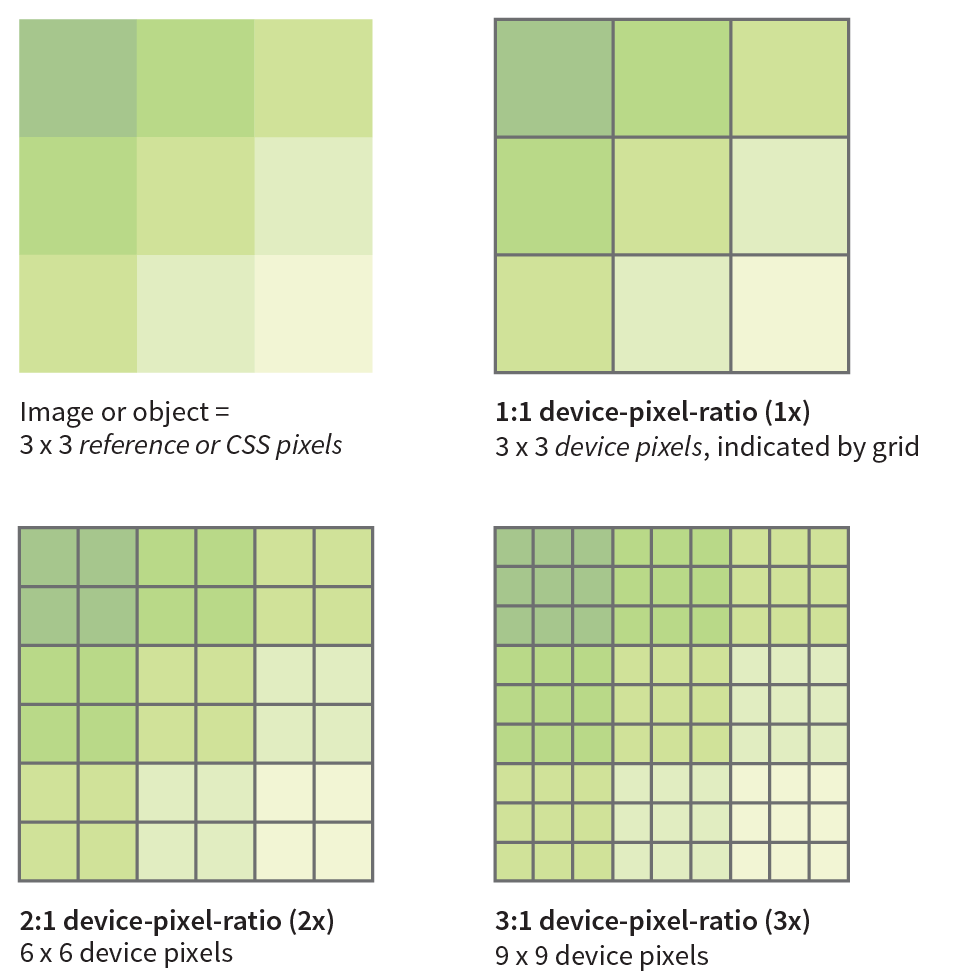
Everything that you see on a screen display is made up of little squares of colored light called pixels. We call the pixels that make up the screen itself device pixels (you’ll also sometimes see them referred to as hardware pixels or physical pixels). Until recently, screens commonly fit 72 or 96 device pixels in an inch (now 109 to 160 is the norm). The number of pixels per inch (ppi) is the resolution of the screen.
Bitmapped images, like JPEG, PNG, and GIF, are made up of a grid of pixels too. It used to be that the pixels in images as well as pixel dimensions specified in our style sheets mapped one-to-one with the device pixels. An image or box element that was 100 pixels wide would be laid out across 100 device pixels. Nice and straightforward.
Device-pixel-ratios
It should come as no surprise that it’s not so straightforward today. Manufacturers have been pushing screen resolutions higher and higher in an effort to improve image quality. The result is that device pixels have been getting smaller and smaller, so small that our images and text would be illegibly tiny if they were mapped one-to-one.
Devices use a measurement called a reference pixel for layout purposes.
To compensate, devices use a measurement called a reference pixel for layout purposes. Reference pixels are also known as points (PT) in iOS, Device Independent Pixels (DP or DiP) in Android, or CSS pixels because they are the unit of measurement we use in style sheets. The iPhone 8 has a screen that is made up of 750 × 1334 device pixels, but it uses a layout grid of 375 × 667 points or CSS pixels (a ratio of 2 device pixels to 1 layout pixel—2:1 or 2x). A box sized to 100 pixels wide in CSS would be laid out across 200 device pixels on the iPhone8. The iPhone X has a screen that is made up of 1125 × 2436 pixels, but it uses a layout grid of 375 × 812 points (a ratio of 3 device pixels to one point—or 3x). A box sized to 100 pixels is laid out across 300 device pixels on the iPhone X.
The ratio of the number of device pixels to CSS pixels is called the device-pixel-ratio (Figure 7-10). Common device-pixel-ratios on handheld devices are 1.325x, 1.5x, 1.7x, 2x, 2.4x, 3x, and even 4x (the “x” is the convention for indicating a device-pixel-ratio). Even large desktop displays are featuring ratios of 2x, 3x, and 4x.
Let’s say you have an image that you want to appear 200 pixels wide on all displays. You can make the image exactly 200px wide (px is short for pixels), and it will look fine on standard-resolution displays, but it might be a little blurry on high-resolution displays. To get that image to look sharp on a display with a device-pixel-ratio of 2x, you’d need to make that same image 400 pixels wide. It would need to be 600 pixels wide to look sharp on a 3x display. Unfortunately, the larger images may have file sizes that are four or more times the size of the original. Who wants to send all that extra data to a 1x device that really only needs the smaller image?
Introducing srcset
We now have a way to serve larger images just to the browsers on displays that benefit from them. We do it using the new srcset attribute with our old friend the img element. srcset allows developers to specify a list of image source options for the browser to choose from.
The value of srcset is a comma-separated list of options. Each item in that list has two parts: the URL of an image and an x-descriptor that specifies the target device-pixel-ratio. Note that the whole list is the value of srcset and goes inside a single set of quotation marks. This sample shows the structure of a srcset value:
srcset="image-URL#x,image-URL#x"
The src attribute is still required, and is generally used to specify the default 1x image for browsers that don’t support srcset. Make sure there is an alt attribute as well:
<img src="image-URL" alt="" srcset="image-URL#x,image-URL#x">
Let’s look at an example. I have an image of a turkey that I’d like to appear 200 pixels wide. For standard resolution, I created the image at 200 pixels wide and named it turkey-200px.jpg. I’d also like it to look crisp in high-resolution displays, so I have two more versions: turkey-400px.jpg (for 2x) and turkey-600px.jpg (for 3x). Here is the markup for adding the image and indicating its high-density equivalents with x-descriptors:
<img src="/images/turkey-200px.jpg" alt=""srcset="/images/turkey-400px.jpg 2x, /images/turkey-600px.jpg 3x">
Because browsers ignore line returns and spaces in the source document, I can also write that same element stacked in this way to make it a little easier to read, as I will be doing throughout this chapter:
<img
src="/images/turkey-200px.jpg" alt=""
srcset="/images/turkey-400px.jpg 2x,
/images/turkey-600px.jpg 3x" >That makes the options and structure more clear at a glance, don’t you think?
Browsers that recognize the srcset attribute check the screen resolution and download what they believe to be the most appropriate image. If the browser is on a Mac with a 2x Retina display, it may download image-400px.jpg. If the device-pixel-ratio is 1.5x, 2.4x, or something else, it checks the overall viewing environment and makes the best selection. It is important to know that when we use srcset with the img element, we are handing the keys to the browser to make the final image selection.
When we use srcset with the img element, we are allowing the browser to make the best image selection.
When to use x-descriptors
X-descriptors tell the browser to make a selection based on screen resolution only, with no regard for the dimensions of the screen or viewport. For this reason, x-selectors are best used for images that stay the same pixel dimensions regardless of the screen size, such as logos, social media badges, or other fixed-width images.
It is much more likely that you’ll want images to resize based on the size of the screen and to be able to serve small images to small handheld devices, and large images to desktops (that’s kind of the crux of this responsive image thing, after all). Now that you are familiar with using the srcset attribute, let’s see how it can be used to deliver images targeted to various screen sizes. Here’s where srcset really shines.
Variable-Width Images (w-descriptor)
When you’re designing a responsive web page, chances are you’ll want image sizes to change based on the size of the browser viewport (see Note). This is known as a viewport-based selection. And because you are the type of web developer who cares about how fast pages display, you’ll want to limit unnecessary data downloads by providing appropriately sized images.
Note
On a mobile device, the viewport fills the whole screen. On a desktop browser, the viewport is the area where the page displays, not including the scrollbars and other browser “chrome.”
To achieve this goal, use the srcset and sizes attributes with the img element. As we saw in previous examples, the srcset gives the browser a set of image file options, but this time, it uses a w-descriptor (width descriptor) that provides the actual pixel width of each image. Using srcset with a w-descriptor is appropriate when the images are identical except for their dimensions (in other words, they differ only in scale). Here’s an example of a srcset attribute that provides four image options and specifies their respective pixel widths via w-descriptors. Note again that the whole list is in a single set of quotation marks:
srcset="strawberries-480.jpg 480w,
strawberries-960.jpg 960w,
strawberries-1280.jpg 1280w,
strawberries-2400.jpg 2400w"
Using the sizes attribute
That’s a good start, but whenever you use w-descriptors, you also need to use the sizes attribute to tell the browser the approximate size that the image will appear in the page’s layout. There is a very good reason (in addition to being required in the spec), and it is worth understanding.
The sizes attribute is required when you use width descriptors.
When a browser downloads the HTML document for a web page, the first thing it does is look through the whole document and establish its outline structure (its Document Object Model, or DOM). Then, almost immediately, a preloader goes out to get all the images from the server so they are ready to go. Finally, the CSS and the JavaScript are downloaded. It is likely that the style sheet has instructions for layout and image sizes, but by the time the browser sees the styles, the images are already downloaded. For that reason, we have to give the browser a good hint with the sizes attribute whether the image will fill the whole viewport width or only a portion of it. That allows the preloader to pick the correct image file from the srcset list.
We’ll start with the simplest scenario in which the image is a banner and always appears at 100% of the viewport width, regardless of the device (Figure 7-11). Here’s the complete img element:
<img src="strawberries-640.jpg"
alt="baskets of ripe strawberries"
srcset="strawberries-480.jpg 480w,
strawberries-960.jpg 960w,
strawberries-1280.jpg 1280w,
strawberries-2400.jpg 2400w"
sizes="100vw">

In this example, the sizes attribute tells the browser that the image fills the full viewport by using viewport width units (vw), the most common unit for the sizes attribute, so the browser can pick the best image for the job. For example, 100vw translates to 100% of the viewport width, 50vw would be 50%, and so on. You can also use em, px, and a few other CSS units, but you cannot use percentages. Browsers that do not support srcset and sizes simply use the image specified in the src attribute.
Sizing an image to fill the whole width of the browser is a pretty specific case. More likely, your images will be one component in a responsive page layout that resizes and rearranges to make best use of the available screen width. Figure 7-12 shows a sidebar of food photos that take up the full width of the screen on small devices, take up a portion of the width on larger devices, and appear three across in a layout for large browser windows.

For cases like these, use the sizes attribute to tell the browser something about how the image will be sized for each layout. The sizes value is a comma-separated list in which each item has two parts. The first part in parentheses is a media condition that describes a parameter such as the width of the viewport. The second part is a length that indicates the width that image will occupy in the layout if the media condition is met. Here’s how that syntax looks:
sizes="(media-feature:condition)length,
(media-feature:condition)length,
(media-feature:condition)length"
I’ve added some media conditions to the previous example, and now we have a complete valid img element for one of the photo images in Figure 7-12:
<img src="strawberries-640.jpg" alt="baskets of ripe strawberries"
srcset="strawberries-240.jpg 240w,
strawberries-480.jpg 480w,
strawberries-672.jpg 672w"
sizes="(max-width: 480px) 100vw,
(max-width: 960px) 70vw, 240px">The sizes attribute tells the browser the following:
- If the viewport is 480 pixels wide or smaller (maximum width is 480 pixels), the image fills 100% of the viewport width.
- If the viewport is wider than 480 pixels but no larger than 960 pixels (max-width: 960px), then the image will appear at 70% of the viewport. (This layout has 15% margins on the left and the right of the images, or 30% total.)
- If the viewport is larger than 960 pixels and doesn’t meet any of the prior media conditions, the image gets sized to exactly 240 pixels.
Now that the browser knows the width of the viewport and how big the image will appear within it, it can select the most appropriate image from the srcset list to download.
Warning
The sizes attribute will resize an image even if there is no CSS applied to it. If there is a CSS rule specifying image size that conflicts with the value of the sizes attribute, the style rule wins (i.e., it overrides the sizes value).
There’s a bit more to using sizes than shown here—other media conditions, additional length units, even the ability to ask the browser to calculate widths for you. If you plan on using viewport-width-based images in your designs, I recommend reading the spec to take full advantage of the possibilities.
Note
Strategies and tools for producing the image sets for responsive layouts are introduced in .
Art Direction (picture Element)
<picture>…</picture>
Specifies a number of image options
<source>…</source>
Specifies alternate image sources
So far, we’ve looked at image selection based on the resolution of the screen and the size of the viewport. In both of these scenarios, the content of the image does not change but merely resizes.
But sometimes, resizing isn’t enough. You might want to crop into important details of an image when it is displayed on a small screen. You may want to change or remove text from the image if it gets too small to be legible. Or you might want to provide both landscape (wide) and portrait (tall) versions of the same image for different layouts.
Use the picture element when simply resizing the image is not enough.
For example, in Figure 7-13, the whole image of the table as well as the dish reads fine on larger screens, but at smartphone size, it gets difficult to see the delicious detail. It would be nice to provide alternate versions of the image that make sense for the browsing conditions.

This scenario is known as an art-direction-based selection and it is accomplished with the picture element. The picture element has no attributes; it is just a wrapper for some number of source elements and an img element. The img element is required and must be the last element in the list. If the img is left out, no image will display at all because it is the piece that is actually placing the image on the page. Let’s look at a sample picture element and then pick it apart:
<picture><sourcemedia="(min-width: 1024px)"srcset="icecream-large.jpg">
<sourcemedia="(min-width: 760px)"srcset="icecream-medium.jpg">
<img src="icecream-small.jpg" alt="hand holding ice cream cone and text that reads Savor the Summer">
</picture>This example tells the browser that if the viewport is 1024 pixels wide or larger, use the large version of the ice cream cone image. If it is wider than 760 pixels (but smaller than 1024, such as on a tablet), use the medium version. Finally, for viewports that are smaller than 760 pixels and therefore don’t match any of the media queries in the previous source elements, the small version should be used (Figure 7-14). The small version, as specified in the img element, will be used for browsers that do not recognize picture and source.

Each source element includes a media attribute and a srcset attribute. It can also use the sizes attribute, although that is not shown in the previous example. The media attribute supplies a media query for checking the current browsing conditions. It is similar to the media conditions we saw in the earlier srcset example, but the media attribute specifies a full-featured CSS media query (we’ll talk more about media queries in Chapter 17, Responsive Web Design). The srcset attribute supplies the URL for the image to use if the media query is a match. In the previous example, there is just one image specified, but it could also be a comma-separated list if you wanted to provide several options using x- or w-descriptors.
Browsers download the image from the first source that matches the current conditions, so the order of the source elements is important. The URL provided in the srcset attribute gets passed to the src attribute in the img element. Again, it’s the img that places the image on the page, so don’t omit it. The alt attribute for the img element is required, but alt is not permitted in the source element.
Art direction is the primary use of the picture element, but let’s look at one more thing it can do to round out our discussion on responsive images.
Alternative Image Formats (type Attribute)
Once upon a time, in the early 1990s, the only image type you could put on a web page was a GIF. JPEGs came along not long after, and we waited nearly a decade for reliable browser support for the more feature-rich PNG format. It takes a notoriously long time for new image formats to become universally supported. In the past, that meant simply avoiding newer formats.
In an effort to reduce image file sizes, more efficient image formats have been developed—such as WebP, JPEG 2000, and JPEG XR—that can compress images significantly smaller than their JPEG and PNG counterparts (see Note). And once again, some browsers support them and some don’t. The difference is that today we can use the picture element to serve the newer image formats to browsers that can handle them, and a standard image format to browsers that can’t. We no longer have to wait for universal browser support.
Note
The bitmapped image formats, including WebP, JPEG 2000, and JPEG XR, are discussed in more detail in .
In the following example, the picture element specifies two image alternatives before the fallback JPEG listed in the img element:
<picture>
<source type="image/webp" srcset="pizza.webp">
<source type="image/jxr" srcset="pizza.jxr">
<img src="pizza.jpg" alt="">
</picture>
For image-format-based selections, each source element has two attributes: the srcset attribute that we’ve seen before, and the type attribute for specifying the type of file (also known as its MIME type, see the “File (MIME) Types” sidebar). In this example, the first source points to an image that is in the WebP format, and the second specifies a JPEG XR. Again, the browser uses the image from the first source that matches the browser’s image support, so it makes sense to put them in order from smallest to largest file size.
Browser Support
As I write this section, it seems like a new browser is adding support for picture, srcset, and sizes every day, but of course, old browser versions have a bad habit of sticking around for years. This is not a reason to avoid using responsive images, however. First of all, all of these features are designed to include the img element as a built-in fallback for browsers that don’t recognize the newer markup. In the worst case, the browser grabs the image specified in the img element.
If that isn’t good enough, try including Picturefill with your web pages. Picturefill is an example of a polyfill, a script that makes older browsers behave as though they support a new technology—in this case, responsive images. It was created by Scott Jehl of Filament Group, creators of many fine responsive design and frontend development tools. Go to scottjehl.github.io/picturefill/ to download the script and read the very thorough tutorial on how it works and how to use it.
Responsive Images Summary
This has been a long discussion about responsive images, and we’ve really only scratched the surface. We’ve looked at how to use the img element with srcset and sizes to make pixel-ratio-based and viewport-size-based selections (you can try them yourself in Exercise 7-3). We also saw how the picture element can be used for art-direction-based and image-type-based selections.
I’ve kept my examples short and sweet, but know that it is possible to combine techniques in different ways, often resulting in a tower of code for each image. To see some examples of how these responsive image techniques might be combined to target more than one condition, I recommend Andreas Bovens’s article “Responsive Images: Use Cases and Documented Code Snippets to Get You Started” on the Dev.Opera site (dev.opera.com/articles/responsive-images/).
I also recommend the 10-part “Responsive Images 101” tutorial by Jason Grigsby at Cloud Four. He goes into a bit more detail than I was able to here and provides links to other good resources. Start with “Part 1: Definitions” (cloudfour.com/thinks/responsive-images-101-definitions/).
Exercise 7-3. Adding responsive images

Whew! We’re Finished
That wraps up our exploration of images. We’ve seen how to place images with the img element and its required src and alt attributes. We’ve talked about the importance of good alternative text for accessibility. We also looked at a few ways to embed SVG images into a web page. Finally, we took on the newly minted responsive image features, including srcset and sizes for the img element to target high-density displays or to provide a variety of image sizes for the browser to choose from, and the picture and source elements for art direction and alternative image formats. Now try answering a few questions to test your knowledge.
Test Yourself
Images are a big part of the web experience. Answer these questions to see how well you’ve absorbed the key concepts of this chapter. The correct answers can be found in Appendix A.
- Which attributes must be included in every img element?
- Write the markup for adding an image called furry.jpg that is in the same directory as the current document.
- Name two reasons to include alternative text for an img element.
- What might be going wrong if your images don’t appear when you view the page in a browser? There are three possible explanations.
- What is the difference between an x-descriptor and a w-descriptor?
- What is the difference between a device pixel and a CSS (reference) pixel?
- Match the responsive image scenarios with the HTML solutions:
<img src="" alt="" srcset="URL x-descriptor"><img src="" alt=" srcset="URL w-descriptor" sizes="#"><picture><source type="…" srcset=""><img src="" alt=""></picture><picture>
<source media="()" srcset=""><img src="" alt=""></picture>____ You want the image to always fill the width of the browser window.
____ You want to take advantage of the file savings of the WebP image format.
____ You want to remove the text from an image when it is on small screens.
____ You want your product images to look as sharp as possible on high-resolution screens.
____ You want to show a close-up of the action in a news image on small screens.
____ You want the image to resize smaller when it is part of the layout on a large screen.
- Challenge question: Describe what this example tells the browser to do:
<picture>
<source sizes="(min-width: 480px) 80vw,
100vw"
srcset="photo-200.webp 200w
photo-400.webp 400w,
photo-800.webp 800w,
photo-1200.webp 1200w"
type="image/webp">
<img src=" photo-400.jpg" alt=""
sizes="(min-width: 480px) 80vw,
100vw"
srcset="photo-200.jpg 200w,
photo-400.jpg 400w,
photo-800.jpg 800w,
photo-1200.jpg 1200w">
</picture>
- What is cache and how does it affect web page performance?
- Name one advantage and one disadvantage of adding an SVG to a page with the img element.
- Name one advantage and one disadvantage of inline SVG.
- When would it be appropriate to add an SVG to a page as a background image with CSS?
- What is this bit of code describing, and when might you need to use it?
image/svg+xml
- What is this bit of code describing, and where would you find it?
http://www.w3.org/2000/svg
Element Review: Images
Following are the elements you learned in your exploration of image markup.