Chapter 8. The Black and White on Silver Efex Pro 2
If you must sleep, do not fall asleep with your head on the keyboard. It ruins the code.
—Nils Kokemohr
Every technique that you have used to this point is one that you could do using only Photoshop. Even in the discussion about RAW processors in Chapter 3, (in which I compared Lightroom/Adobe Camera Raw [ACR] and, in the Rubbing Your Nikon RAW File the Right Way PDF discussion of Capture NX2 with its built-in Black and White conversion plug-in), you could still approach the conversion process with just Adobe Photoshop. For me this is an important consideration, because I currently believe that the best chromatic grayscale conversions are achieved in Photoshop. Although you can frequently achieve acceptable, usable chromatic grayscale conversions using RAW processing software (Lightroom 4, Aperture 3, Capture NX 2, etc.), Photoshop affords you the most control over your image. In this chapter, you are going to work with a piece of software, Nik Software’s Silver Efex Pro plug-in (now in its second version), that makes Photoshop even better.
Of all of the black-and-white conversion software on the market today, Silver Efex Pro is considered by all but a very few to be the best of class. Certainly nothing with which I have worked—and I make it a point to work with every piece of black-and-white conversion software that comes out—comes even close to the ease of use, variety of choices, and the amount of granular control that this plug-in affords the end-user. In my opinion, it is an elegantly designed piece of software.
In the spirit of full disclosure, I have been involved with the development of this software since it was a twinkle in Nils Kokemohr’s eye. I was part of the original alpha testing group, as well as the software’s first beta tester.
The lessons that are this chapter build on the work that you did on the images in the preceding chapter. (The chromatic grayscale conversion that I currently use for my digital, non-infrared photography is mostly done with a combination of what you did in the previous chapter and what you are about to do in this one. For my digital infrared photography, I almost exclusively use the Silver Efex Pro 2 plug-in.)
I have created a QuickTime tutorial with Josh Haftel, the senior product manager for Nik Software, that goes over, in great detail, the “button-ology” of the Silver Efex Pro 2 plug-in. Before you go any further in this chapter, I recommend that you take the time to watch this tutorial that can be found on the download page for this book.
It is important for you to have watched the QuickTime tutorial for the Silver Efex Pro 2 plug-in before you move on to this chapter’s lesson because the emphasis in this chapter is more on the aesthetics (the whys rather than the hows of the technology) and applying the theories that you have learned up to this point, than it is on which button does what. (For easy reference, in addition to the Quick-Time tutorial, I have included an extensive overview of the Silver Efex Pro 2 plug-in in this chapter. See: The Black and White on the Silver Efex Pro 2 User Interface.)
Since this is the last chapter of the printed book, you should be adept at doing chromatic grayscale conversions. It is at that level that I will begin the next lessons. Once again, you will be using actions. What I have endeavored to create is a series of actions that take into account every possible scenario in which you may find yourself when it comes to making a chromatic grayscale conversion. I believe that your photographic life should be more about being behind the camera and being pulled through the lens, than it should be about sitting in front of the adult videogame known as Photoshop. With that thought in mind, once you have watched the tutorial and read the next section, you should be ready to move on to the Silver Efex Pro lesson.
The Black and White on the Silver Efex Pro 2 User Interface
Before you start playing with an image, it is a good idea to have an understanding of the tool that you are about to use. This section gives a brief overview on how the Silver Efex Pro 2 user interface is laid out and how it works. To reiterate, in addition to this overview, you will find this information as a QuickTime tutorial that you can download from the download site for this book.
If you do not have a copy of the Silver Efex Pro 2 plug-in, you can download a 15-day trial from www.niksoftware.com or click on the link located on the download page for this book.
Silver Efex Pro 2 offers a complete workflow solution for converting color images into chromatic grayscale ones. The interface of Silver Efex Pro 2 is set up with an efficient workflow in mind: from global to granular and from left to right (Figure 8.1).
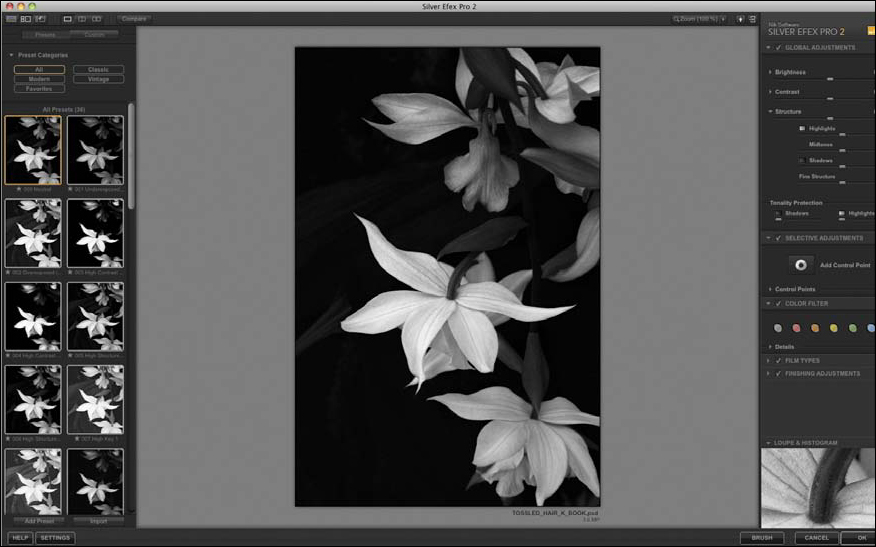
Figure 8.1. The Silver Efex Pro 2 interface
By default, on the left side of the interface, you have a Preset Browser that offers traditional and creative starting points for changing the overall appearance of your image (Figure 8.2). The default option is Neutral and is an unmodified chromatic grayscale conversion from color. Other options include presets based on traditional film processing and printing techniques such as push and pull processing and simulated toning solutions; and traditional shooting techniques such as high key and low key lighting, using a graduated neutral density filter, and under/over exposing the film. The creative techniques provided within the Preset Browser include stylistic options to enhance detail, to mimic cinematic film styles from the early 20th century, and alternative photographic processes like pinhole photography. In addition to the presets that are built in to the software, you can also create and share your own.
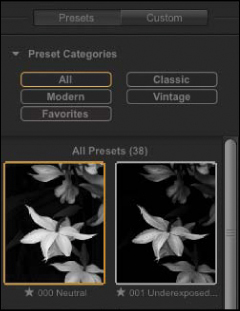
Figure 8.2. The Preset Browser
Also available on the left side is the History Browser, which allows you to view the sequence of adjustments that you make while editing an image and to compare any two steps in that sequence. The history sequence is separated into sections by the type of adjustment that was made. The last adjustment is shown at the bottom of the list.
On the right side of the interface, the controls are divided into a suggested workflow, from global to granular (Figure 8.3). Many of the adjustments in Silver Efex Pro 2 are based on traditional photographic concepts. As an example, the Color Filtration section is based on glass filters that photographers might put in front of the lens while photographing to change the tonal relationship of colors. Additionally, there are recreations of film types based on the grain quality, color sensitivity, and tonal reproduction curves of black-and-white films, and the use of alternative finishing adjustments such as vignettes, toning solutions, and image borders. Each major adjustment section within Silver Efex Pro (the Global Adjustments, Selective Adjustments, etc.) has the option to turn the effect on and off in order to preview the adjustments within that section.
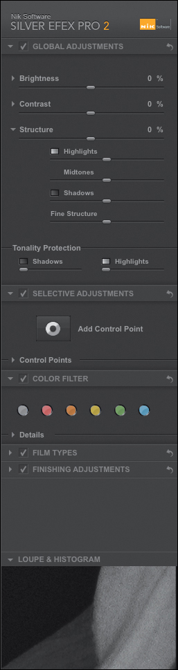
Figure 8.3. The right side of the interface
The Global Adjustments section offers a Brightness, Contrast, and Structure slider set, with Tonality Protection (Figure 8.4). Each of the global Brightness, Contrast, and Structure sliders has a subsection with an additional slider for greater control based on the tonality range that you wish to create.
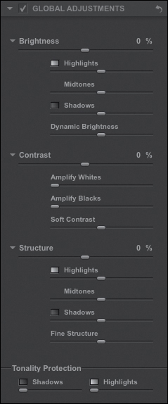
Figure 8.4. The Global Adjustments section
The Brightness and Contrast sliders work as you would expect; moving the Brightness slider brightens or darkens the image, and moving the Contrast slider increases or decreases the image’s contrast. The Dynamic Brightness slider is a control unique to Silver Efex Pro 2. Developed by Nik Software, it provides you with the ability to brighten or darken the overall image while maintaining a consistent contrast ratio throughout the image. The Brightness slider set offers a refined control for your image at the start of editing.
The Contrast slider set acts in a way similar to the Brightness slider set so that you can separately control the black or shadow areas’ contrast and the white or highlight areas’ contrast. The last control within the Contrast slider set is the Soft Contrast slider. This separates the image into unique elements, and then applies contrast within each of them. It also applies a softening effect to provide smoother transitions between the areas in which the contrast is changed, resulting in a more natural effect.
The Structure slider set is designed to provide localized contrast within objects in the image and separates the image into unique elements so that the contrast inside of those elements can be individually controlled. This provides greater overall enhancement of fine details in the image.
The Selective Adjustments section of Silver Efex Pro 2 is one of the most important (Figure 8.5). Built into Silver Efex Pro 2 are control points that allow for the adjustment of any object or area in an image simply by placing a control point on that object or area.

Figure 8.5. The Selective Adjustments section
Each control point has a Size, Brightness, Contrast, Structure, Amplify Whites, Amplify Blacks, Fine Structure, and Selective Colorization slider. The Size slider controls the extent of the area defined by the control point and is determined by the color, tone, texture, and location in which the control point is placed. As the Size slider is increased, the area affected is increased.
The Brightness, Contrast, Structure, Amplify Whites, Amplify Blacks, and Fine Structure sliders for any particular control point function the same way as do the global controls, but on a selective basis. The Selective Colorization control allows you to bring color from the original image back into the black-and-white, one if you desire.
The Color Filter section of Silver Efex Pro 2 mimics glass filters that photographers might put in front of their lens when shooting black–and-white film to enhance contrast (Figure 8.6). A color filter would brighten the areas that had the same color as the glass filter and darken the complementary color. The Color Filter section provides you with greater control over your image than did traditional glass filters, because you can dial in the exact color and amount of filtration desired.
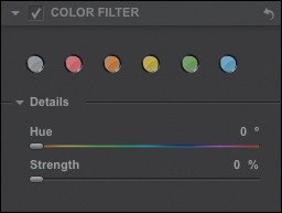
Figure 8.6. The Color Filter section
The Film Types section in Silver Efex Pro 2 simulates the grain quality, spectral sensitivity, and tonal curves of 18 different black-and-white films (Figure 8.7). These simulated films include those available and once available, from Agfa, Fuji, Kodak, and Ilford. They are great options to explore as a beginning step for editing the image, because the adjustments will affect the overall brightness, contrast, and tonal relationships of the image.
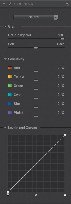
Figure 8.7. The Film Types section
The Grain subsection has two sliders: the Grain Per Pixel slider and the Soft/Hard slider. The Grain Per Pixel slider controls the amount of grain introduced into the image. The smaller the number on the Grain Per Pixel slider, the more noticeable the grain will be in the image, because each pixel will be made up of larger grain elements. The Soft/Hard slider controls the contrast between the grains introduced, offering a fine-tune control for the grain’s appearance.
The Sensitivity, Levels, and Curves controls of the Film section provide tools to control how the image globally translates colors into tones and the overall tonal curve of the image.
The Finishing Adjustments section of Silver Efex Pro 2 provides tools to add a finishing touch to your image when you have completed your major editing (Figure 8.8). The Finishing Adjustments contain controls for toning, adding vignettes, burning in the edges of an image, and applying image borders.
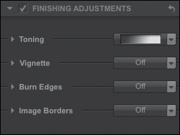
Figure 8.8. The Finishing Adjustments section
The Toning section of Silver Efex Pro 2 adds tints to the image, many of which are based on traditional toning solutions used in traditional film photography (Figure 8.9). There are also tools to fine-tune the toning on the image or to create your own tone using the Silver Hue and Paper Hue sliders. The Silver Hue slider adds a tint to the dense areas (or shadows) and the Paper Hue slider adds a tint to the highlighted areas. The Balance slider controls where the two sliders will interact in the midtones.
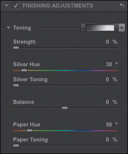
Figure 8.9. Toning section
The Vignette controls allow you to evenly add a lightening or darkening effect to all edges of the image (Figure 8.10). The sliders control the lightness or darkness of the effect, its shape, how much of it goes into the image, and around what the effect is centered.
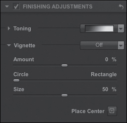
Figure 8.10. Vignette section
The Burn Edges controls allow you to add density to any edge (Figure 8.11). The controls adjust the edge’s darkness, the extent of the area affected, and how quickly or slowly it transitions from the full effect to no effect. There are also four separate controls so that each edge can have an effect that is unique.
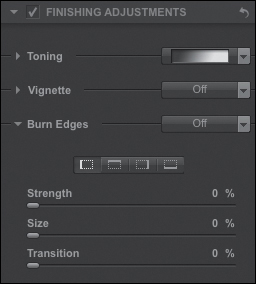
Figure 8.11. The Burn Edges section
The Image Borders section adds stylistic borders that mimic film borders that you might have obtained with filed negative carriers when printing in the darkroom (Figure 8.12).

Figure 8.12. The Image Borders section
Image 1: Using a Single Silver Efex Pro 2 Smart Filter Layer
The image that you will use for the first lesson in this chapter is the same one that you used in the second lesson of the previous chapter. For both this image, as well as the second one in this chapter (which was the first image you worked on in the previous chapter), you will, once again, run an action. By now, you should have watched the QuickTime tutorial for this chapter. If an idea or concept has already been discussed in this book, or in the QuickTime tutorial, it will not be repeated and only the steps will be listed. I have not, however, left out any critical step. My focus from this point forward is directed to the aesthetics of choice—the whys of what you will do—because you should already have a good understanding of the hows.
Step 1: Running the oz 2 Kansas Action
Pre-Step:
If you have just installed the Silver Efex Pro 2 plug-in or if you are planning to run it in demo mode, it is important to run it at least once before you run any of the actions that use it. Also, if you are running in demo mode, when you launch Photoshop, you may need to open the plug-in before you run the action. This is because when the plug-in is in demo mode it launches the registration window with every new launch of Photoshop.
You have to do this because there is no way to tell an action to be aware of these circumstances. Actions expect things to happen the same way every time, and this issue only occurs some of the time. To save yourself the hassle of unwanted issues, and to practice a little preemptive tech support, if you are running the plug-in in demo mode, open up the plug-in before you run the action.
1. Open the file MIST_OZ_CH08.tif (located on the download page for this book).
This is the same file that you worked on in the previous chapter. There is an additional copy of this image in the Chapter 8 section of the download page to make it more convenient for this lesson.
Also there is a variation of this action that will combine the Multiple Channel Mixer approach with the creation of a Silver Efex Pro 2 Smart Filter.
2. From the Actions panel, open the OZ_2_K_ACTIONS_12 actions set by clicking on the disclosure triangle located to the left of the folder.
3. Click on the SEP2_ONLY action to make it active.
4. Click on the Run Action button located at the bottom of the Actions panel. This will start the action.
5. The action will create a Master layer, duplicate the file, and open the Save As dialog box.
6. In the Save As dialog box, the file is named SEP_SINGLE_SA.psb. Add MIST_OZCH8_ to the beginning of the file name so that it becomes MIST_OZCH8_ SEP_SINGLE_SA.psb.
7. Locate the OZ_2_K_IMAGES folder, open it, and click Save. The MIST_OZCH8_SEP_SINGLE_SA.psb file is now saved to that folder.
Step 2: The Creation of a Single Silver Efex Pro 2 Smart Filter Layer
This variation of the Silver Efex Pro 2 action goes through a series of “under the hood” events that are designed to maintain both a non-destructive (as well as an exit strategy) approach to image editing workflow. Once the action has saved the file on which you are running the action, it will duplicate the layer, make it a Smart Filter, and then launch the Silver Efex Pro 2 plug-in. The Silver Efex Pro 2 dialog box will be open set to its default setting—Neutral Preset. You should see this (Figure 8.13).
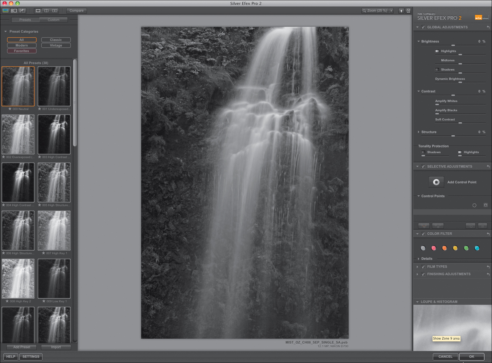
Figure 8.13. The Silver Efex Pro interface
Use the keyboard command F, if you want to put the Silver Efex Pro 2 plug-in into full-screen mode when the Silver Efex Pro dialog box is open.
Also, you can scroll through the Preset menu using the up and down arrow keys, something that I suggest you do. However, for both of the images used in this chapter’s lessons, you will use the Neutral Preset.
As you look at the image, think about what aspects of it you like as well as what you might like to change. Whenever you are analyzing any of your images and find yourself saying, “I hate this image,” before you delete it, consider this—it is not the image that you do not like, it is aspects of the image that you do not like. When you decided to take the image, or ideally, when you were taken by the image, something compelled you to fire the shutter. In that moment, you liked the image. Hopefully, if you did not like it, you would not have taken it. So, instead of abandoning the image, take a moment or two and analyze its individual components. For example, if you find yourself with an image that you do not like because it is made up mostly of reds, it is not that you do not like the color red; rather it is that you do not like aspects of the color red in that particular image. Think a moment. If you have a photograph that is mostly red, at the moment of capture, it must have been the red that captured you. What you have is an image with aspects of the red that you do not like. Perhaps you think that the red is too flat and lacks contrast. If that is the case, then what you must do is to increase the saturation and boost the contrast. If the reds are too orange, you will need to lower the yellow content of the red. When you analyze your own images, think of them in a positive way; think about what they can become. Also, when thinking about what you will do with an image, ask yourself simple questions—ones in which the answers are as close to yes or no as possible. The seemingly complex question of what to do with an image is actually made up of many simple choices.
Step 3: Analyze the Image Using Loupe & Histogram
In the Silver Efex Pro 2 dialog box, look at the image on which you are working. If you move down to the lower right-hand corner of the dialog box, you will find the Loupe & Histogram part of it. There you will find a series of squares that are numbered from 0 to 10 and range from black to white. These 11 squares are the 11 zones of the Zone System that I discussed in Chapter 6. Normally, one of the first things that I do when I use Silver Efex Pro 2 is to see into which zones the image structures and image textures of my image fall. Also, I find that the Histogram information is more helpful than the default Loupe mode.
8. Click on the Loupe & Histogram section. To open it if it is closed, click on the disclosure triangle. (Figure 8.14).
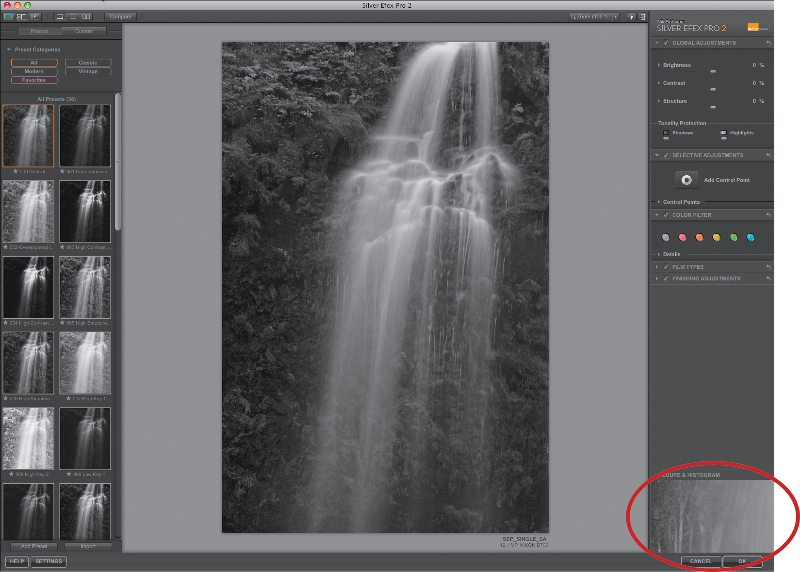
Figure 8.14. Showing the Loupe & Histogram section
9. Click on Histogram (Figure 8.15).
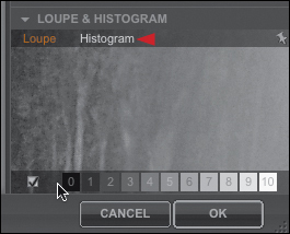
Figure 8.15. The Histogram area
The histogram shows that the image structures fall mainly in the lower and mid-zones with very few in the upper zones. Next, you will use the Zone Scale located at the bottom of the Loupe & Histogram dialog box to see into what zones your image structures and textures fall.
10. Starting from the left and moving to the right, individually and collectively, click on and off the gray squares 1, 2, and 3. This shows you which areas of the image fall in each of those zones. (Each zone is represented as a series of colored lines.) This is what you should see if gray squares 1, 2, and 3 are turned on (Figure 8.16).

Figure 8.16. The image after turning on zones 1, 2, and 3
11. Click off the gray squares 1, 2, and 3 (if you have not already). Individually and collectively, click on and off the gray squares 4, 5, 6, and 7. This shows you which areas of the image fall in each of those zones. (Again, each zone is represented as a series of colored lines.) This is what you should see if gray squares 4, 5, 6, and 7 are turned on (Figure 8.17).
Figure 8.17. The image after turning on zones 4, 5, 6, and 7
12. Click off the gray squares 4, 5, 6, and 7 (if you have not already). Moving right to left this time, individually and collectively, click on and off the gray squares 8, 9, and 10. This shows you which areas of the image fall in each of those zones. (Again, each zone is represented as a series of colored lines.) This is what you should see if gray squares 8, 9, and 10 are turned on (Figure 8.18).
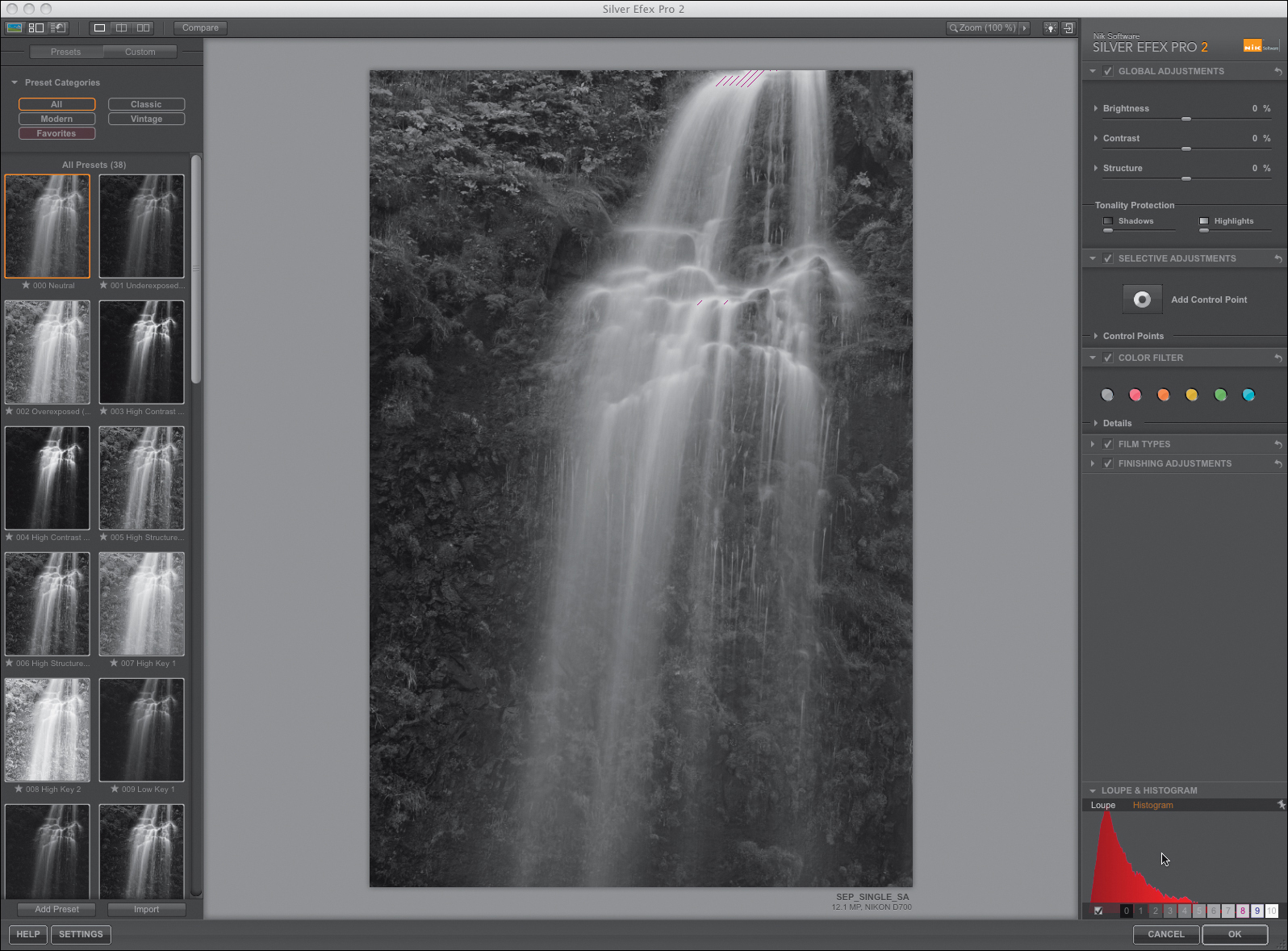
Figure 8.18. The image after turning on zones 8, 9, and 10
You should have observed that the image structures are heavily weighted to Zones I—III in the rock and foliage area, while the waterfall falls exclusively in the mid-zones, specifically Zones IV—VII. Except for two very small areas at the top of the waterfall and one directly in the middle of its main section, there are no significant image structures in any of the upper Zones, specifically Zone IX—X. Knowing where the tonality of the image structures lie is extremely important before you make aesthetic decisions about your image.
What you know about this image is the following:
• Because most of the image structures fall in the lower zones, you will need to pay attention to not creating more Zone I and Zone 0 areas (unless that is the desired effect you want).
• You can, should you decide to, deepen (darken) the Zone III and IV image structures and image textures.
• There are some image structures in the upper left of the image that contain mid-zone values. You should move those structures into the lower zones because, if the area in the upper left-hand corner is the same brightness as areas of the waterfall, potentially, the viewer’s eye may be pulled from the waterfall to that area of the image. As I discussed in Chapter 3, you want the viewer’s eye to go first to the waterfall (the primary isolate) and then to areas like those in the upper left-hand corner that are secondary isolates.
This brings me to a discussion of the waterfall image structures and textures. These structures and textures fall almost exclusively in the mid-zones. One of the things that you want to achieve in this image is a sense of dimensionality, a sense that the image appears to have three dimensions and a depth that you can almost feel. Also, you want to control where the viewer’s eye goes first and where it lingers longest.
One of the primary goals for which you should strive as you edit the image is to have complete control of both the viewer’s unconscious and conscious eye (For a complete discussion, see: Believing Is Seeing: The Way the Eye “Sees” What it Saw, in Chapter 1.) Specifically, you should control how the viewer’s unconscious eye tracks through your image and how the viewer’s conscious eye sees the story that you want to tell. Once you have an understanding of what the goals are for this image, you must to decide how you will attain them.
Sometimes an image is best served by using more than one Silver Efex Pro 2 layer. How I determine whether to use a single or multiple Silver Efex Pro 2 Smart Filter approach is by going to the Color Filter section and clicking on each of the individual filters.
The power of using more than one Silver Efex Pro 2 layer is the focus of the next lesson in this chapter.
13. Click on the disclosure triangle for the Color Filter section, if it is not already open (Figure 8.19).
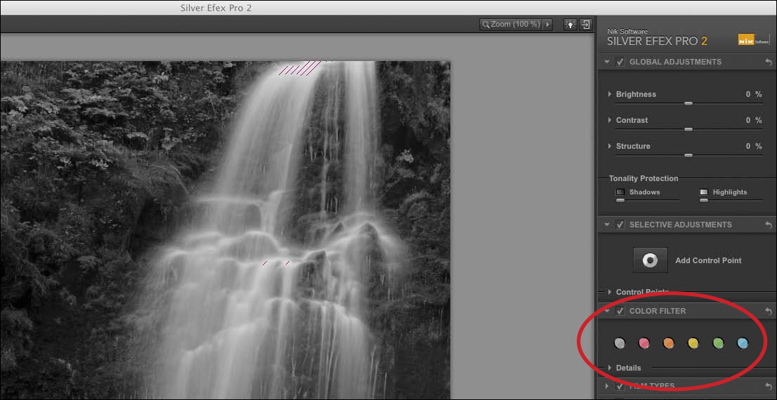
Figure 8.19. The Color Filter section
14. Click on each of the Red, Orange, Yellow, Green, and Blue Filter icons.
15. Click on Clear Filter, the one all the way to the left of the Color Filter set of icons.
After clicking on the Red, Orange, Yellow, Green, and Blue filter icons located in the Color Filter section, you should have seen almost no change in image structure detail in the Red through Green filters. However, a noticeable change occurred when you clicked on the Blue filter. Because of this (and the fact that, although the Blue filter achieves some of the goals in the lower zone areas of the image, it flattens too much of the contrast when applied) so a single Silver Efex Pro 2 Smart Filter layer approach appears to be the best idea (Figures 8.20, 8.21, 8.22, 8.23, and 8.24).
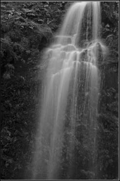
Figure 8.20. The Red filter

Figure 8.21. The Orange filter

Figure 8.22. The Yellow filter
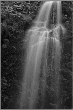
Figure 8.23. The Green filter
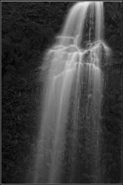
Figure 8.24. The Blue filter
Step 4: Global Adjustments
Once you have defined how you want to control the viewer’s eye, it is time to implement those choices. Because brightness and contrast are intertwined with each other (brightness being a range from light to dark and contrast being the ratio between light and dark), I have found that with the Silver Efex Pro 2 plug-in, it is often best to start by adjusting the overall image brightness and darkness. Keep in mind that dark is as important to an image as is light. When I approach working with light, be it in the field or in post-processing, I conceptualize it and treat it as if it were a solid object.
In this step, you will do a global adjustment to this image’s brightness, contrast, and structure using the tools to be found in the Global Adjustments part of the Silver Efex Pro 2 interface (Figures 8.25 and 8.26).
Figure 8.25. The Global adjustments
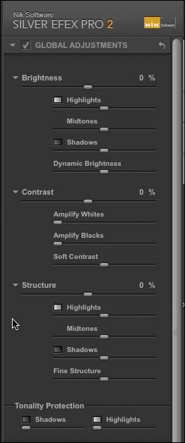
Figure 8.26. The expanded Global adjustments section
Brightness Adjustments
The Brightness area of the Global Adjustments section is broken into five control sliders: Brightness, Highlights, Midtones, Shadows, and Dynamic Brightness. Brightness affects the image’s overall light-to-dark appearance, Highlights focuses on brightening or darkening just the highlight areas, Midtones focuses on brightening or darkening just the midtone areas, Shadows focuses on brightening or darkening the shadow areas, and Dynamic Brightness affects the highlights and shadows of the more midtone areas.
16. Click on the Brightness slider. What you will do should be based on how you want the viewer’s eye to move through the image. I suggest that you start by darkening the image, so move the slider to the left until you reach the desired effect. I chose -16% (Figure 8.27).

Figure 8.27. Decreasing the Brightness slider to -16%
Now that you have set the image’s global brightness, fine-tune its individual components.
17. Click on the Midtones slider and move it to the right until you obtain the desired effect. I chose 29% (Figure 8.28).
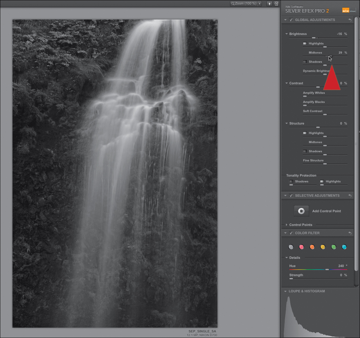
Figure 8.28. Increasing the Midtones slider to 29%
18. Click on the Shadows slider and move it to the left until you get the desired effect. Again, this decision is based on the observations that were made in Step 3. For this image, I selected -15% (Figure 8.29).

Figure 8.29. Decreasing the Shadows slider to -15%
19. Click on the Dynamic Brightness slider and move it to the left, until you reach the desired effect. I opted for -15% (Figure 8.30).
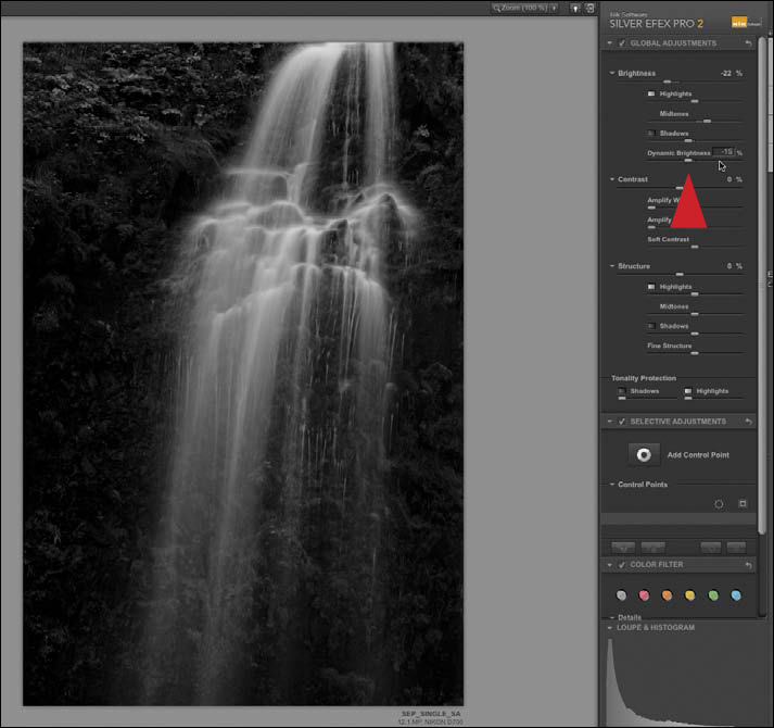
Figure 8.30. Decreasing the Dynamic Brightness slider to -15%
20. Click back on the overall Brightness slider and move it to the right until you obtain the desired effect. I chose -13% (Figure 8.31).

Figure 8.31. Moving the Brightness slider to -13%
At the bottom of the Global Adjustments part of the Edit menu is the Tonality Protection dialog box. It has two sliders that allow you to set limits for how the shadow areas and the highlight areas are affected. (They function in a similar way to the Blend If sliders in the Layer Styles dialog box.)
Next, you will protect the shadow areas, specifically the Zone 0, Zone I, and Zone II image structures and textures.
21. Click on the Shadows slider in the Tonality Protection section and move it to the right until the blocked up areas in the rocks to the left of the waterfall and foliage open up. The setting that I selected was in the middle of the slider (Figure 8.32).
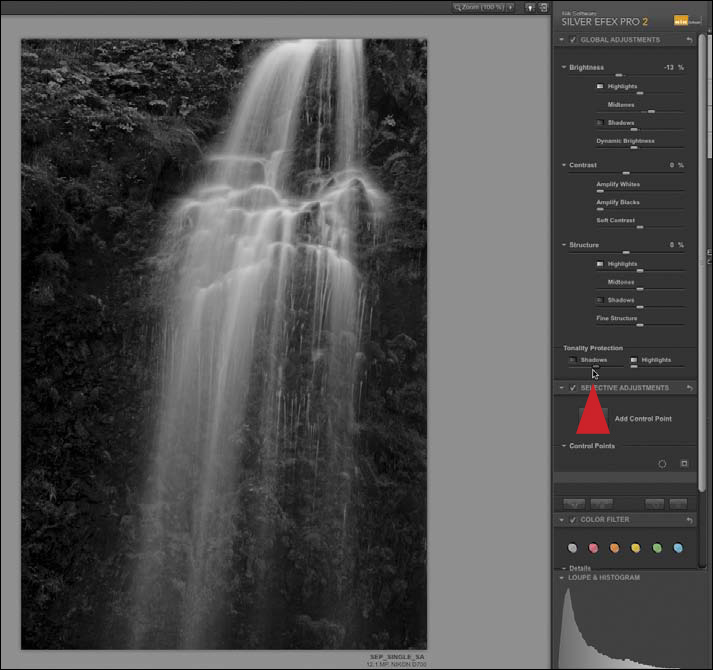
Figure 8.32. Increasing the Shadows slider in the Tonality Protection section
The Tonality Protection functionality is capable of protecting only what is in the image. Tonality Protection will not work on blown-out highlights or blocked-up shadows, because there is nothing there to protect.
Contrast Adjustments
You have set the global brightness and addressed the issues of both the light and dark aspects of the image, so it is time to globally adjust contrast. In the Contrast part of the Global Adjustments section, you will see a Global Contrast slider, an Amplify Whites slider, an Amplify Blacks slider, and a Soft Contrast slider. The Amplify Whites slider targets the upper end of contrast while the Amplify Blacks slider targets the lower end. The Soft Contrast slider works on contrast in the same fashion as Dynamic Brightness works on the elements of brightness.
22. Click on the Amplify Whites slider and move it to the right until you reach the desired effect. I chose 20% (Figure 8.33).
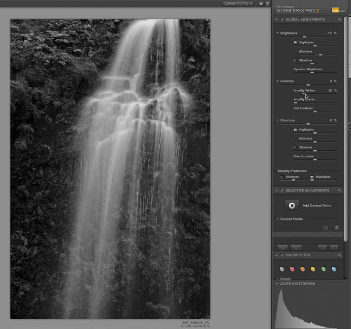
Figure 8.33. Increasing the Amplify Whites slider to 20%
23. Click on the Soft Contrast slider and move it to the right until you reach the desired effect. I selected 32% (Figure 8.34).
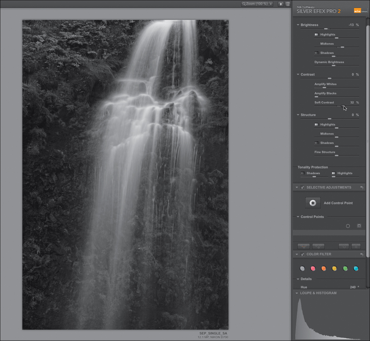
Figure 8.34. Increasing the Soft Contrast slider to 32%
Structure Adjustments
One of the many functionalities that sets Silver Efex Pro 2 apart from any other dedicated black-and-white conversion software is the Structure algorithm. Think of Structure as the Clarity tool on steroids. Though many images require global Structure adjustments, this image requires greater finesse, so you will use a granular (selective) rather than a global approach.
Step 5: Selective Adjustments
The Selective Adjustments section utilizes Nik Soft-ware’s application of U Point technology in the form of control points. The control points in Silver Efex Pro 2 are even more refined than those in Capture NX 2 (as discussed in the Rubbing Your Nikon RAW File the Right Way PDF located on the download page for this book). The control points in SEP 2 are Nik Software’s most updated version and work the same way and are as responsive as the implementation in Viveza 2. The control point approach to selection affords you unheard-of accuracy.
In these next steps, you will selectively lighten and darken the image, increase its contrast, and introduce Structure improvements to the image.
24. In the Selective Adjustments dialog box (click on the disclosure triangle if the Selective Adjustments dialog box is not open), click on the Add Control Point icon (Figure 8.35).

Figure 8.35. The Add Control Point button
25. Place the targeting cursor on the area that you would like the control point to influence and click or place the control point (Figure 8.36).
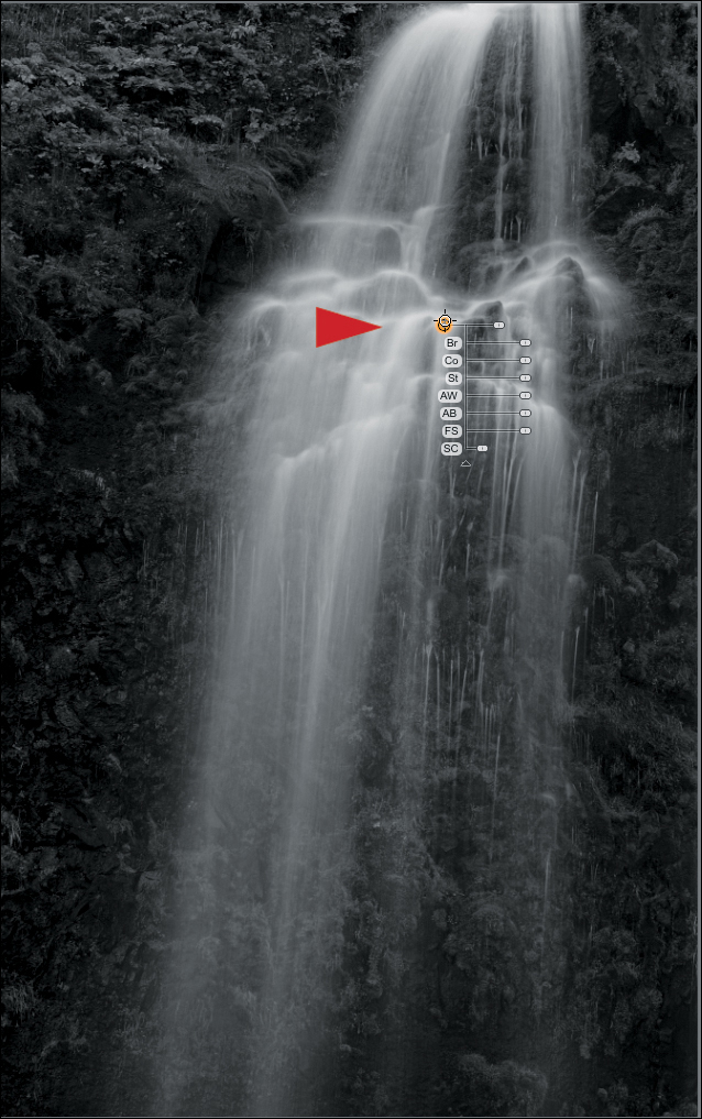
Figure 8.36. Adding a control point to the waterfall
You should notice that there are a series of letters along the center bar and a series of sliders.
The Slider / Letter Position can change sides depending on the location of the control point within an image. For example, if a control point is close to the bottom of the image, the centerline, letters, and sliders will be on the top of the main radius bar slider. If the control point is close to an edge of the image, the letters and sliders will change position. This occurs so that you can more easily and efficiently access the sliders.
You can see the area influenced by a control point by clicking on the checkbox in the Selective Adjustments dialog box to the right of the active control point in the right side of the interface.
You can also use the Zone identifier, the one you used to analyze the image at the beginning of lesson (located in the Loupe & Histogram part of the interface), to see how you are impacting the brightness and darkness of your image.
Lastly, you can control the control points with the arrow keys. The up and down arrow keys move you up or down through the different control point adjustments. The left and right arrow keys increase or decrease the effect.
26. Click on the Co (Contrast) slider and move it to the right (to increase the contrast) until you obtain the desired effect. I selected 49% (Figure 8.37).
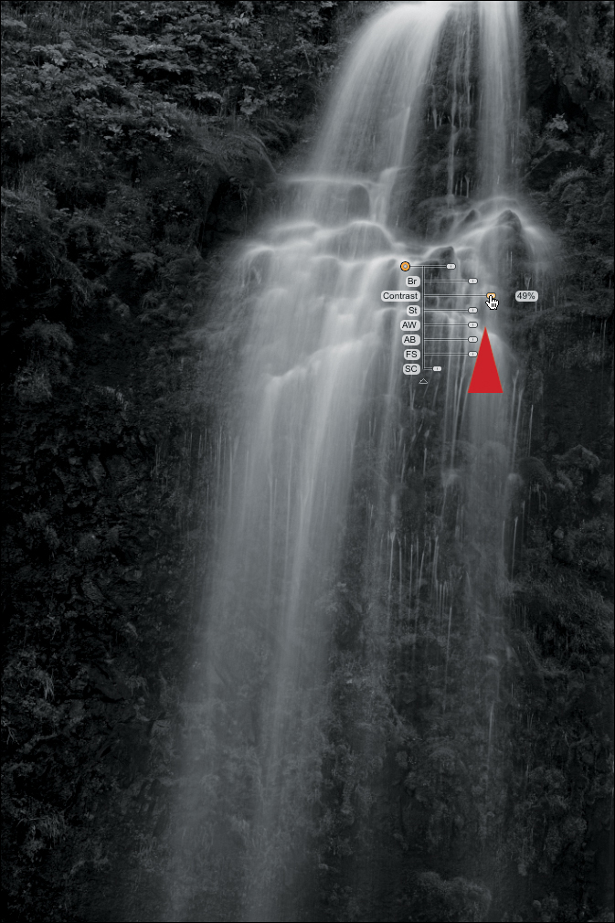
Figure 8.37. Increasing the Contrast slider to 49%
27. Click on the Br (Brightness) slider and move it to the right until you achieve the desired effect. I chose 25% (Figure 8.38).
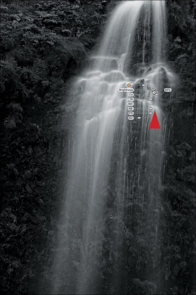
Figure 8.38. Increasing the Brightness slider to 25%
28. Click on the AW (Amplify Whites) slider and move it to the right until you get the desired effect. I elected to use 44% (Figure 8.39).

Figure 8.39. Increasing the Amplify Whites slider to 44%
29. Click on the St (Structure) slider and move it to the right until you obtain the desired effect. I chose 52% (Figure 8.40).

Figure 8.40. Increasing the Structure slider to 52%
30. Click on the FS (Fine Structure) slider and move it to the right until you achieve the desired effect. I selected 52% (Figure 8.41).
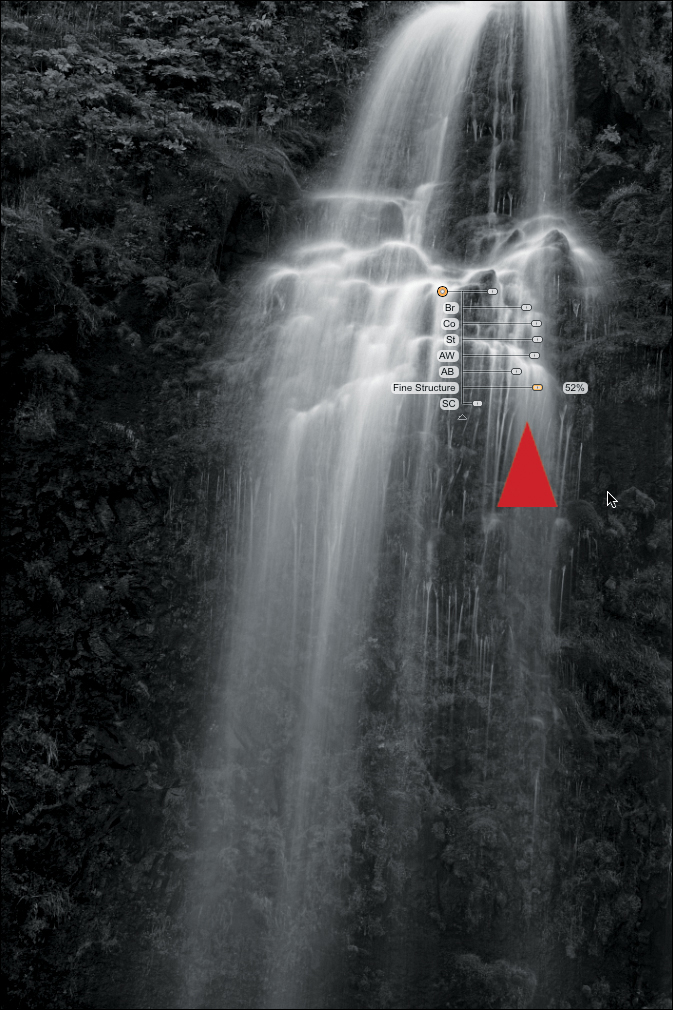
Figure 8.41. Increase the Fine Structure slider to 52%
You worked on this area first because this is the primary isolate of the image and, as such, it is the area of the image that you want the viewer’s eye to go to first and the area of the image to which you want their eye to return as they journey through the image.
You edited the image in this order based on the needs of the image, not based on some preconceived rule or notion. When it comes to image editing, this is the way most workflow decisions should be made. In this image, you worked on contrast first, because there are abutting dark and light areas. By increasing the overall contrast, both of these areas tended to darken. This is why the second adjustment was to the image’s brightness. Then, because you want the viewer’s eye to be drawn first to the main part of the waterfall, the next fine adjustment was to Amplify Whites. You did not use the Amplify Blacks adjustment because you did not want to darken the darks anymore than they already were. Next, you applied Structure to obtain finer contrast control in the mid-tone image structures of the waterfall. Fine Structure was used last because it provided you with even more granular control of localized contrast so that you could introduce granularity into the waterfall’s mist, reinforcing the illusion of motion. And all of this was achieved by applying just one control point. To emphasize the significance of this fact, here is the area affected by the control point that you have just adjusted (Figure 8.42).
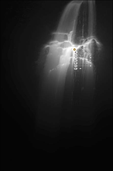
Figure 8.42. The area of influence
31. Click on the Add Control Point icon. Place the targeting cursor on the area of the upper waterfall (Figure 8.43).
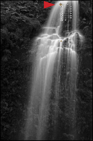
Figure 8.43. Adding a control point to the waterfall
32. Click on the Co (Contrast) slider and move it to the left (to decrease the contrast) until you obtain the desired effect. I selected -29% (Figure 8.44).
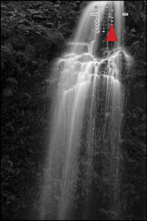
Figure 8.44. Decreasing the Contrast slider to -29%
33. Click on the Br (Brightness) slider and move it to the left (to decrease the brightness) until you achieve the desired effect. I chose -39% (Figure 8.45).

Figure 8.45. Decreasing the Brightness slider to -39%
34. Click on the Add Control Point icon. Place the targeting cursor on the area of the lower left part of the waterfall (Figure 8.46).
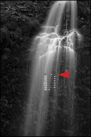
Figure 8.46. Adding a control point to the lower waterfall
35. Click on the Co (Contrast) slider and move it to the right (to increase the contrast) until you get the desired effect. I elected to use 29% (Figure 8.47).
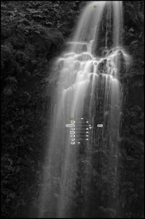
Figure 8.47. Increase the Contrast slider to 29%
You made adjustments to the upper and lower parts of the waterfall in order to create the illusion of depth; of three dimensionality. To achieve this, you diminished the contrast and darkened structures of the water because the upper part of the waterfall is the farthest from the foreground. The lower part of the waterfall, specifically the mist and falling water, is the most forward of all the image structures. By increasing the contrast between those image structures and the rocks and foliage behind them, you further intensified the feeling of three dimensions.
There are two more areas in this image that need to be addressed. They are the upper left-hand corner of the image and the area of the rocks to the left of the waterfall—midway down. The upper areas of the left-hand corner image are a little too bright and the rock and foliage structures to the left of the fall (in the middle of the image) are a little blocked up. The next series of adjustments will address these issues.
36. Click on the Zoom icon. (I set mine to 100%.) You should see this (Figure 8.48).
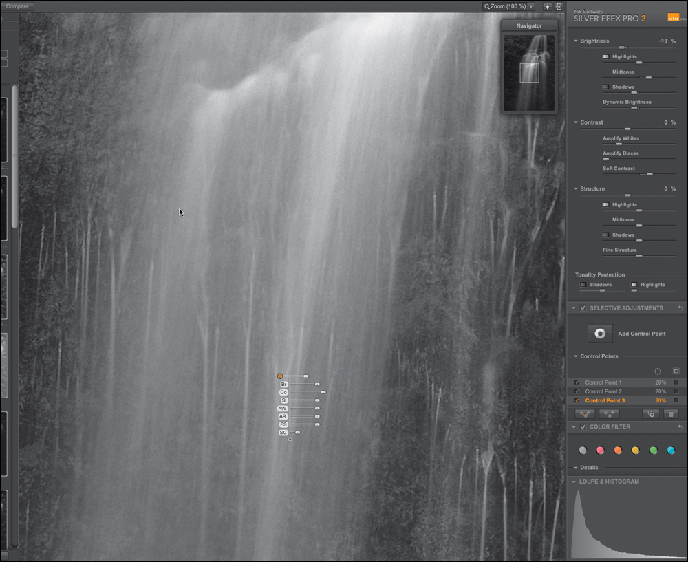
Figure 8.48. Zooming in
37. In the Navigator window, move the square until the upper left-hand corner of the image are in the main window. (Figure 8.49).
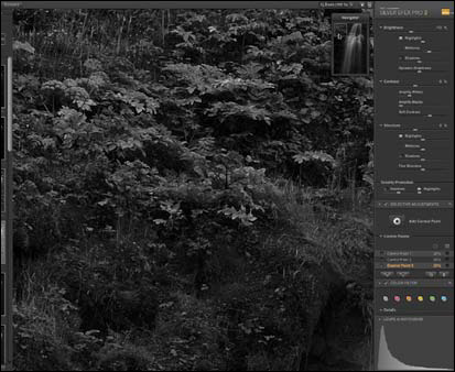
Figure 8.49. Moving to the upper left-hand corner of the image
38. Click on the Add Control Point icon. Place the targeting cursor on the area of the upper waterfall (Figure 8.50).

Figure 8.50. Adding a control point to the upper left area
39. Click on the Br (Brightness) slider and move it to the left (to decrease the brightness) until you obtain the desired effect. I chose -45% (Figure 8.51).
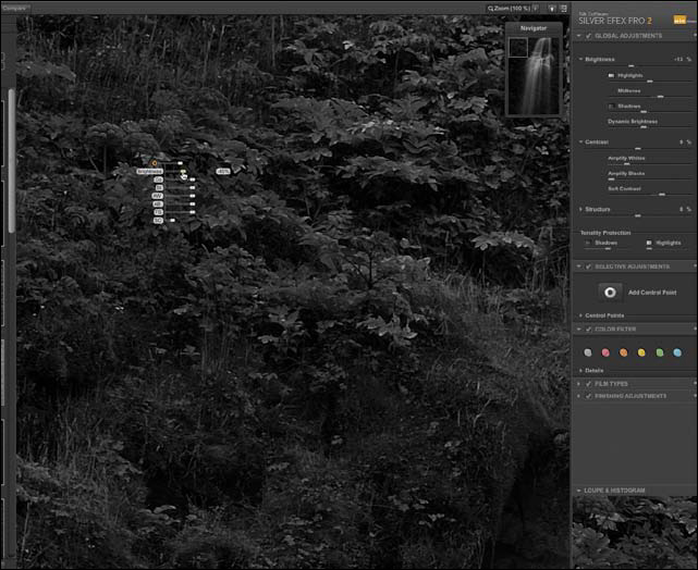
Figure 8.51. Decrease the Brightness slider to -45%
40. Duplicate the control point (Command + D / Control + D) and move it slightly upward and slightly to the right of the control point that you just duplicated (Figure 8.52).
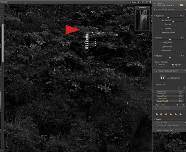
Figure 8.52. Duplicate the control point and move it up and to the right
41. Zoom out until the entire image is back in view (Command + - / Control + -).
42. Click on the Add Control Point icon. Place the targeting cursor on the area to the left of the main part of the waterfall (Figure 8.53).
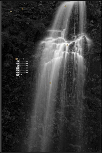
Figure 8.53. Adding a control point to the left of the waterfall
43. Click on the Br (Brightness) slider and move it to the right until you achieve the desired effect. I selected 15% (Figure 8.54).
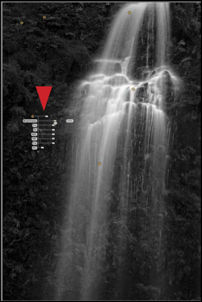
Figure 8.54. Increasing the Brightness slider to 15%
44. Click OK.
The Photoshop action will restart, create a Master layer, save the file that you have just created, duplicate the file, flatten the image, and save the duplicated file as a TIFF. This should be the only file that is left open on your desktop. You should see something like this (Figures 8.55 and 8.56). In the Info panel, notice that the main sample point (sample point 2) registers at 247 (the beginning of Zone IX, the significance of which was discussed in great length in the previous chapter).
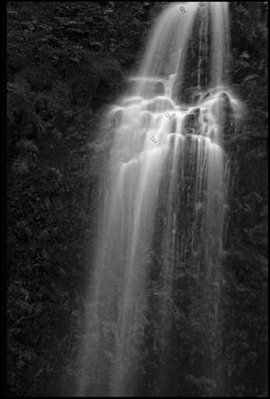
Figure 8.55. The image
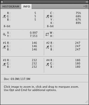
Figure 8.56. The Info panel
Image 2: The Harmonics of Chording—The ABCs of Playing the RGBs
He who doesn’t risk does not get to drink champagne.
—Russian Proverb
The concept of chording with an image is something you did in both Chapter 2 and in the previous chapter. Image chording is the technique of using variations of the same type of adjustment and blending them to create a harmony that results in a visually pleasing effect in your image. That is what you did with the individual Channel Mixer adjustment layers that you balanced for green, red, and blue. In this lesson, you will apply the same concept but, instead of using four Channel Mixer adjustment layers, you will use four Silver Efex Pro 2 Smart Filter layers: one balanced for neutral, one balanced for green, one balanced for red, and one balanced for blue.
The differences between the Multiple Silver Efex Pro 2 Smart Filter layer approach and the Multiple Channel Mixer adjustment layer approach are: 1) In the Multiple Channel Mixer adjustment layer approach, the Neutral Channel Mixer adjustment layer is on top, while in the the Multiple Silver Efex Pro 2 Smart Filter layer approach the Neutral layer is on the bottom; 2) The Multiple Channel Mixer adjustment layer approach consists of using adjustment layers that do not contain any pixel data and are layers of math overlaying the pixel data (meaning that, even though you are causing a visual change to the image, you are not changing the actual pixels themselves). In the Silver Efex Pro 2 Smart Filter layer approach, because the layers do contain actual pixel data, the resulting file size is considerably larger. 3) In the Multiple Channel Mixer adjustment layer approach, you control only the channels, but in the Silver Efex Pro 2 Smart Filter layer approach, you have control over every aspect of the image. (The considerable function of the Silver Efex Pro 2 plug-in is described in both the QuickTime tutorial and in The Black and White on the Silver Efex Pro 2 User Interface section at the beginning of this chapter.)
Step 1: Running the SEP 2 RGB Chording Action
The technique that you are about to use works well on both landscapes and portraits. Once again, you will use the same image as you did in the previous chapter, because the last part of this lesson will be to blend the Multiple Channel Mixer adjustment layer approach with the one that you are about to do. Be aware that you can blend the Multiple Channel Mixer adjustment layer approach with either a single Silver Efex Pro 2 or a Chorded Silver Efex Pro 2 layer. Every chromatic grayscale conversion technique that you have learned in this book can be used with every other technique in this book. Your goal is to produce the best possible image and it does not matter what journey you take to get there.
1. Open the file named LILAN_OZCH8.tif. (For convenience, a copy of this file is located in the Chapter 8 section of the download page for this book.)
2. As you did in the previous chapter, from the Actions panel, open the OZ_2_K_12 actions set by clicking on the disclosure triangle located to the left of the folder.
3. Click on the SEP2_RGB_CHORDING action to make it active.
4. Click on the Run Action button located at the bottom of the Actions panel to start the action.
5. The action will duplicate the file and open the Save As dialog box.
6. In the Save As dialog box, the file is named SEP_RGB_CORD.psb. Add LILAN_OZ_CH08 to the beginning of that name so that it becomes LILAN_OZ_CH08_SEP_RGB_CORD.psb.
7. Locate the folder OZ_2_K_IMAGES and save the LILAN_OZ_CH08_SEP_RGB_CORD.psb file to it.
Once you have saved the file LILAN_OZ_CH08_SEP_RGB_CORD.psb, the SEP2_RGB_CHORDING action will go through a series of “under the hood” events.
• The action will create a layer set,
• name the layer set SEP_RGB_CHORD,
• duplicate the base layer,
• place that layer in the layer set,
• convert the copied base layer into a Smart Filter,
• open the Silver Efex Pro 2 plug-in,
• set it to the Neutral preset (see the following note),
• duplicate that layer three times,
• and then set one of the Silver Efex Pro 2 Smart Filter layers to the Neutral preset with the Green filter, another one to the Neutral preset set to the Red filter, and the last one to the Neutral preset set to the Blue filter.
The NEUTRAL layer is there to ensure that no color will bleed through if you do brushwork on the GREEN, RED, and BLUE layers. This does not mean that you cannot make adjustments to the NEUTRAL layer or that you cannot use it as the base layer, which you may want to do. When you are creating anything, the answer to every question should be “yes.” “Yes” keeps creative motion moving forward, while “No” stops it. For example, “Can I make an adjustment on the NEUTRAL layer?” The answer is “yes.” Or “Should I take a few more shots?” The answer is “yes.”
What the action that you are running is doing is the same in concept as the action that you ran in the previous chapter, but with layers that have pixels in them instead of adjustment layers. You now have three layers on which you can do brushwork and with which you can address the RGB aspects of the image. You also have one layer to guarantee that you will have no color bleed from the RGB layers above it. Once again, the Green layer is the first of the “color” layers for the same reasons that I discussed in the previous chapter. The Neutral layer is on the bottom instead of the top, because the layers that you just created are solid whereas the Channel Mixer adjustment layers were transparent.
Once the action has created a Neutral, Green, Red, and Blue Silver Efex Pro 2 Smart Filter layer, a dialog box appears with the statement, “The Action will now show you the individual SEP 2 layers, starting with the NEUTRAL layer. Observe what you like and like less about each of the separate layers.”
8. Once you have made your observations about the NEUTRAL layer, click on Continue (Figure 8.57).
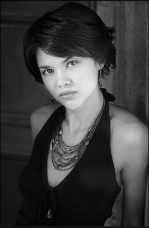
Figure 8.57. The Neutral SEP2 layer
9. The action will then show you the GREEN layer as it did for the NEUTRAL one. Once you have made your observations about the GREEN layer, click on Continue (Figure 8.58).
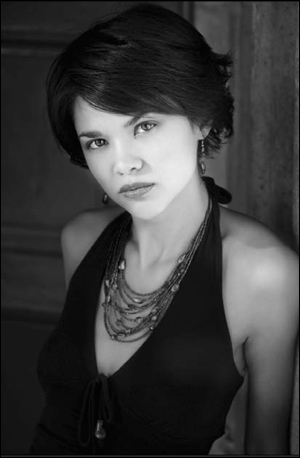
Figure 8.58. The Green layer
10. The action will then show you the RED layer as it did for the GREEN one. Once you have made your observations about the RED layer, click on Continue (Figure 8.59).

Figure 8.59. The Red layer
11. The action will then show you the BLUE layer as it did for the RED one. Once you have made your observations about the BLUE layer, click on Continue (Figure 8.60).
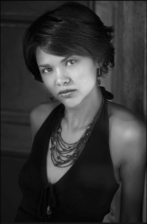
Figure 8.60. The Blue layer
12. A dialog box will now appear, which reads, “The Action will now open the individual layers starting with NEUTRAL so you can do individual layer-specific adjustments based on what you liked and disliked about each of the individual layers. Adjust these first before any order change.” Click on Continue.
Step 2: Fine-Tuning the Individual Neutral, Green, Red, and Blue Silver efex Pro 2 Smart Filter Layers
Keep several things in mind as you work on the individual Silver Efex Pro 2 Smart Filter layers. First, you can do brushwork on only three of the four layers. Second, because you can do adjustments on all four layers (should you choose to), whatever layer you decide should be at the bottom of the layer stack (even though all four layers have layer masks) is the one on which you will not do brushwork. Third, you can select one of the presets at any time or change the layer order. If you do, you can fine-tune your adjustments because all of the layers are Smart Filters. One of the advantages of using the Silver Efex Pro 2 plug-in is that it factors in Hue when it does a chromatic grayscale conversion.
Throughout this book, you observed that the red, green, and blue channels of your image contained different representations of the image in grayscale. Not only does each of these channels have different grayscale representations of the image, a channel may also contain data not found in one or the other two channels. By approaching chromatic grayscale conversion with this understanding, you not only access the grayscale representation of the individual color channels—you can also use all of the power tools and controls of the Silver Efex Pro 2 plug-in on each channel.
Take a look at what there is to like and dislike about the NEUTRAL, GREEN, RED, and BLUE layers. Begin with the GREEN Silver Efex Pro 2 layer. The green channel tends to hold the most of the midtone contrast and structure information. Because of this, the GREEN Silver Efex Pro 2 layer is the one best suited to be the primary one. The issues with this layer are that the model’s forward shoulder is a little hot and the left side of her face (the one closest to the background) needs to be opened up a little.
NEUTRAL Silver efex Pro 2 Layer
13. With the NEUTRAL Silver Efex Pro 2 dialog box open, make no adjustment and click OK. The action will close the NEUTRAL Smart Filter and open up the GREEN Silver Efex Pro 2 dialog box.
You can make adjustments on the NEUTRAL layer. For example, you may like how the Neutral preset looks and want to use it to darken or lighten aspects of the image. This was not the case for this image. Remember that the only layer on which you can do no brushwork is the bottom-most Silver Efex Pro 2 Smart Filter layer.
GREEN Silver Efex Pro 2 Layer
14. Click on the Add Control Point icon located in the Selective Adjustments part of the Edit menu. Click on it and place the control point on the upper part of the subject’s forehead (Figure 8.61).
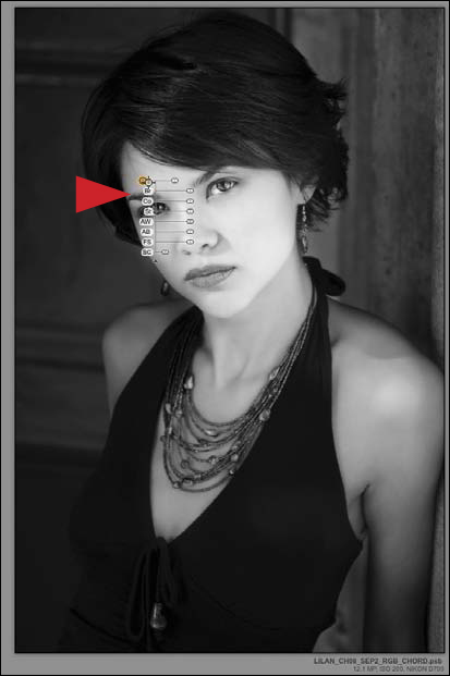
Figure 8.61. Placing a control point on the forehead
15. In the Control Point set the brightness (Br) to 32%, the contrast (Co) to 9%, and the Amplify Whites (AW) to 24%.
16. Duplicate the control point (Command + D / Control + D) that you just created and adjusted, and move it to just under her back eye (Figure 8.62).
Figure 8.62. Duplicating the control point to under her eye
17. Duplicate the control point (Command + D / Control + D) that you created in Step 16, and move it to back edge of the subject’s face between her nose and mouth (Figure 8.63).
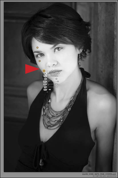
Figure 8.63. Duplicating the control point to between her nose and mouth
18. Duplicate the control point (Command + D / Control + D) that you created in Step 17, and move it to the middle of her chest, just below her neck where her collarbone begins (Figure 8.64).
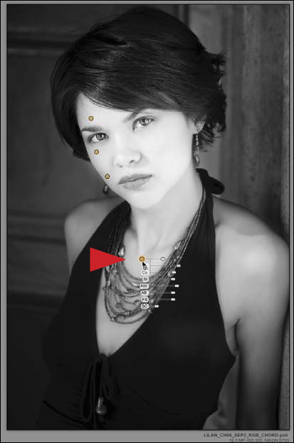
Figure 8.64. Duplicating the control point to her chest
19. Placing the cursor in the upper left-hand corner of the image, just above the topmost control point, click and drag downward to the lower right corner, just below the lowermost control point. This selects all the control points that you just placed (Figures 8.65 and 8.66).
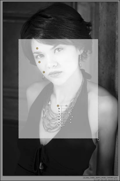
Figure 8.65. Selecting all control points
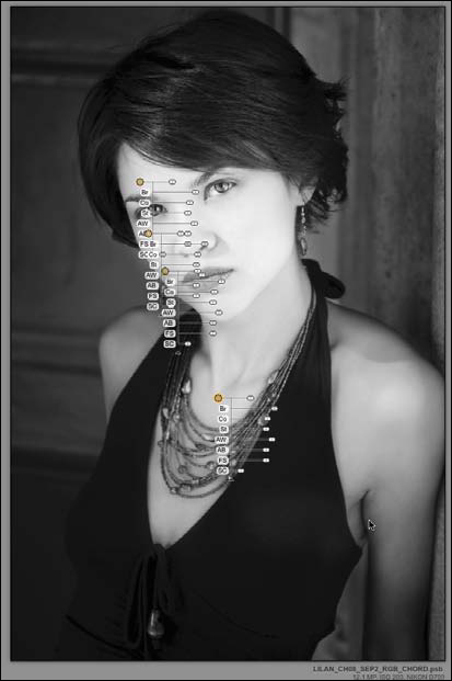
Figure 8.66. All control points selected
20. Once you have done that, click on the Click to Group the Selected Control Points icon located in the Selective Adjustments section. This will group all of the control points that you just placed and allow you to use any one to control all the others (Figures 8.67 and 8.68).
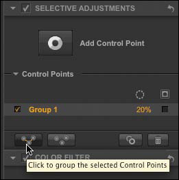
Figure 8.67. Grouping the control points

Figure 8.68. All control points grouped together
21. Increase the Contrast (Co) to 37% and the Amplify Whites (AW) to 42% (Figure 8.69).
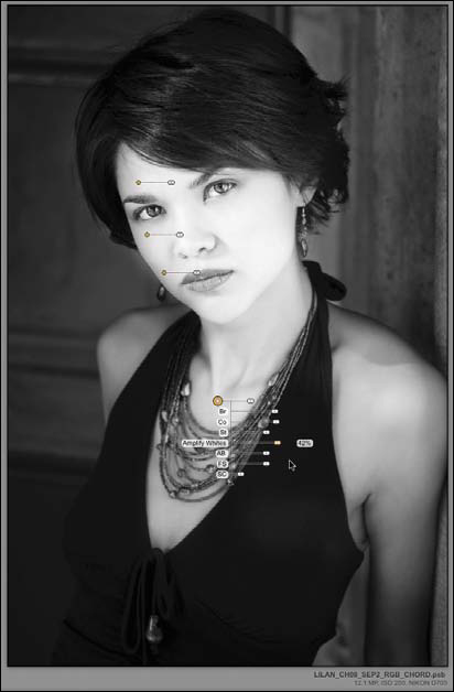
Figure 8.69. Increasing Contrast and Amplify Whites
22. Click on the Add Control Point icon located in the Selective Adjustments section. Drag it and place the control point on the background, just to the left of the subject’s earring immediately above her back shoulder (Figure 8.70).
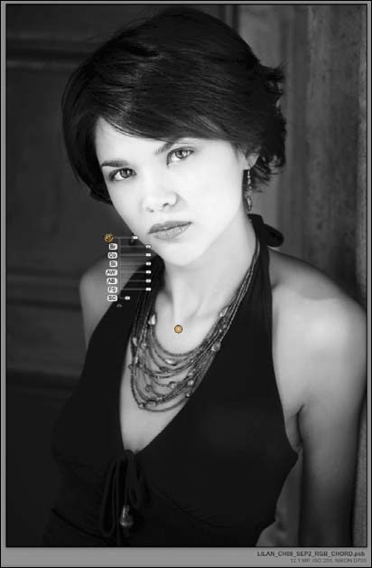
Figure 8.70. Adding a control point to the background
23. Decrease the brightness (Br) to -11% (Figure 8.71).
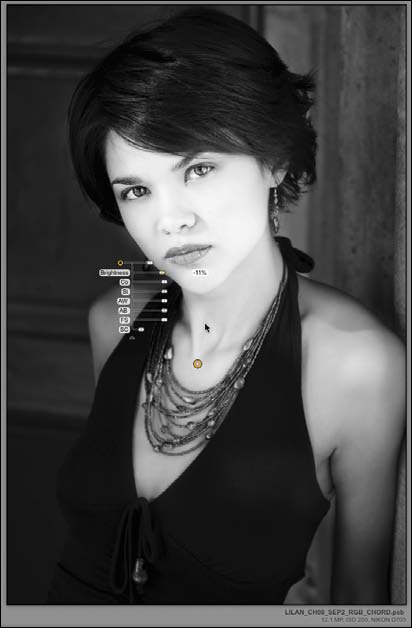
Figure 8.71. Decreasing the Brightness to -11%
You have done this is in order to counteract the background’s brightness that was created when you placed the control points on the subject’s face, which caused some unwanted brightness on the background. As you have just seen, one of the unique properties of control points is that they have the ability to detect and interact with each other. This means that they are capable of producing mask edges not possible to create with any other technique.
24. Click on the Add Control Point icon located in the Selective Adjustments. Place the control point on the background in the lower left corner of the image (Figure 8.72).
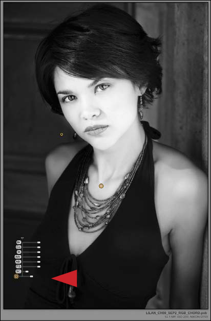
Figure 8.72. Adding a control point to the lower left
25. Increase the Brightness (Br) to 16% (Figure 8.73).
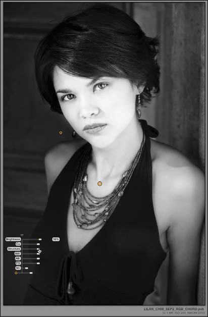
Figure 8.73. Increasing the Brightness slider to 16%
You do this is to open up (brighten) the background area to separate it from the dress. Prior to dropping this control point, this area of the image was blocked up.
26. Click on the Add Control Point icon located in the Selective Adjustments part of the Edit menu. Drag it and place the control point on the subject’s front shoulder (Figure 8.74).
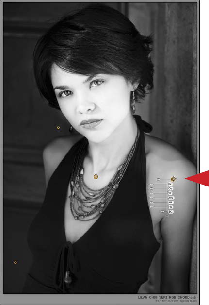
Figure 8.74. Adding a control point to the front shoulder
27. Decrease the Contrast (Co) to -25% (Figure 8.75).

Figure 8.75. Decreasing the Contrast to -25%
28. Click OK. The newly adjusted GREEN Silver Efex Pro 2 layer looks like Figure 8.76.

Figure 8.76. Green Silver Efex Pro 2 layer
RED Silver efex Pro 2 Layer
Now that you have made the fine-tuning adjustments to the GREEN Silver Efex Pro 2 layer, it is time to move on to the RED Silver Efex Pro 2 layer. Notice that the subject’s skin tone appears much smoother and creamier than it did in the GREEN Silver Efex Pro 2 layer. Also, the wall directly behind the subject and the image structures in the upper right-hand corner are much smoother and have a gentler feel to them than they did in the GREEN Silver Efex Pro 2 layer. Therefore, you will want to add some of the qualities of the RED layer into her face and you will want to use the qualities of the background of the RED layer. To accomplish this, you will use control points to selectively open up the subject’s face and darken the background.
29. Click on the Add Control Point icon located in the Selective Adjustments part of the Edit menu. Drag it and place the control point on the upper right corner of the image (on the background) between the image’s right edge and the subject’s ear (Figure 8.77).
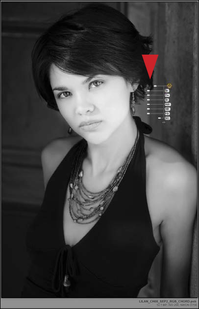
Figure 8.77. Adding a control point to the right corner
30. Decrease the Brightness (Br) to -15% and the Contrast (Co) to -32% (Figure 8.78).
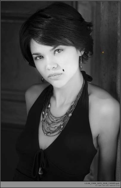
Figure 8.78. Decreasing the Brightness -15% and Contrast to -32%
You should notice that there is a circular area of diminished brightness and contrast about the size of the Kennedy half-dollar. Because this area needs to be larger than it currently is, increase the radius of the control point.
31. Click on the Radius handle (the handle located directly across from the control point). Move it outward (in this case, to the left), until the radius of the control point is almost to the upper edge of the top of the image and the lower part of the circle touches just outside of the subject’s nose (Figure 8.79).

Figure 8.79. Adjusting the radius of the control point
How the Radius handle works is based on the control point location. Moving the handle away from the control point expands the radius of the altered area and moving the handle towards the control point decreases it.
32. Duplicate this control point (Command + D / Control + D) and move it to the upper part of the right-hand corner of the background, parallel to the control point from which you duplicated this one (Figure 8.80).
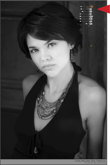
Figure 8.80. Duplicating the control point to the top right
33. Duplicate this control point (Command + D / Control + D) and move it to the middle part of the background (left of her face) and approximately midway between the left corner of the image and the edge of her face (Figure 8.81).
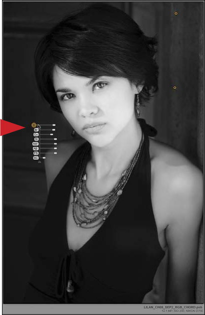
Figure 8.81. Duplicating another control point to the mid-left area
34. As you did with the GREEN Silver Efex Pro 2 layer, place the cursor in the upper right-hand corner of the image, just above the topmost control point. Click and drag downward to the lower left corner just below the lowermost control point. This selects all the control points that you just placed. Click on the Click to Group Selected Control Points icon located in the Selective Adjustments section.
It is sometimes a good idea to link like control points together as you build up an image. Once you have placed all of the control points, the fine-tuning aspect of the image-editing process is easier and the workflow more efficient. Also, you can always undo a group.
35. Click on the Add Control Point icon located in the Selective Adjustments part of the Edit menu. Place the control point on the upper part of her forehead in approximately the same place that you did for the GREEN layer.
36. Set the Brightness to 20%, the Contrast to 18%, and the Amplify Whites to 24% (Figure 8.82).
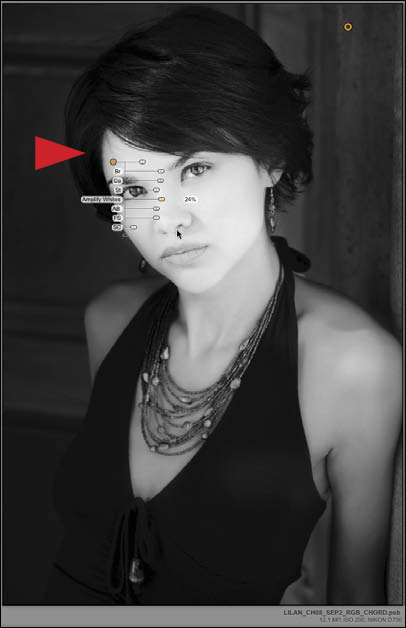
Figure 8.82. Increasing the Brightness, Contrast, and Amplify Whites sliders
37. Duplicate this control point (Command + D / Control + D) and move it to the back edge of the subject’s face between her nose and mouth (Figure 8.83).
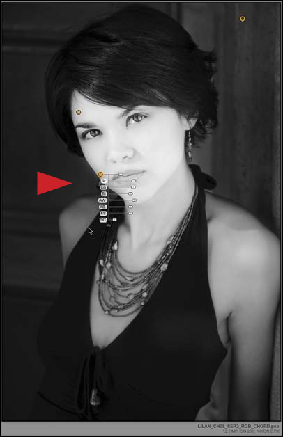
Figure 8.83. Duplicating the control point
38. Duplicate this control point (Command + D / Control + D) and move it to the middle of her chest, just below her neck where her collarbone begins (Figure 8.84).

Figure 8.84. Duplicating the control point to her chest
39. Place the cursor in the upper left-hand corner of the image, just above the topmost control point. Click and drag downward to the lower right corner, just below the lowermost control point. This selects all the control points that you just placed. Click on the Click to Group Selected Control Points icon located in the Selective Adjustments section. Now you have two linked control point groups.
40. Click on the Add Control Point icon located in the Selective Adjustments part of the Edit menu. Drag it and place the control point on the subject’s front shoulder. Decrease the Brightness to -26% and the Contrast to -18% (Figure 8.85).

Figure 8.85. Adding a control point to her shoulder
41. Duplicate this control point (Command + D / Control + D), move it to the bottom right of the image, and place it on the background between the subject’s arm and body (Figure 8.86).
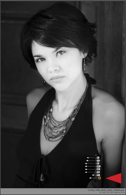
Figure 8.86. Duplicating the control point
42. Click on the control point in the upper right-hand corner (this controls the background group of control points) and decrease the Brightness (Br) to -25% (Figure 8.87).
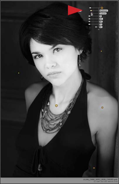
Figure 8.87. Decreasing the Brightness to -25%
43. Click on the control point in the middle of the subject’s chest (this controls the face and neck group of control points). Increase the Contrast (Co) to 33%, the Amplify Whites (AW) to 34%, the Structure (St) to 27%, and the Brightness (Br) to 27% (Figure 8.88).
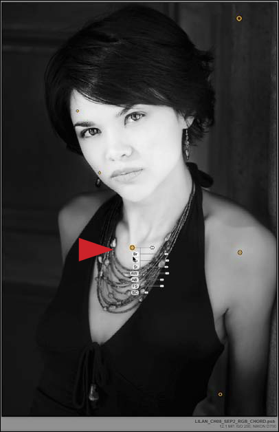
Figure 8.88. Increasing the Contrast, Amplify Whites, Structure, and Brightness sliders
44. Click on the Add Control Point icon located in the Selective Adjustments section. Drag it and place the control point on the highlighted area of her hair. Increase the Structure (St) to 54%, the Fine Structure (FS) to 42%, the Brightness (Br) to 6%, and the Contrast (Co) to 10% (Figure 8.89).
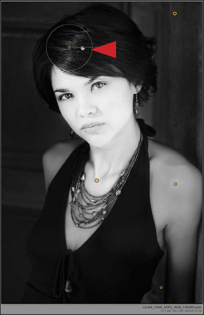
Figure 8.89. Adding a new control point and increasing the Structure, Fine Structure, Brightness, and Contrast sliders
45. Decrease the radius of the control point to just inside her hairline (Figure 8.90).
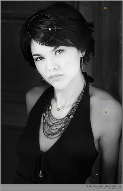
Figure 8.90. Decrease the radius of the control point
46. Click OK. The newly adjusted RED Silver Efex Pro 2 layer looks like Figure 8.91.
Figure 8.91. The image with the RED SEP2 layer
BLUE Silver efex Pro 2 Layer
The fine-tuning adjustments to the GREEN and RED Silver Efex Pro 2 layers are complete. Next, you will work on the BLUE Silver Efex Pro 2 layer. Here, the skin tone is rich in tonal depth, but it also shows slight mottling. Of the four layers, this one has the best separation between the background and the subject, as well as the most detail in the subject’s hair. Thus, the goal here is to smooth out the mottling, reduce the darkness under her eyes, and slightly darken the wall in the upper right-hand corner.
47. Click on the Add Control Point icon located in the Selective Adjustments section. Drag it and place the control point on the upper part of her forehead, in approximately the same place in which you placed it for the GREEN and RED layers.
48. Set the Brightness (Br) to 20%, the Contrast (Co) to 14%, and the Amplify Whites (AW) to 14% (Figure 8.92).
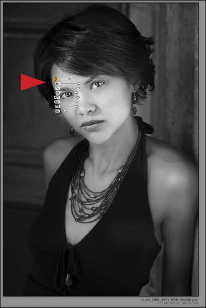
Figure 8.92. Increasing the Contrast, Brightness, and Amplify Whites sliders
49. Duplicate this control point (Command + D / Control + D) and move it to back edge of the subject’s face between her nose and mouth (Figure 8.93).
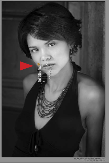
Figure 8.93. Duplicating the control point to her face
50. Duplicate this control point (Command + D / Control + D) and move it to the middle of her chest, just below her neck where her collarbone begins (Figure 8.94).
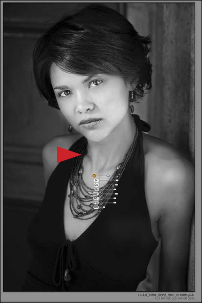
Figure 8.94. Duplicating the control point to her chest
51. Place the cursor in the upper left-hand corner of the image, just above the topmost control point. Click and drag downward to the lower right corner, just below the lowermost control point. This selects all the control points that you just placed. Click on the Click to Group Selected Control Points icon located in the Selective Adjustments section. Now you have two linked control point groups.
52. Click on the Master control point for this group (the one located in the center of the model’s chest). Decrease the Amplify Blacks (AB) to -42% and increase the Amplified Whites (AW) to 29%. The mottling in her skin tone is gone, but its richness and depth is preserved (Figure 8.95).
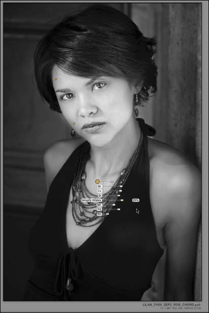
Figure 8.95. Decrease the Amplify Blacks and increase the Amplify Whites
You will now correct for the similarity in tone between the background and the skin tone in the BLUE layer by placing a control point on the background to the left of the subject’s face.
53. Click on the Add Control Point icon located in the Selective Adjustments section. Drag it and place the control point on the background, just above her back shoulder and parallel to her earring. Decrease the Brightness (Br) to -19% (Figure 8.96).
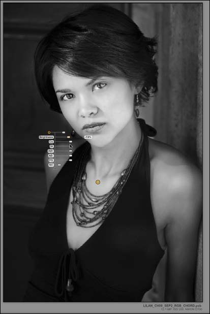
Figure 8.96. Add a control point to the background
One of the remaining issues in this layer is that it lacks some of the pop and snap of the GREEN one. By addressing the issues of color, you will make the adjustments that you want by using the Sensitivity controls located in the Film Types section. This functionality is very similar in global concept to Photoshop’s Black & White adjustment layer, but it allows you much finer control. In addition, it addresses the issue of colors that are made up of multiple color values better than does Photoshop’s Black & White adjustment layer. This is why the Sensitivity controls located in the Film Types section are ideally suited for fine-tuning the individual colors.
54. Click on the disclosure triangle for the Film Types section. Click on the disclosure triangle for Sensitivity (Figures 8.97 and 8.98).
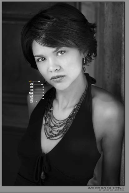
Figure 8.97. Before the adjustment
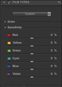
Figure 8.98. The Sensitivity section
55. In the Sensitivity section, decrease the Red value to -40% and increase the Yellow value to +40% (Figures 8.99 and 8.100).
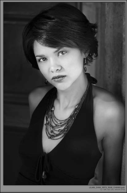
Figure 8.99. After the adjustment
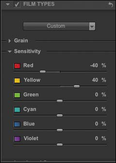
Figure 8.100. Decrease the Red slider and increase the Yellow slider
You did Steps 54 and 55 because the opposite of blue on the color wheel is orange. Orange is a mix of red and yellow, and yellow is a combination of the primary colors red and green. By going in the opposite direction of equal values of red and yellow (that make up the opposite of blue), you introduce contrast into the image while preserving the aspects of the skin tone that you like, as well as maintaining the integrity of your adjustments that removed the mottling of the subject’s skin.
For the sake of simplicity in what have already been very complicated lessons, I chose to use the Sensitivity controls (located in the Film Types section) on this layer only. Please note that this particular adjustment is one that I consider using on all layers every time that I launch the Silver Efex Pro 2 plug-in.
56. Click OK. The newly adjusted BLUE Silver Efex Pro 2 layer looks like Figure 8.101.
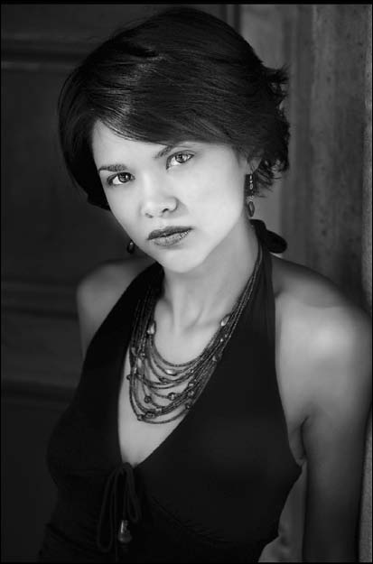
Figure 8.101. The image after
Once these adjustments are completed, the action will save the document and a dialog box will come up that states, “It is now time to decide layer order and what, if any, brushwork will be done OR if you want to use all layers.” Remember that the bottom-most layer receives no brushwork. Restart the Action when done.” The action defaults to the GREEN layer. You can move any of the four layers that you have just created into any layer order. Because they are Smart Filters, you can also readjust them later. Your big decision here is whether to fill the layer masks with white or black. The decision process for determining this is based on the 80/20 rule. (See the sidebar: Unmasking Layer Masks and the 80/20 Rule in Chapter 2.)
57. Click Stop.
Step 3: Further Fine-Tuning the Blue, Red, and Green Silver efex Pro 2 Smart Filter Layers by Using Attached Layer Masks
Blending multiple layers of different densities and different colors is not a new concept. This approach is based on a Renaissance painting technique called sfumato, which is the intricate mixing of thin layers of pigment, glaze, and oil to yield the appearance of lifelike shadows and light. In his work, of which Mona Lisa was a prime example of sfumato, Leonardo da Vinci used upwards of 30 layers of paint with a total thickness of less than 40 μm, or about half the width of a human hair. You are about to accomplish a similar effect using opacity. This approach works amazingly well for the creation of realistic looking atmospheric effects (e.g., misty haze) as well as for creating visual depth and dimensionality in an image.
The RED Silver efex Pro 2 layer
58. Turn on the RED layer, make the layer mask active, and fill it with black. Set the foreground color to white and the background color to black.
59. Select the Brush tool, set the brush width to a diameter of 200 pixels, and set its opacity to 50%. Brush in the subject’s face and neck.
60. Bring up the Fade Effect dialog box (Command + Shift + F / Control + Shift + F) and move the slider to the right until you reach the effect that you desire. I chose 69%. Next, set the foreground color to black and the opacity to 100% and brush back her eyes. With the brush opacity still at 100%, brush back her lips (Figures 8.102, 8.103, and 8.104).
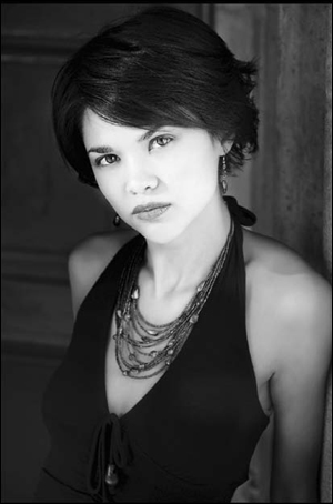
Figure 8.102. The image before brushwork

Figure 8.103. The image after brushwork

Figure 8.104. The layer mask
61. Select the Brush tool, set the brush width to 500 pixels, and its opacity to 50%. With the foreground color set to white and the background color set to black, brush in the right side of the image from the background down to her shoulder and then all the way to the bottom of the image. Make sure that you do not brush into the area of her neck or face. Bring up the Fade Effect dialog box (Command + Shift + F / Control + Shift + F) and move the slider to the right until you get the effect that you desire. I chose 83% (Figures 8.105 and 8.106).
Figure 8.105. The image after brushwork
Figure 8.106. The layer mask
62. Select the Brush tool, set the brush width to 500 pixels, and its opacity to 50%. With the foreground color set to white and the background color set to black, brush in the right side of the image from the background down to her shoulder and then all the way to the bottom of the image. Make sure that you do not brush into the area of her neck or face. Bring up the Fade Effect dialog box (Command + Shift + F / Control + Shift + F) and move the slider to the right until you obtain the effect that you desire. I selected 70% (Figures 8.107 and 8.108).

Figure 8.107. The image after brushwork

Figure 8.108. The layer mask
The BLUE Silver efex Pro 2 layer
63. Turn on the BLUE layer, make the layer mask active, and fill the layer mask with black. Set the foreground color to white and the background color to black.
64. Select the Brush tool, set the brush width to 150 pixels, and its opacity to 50%. Brush in her face and neck.
65. Bring up the Fade Effect dialog box (Command + Shift + F / Control + Shift + F) and move the slider to the right until you get the effect that you desire. I elected to use 57%.
66. Brush in her front shoulder. Bring up the Fade Effect dialog box and set the opacity to 60%.
67. Set the foreground color to black and the opacity to 100%. Brush back her eyes.
68. Set the foreground color to white and the background color to black. Set the brush opacity to 50%. Brush the highlight area of her hair and leave the brush opacity at 50%. Reduce the overall layer opacity to 74% (Figures 8.109 and 8.110).

Figure 8.109. The image after brushwork
Figure 8.110. The layer mask
69. Restart the action.
70. The action will save the file, then duplicate it, and save a flattened version as a TIFF.
71. The Save As dialog box will appear with _SEP_RGB_CHORD_FINAL.tif. Add LILAN_OZ_CHO8 to the beginning of that file name so that it becomes LILAN_OZ_CHO8_SEP_RGB_CHORD_FINAL.tif.
Variations on a Theme: When Conversion Techniques Collide
Anyone who has never made a mistake has never tried anything new.
—Albert Einstein
In this next lesson, you will take the image that you just completed and combine it with the image that you created in the previous chapter. This is how I create the majority of my chromatic grayscale images. I reiterate—impossible is just an opinion. Give yourself permission to combine multiple conversion techniques. The goal is not to maintain conversion approach purity; the goal is to produce an image that reflects your voice. No one cares how many layers your file has, they care only about what the final image says to them.
Prior to the creation of the Silver Efex Pro software, I created a chromatic grayscale image using the Multiple Channel Mixer adjustment layer approach that you used in the previous chapter. I have found that the Silver Efex Pro software can do many things that the Multiple Channel Mixer adjustment layer approach can do, but not all of them. The solution to this issue is a simple one. Create a chromatic grayscale conversion using both approaches, so that you end up with two images. Then you can use the best from each. This is what you are going to do next.
In addition to the three actions that you have used in this and the previous chapter, there are two actions in the action set that are combined into one file; the single and multiple Silver Efex Pro approaches as well as the Multiple Channel Mixer adjustment layer approach.
1. If it is not already open, open the file LILAN_OZ_CH08_SEP_RGB_CHORD_FINAL.tif.
2. Open the file LILAN_OZCH07_OZ_2_KANSAS_BW_FINAL.tif.
3. Holding down the Shift key, click on the background layer and Shift-drag it to the LILAN_OZ_CHO8_SEP_RGB_CHORD_FINAL.tif file that you just completed in the previous lesson. Name this layer OZ2K_CM.
4. Double-click on the background layer and name it SEP2_CHORD.
You should clearly see some similarities and some differences between the two images. Both images are acceptable, but each has something that the other could use. Each also has something that you would be glad to do without. In this lesson, you will use the best of both worlds.
In the Multiple Channel Mixer adjustment layer version of the image, there is a greater depth in the subject’s skin tone, but the areas under her eyes are still a bit dark. Also, some of the background is slightly brighter and has a slightly gentler contrast than it does in the Silver Efex Pro 2 image. In the Silver Efex Pro 2 image, overall, the subject’s skin tone is smoother, the detail in her hair is better, and the background is deeper (Figures 8.111 and 8.112).

Figure 8.111. Before brushwork in the SEP_RGB_CHORD version

Figure 8.112. Before brushwork in the OZ_2_KANSAS_BW version
Looking at both images, I thought that the Silver Efex Pro 2 version contained more elements that I liked than did the Multiple Channel Mixer adjustment layer image. Based on that, I chose the Silver Efex Pro 2 version as the base image and used the Multiple Channel Mixer adjustment layer image as the one from which I brushed in image detail. This is what I will have you do. You will brush in the subject’s face, brush back her eyes (so that there will be no brushwork done to them), brush under her eyes to diminish what little darkness is there, brush in the right side of the background to bring in some of the image structures that are appealing, and then brush in the left side of the background to bring in appealing image structures from there (Figure 8.113).
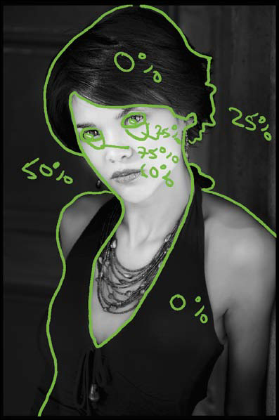
Figure 8.113. The image map of areas to be brushed in
5. Make the CM_LAYER active. Add a layer mask and fill it with black. Set the foreground color to white and the background color to black.
6. Select the Brush tool, set the brush width to 150 pixels, and set its opacity to 50%. Brush in the subject’s face and neck.
7. Bring up the Fade Effect dialog box (Command + Shift + F / Control + Shift + F) and move the slider to the right until you reach the effect that you desire. I chose 62%.
8. Brush under both eyes. Bring up the Fade Effect dialog box (Command + Shift + F / Control + Shift + F) and set the opacity to 70% (Figures 8.114, 8.115, 8.116, and 8.117). (See the sidebar: Error-Free Layer Masks in Chapter 2.)

Figure 8.114. Before brushwork

Figure 8.115. After brushwork
Figure 8.116. Before brush-work close-up

Figure 8.117. After brush-work close-up
9. Select the Brush tool, set the brush width to 150 pixels, and set its opacity to 50%. Brush in the upper right corner of the background.
10. Bring up the Fade Effect dialog box (Command + Shift + F / Control + Shift + F) and move the slider to the right until you reach the effect that you desire.
I selected 23%. Brush in the left side of the background (Figures 8.118 and 8.119).

Figure 8.118. After brush-work on the left background
Figure 8.119. The layer mask
11. With the CM_LAYER active (make sure it is the topmost layer), make a Master layer (Command + Option + Shift + E / Control + Alt + Shift + E).
12. Save the file.
13. Then, choose Save As and save the file (Command + Shift + S / Control + Shift + S) as LILAN_OZ_COMBINED. Examine the final image (Figure 8.120).
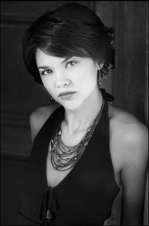
Figure 8.120. The final image
Conclusion
When you add to the truth, you take away from the truth.
—The Talmud
The technique that I have described in this chapter shows you exactly what level of granular control you can have when you convert an image from full color to chromatic grayscale. It also shows you that you can journey from one approach to another and mix them to create the image that matches your vision. The lesson that was this chapter is also the application of all of the lessons in this book.
If I told you at the beginning of this book that you were going to use color to control and create a black-and-white image and that you were going to refer to that image as a chromatic grayscale image, and that you were going to use up to nine layers, and five of which were adjustment layers and four of which were Smart Layers, and that you had to make as perfect a color image as you could before you do the conversion, you might think I had been sniffing pixels again. But if you are reading these words and have made it here, you now understand that there is very little that is black and white when it comes to the conversion process of creating a black-and-white image.
Each one of the chapters in this book represents the main stepping stones of journey that I went on in pursuit of learning how to create a chromatic grayscale or black-and-white image. It is my hope that you now have within you the echo of knowledge that is needed to look at a scene and know if the image is worthy of doing the dance of conversion and how to make your chromatic grayscale images look as good as you imagine them to look in your mind’s eye. It is also my hope that you now have the tools to create images that move the viewer the way you were moved when you were so taken that you clicked the shutter and you captured the image that captured you.