 Are fund managers enthusiastically buying? Or are they heading for the exits, unloading shares as fast as they can?
Is the Stock Finding Support or Hitting Resistance?
3 Telltale Patterns That Launch Big Moves
“Just as doctors would be irresponsible not to use X-rays on their patients, investors are just plain foolish if they don’t learn to interpret the price and volume patterns found on stock charts.”
—WILLIAM J. O’NEIL
I couldn’t imagine making any buy or sell decision without first checking the chart. It would be like driving blindfolded: If I can’t see what’s going on around me, how do I know if I should hit the gas—or the brakes?
Charts truly are that important. And here’s why.
Think back to one of the “Big Rocks” we’ve been discussing:
Buy stocks being heavily bought by institutional investors. Avoid those they’re heavily selling.
We spent an entire section hammering home that key point: Fund managers and other professionals ultimately determine the fate of your stocks.
By using charts, you can literally see what these big investors are doing. And it’s not hard to do once you demystify what’s in a chart and understand one simple fact …
When I was starting out, charts seemed overly “technical” to me. My epiphany came when I finally realized all those lines and bars aren’t so mysterious after all. They actually do just one simple thing: They tell you a story. As you’ll soon see, charts paint a behind-the-scenes picture of what is really going on with the stock:
 Are fund managers enthusiastically buying? Or are they heading for the exits, unloading shares as fast as they can?
 Despite some recent price declines, have institutional investors actually been stepping in to support the stock and pick up more shares—meaning it could be heading for even bigger gains?
 How have big investors reacted to recent news about the stock? Did they sell even though the news was good? Or did they buy more shares even though the news was bad?
By understanding that story and looking for certain signals, you’ll know if now is a time to buy, sell or hold.
At workshops and IBD Meetup events, I’ve worked with countless investors looking at stock charts for the very first time. From that experience—and my own—I’ve boiled down the basics of chart-reading into a few key concepts.
The goal here isn’t to get into advanced techniques. It’s about getting started: By the end of this chapter, you’ll have everything you need to run your stocks through the “Chart Analysis” items on the buying and selling checklists.
Here’s how we’ll do that one step at a time:
 Chart-Reading 101: You’ll learn what’s in a chart and 3 ways to “see” if institutional investors are heavily buying or selling a stock.
 3 Telltale Patterns That Launch Big Moves and Alternative Buy Points: You’ll see that spotting “bases” and “buy points” is really not that hard—and can be immensely profitable.
 Using Charts to Go Through the Checklists: I’ll show you how to start using the “Chart Analysis” items on the buying and selling checklists to help capture—and keep—solid gains.
Even if it seems a little confusing at first, don’t give up. Watch the videos and take the Action Steps. You’ll soon get the hang of it and realize that chart-reading truly is a lifelong money-making skill.
As Bill O’Neil has said: “Fortunes are made every year by people who learn to properly read charts.”
To understand the “story” a chart reveals, we’ll cover 3 basic concepts:
 What’s the trend?
 Always check price and volume.
 Is the stock finding support or hitting resistance?
Once you understand those, all the other things on the buying and selling checklists—chart patterns, buy points, sell signals, etc.—will fall into place.
But first, we need to answer an even more basic question: What’s in a chart?
Important: Be sure to use both daily and weekly charts. The weekly chart helps you see longer-term trends, while the daily chart helps you pinpoint specific buy and sell signals. (Throughout this book, each chart is identified as being either weekly or daily in the top left corner.)
Weekly charts give you a longer term perspective and help you see the stock’s underlying trend.
Daily charts help you spot specific buy points and early warning signs.
 Black bars vs. red bars: IBD charts are color-coded to make them easy to read: Black (blue on Investors.com) indicates the share price for that day or week closed higher. Red means the share price closed lower.
 Long price bars vs. short price bars: In the price area (upper half) of the chart, the bars may be long or short. The bars show the price range for that day or week. So a longer price bar indicates a wider swing in price, while a shorter price bar means the stock traded in a tighter range.
 Above-average vs. below-average volume: In the volume area (lower half) of the chart, you’ll see a black horizontal line. That shows the average volume (i.e., the number of shares traded) for that stock over the last 50 days on a daily chart or 10 weeks on a weekly chart.
If the volume bar is above that line, it means volume for that particular stock was above average for that day or week. As you’ll soon see, sharp spikes in volume reveal what institutional investors are really up to, and this line helps you see if volume is unusually heavy or light.
 Moving average lines: These horizontal lines, found in the price area (upper half) of the chart, simply track the average share price over the specified time period.
On a weekly chart, the red horizontal line shows the 10-week moving average, and the black line shows the 40-week moving average. On a daily chart, the red line tracks the 50-day moving average, while the black line tracks the average share price over the last 200 trading days.
You’ll soon understand why it’s extremely important to see how a stock behaves when it is trading around these benchmark lines.
 Relative strength line: In the price area (upper half) of the chart, the horizontal relative strength line compares the share price movement over the last 52 weeks of that particular stock to the price movement of the S&P 500.
If the line is trending up, the stock is outperforming the S&P 500—a positive sign that tells you that stock is a market leader in terms of price action. If the relative strength line is trending down, it tells you the stock is lagging the overall market.
Next up: Let’s look at 3 ways you can tell what “story” the chart is telling—and see if institutional investors are heavily buying or selling.
This “story” is fairly obvious, but very important: Which direction is the stock heading in right now?
There are basically just 3 possibilities.

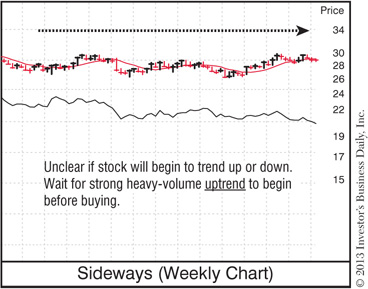
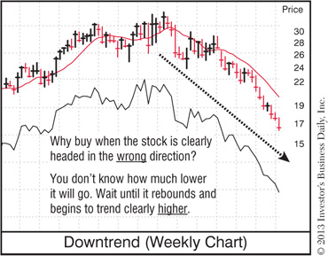
You want to buy a stock when it’s showing strength, not weakness. “Strength” means the stock is trending higher and finding support at key moments—both signs that institutional investors are buying shares.
Look at the example of a downtrend. Does that look like strength or weakness? How much lower will that stock go before it finds an area of support (a “floor”) and starts coming back up? Will it ever come back up? No one knows! It might start a big run tomorrow; it might keep going lower.
That’s the point: Why take on all that risk and uncertainty when you don’t have to?
Don’t get suckered into “bargain hunting” for beaten down stocks that are on the decline. Remember what we learned earlier: Stocks hitting new lows tend to go lower. Stocks hitting new highs tend to go higher.
So only buy stocks that are already showing strength and moving in the right direction—up!
Some people write off charts as too complicated—or as some type of modern day fortune-telling tea leaf. But the fact is, charts are nothing more than a visual representation of price and volume action.
And the picture a chart paints is very revealing: That combination of price and volume clearly shows you what big investors are up to.
Here’s how it works …
Institutional investors are like the proverbial elephant in the bathtub— they can’t hide. When they jump in or get out, you can’t miss it if you use charts.
That’s because a stock chart will clearly show any significant spike (or drop) in volume as the share price changes. That change in volume tells you how serious the buying or selling by institutional investors actually is.
The scenarios in the following charts give you a basic look at how price and volume work together. Other factors may come into play, but for now these outline the key concepts to keep in mind.
As you go through these scenarios, understand that you’re looking for unusual volume—either unusually heavy or unusually light.
For example, if a stock that normally trades 1 million shares a day suddenly trades 2 million, you need to pay attention. That’s not your Uncle Fred buying or selling 100 shares. That’s institutional trading—and you have to find out what “story” it’s telling.
Take a few minutes to carefully review the notes inside the following charts. Pay special attention to the spikes in volume that are highlighted and the “story” they reveal about what fund managers and other big investors are up to. Knowing how to spot unusual volume—and understanding what it means—will be key to your investing success.
Institutional Buying: Big Price Gains on Unusually Heavy Volume
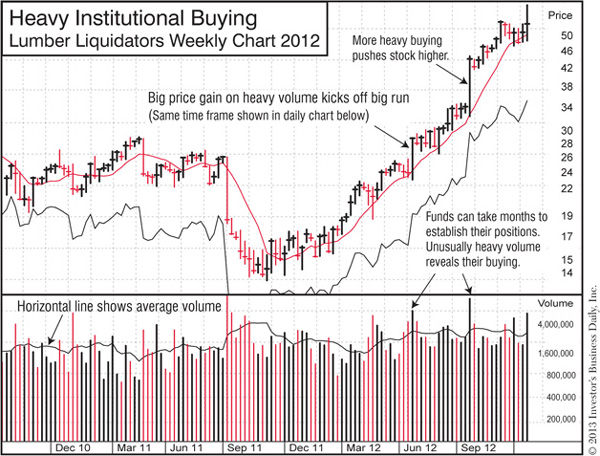
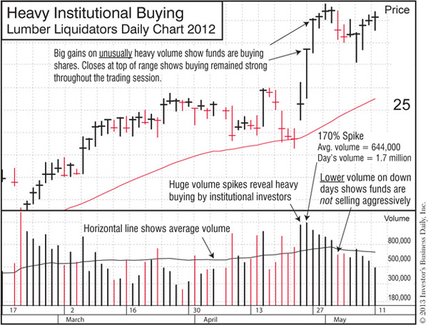
Big price gains on unusually heavy volume show institutional investors are buying aggressively. It’s also a bullish sign when the stock’s closing price is in the top part of the range for that day or week.
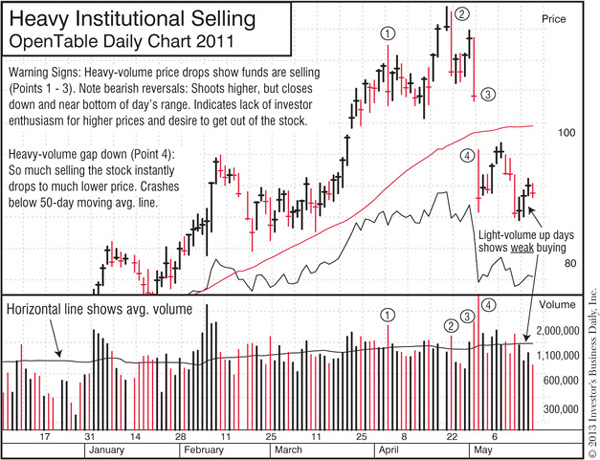
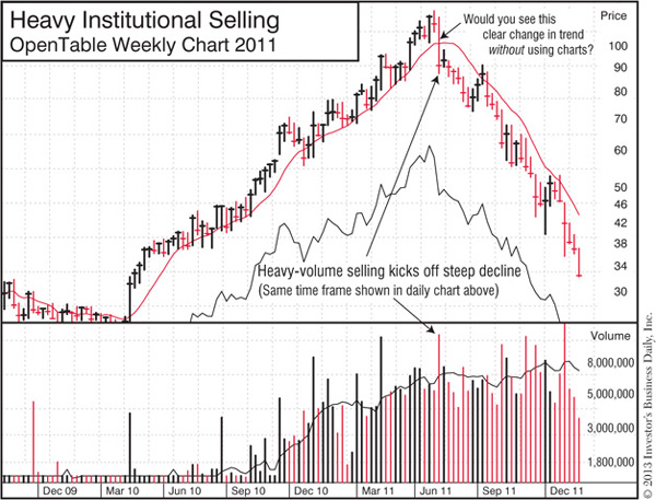
Big price drops on unusually heavy volume show institutional investors are selling aggressively. It’s also a bearish sign when the stock’s closing price is in the bottom part of the range for that day or week.
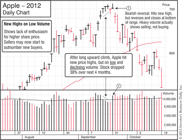
Light volume on up days or weeks could mean big investors are not enthusiastic about the stock. May be a sign the stock will start to sell off.

Light volume on down days or weeks means big investors are sitting tight and not selling aggressively.
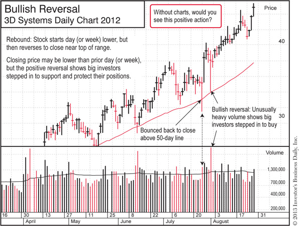
Bullish reversal shows investors stepped in to support the stock.

Bearish reversal on heavy volume: Shows big investors used initial price gain as opportunity to sell. Rather than support the stock and push it higher, they sold and pushed it down.
Here’s another way to think about volume.
Let’s say you run a small clothing store and you have to decide what clothes to buy for the summer season. In a trade magazine, you see a survey that says “70% of women plan on buying a red swimsuit this year.” Your initial reaction might be, “Wow, I’d better fill my shelves with red swimsuits.”
But then you dig a little deeper and find out there were only 10 respondents to that survey!
Would you still base your inventory on the opinions of 10 people? Of course not. Now, if the survey was properly sampled, professionally conducted and had 10,000 respondents, you might lend the results more credence.
It’s the same with volume. If a stock’s share price goes up 2% one day, that doesn’t tell you all that much—until you also check the volume. Was it unusually heavy? Or was volume well below average?
Without that information, there’s no way to understand what the price change actually means. Are big fund managers showing real enthusiasm and heavily buying the stock? Or is it just a head fake?
It still amazes me that so many financial news programs and publications will just say “IBM closed 1% higher today” and say nothing about the volume. It’s essentially the same as a pollster saying “7 out of 10 women love red swimsuits” without explaining how many people they surveyed (i.e., the volume) to come to that conclusion.
They say real estate is all about “location, location, location.” You’ll find that when it comes to using charts to see the right time to buy and sell a stock, it’s all about “volume, volume, volume.” So to understand what the changes in share price are really telling you, always check the volume.
Now that you have a basic sense of the important relationship between share price and trading volume, let’s take a look at another key chart-reading concept: Support and resistance.
Think of it like a floor (support) and ceiling (resistance).
The chart patterns and “buy points” we’ll discuss are all based on this simple idea: To make sure the stock is more likely to go up than down when you buy it, first make sure it has already established a solid floor (support) from which it can move higher. Then wait for the stock to show real power by smashing through the ceiling (resistance), clearing the way for a new upward move.
Here again, let’s go through some common scenarios so you understand the basic concepts.
Be sure to pay attention to changes in volume in these scenarios. For example, when a stock is punching through an area of resistance, you want to see unusually heavy volume kick in. That shows institutional investors are buying enthusiastically and aggressively. Light volume would show more hesitation and a lack of conviction—which could mean the stock will fail to climb higher and soon fall back below that same area of resistance.
It’s very important to watch how your stock behaves around the moving average lines—particularly the 10-week line on the weekly chart and the 50-day line on a daily chart. The reason is simple: Professional investors use these lines as key benchmarks. So you can see if fund managers and other big players are supporting or selling the stock by watching how it behaves around those key moving average lines.
 Support: If institutional investors still have a positive outlook on the stock, they’ll often step in to buy more shares and protect their positions when the stock pulls back to or dips below the moving average line.
In that scenario, you’ll typically see the stock pull back to the 50-day or 10-week line on light volume (showing that institutions are not selling aggressively), then bounce back above that line on heavy volume (showing that fund managers are stepping in to buy more shares).
 Sell-off: If the stock fails to find support at the benchmark lines and crashes below them on heavy volume, what does that tell you? That big investors may now be less interested in shoring up their positions and more interested in just getting out of the stock.
Again, the key is to watch the volume: If trading is particularly heavy as the stock breaks through the moving average line, that’s a definite warning sign. If volume is light, it could mean the selling is less serious.
As you can see in the following chart for F5 Networks, it’s not unusual for a stock to move below the 10-week or 50-day moving average line for a few days or weeks, even as its overall trend is still headed higher. So a drop below one of these key benchmark lines does not mean you should automatically sell the stock. We’ll talk more about that and specific sell signals in the Selling Checklist.
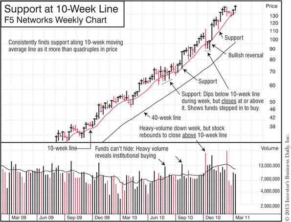
Looking for support at the 10-week and 50-day moving average lines can help you hold a stock for potentially bigger gains.
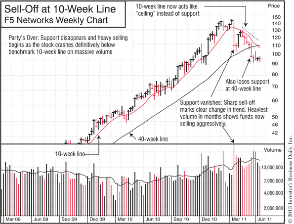
Watch out when a stock crashes through and closes sharply below the 10-week line on heavy volume. It could mean more selling is on the way.
In addition to watching how a stock behaves around the moving average lines, you also want to look for signs of support and resistance at certain price areas. This is a vital part of understanding how and why the telltale chart patterns we’ll discuss later help you pinpoint the best time to buy a stock.
And after you buy, this concept will also help you know whether you should hold the stock because it’s building “stepping stones” by finding support at key areas—or if it’s time to sell because it crashed right through the “floor.”
The following examples show you what support and resistance look like on a chart. As you look at the notes in each example, pay particular attention to that all-important relationship between price and volume.
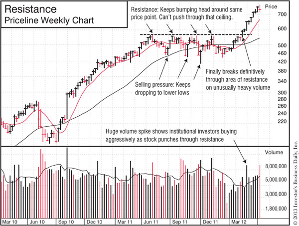
An area of resistance is a key testing ground: Make sure the stock can punch through it on heavy volume.
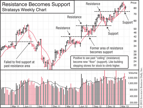
Stepping stones: Watch to see if a prior area of resistance becomes an area of support. That can help you hold a stock as it climbs higher, one step at a time.
Next up: Let’s use the 3 concepts we just learned to spot the telltale patterns that launch big price moves.
As a political history buff, I’m always struck by how little things change from decade to decade, even century to century. New players and issues come and go, but the core arguments and debates remain essentially the same. Why? Because it all comes back to human nature, and human nature never changes.
It’s the same with the stock market. And if you understand and accept human nature for what it is, the seemingly chaotic behavior of the market will make more sense—and you can make more money.
I’m bringing this up because as we go through the 3 main patterns that alert you to a potential big move, I want you to keep in mind that these are not random shapes on a chart. They’re a reflection of human emotions: Hope, fear and greed. And just like the price and volume action, they have a story to tell.
Because human nature doesn’t change, the shapes of these telltale patterns also remain the same.
At the beginning of How to Make Money in Stocks, Bill O’Neil showed the charts of 100 of the top-performing stocks over the last 100+ years. Whether it was General Motors in 1915, Coca-Cola in 1934 or Priceline.com in 2006, those patterns (also known as “bases”) were identical. You’ll find the same shapes today and the same patterns decades from now.
By learning to spot these bases, you’ll be able to get in early on the best stocks—year after year.
Think of a chart pattern like a “launching pad”: It’s the starting point for the stock’s big new move. So once you learn to spot these 3 common bases, you’ll be right there for “takeoff.” That’s why it’s so profitable to use chart patterns to time your buys.
As I said before, it takes some time and effort to read charts properly. But stick with it. It’s not as hard as you may think, and as the table below shows, the payoff can be life-changing.
We’ll talk first about the 3 main patterns that launch the big gains of virtually all big winners: Cup-with-handle, double bottom and flat base. Once we see how to spot the basics, we’ll also take a look at some additional clues you want to keep an eye on in the “Go Beyond Just the Shapes” section of this chapter.
Then we’ll go over 2 alternative buying opportunities that can deliver some nice gains: 3-weeks tight and a pullback to the 50-day or 10-week moving average line.
There are other patterns and price actions to look for, but these are by far the most common and, frankly, the most profitable. So as you’re getting started, keep it simple and just focus on these.
As we go through these patterns, keep in mind what we just discussed about the “story” that price and volume and support and resistance reveal. That provides the backstory for what’s going on in these chart patterns and why it’s important.
 Winning stocks often start their big runs by forming this pattern
 Resembles a teacup viewed from the side
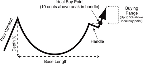
How do you find winning stocks in the early stages of a major move? Learn to spot a cup-with-handle. Year after year, the biggest winners often launch their runs as they break out of this same pattern.
We’ll go through several examples below, but first let’s see what to look for in a proper cup-with-handle.
As we do that, we’ll also take a look at what “story” the chart is telling as the base forms. That will help you understand how chart patterns and buy points work—and see how emotions and human nature play a big role.
Watch Your Chart-Reading Skills Grow with IBD TV
 Tune in to free Daily Stock Analysis and Market Wrap videos to see how to analyze charts–and build a timely watch list. See how at www.investors.com/GettingStartedBook.
To form a proper “base” or chart pattern, you have to have a prior uptrend. The idea behind a base is that after making a decent run, the stock is now digesting those gains as it catches its breath in preparation for an even higher climb. In other words, it’s forming the “stepping stones” we discussed in the section on support and resistance.
The prior uptrend typically happens when the overall market is moving higher. When that uptrend starts to slip into a correction, even the top CAN SLIM® stocks will likely pull back and start forming a new base.
When that happens, savvy investors who got in early on that uptrend will start to cash in their gains. You’ll probably see your 20%–25% profit-taking rule kick in around this time.
But it’s a very different story for people who did not get in early and ended up buying at the end of that prior uptrend. Because they didn’t have proper buy rules like the ones in the Buying Checklist, they bought just as the overall market weakened and the stock itself started to decline. And since they probably don’t have proper sell rules either, they’ll soon be sitting on a big loss.
 Base Depth: 15%–30%
The depth of the base—measured from the peak on the left side of the cup to the lowest point (the “bottom”) of the cup—should be between 15%–30%. In a severe bear market, the depth may be 40%–50%. As a general rule, look for stocks that held up relatively well during the market correction. So if one stock on your watch list dropped 35% while another’s base depth is only 20%, all else being equal, the stock with the 20% decline could be forming a stronger base.
Remember those folks who bought too late in the prior uptrend? They’re now sitting on significant losses, just hoping and praying to somehow get back to breakeven.
In the meantime, the stock has found a bottom and is now starting to form the right side of the cup. Why did that happen? Because institutional investors stopped selling and started buying. That’s what stops the bleeding and allows the stock to start moving higher again.
 Base length: At least 7 weeks
 The first down week in the base counts as Week #1
The minimum length for a cup-with-handle is 7 weeks, but some can last much longer—several months or even a year or more. Be wary of any pattern that has the shape of a cup-with-handle but is only, say, 5 weeks long. That’s typically not enough time for the stock to consolidate the prior gains, and that base has a higher chance of failing.
The length of a cup-with-handle is usually affected by the length of the general market correction. In a long, deep bear market, you’ll likely have a lot of long, deep cup-with-handle formations. And in shorter and shallower interim corrections, you’ll see the bases mirror that same action.
 The Handle
 Volume in handle should be light
 Depth of the handle should be around 10%–12%
 Should form in upper half of base
 Peak of handle should be within 15% of old high on left side of cup
The handle should be a mild pullback on relatively light volume. It’s a “shakeout” of weaker holders—those not committed to holding the stock longer term. A sharp decline of more than 12%–15% on heavy volume could indicate a more serious sell-off that might prevent the stock from launching a successful move.
The handle should form in the upper half of the base. If it begins forming too soon (i.e., in the lower half of the base), it could mean institutional buying, right now, is not as strong as it needs to be to push the stock higher.
Who are the weaker holders getting shaken out in the handle? Those folks who bought late at the end of the prior uptrend and suffered big losses. Getting a profit is no longer their goal. They just hope to recoup some of their losses. So as the stock nears that old high—and the weaker holders’ breakeven points—they start to sell.
Here’s why that shakeout is healthy: If you have a lot of “weak holders” in a stock, whenever the share price rises, they jump in to sell, which pushes the price back down. Once they’re out of the picture, it’s easier for the stock to move higher.
And what about the big investors who’ve been picking up shares as the stock formed the right side of the cup?
They’re more committed and are holding onto their shares. That’s why the volume in the handle is light: Only the weak holders are selling. The big institutions are sitting tight in expectation of a new upward move.
 Ideal buy point
 10 cents above the peak in the handle
 Buying range: Up to 5% above ideal buy point
 Always buy as close as possible to the ideal buy point!
If the peak in the handle is, say, $30, then you add 10 cents to get the ideal buy point of $30.10.
The buying range would be from $30.10 to $31.60—5% above the ideal buy point.
You want to buy as close to the ideal buy point as possible. If you’re not able to watch the market during the day, you can set trade triggers ahead of time (Chapter 4).
Once a stock climbs more than 5% above the ideal buy point, it’s considered “extended” or beyond the proper buying range. Don’t buy extended stocks.
Stocks often pull back a bit after a breakout. If you buy too late, there’s a higher chance you’ll get “shaken out” of the stock because it triggers the 7%–8% sell rule we covered in the Selling Checklist.
Note how the peak in the handle is the most recent area of resistance: The stock bumped its head against that ceiling and fell back down.
So that’s our new testing ground—and that’s why we use that to determine the buy point.
Can the stock punch through that area on heavy volume? That would mean institutional investors are enthusiastically buying the stock and willing to push it higher.
For all bases, we add 10 cents to the most recent area of resistance to determine the ideal buy point. That’s just to make sure the stock is truly punching through that resistance and not just bumping up against it.
 Volume on day of breakout: At least 40%–50% above average
On the day a stock breaks past its ideal buy point, volume should be at least 40%–50% higher than normal for that stock. That shows strong institutional buying. On many breakouts, you’ll see volume spike 100%, 200% or more above average. Light or below-average volume could mean the price move is just a head fake, and the stock is not quite ready for a big run.
Be on the Lookout During Earnings Season
 Whether it’s from a cup-with-handle or other pattern, many breakouts happen when companies release their latest quarterly earnings report. So stay alert—but also cautious: The stock may drop sharply instead. See Chapter 3 for more on how to handle earnings season.
Hindsight is indeed 20-20.
After a stock has completed the pattern, it’s easy to retroactively say, “I would have made more money if I’d bought at the bottom.” That’s true— that one time—in hindsight. But when the base is still forming, how do you know if the stock has really hit bottom?
If you try to buy before the pattern is complete, you’re just taking on unnecessary risk.
If you wait for the stock to finish the base and break out on heavy volume, you dramatically reduce your risk and still leave plenty of potential for major gains.
Below are examples of winning stocks that launched big runs from a cup-with-handle pattern. Both the daily and weekly charts are included. The weekly charts show the longer term trend, while the daily charts show the action on the actual day of the breakout. Be sure to use both!
Don’t rush through the following examples. Take some time to study the notes and see how these patterns met the key requirements of a proper cup-with-handle. And as always, pay close attention to the price and volume action within the base, and see how the concept of “support and resistance” comes into play.
Also remember that IBD does a lot of the work for you. You’ll find highlights of stocks forming cup-with-handles and other patterns as you review IBD 50, Your Weekly Review, Stock Spotlight and other features as part of your daily and weekend routines (Chapter 4).
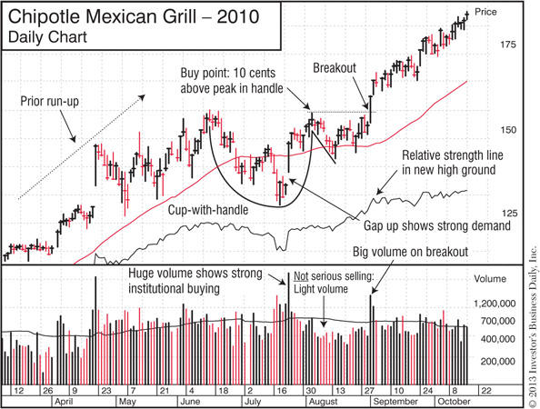
Chipotle Mexican Grill increased 186% from September 2010–April 2012.
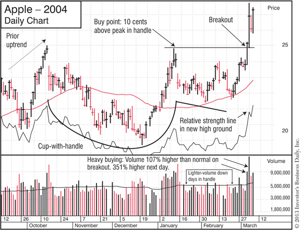
Apple increased 596% from March 2004–January 2006.
Sometimes the best way to see what works is to study what fails.
Take a look at the following chart patterns, and see how they stack up against the traits of proper—and successful—cup-with-handle formations.
Learning to spot these kinds of flaws will help significantly improve your stock-picking batting average.
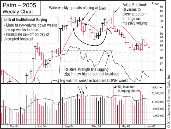
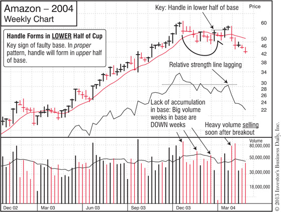
Finding Flaws
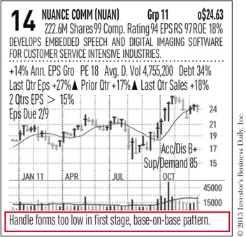
 In the IBD 50 and Your Weekly Review, you’ll find alerts to warning signs and potential flaws in a base. That’ll also help you learn to spot them on your own.

The cup-without-handle—also called a cup-shaped base or simply a cup— is a variation on the cup-with-handle pattern. As the name implies, it’s essentially the same, except it doesn’t have a handle. All the attributes, except for the buy point, are identical.
The buy point in a cup-shaped base is calculated by adding 10 cents to the peak on the left side of the cup—the most recent area of resistance.
Next is an example of how Google formed a cup-shaped base that launched a 119% gain in less than 10 months.
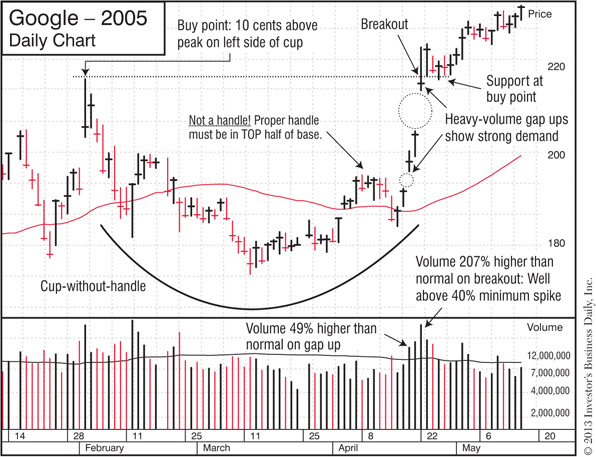
Google increased 119% from April 2005–January 2006.
See How to Spot a Cup-with-Handle
 Watch a short video at www.investors.com/GettingStartedBook.
Second Most Common Pattern
 Looks like a lopsided “W”
 Often occurs when overall market is choppy and volatile
 Can also set the stage for huge price gains
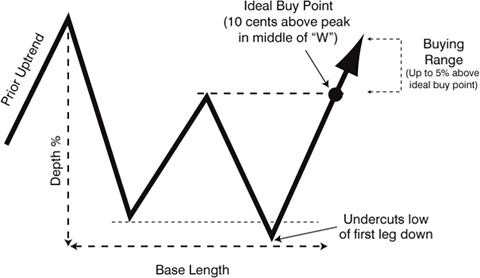
While the shape is different than a cup-with-handle, the core concepts and backstory of double bottoms are the same.
 Mirroring the Market: Double bottoms tend to form while the overall market is volatile, and that’s reflected in the shape. You have one down leg, then the stock tries to rally but hits resistance and ends up pulling back to form a second down leg. The stock rebounds one more time and is finally able to punch through and move higher. The breakout typically occurs when the overall market has also bounced back from a correction into a new uptrend.
 Support and Resistance: Like the cup-with-handle and all other bases, the buy point for a double bottom is calculated by adding 10 cents to the most recent area of resistance. That’s the peak in the middle of the “W.” Breaking through that resistance on unusually heavy volume shows institutional investors are back in the game, aggressively scooping up shares.
 Shakeout: Remember how the handle in the cup-with-handle shook out the weaker holders? You have the same concept here, just in a different place. Note how the bottom of the second leg in a double bottom undercuts the bottom of the first leg. That gets rid of the weaker holders, leaving more committed investors who create support for the stock’s new run.
Here’s a quick list of the key traits to look for in a double bottom.
 Prior uptrend: 30% or more
 Base depth: 40% or less
 Base length: At least 7 weeks
 The first down week in the base counts as Week #1
 Peak in middle of “W”
 Should form in upper half of base
 Should be below left-side peak
 Undercut: Bottom of second leg down should be lower than bottom of first leg down
 Ideal buy point
 10 cents above the peak in the middle of the “W”
 Buying range: Up to 5% above the ideal buy point
 Always buy as close as possible to the ideal buy point!
 Volume on day of breakout: At least 40%–50% above average
Below are examples of winning stocks that launched big runs from a double bottom.
Again, don’t rush through these examples. Study what the patterns look like on both the daily and weekly charts, and look for big spikes in volume on the breakouts.
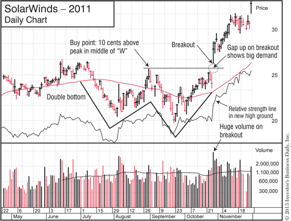
SolarWinds increased 137% from October 2011–September 2012.
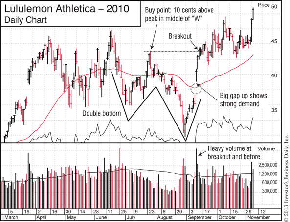
Lululemon Athletica increased 196% from September 2010–July 2011.
Here are some common flaws to look out for when reviewing a potential double bottom pattern.

In a double bottom, make sure the low in the second leg down undercuts the low in the first leg.
See How to Spot a Double Bottom
 Watch a short video at www.investors.com/GettingStartedBook.
Usually a Second-Stage Base
 Often occurs after a stock forms a cup-with-handle or double bottom
 Can offer another opportunity to start a new position or add shares to an existing one
 Milder decline than cup-with-handle and double bottom
 Shorter time frame (minimum 5 weeks)
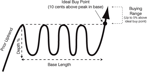
Remember how we mentioned the best stocks will form “stepping stones” as they make their big moves? They’ll go up for a while, pull back to form a new base, then resume their climb—giving you multiple opportunities to make money.
The flat base is a classic example of that. They typically form after a stock has made a nice gain from a cup-with-handle or double bottom breakout. That’s why they’re often considered “second-stage” bases. (We’ll get into that later in this chapter in “Go Beyond Just the Shapes.”)
Here are the key concepts to understand.
 Trading Sideways to “Digest” Earlier Gains: Stock will often break out of a cup-with-handle or double bottom pattern, run up at least 20%, then go sideways to form a flat base. It’s a milder decline than what you see in other patterns—no more than 15%.
The price range will usually remain fairly tight throughout the base. That may mean institutional investors—who have to buy tens of thousands or more shares to establish their large positions—are quietly buying within a certain price range. That’s how they increase their holdings without significantly driving up their average cost-per-share.
 Support and Resistance: Here again the buy point is determined by adding 10 cents to the most recent area of resistance—the highest price point within the flat base. Until the stock breaks through that “ceiling” (preferably on heavy volume), it won’t be able to launch the next leg of its climb.
 Shakeout: Flat bases also have a way of shedding those weaker holders we keep mentioning. Instead of a sharper sell-off like the handle in a cup-with-handle or the second-leg undercut in a double bottom, the flat base shakeout is more of a slow grind. The weaker holders just get worn out by the indecisive, sideways action and eventually lose patience and sell.
Here’s a quick list of the key traits to look for in a flat base.
 Prior uptrend: 30% or more
 Base depth: 15% or less
 Base length: At least 5 weeks
 The first down week in the base counts as Week #1
 Ideal buy point
 10 cents above the peak within the base
 Buying range: Up to 5% above the ideal buy point
 Always buy as close as possible to the ideal buy point!
 Volume on day of breakout: At least 40%–50% above average
Here are just two examples of winning stocks that launched big runs from a flat base.
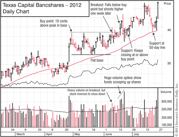
Texas Capital Bancshares increased 33% from June–October 2012.
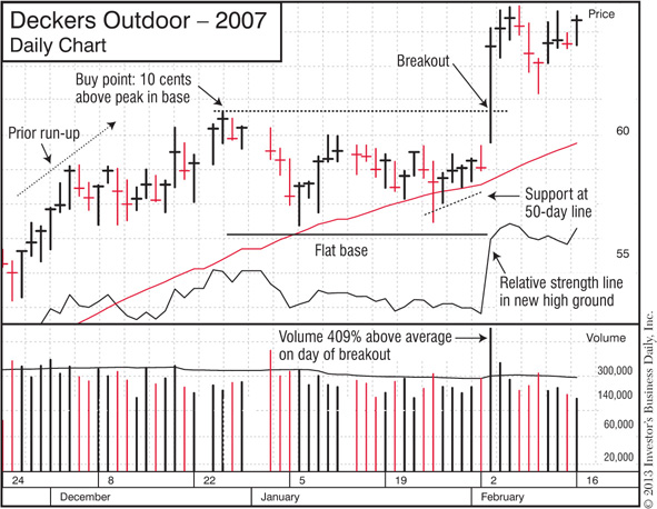
Deckers Outdoor increased 175% from February–December 2007.
Sometimes a stock will break out from a cup-with-handle or double bottom but fail to make the typical 20%–25% gain before starting to form a new pattern.
When that happens, we call it a “base-on-base” formation—and it can lead to some powerful moves.
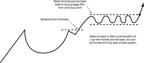
Here are the 2 key things to understand about a base-on-base:
• The stock must begin forming a new base before rising at least 20% from the ideal buy point in the prior pattern.
Here’s how that works.
Say a stock breaks out of a cup-with-handle with an ideal buy point of $100. If it starts forming a flat base after climbing to just $115—only a 15% rise—the prior cup-with-handle and the new flat base would be considered one “base-on-base” formation.
• The ideal buy point depends on what type of pattern the second base is.
While the second base in the base-on-base can be any type of pattern, it often ends up being a flat base. Whatever type of formation it is, all the normal criteria for that pattern still apply.
So if it’s a flat base, the ideal buy point would be 10 cents above the peak in that flat base.
If the second pattern in the base-on-base is a cup-with-handle, then the buy point would be 10 cents above the peak in the handle.
Just as double bottoms typically form when the overall market is volatile, base-on-base patterns often appear when there is uncertainty or significant selling pressure.
You’ll see stocks make that initial breakout from the prior pattern, but then the overall market weakens and they quickly pull back to form that second base.
The good news is, once the heavy “weight” of a market downturn or selling pressure is removed, leading stocks break out from these base-on-base and other patterns and quickly spring higher to new gains.
Here are examples of the kind of profits base-on-base patterns can deliver.
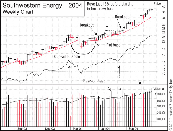
Southwestern Energy increased 504% from June 2004–October 2005.
Apple increased 402% from August 2004 to January 2006.
See How to Spot a Flat Base
 Watch a short video at www.investors.com/GettingStartedBook.
Once you spot the shape of a chart pattern, also look for signs of “accumulation” (institutional buying) and support within the base. That’s how you separate sound patterns from potentially faulty ones.
This comes back to Big Rock #3 we discussed earlier: Buy stocks being heavily bought by institutional investors. Avoid those they’re heavily selling.
Look for “Clues” in the Daily Stock Analysis Videos
 Regularly watching these free videos in the IBD TV section of Investors.com is an easy way to improve your chart-reading skills. See how at www.investors.com/GettingStartedBook.
These signals further confirm that big institutional investors are enthusiastic about the stock and are buying up shares, providing the fuel for a higher climb.
 More up weeks on heavy volume than down weeks on heavy volume in the base
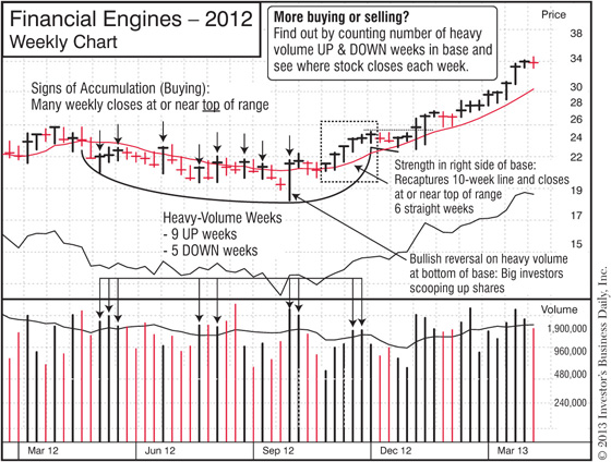
Financial Engines increased 48% from November 2012–March 2013.
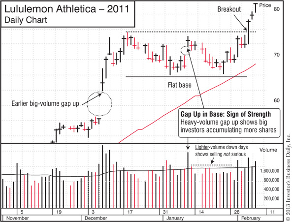
Lululemon Athletica increased 72% from February–July 2011.
 Positive reversals, and closes in the upper half of the range
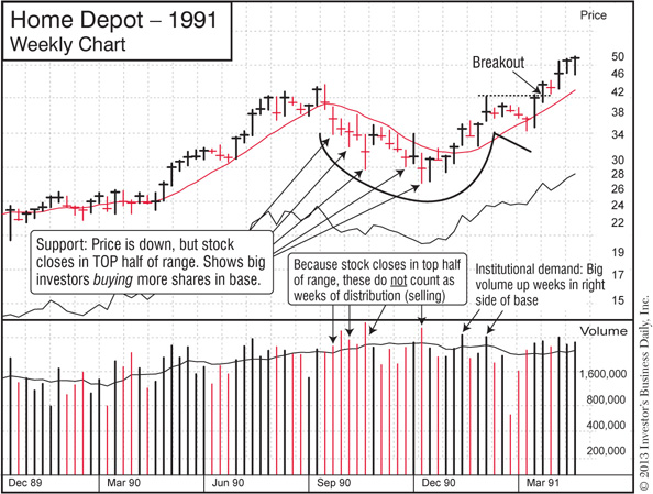
Home Depot increased 275% from January 1991–January 1993.
When you see these signs of institutional selling or uncertainty in a cup-with-handle or other pattern, proceed with caution. That base is less likely to launch a big move and is more likely to fail.
 Too many down weeks on heavy volume

 Gap downs on heavy volume

 Wide and loose, volatile trading action
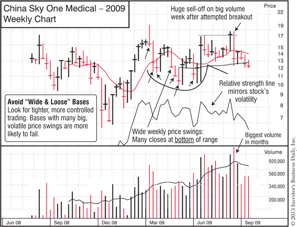
Compare China Sky’s wide and loose action to the tighter, healthier trading in the chart for Financial Engines we saw earlier in “Signs of Institutional Buying.”
Nothing goes up forever.
As we saw earlier, the big money is made in the early stages—usually the first 1–2 years—of a new bull market. That’s when the prior bear market has wiped the slate clean, and a new crop of leading stocks break out from a chart pattern and soar higher.
As they continue to climb higher, these stocks will likely take a breather and form another chart pattern along the way—maybe a flat base. That would be a second-stage base.
The Reset Button
 Generally, a bear market resets the “base count”—the number of chart patterns the stock has formed since the start of its big run. So the first breakout in a new bull market is considered a first-stage base. Note: Milder “interim corrections” do not reset the count (Big Rock #1, Chapter 3).
By the time a stock starts forming a third- or fourth-stage base, it could be getting a little long in the tooth. Here’s why:
 The stock itself has already made a big move. It could be up 100% or more. How much higher can it really go before institutional investors cash in their profits and put the stock into a deep decline?
 The overall market may be running out of steam. When you get into the third year of a bull cycle, the market tends to get more volatile and choppy. That impacts the leading stocks, and they may also struggle to move higher.
That’s the basic reason you want to be careful about buying stocks as they break out of a third- or even later-stage base.
Late-stage patterns can work and sometimes do lead to nice gains. But successful investing is about keeping the odds in your favor. So just understand that late-stage bases involve more risk. If you buy a stock on a late-stage breakout, you might cut your losses sooner—say, at 3%–4%—if the stock fails to gain traction.
See How to “Count” Bases
 This is easier to “show” than “tell,” so if you’d like to learn more about late-stage bases, check out a short video on that topic at www.investors.com/GettingStartedBook.
Later-stage bases can lead to good gains, but they are riskier than first- and second-stage patterns.
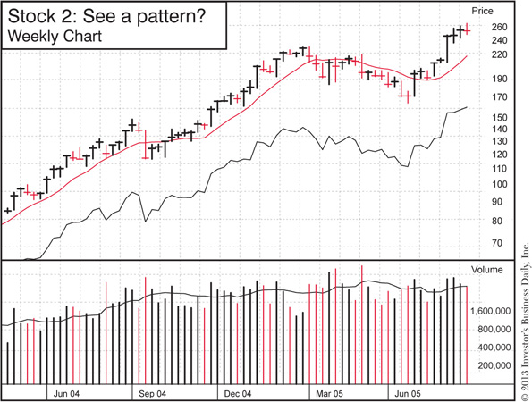
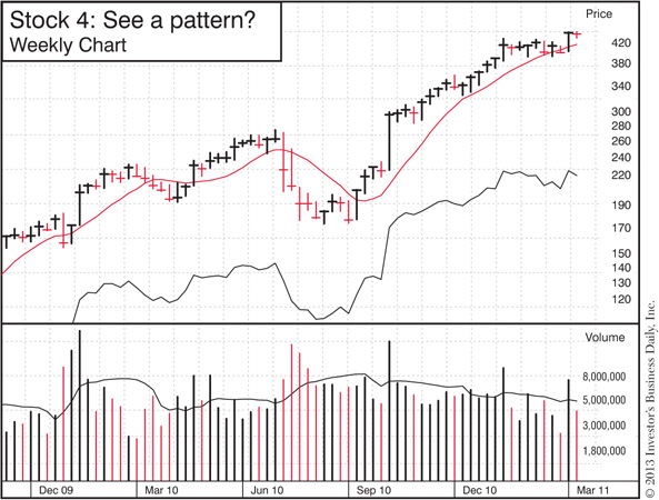
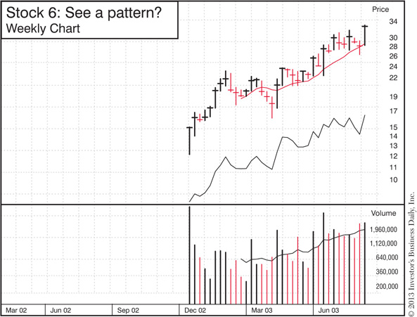
Now it’s time to put what you’ve learned to the test!
Here’s how to do it:
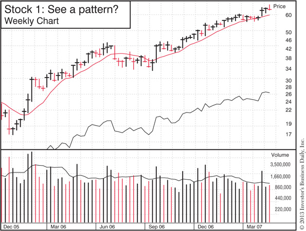
1. Go through the examples below and see if you can spot a pattern within each chart. If you do, can you name the type of base and see the ideal buy point?
2. Once you spot the pattern, look for the “clues” we discussed in “Go Beyond Just the Shapes.” Do you see any? What do they tell you about the stock and chart pattern? Is the relative strength line in or near new high territory?
3. See how you did by checking the markups I’ve included for the same chart on a different page.
The More You Practice, The More You Profit
 Don’t expect to learn all of this in one sitting! Take chart-reading one step at a time, and you’ll see it all come together very soon.
Here’s what I suggest: Before and/or after you take this quiz, watch the videos I included at the end of each chart pattern description and do the Simple Weekend Routine. That will help you improve your own chart-reading skills—and see where to find stocks forming these 3 telltale patterns right now.
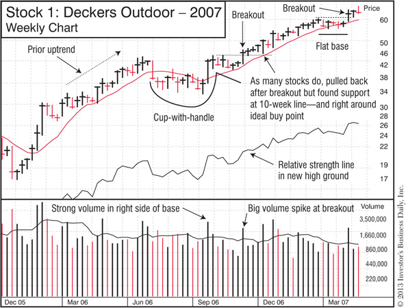
Deckers Outdoor increased 151% from September 2006–August 2007.
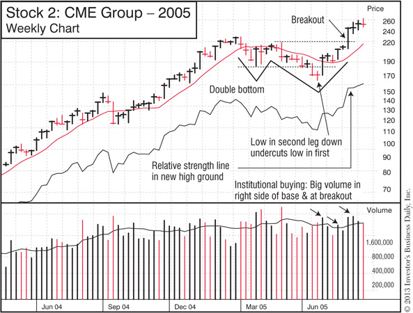
CME Group increased 224% from June 2005–December 2007.
DryShips increased 815% from January 2006–January 2007.
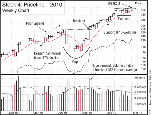
Priceline.com increased 105% from August 2010–May 2011.
Xerox increased 660% from April 1963 to April 1966.
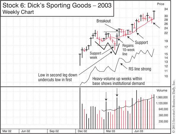
Dick’s Sporting Goods increased 181% from February 2003–April 2004.
Keep improving your chart-reading skills—while also building a timely watch list—by regularly watching the Daily Stock Analysis and Market Wrap videos at Investors.com/IBDtv.
The cup-with-handle, double bottom and flat base are the main patterns that launch big runs. But what if you miss those breakouts? Don’t worry. All is not lost!
The big winners will typically form alternative buying opportunities. You can use these to initiate a position in the stock—or add to your position if you did catch the breakout.
Since these are secondary buy points, it’s a good idea to buy a smaller position than you would from, say, a cup-with-handle. That’s especially true if you’re buying more shares in a stock you already own. In that case, you always want to buy fewer shares than you purchased in the initial breakout. That keeps you from running up your average purchase price too much.
Here are two of the most common alternative buying opportunities.
Like a flat base, this occurs after a stock breaks out, goes up for a while, then pauses to digest those gains.
As the name implies, it only takes 3 weeks to form. Here are the key points:
 Each weekly close should be within about 1% of the prior week’s close.
That’s what creates the “tight” range you see in the chart. Remember to focus on the weekly closing prices. During the week, the share price may move around a bit, but you’re focused on where it closes on Friday.
What do the tight weekly closes tell you? That institutional investors are holding onto their shares.
Fund managers and other professionals expect more from the stock, so they’re not taking their profits off the table. In fact, they’re quietly accumulating more shares, and that’s what keeps the stock in that tight and narrow price range.
 Ideal buy point
• 10 cents above the peak in the formation (i.e., the most recent area of resistance)
• Buying range: Up to 5% above the ideal buy point
• Always buy as close as possible to the ideal buy point!
 Volume on day of breakout: At least 40%–50% above average
As with all bases, you want volume to be at least 40%–50% higher than normal on the breakout to show that fund managers and other professional investors are jumping in.
Next are just 2 examples of how a 3-weeks tight can give you an opportunity to pick up shares as a winning stock continues its run.
Nationstar Mortgage increased 82% from June–October 2012.
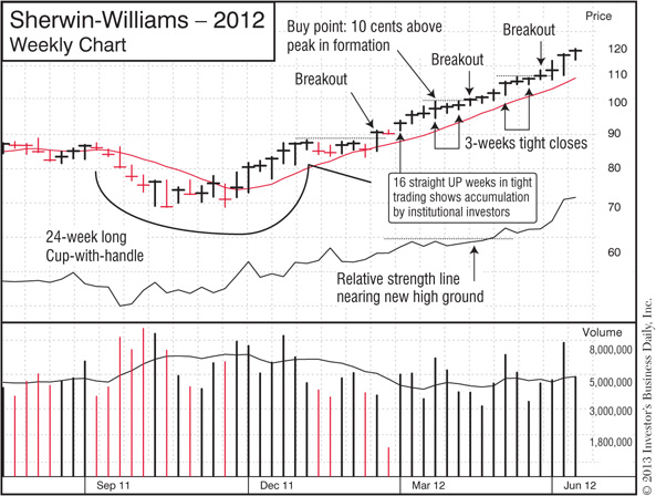
Sherwin-Williams increased 57% from February–October 2012.
See How to Spot a 3-Weeks Tight Pattern
 Watch a short video at www.investors.com/GettingStartedBook.
After a stock has broken out of a proper chart pattern, it may pull back to the benchmark 10-week or 50-day moving average lines we discussed earlier. If the stock bounces off the moving average line and shoots higher on heavy volume, it can offer a chance to buy shares.
That type of behavior shows institutional investors are stepping in to “support” and defend the stock. It happens around these moving average lines simply because professional investors use those lines as key benchmarks (see “Chart-Reading 101” in this chapter).
You’ll often hear pundits talk about “buying on the dips”—that is, buying a stock just because its share price is now lower and appears to be a “bargain.” That’s an extremely risky strategy. A stock going down in price is going down for a reason.
Depending on how heavy the volume is, one of those reasons may be that fund managers are dumping shares and moving out of the stock. Remember “Big Rock #3”: Buy stocks being heavily bought by institutional investors. Avoid those they’re heavily selling.
So how is buying on a “pullback” different?
Simple: You wait for the stock to find support and move up on heavy volume before you buy. In other words, don’t buy it if it keeps going down!
Here are some basic guidelines for how to properly buy on a pullback:
 Look for light volume on the pullback
This shows professional investors are not aggressively selling shares. Volume may be above average certain days or weeks during the pullback, but overall it should be “drying up” or getting lighter as the stock nears the moving average line.
 Make sure the stock bounces off the moving average line and heads higher on heavy volume
You want the stock to rebound and show strength, not weakness, before you buy. Never buy a stock as it’s moving down.
 Buy as close to the moving average line as possible
As the stock bounces off the 50-day or 10-week moving average line, you want to buy as close to that line as possible. The farther away from the line you buy, the riskier it gets.
 Focus on the first 2 pullbacks
The best gains typically come from the first 2 pullbacks to the 10-week line. By the time a stock’s third or fourth retreat occurs, it likely has already had a good move. Chances are now higher that the pullback is actually the start of a more serious sell-off.
Study the following weekly and daily charts for Netflix. They show how a pullback can be an opportunity to add shares to a winning position, or a second chance to buy into a stock if you missed an earlier breakout.
That’s also a good reminder of why you want to continue to track winning stocks as they make a big move. They’ll typically offer multiple opportunities for you to get in and profit.
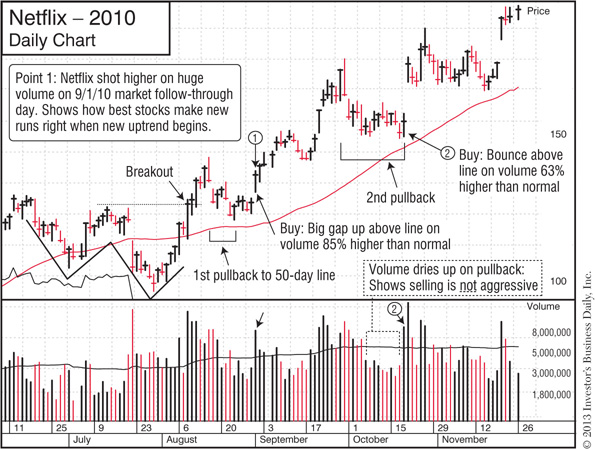
Netflix increased 150% from September 2010–July 2011.
5 Quick Guidelines for How to Buy on a Pullback
 Watch my 2-Minute Tip video on the right way to buy on a pullback at www.investors.com/GettingStartedBook.
Next up: Now that we’ve gone through Chart-Reading 101 and how to spot profitable chart patterns, let’s see how to check off the “Chart Analysis” items on the buying and selling checklists.
In the Buying Checklist and Selling Checklist sections we covered earlier, you saw how to quickly run through most of the buying and selling criteria using Stock Checkup and some basic rules.
Now that we’ve also covered the basics of chart-reading, let’s see how to go through the “Chart Analysis” items on both checklists.
If you’re brand new to charts, I’m sure you’re still trying to absorb all the patterns and concepts we just went through. As I keep saying—and as I know from personal experience—it takes a little time for it all to sink in and come together. But whatever you do, don’t give up on chart-reading!
The practice you put in now will pay off down the road. So stick with it. Keep doing the Simple Weekend Routine, and keep watching the Daily Stock Analysis and other IBD TV videos. Spotting buy and sell signals in a chart will soon become second nature.
Let’s start right now with a quick run through the Buying Checklist.
Chart Analysis: Buy stocks as they break out of the common patterns that launch big moves.
 Breaking out of sound base or alternative buy point
 Volume at least 40% to 50% above average on breakout
 Relative strength line in new high ground
 Within 5% of ideal buy point
As we go through this, don’t forget why we put so much emphasis on following sound buy rules:
Stocks that pass the Buying Checklist have the greatest potential to make a big gain.
And by making each stock prove itself before you buy, you significantly increase your chances of starting out right—with a nice profit instead of a loss. That’s why you want to always use this checklist as your starting point: Less risk, more reward.
 Breaking out of a sound base or alternative buy point
Is the stock nearing the ideal buy point in a cup-with-handle, double bottom or flat base—or an alternative buying area like a 3-weeks tight or pull-back to the 10-week line?
To help with your analysis, do a search on Investors.com to see what IBD has written about the stock’s latest chart action. And if the stock is on the IBD 50, Your Weekly Review, Sector Leaders or IBD Big Cap 20, check the latest chart analysis. Does that analysis match what you’re seeing?
If the stock is not forming any recognizable pattern or buy point, what does that tell you?
It means you need to stay patient. Stick to your rules and wait for a proper buying opportunity to emerge. A little discipline goes a long way to keeping you profitable and protected!
Is the Pattern Sound—or Suspect? Find Out with the Base Checklist
 Download and print this little “cheat sheet” to help you quickly evaluate a cup-with-handle or other pattern. You’ll find the Base Checklist at www.investors.com/GettingStartedBook.
 Volume on day of breakout: At least 40%–50% above average
If volume is below or just barely above average, that makes the breakout more suspect. Look for a big spike to show enthusiastic institutional buying.
Remember: 40%–50% is the minimum benchmark. On a strong breakout, you’ll often see volume come in 100%, 200% or more above average.
 Check the “Volume % Change” feature.
IBD’s unique “Volume % Change” tells you throughout the trading day if volume is trending above or below average. You’ll see it when you pull up a stock quote on Investors.com.
So as a stock breaks out, you’ll find the projected Volume % Change based on the trading volume up to that point, letting you easily see if it’s on track to hit the 40%–50% benchmark.
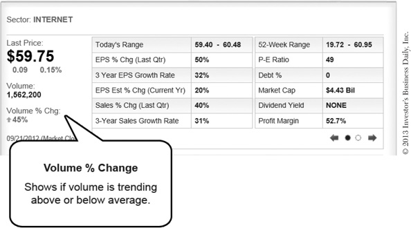
You‘ll find “Volume % Change” in Stock Checkup and the quotes pages on Investors.com and in IBD Smart NYSE + Nasdaq Tables (Chapter 7).
 Check the daily chart.
You can also see how heavy volume is on the day of the breakout with a quick glance at the daily chart.
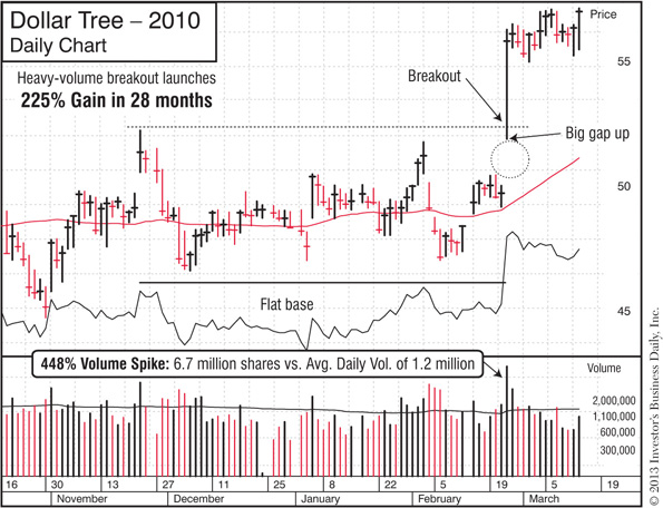
Unusually heavy volume on a breakout shows strong institutional demand.
In some cases, you may find volume falls short of the 40%–50% benchmark on the day of the breakout, but heavy volume kicks in a day or two later. That’s not ideal, but if the stock has the CAN SLIM® traits, is still within buying range (i.e., less than 5% above the ideal buy point) and volume comes in particularly strong, you could still buy it.
 Relative strength line in new high ground
The relative strength (RS) line compares the price performance of your stock over the last 52 weeks to that of the S&P 500.
 If the RS line is trending higher, the stock is outperforming the overall market.
 A downward trending line means the stock is lagging the market.
It’s bullish to see the RS line already moving into new high territory as a stock completes its base and breaks out. It confirms the stock has bounced back from its correction and is now showing market-leading power.

Make a point to always check the relative strength line when evaluating a chart pattern.
 Within 5% of ideal buy point
As we saw earlier, the buy points and buying ranges of base patterns are all essentially calculated the same way:
 Ideal Buy Point: 10 cents above the most recent area of resistance
 Buying Range: Up to 5% above the ideal buy point
Your goal is to buy as close to the ideal buy point as possible, but the stock can still be bought up to 5% past that price.
Don’t chase “extended” stocks—those beyond the 5% buying range.
It just exposes you to unnecessary risk. Stocks often pull back after they break out, and the farther away from the ideal buy point you make a purchase, the higher chance you have of getting “shaken out” by the 7%–8% sell rule.
So if you miss a breakout, resist the temptation to chase that train down the tracks. Instead, wait for it to pull into the next station by forming a new base or alternative buy point like a pullback or 3-weeks tight. That allows you to board the train more safely and sensibly.

Stay disciplined and only buy stocks within a proper buying range.
Checking the Chart for Buy Signals
 See a short video on how to run your stock through the “Chart Analysis” elements of the Buying Checklist at www.investors.com/GettingStartedBook.
Next up: Let’s use charts and the Selling Checklist to look for early warning signs in a stock.
 Chart Analysis: Consider selling some or all of your shares if you see these signals:
→ Biggest single-day price decline since start of stock’s run on heaviest volume in months
→ Sharp drop below 50-day moving average line on heaviest volume in months
→ Sharp drop—and close—below 10-week moving average line on heavy volume
We’ve already covered the basic selling game plan:
 Take most profits at 20%–25%.
 Cut all losses at no more than 7%–8%.
 Take defensive action as a market downtrend begins.
That’s a simple and effective way to nail down some good profits and avoid any serious losses.
And now that you’ve added charts to your investing toolbox, you can tap into additional ways to spot early warning signs in your stocks—signs that someone who does not use charts simply cannot see. Over time, it will become increasingly clear what a huge, money-making advantage that gives you.
As you become more comfortable with charts, you’ll discover other techniques that help you move to the sidelines and safeguard your profits. But to get started, let’s take a look at 3 common signs of trouble.
 Biggest single-day price decline since start of stock’s run on heaviest volume in months
Let’s see: A huge decline on the heaviest volume in months …
There’s no mystery to that “story.” Institutional investors are aggressively dumping shares!
Some fund managers may be liquidating their positions, and that spells serious trouble for the stock—and for you if you continue to hold.
The stock may bounce back down the road, but that type of sudden sell-off is a trend-changer: Chances are high the stock will continue to move farther south.
In the context of this sell rule, let’s revisit the charts we saw for OpenTable earlier in “Chart-Reading 101.” The company had carved out a profitable niche with a new platform that lets restaurants take online reservations and market to their customers. It was a young, innovative company and a market leader—until its trajectory changed sharply in the spring of 2011.
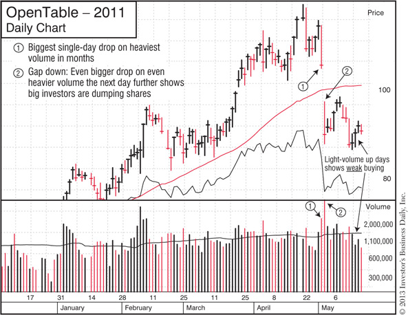
A huge price drop on heavy volume shows big investors are aggressively selling.
Here’s what that looked like on OpenTable’s weekly chart.
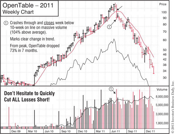
Do you see how the trend changed on that big sell-off?
As briefly noted in the charts for OpenTable in “Chart-Reading 101,” there were other warning signs even before the stock flashed this sell signal. Learning to spot those is definitely helpful, but as you’re getting started, at a minimum, stick to this rule. If a stock makes this kind of sharp downward shift on the heaviest volume in months, it’s time to sell at least some of your shares.
A vital part of the Selling Checklist is to make sure you take defensive action when the overall market starts to weaken. As the following examples for Fossil show, warning signs and sell signals often appear in individual stocks as distribution days mount and the market uptrend slips into a correction. Paying attention to those signs can help you lock in your profits and move to the sidelines before any serious damage hits.
Be ready to lock in profits as the overall market weakens.
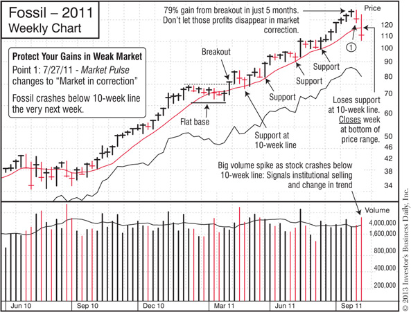
Double whammy: The market is in a correction and your stock is selling off on heavy volume. Time for defensive action.
Take another look at the weekly charts for OpenTable and Fossil—and recall what we learned earlier about support and resistance.
In the months leading up to the sharp sell-off, both stocks had been making a relatively steady upward climb, finding nice support at their 10-week moving average lines.
Do you see how that changed when the stocks suddenly made those exceptionally sharp declines on unusually heavy volume? Don’t ignore such a change in trend—it’s usually a sign of even more trouble ahead.
 Sharp drop below 50-day moving average line on heaviest volume in months
As we saw in the section on support and resistance, professional investors often use the 50-day moving average line as a key benchmark. That’s why it’s so important to watch how a stock behaves when it trades near that line.
 If the stock stays above the 50-day line, that means professional investors are stepping in to support the stock and protect their positions.
 If the stock crashes sharply below the 50-day line on unusually heavy volume, that could mean institutions are reducing their holdings, and more selling will follow.
A drop below the 50-day line does not necessarily mean you should automatically sell your entire position. However, it is a definite warning sign, particularly if the stock:
 Slices sharply below the line (especially on a huge gap down)
 Closes at the very bottom of the day’s price range
 Declines on unusually heavy volume
Also, if the general market is weakening and the Market Pulse outlook has changed to “Uptrend under pressure” or “Market in correction,” that’s all the more reason to take defensive action and protect yourself.
Next is an example of a heavy-volume drop below the 50-day line.
Support or sell-off? Always watch how a stock behaves around the 50-day line.
In “Go Beyond Just the Shapes,” we saw why a big gap up on heavy volume is a good thing. It shows there’s so much demand for a stock that, instead of moving up incrementally, it instantly jumps to a much higher price.
But a heavy-volume gap down is a completely different story. It tells you institutions are so eager to sell that the stock instantly drops down to a much lower price.
Take a minute and go back to the daily charts above for OpenTable and Trimble. Do you see the heavy-volume gap downs they had—and how the stocks went even farther south after that? If you ever see that behavior in one of your stocks, it’s definitely a sign to reduce your exposure and sell some or all of your shares.
 Sharp drop—and close —below 10-week moving average line on heavy volume
The 10-week moving average line found on weekly charts is roughly equivalent to the 50-day line found on daily charts. While professional investors use both lines as benchmarks (and you should too!), the 10-week line makes it easier to see the longer-term trend.
As we just saw, if a stock drops sharply below the 50-day line on extremely heavy volume and closes at the bottom of its range, that’s a serious sign of trouble. On the other hand, if volume is light and the stock bounces back to close near the top of the day’s range and at or just below that benchmark line, it could mean funds are buying shares to prop up the stock and protect their positions.
To gauge how serious the selling is, also check the weekly chart.
You may find that after a day or two of selling, fund managers step in to buy shares, and by the end of the week, the stock closes above or just under the 10-week line. That’s a sign of support.
However, if the stock breaks sharply below the 10-week line and closes under it on heavy volume, that’s a sign of institutional selling, not support. It’s often a precursor to more selling, meaning it’s time to protect yourself.
Here are two examples. The first shows a stock that did not find support and closed below the 10-week line on heavy volume. The second shows one that bounced back by the end of the week.
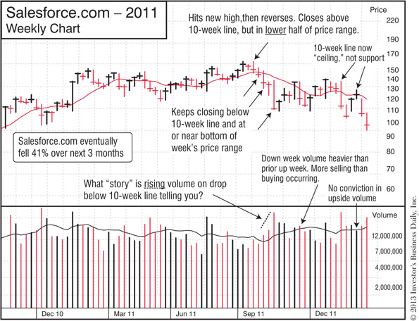
Salesforce.com did not find support at 10-week line, and continued lower.
Waiting to see where the stock closes for the week can help you hold on for bigger profits.
Checking the Chart for Sell Signals
 See a short video on how to spot signs of trouble using daily and weekly charts at www.investors.com/GettingStartedBook.