When you first turn on a Mac running OS X 10.6, an Apple logo greets you, soon followed by an animated, rotating “Please wait” gear cursor—and then you’re in. No progress bar, no red tape.
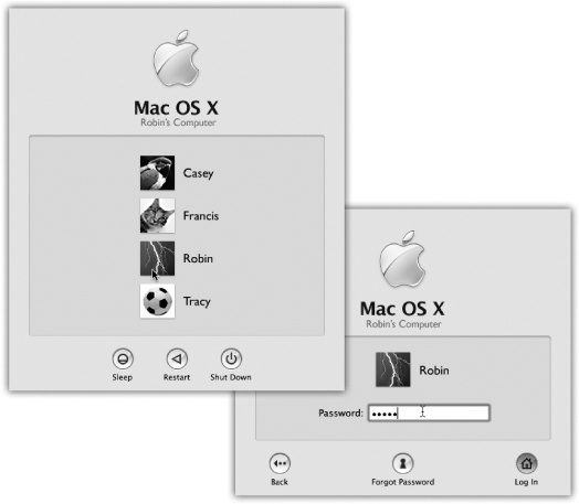
Figure 1-1. Left: On Macs configured to accommodate different people at different times, this is one of the first things you see upon turning on the computer. Click your name. (If the list is long, you may have to scroll to find your name—or just type the first few letters of it.) Right: At this point, you’re asked to type in your password. Type it, and then click Log In (or press Return or Enter; pressing these keys usually “clicks” any blue, pulsing button in a dialog box). If you’ve typed the wrong password, the entire dialog box vibrates, in effect shaking its little dialog-box head, suggesting that you guess again. (See Chapter 12.)
What happens next depends on whether you’re the Mac’s sole proprietor or you have to share it with other people in an office, school, or household.
If it’s your own Mac, and you’ve already been through the Mac OS X setup process described in Appendix A, no big deal. You arrive at the Mac OS X desktop.
If it’s a shared Mac, you may encounter the Login dialog box, shown in Figure 1-1. Click your name in the list (or type it, if there’s no list).
If the Mac asks for your password, type it and then click Log In (or press Return). You arrive at the desktop. Chapter 12 offers much more on this business of user accounts and logging in.
The desktop is the shimmering, three-dimensional Mac OS X landscape shown in Figure 1-2; technically, you’re in a program called the Finder. On a new Mac, it’s covered by a starry galaxy photo that belongs to Snow Leopard’s overall outer-space graphic theme. (If you upgraded from an earlier version of Mac OS X, you keep whatever desktop picture you had before. In fact, at first glance, you probably won’t spot anything different about Snow Leopard at all.)
If you’ve ever used a computer before, most of the objects on your screen are nothing more than updated versions of familiar elements. Here’s a quick tour.

Figure 1-2. The Mac OS X landscape looks like a more futuristic version of the operating systems you know and love. This is just a starting point, however. You can dress it up with a different background picture, adjust your windows in a million ways, and, of course, fill the Dock with only the programs, disks, folders, and files you need.
Note
If your desktop looks even barer than this—no menus, no icons, almost nothing on the Dock—then somebody in charge of your Mac has turned on Simple Finder mode for you. Details on Parental Controls.
For years, Apple has encouraged its flock to keep a clean desktop, to get rid of all the icons that many of us leave strewn around. Especially the hard drive icon, which has appeared in the upper-right corner of the screen since the original 1984 Mac.
In Snow Leopard, the Macintosh HD icon no longer appears on the screen (unless it was there before you upgraded). “Look, if you want access to your files and folders, just open them directly—from the Dock or from your Home folder (Your Home Folder),” Apple seems to be saying. “Most of the stuff on the hard drive is system files of no interest to you, so let’s just hide that icon, shall we?”
This row of translucent, almost photographic icons is a launcher for the programs, files, folders, and disks you use often—and an indicator to let you know which programs are already open. In Snow Leopard, they appear to rest on a sheet of transparent smoked glass.
In principle, the Dock is very simple:
Programs go on the left side. Everything else goes on the right, including documents, folders, and disks. (Figure 1-2 shows the dividing line.)
You can add a new icon to the Dock by dragging it there. Rearrange Dock icons by dragging them. Remove a Dock icon by dragging it away from the Dock, and enjoy the animated puff of smoke that appears when you release the mouse button. (You can’t remove the icon of a program that’s currently open, however.)
Click something once to open it. When you click a program’s icon, a tiny, bright, micro-spotlight dot appears under its icon to let you know it’s open.
When you click a folder’s icon, you get a pop-up arc of icons, or a grid or list of them, that indicates what’s inside. See Organizing and Removing Dock Icons for details.
Each Dock icon sprouts a pop-up menu. To see the menu, Control-click it or right-click it. A shortcut menu of useful commands pops right out.
Hold the mouse button down on a program’s Dock icon to see mini versions of all that program’s open windows. This feature, new in Snow Leopard, is an extension of the Exposé feature described on Exposé: Death to Window Clutter. (Click the window, or the Dock icon, to close Exposé.)
Because the Dock is such a critical component of Mac OS X, Apple has decked it out with enough customization controls to keep you busy experimenting for months. You can change its size, move it to the sides of your screen, hide it entirely, and so on. Chapter 4 contains complete instructions for using and understanding the Dock.
The  menu houses important Mac-wide commands like Sleep, Restart, and Shut Down. They’re always available, no matter which program you’re using.
Every popular operating system saves space by concealing its most important commands in menus that drop down. Mac OS X’s menus are especially refined:
They stay down. Mac OS X is multithreaded, which means it’s perfectly capable of carrying on with its background activities while you study its open, translucent menus. Therefore, Mac OS X menus stay open until you click the mouse button, trigger a command from the keyboard, or buy a new computer, whichever comes first.
Tip
Actually, menus are even smarter than that. If you give the menu name a quick click, the menu opens and stays open. If you click the menu name and hold the mouse button down for a moment, the menu opens, but closes again when you release the button. Apple figures that, in that case, you’re just exploring, reading, or hunting for a certain command.
They’re translucent. Unless you’ve turned off this option in System Preferences →Desktop & Screen Saver, you can faintly see the background through the menu bar.
They’re logically arranged. The first menu in every program, which appears in bold lettering, tells you at a glance what program you’re in. The commands in this Application menu include About (which indicates which version of the program you’re using), Preferences, Quit, and commands like Hide Others and Show All (which help control window clutter).
In short, all the Application menu’s commands actually pertain to the application you’re using.
The File and Edit menus come next. As in the past, the File menu contains commands for opening, saving, and closing files. (See the logic?) The Edit menu contains the Cut, Copy, and Paste commands.
The last menu is almost always Help. It opens a miniature Web browser that lets you search the online Mac help files for explanatory text (Shut Down).
You can operate them from the keyboard. Once you’ve clicked open a menu, you can highlight any command in it just by typing the first letter (g for Get Info, for example). (It’s especially great for “Your country” pop-up menus on Web sites, where “United States” is about 200 countries down in the list. Now you can type united s to jump right to it.)
You can also press Tab to open the next menu, Shift-Tab to open the previous one, and Return or Enter to “click” the highlighted command.
All that’s left is figuring out a way to open the menu itself from the keyboard to start the process (details on Control the Menus).
Otherwise, the menu bar looks and works much as it has in operating systems past.
In designing Mac OS X, one of Apple’s goals was to address the window-proliferation problem. As you create more files, stash them in more folders, and launch more programs, it’s easy to wind up paralyzed before a screen awash with overlapping rectangles.
That’s the problem admirably addressed by Exposé and Spaces. They’re described in detail in Chapter 5.
But some handy clutter and navigation controls are built into the windows themselves, too. For example:
The Sidebar is the pane at the left side of every Finder window, unless you’ve hidden it (and by the way, it’s also at the left side of every Open dialog box and every full-sized Save dialog box).
The Sidebar has as many as four different sections, each preceded by a collapsible heading:
Devices. This section lists every storage device connected to, or installed inside, your Mac: hard drives, CDs, DVDs, iPods, memory cards, USB flash drives, and so on. The removable ones (like CDs, DVDs, and iPods) bear a little gray
 logo, which you can click to eject that disk.
Shared. It took 20 years for an operating system to list all the other computers on the home or small-office network, right there in every window, without any digging, connecting, button-clicking, or window-opening. But here it is: a complete list of the other computers on your network whose owners have turned on File Sharing, ready for access. See Chapter 13 for details.
Places. This primary section of the Sidebar lists places (in this case, folders) where you might look for files and folders. Into this list, you can stick the icons of anything at all—files, programs, folders, anything but disks—for easy access.
Each icon is a shortcut. For example, click the Applications icon to view the contents of your Applications folder in the main part of the window (Figure 1-3). And if you click the icon of a file or program, it opens.
Search For. The “folders” in this Sidebar section are actually canned searches that execute instantly when you click one. If you click Today, for example, the main window fills with all the files and folders on your computer that you’ve changed today. Yesterday and Past Week work the same way.
The All Images, All Movies, and All Documents searches round up everything in those file-type categories, no matter what folders they’re actually sitting in.
These instasearches are very useful all by themselves, but what’s even better is how easy it is to make your own search folders to put here. Smart Folders has the details.
Note
Snow Leopard Spots: If you drag away everything listed under the Devices, Places, or Search For headings, the heading itself disappears to save space. The heading reappears the next time you put something in its category back into the Sidebar.
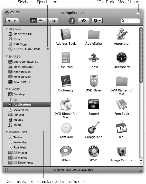
Figure 1-3. The Sidebar makes navigation very quick, because you can jump back and forth between distant corners of your Mac with a single click. In column view, the Sidebar is especially handy because it eliminates all the columns to the left of the one you want, all the way back to your hard-drive level. You’ve just folded up your desktop! Good things to put here: favorite programs, disks on a network you often connect to, a document you’re working on every day, and so on. Folder and disk icons here work just like normal ones. You can drag a document onto a folder icon to file it there, drag a downloaded .sit file onto the StuffIt Expander icon, and so on. In fact, the disks and folders here are even spring-loaded (page 77).
The beauty of this parking lot for containers is that it’s so easy to set up with your favorite places. For example:
Remove an icon by dragging it out of the Sidebar entirely. It vanishes with a puff of smoke (and even a little whoof sound effect). You haven’t actually removed anything from your Mac; you’ve just unhitched its alias from the Sidebar.
Rearrange the icons by dragging them up or down in the list. (You’re not allowed to rearrange the computers listed in the Shared section, though.)
Install a new icon by dragging it off your desktop (or out of a window) into any spot in the Places list of the Sidebar. Unlike previous versions of Mac OS X, you can’t drag icons into any old section of the Sidebar—just the Places place.
Adjust the width of the Sidebar by dragging its right edge—either the skinny divider line or the extreme right edge of the vertical scroll bar, if there is one. You “feel” a snap at the point when the line covers up about half of each icon’s name. Any covered-up names sprout ellipses (…) to let you know (as in “Secret Salaries Spreadsh…”).
TROUBLESHOOTING MOMENT: Fixing the Sidebar
In the pre-Leopard days, dragging stuff out of the Sidebar to get rid of it sometimes created a small quandary: Once you dragged the Macintosh HD, Home, or iDisk icons out of the Sidebar, you couldn’t drag them back in. Suddenly you were stuck with the orphaned horizontal divider, with nothing to divide. The top half of your list was empty.
Nowadays, mercifully, anything you drag out of the Sidebar can be dragged back in again, including the big-ticket items like Home and Macintosh HD.
(Furthermore, entire headings now appear and disappear as needed.)
Even so, there’s a quicker way to restore the Sidebar to its factory settings.
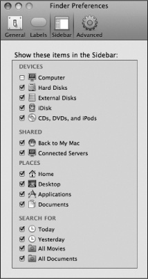
If you choose Finder→Preferences and then click the Sidebar button, you discover the checkboxes shown here. They let you put back the Apple-installed icons that you may have removed in haste. Just turn on a checkbox to restore its icon to your Side-bar. So if something you expect to see in your Sidebar isn’t there, check back here.
On the other hand, you might as well streamline your computing life by turning off the checkboxes of icons that you never want to see filling your Sidebar.
Hide the Sidebar by pressing ⌘-Option-S, which is the shortcut for the new View→Hide Sidebar command. Bring it back into view by pressing the same key combination (or using the Show Sidebar command).
Note
The Sidebar also hides itself when you click the Old Finder Mode button, described on Old Finder Mode: The Toolbar Disclosure Button.
Then again, why would you ever want to hide the Sidebar? It’s one of the handiest navigation aids since the invention of the steering wheel. For example:
It takes a lot of pressure off the Dock. Instead of filling up your Dock with folder icons (all of which are frustratingly alike and unlabeled anyway), use the Sidebar to store them. You leave the Dock that much more room for programs and documents.
It’s better than the Dock. In some ways, the Sidebar is a lot like the Dock, in that you can stash favorite icons of any sort there. But the Sidebar reveals the names of these icons, and the Dock doesn’t until you use the mouse to point there.
It makes disk-ejecting easy. Just click the
button next to any removable disk to make it pop out. After 20 years, Mac has finally beaten the “It’s illogical to eject a disk by dragging it to the Trash!” problem. (Other ways to eject disks are described in Chapter 11.)It makes disc-burning easy. When you’ve inserted a blank CD or DVD and loaded it up with stuff you want to copy, click the
 button next to its name to begin burning that disc. (Details on burning discs are in Chapter 11.)
You can drag onto its folders and disks. That is, you can drag icons onto Sidebar icons, as though they were the real disks, folders, and programs they represent.
It simplifies connecting to networked disks. Park your other computers’ hard drive icons here, as described in Chapter 13, and you shave several steps off the usual connecting-via-network ritual.
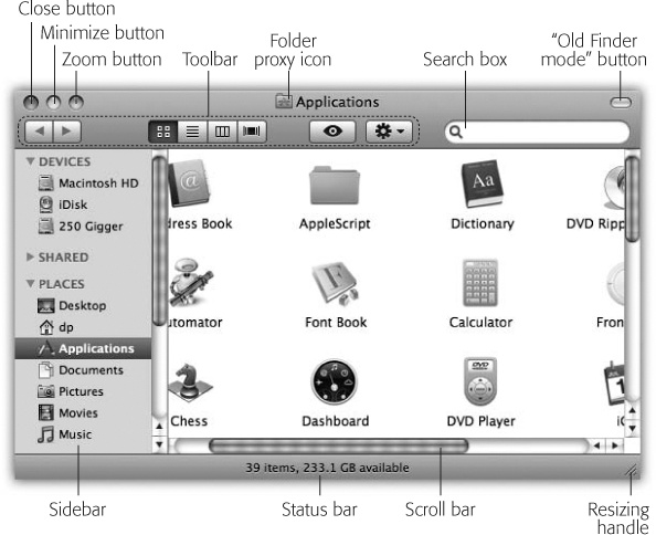
The title bar (Figure 1-4) has several functions. First, when several windows are open, the darkened title bar, window name, mini-icon, and colored left-corner buttons tell you which window is active (in front); in background windows, these elements appear dimmed and colorless. Second, the title bar acts as a handle that lets you move the window around on the screen.
Of course, you can also move Mac OS X windows by dragging any “shiny gray” edge; see Figure 1-5.
Tip
Here’s a nifty keyboard shortcut: You can cycle through the different open windows in one program without using the mouse. Just press ⌘-~ (that is, the tilde key, to the left of the number 1 key on U.S. keyboards). With each press, you bring a different window forward within the current program. It works both in the Finder and in your everyday programs, and it beats the pants off using the mouse to choose a name from the Window menu. (Note the difference from ⌘-Tab, which cycles through different open programs.)
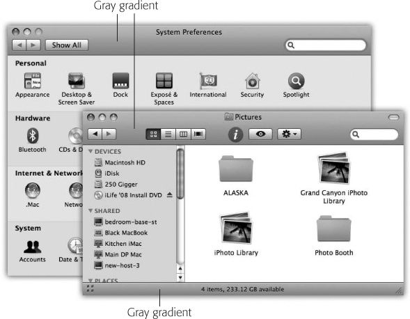
Figure 1-5. Mac OS X is no longer made of simulated brushed aluminum, as in years past. Now it’s accented with strips of gradient gray (that is, light-to-dark shading). All these gradient gray strips are fair game as handles to drag the window.
After you’ve opened one folder that’s inside another, the title bar’s secret folder hierarchy menu is an efficient way to backtrack—to return to the enclosing window. Get in the habit of right-clicking (or Control-clicking, or ⌘-clicking) the name of the window to access the menu shown in Figure 1-6. (You can release the Control or ⌘ key immediately after clicking.)
Figure 1-6. Control-click (or right-click, or ⌘-click) a Finder window’s title bar to summon the hidden folder hierarchy menu. This trick also works in most other Mac OS X programs. For example, you can ⌘-click a document window’s title to find out where the document is actually saved on your hard drive.
By choosing the name of a folder from this menu, you open the corresponding window. When browsing the contents of the Users folder, for example, you can return to the main hard drive window by Control-clicking the folder name Users and then choosing Macintosh HD from the menu.
Tip
Keyboard lovers, take note. Instead of using this title bar menu, you can also jump to the enclosing window by pressing ⌘-↑ (up arrow), which is the shortcut for the Go→Enclosing Folder command.
Pressing ⌘-↓ (down arrow) takes you back into the folder you started in, assuming that it’s still highlighted. (This makes more sense when you try it than when you read it.)
Once you’ve mastered dragging, you’re ready for these three terrific title bar tips:
Pressing the ⌘ key lets you drag the title bar of an inactive window—one that’s partly covered by a window in front—without bringing it to the front. (Drag any empty part of the title bar—not the title itself.)
By the way, you can close, minimize, or zoom a background window without the help of the ⌘ key. Just click one of those three corresponding title-bar buttons normally. Mac OS X does its thing without taking you out of your current window or program.
By double-clicking the title bar, you minimize the window, making it collapse into the Dock exactly as though you had clicked the Minimize button (assuming you haven’t turned off this feature in System Preferences, of course).
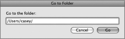
POWER USERS’ CLINIC: The Go to Folder Command
Sometimes a Unix tentacle pokes through the friendly Mac OS X interface. Every now and then, you find a place where you can use Unix shortcuts instead of the mouse.
One classic example is the Go→Go to Folder command (Shift-⌘-G). It brings up a box like the one shown here.
The purpose of this box is to let you jump directly to a certain folder on your Mac by typing its Unix folder path. Depending on your point of view, this special box is either a shortcut or a detour.
For example, if you want to see what’s in the Documents folder of your Home folder, you could choose Go→Go to Folder and type this:
/Users/chris/Documents
Then click Go or press Return. (In this example, of course, chris is your short account name.)
In other words, you’re telling the Mac to open the Users folder in your main hard drive window, then your Home folder inside that, and then the Documents folder inside that. Each slash means “and then open.” (You can leave off the name of your hard drive; that’s implied by the opening slash.) When you press Return, the folder you specified pops open immediately.
Of course, if you really wanted to jump to your Documents folder, you’d be wasting your time by typing all that. Unix (and therefore Mac OS X) offers a handy shortcut that means “home folder.” It’s the tilde character (~) at the upper-left corner of the U.S. keyboard.
To see what’s in your Home folder, then, you could type just that ~ symbol into the Go to Folder box and then press Return. Or you could add some slashes to it to specify a folder inside your Home folder, like this:
~/Documents
You can even jump to someone else’s Home folder by typing a name after the symbol, like this:
~chris
If you get into this sort of thing, here’s another shortcut worth noting: If you type nothing but a slash (/) and then press Return, you jump immediately to the Computer window, which provides an overview of all your disks.
Note, too, that you don’t have to type out the full path—only the part that drills down from the window you’re in. If your Home folder window is already open, for example, then you can open the Pictures folder just by typing Pictures.
But the Go to Folder trick really turns into a high-octane timesaver if you use autocompletion. Here’s how it works: After each slash, you can type only enough letters of a folder’s name to give Mac OS X the idea—de instead of desktop, for example—and then wait a fraction of a second (or, if you’re late for a plane, press the Tab key). Mac OS X instantly and automatically fills in the rest of the folder’s name. It even auto-capitalizes the folder names for you. (In Unix, capitalization matters.)
For example, instead of typing /Applications/Microsoft Office/clipart/standard, you could type nothing more than /ap/ mi/cl/st, remembering to press Tab after each pair of letters. Now that’s a way to feel like a Unix programmer.
The Option key means “Apply this action to all windows in the current program.” For example, Option-double-clicking any title bar minimizes all desktop windows, sending them flying to the Dock.
As the tip of your cursor crosses the three buttons at the upper-left corner of a window, tiny symbols appear inside them:  ,
,  , and
, and  . Ignore the gossip that these symbols were added to help color-blind people who can’t distinguish the colors red, yellow, and green. Color-blind people are perfectly capable of distinguishing the buttons by their positions, just as they do with traffic lights.
But for people who aren’t paying attention to button position, these cues appear to distinguish the buttons when all three are identical shades of gray, as they are when you use Graphite mode (Accounts). They also signal you when it’s time to click. For example, as described in the previous section, you can use these three buttons even when the window is not at the front. You know the buttons are ripe for the clicking when you see the little symbols appear under your cursor.
The most important window gadget is the Close button, the red, droplet-like button in the upper-left corner (Figure 1-7). Clicking it closes the window, which collapses back into the icon from which it came.
Tip
If, while working on a document, you see a tiny dot in the center of the Close button, Mac OS X is trying to tell you that you haven’t yet saved your work. The dot goes away when you save the document.
The universal keyboard equivalent of the Close button is ⌘-W (for window)—a keystroke well worth memorizing. If you get into the habit of dismissing windows with that deft flex of your left hand, you’ll find it far easier to close several windows in a row, because you won’t have to aim for successive Close buttons.
In many programs, something special happens if you’re pressing the Option key when using the Close button or its ⌘-W equivalent: You close all open windows. This trick is especially useful in the Finder, where a quest for a particular document may have left your screen plastered with open windows for which you have no further use. Option-clicking the Close button of any one window (or pressing Option-⌘-W) closes all of them.
On the other hand, the Option-key trick doesn’t close all windows in every program—only those in the current program. Option-closing a Pages document closes all Pages windows, but your Finder windows remain open.
Moreover, Option-closing works only in enlightened applications. (In this department, Microsoft is not yet enlightened.)
Click this yellow drop of gel to minimize any Mac window, sending it shrinking, with a genie-like animated effect, into the right end of the Dock, where it then appears as an icon. The window isn’t gone, and it hasn’t even closed. It’s just out of your way for the moment, as though you’ve set it on a shelf. To bring it back, click the newly created Dock icon; see Figure 1-7. Chapter 4 has more on the Dock.
Minimizing a window in this way is a great window-management tool. In the Finder, minimizing a window lets you see whatever icons were hiding behind it. In a Web browser, it lets you hide a window that has to remain open (because you’re waiting for some task to finish) so you can read something else in the meantime.
Figure 1-7. Clicking the Minimize button sends a window scurrying down to the Dock, collapsing in on itself as though being forced through a tiny, invisible funnel. A little icon appears on the lower-right corner of its minimized image to identify the program it’s running in.
And now, some Minimize button micro-goodies:
If you enjoy the ability to roll up your windows in this way, remember that you actually have a bigger target than the Minimize button. The entire title bar becomes a giant Minimize button when you double-click anywhere on it. (That’s an option in the Appearance panel of System Preferences, described in Chapter 9.)
Better yet, you can also minimize the frontmost window of almost any program (including the Finder) from the keyboard by pressing ⌘-M. That’s a keystroke worth memorizing on Day One.
The Minimize button harbors a very entertaining hidden feature. If you Option-click it, all windows in the current program shrink away simultaneously—great when you’ve got several Web browser windows open, for example, or an abundance of word processor documents. (This tip works only if you’ve turned on System Preferences→Appearance→“Double-click a window’s title bar to minimize.”)
You might expect that Option-clicking one minimized window on the Dock would un-minimize all of a program’s windows—and indeed, that’s true for Cocoa programs (Two Kinds of Programs: Cocoa and Carbon). But if it’s a Carbon program, like Word or Photoshop, then you have to click the windows one at a time on the Dock to bring them back.
Tip
Mac OS X can change menu commands as you press modifier keys. For example, open a couple of Finder windows and then click the Window menu. Focus your eyes on the Minimize Window command. Now press Option and watch both the wording and the listed keyboard equivalent change instantly to Minimize All (Option-⌘-M).
The Option key works wonders on the File menu, too.
In the bad old days (up to late 2009), minimizing a bunch of documents could get really messy. Each one flew onto the Dock, creating a new icon there, creating a tighter and tighter squeeze, shrinking the Dock’s icons until they were the size of Tic Tacs.
In Snow Leopard, you can have your document windows minimize themselves into their program’s Dock icon, rather than creating new Dock icons for themselves. That way, your Dock doesn’t get any more crowded, and the icons on it don’t keep shrinking away to atoms.
To turn on this feature, choose
→System Preferences→Dock. Turn on “Minimize windows into application icon.”So how do you get those windows back out of the Dock icon? You use Dock Exposé, which is described on One-App Exposé.
POWER USERS’ CLINIC: Adjusting the Genie Speed
Apple has a name for the animation you see when you minimize, open, or close a window: the genie effect, because it so closely resembles the way Barbara Eden, Robin Williams, and other TV and movie genies entered and exited their magic lamps and bottles.
But you don’t have to watch the “genie” animation in precisely the same way, day in and day out. You can slow it down or speed it up, like this:
Slow it down. When Steve Jobs first demo’ed Mac OS X, one of his favorite bits was slowing down the animation so we could see it in graceful, slow motion. How did he do that?
If you Shift-click a window’s Minimize button, it collapses into the Dock at about one-fifth its usual speed—an effect sure to produce gasps from onlookers. The Shift key also slows the un-minimizing animation, the one you see when you click a window icon in the Dock to restore it to full size. (Shift-clicking a button to slow down its animation is a running theme in Mac OS X. You’ll find it mentioned in several spots in this book.)
Speed it up. There’s no keystroke for making the animation go faster. You can, however, substitute a faster style of minimizing animation.
To do so, choose →Dock→Dock Preferences. From the “Minimize windows using” pop-up menu, choose Scale Effect, and then close the window. Now, instead of collapsing through an invisible funnel, minimized windows simply shrink as they fly down to the Dock, remaining rectangular. The time you save isn’t exactly going to get you home an hour earlier each day, but at least you have the illusion of greater speed.
(Actually, there’s a third animation style, too, but there’s a trick to unleashing it; see TinkerTool: Customization 101.)
A click on this green geltab (see Figure 1-7) makes a desktop window just large enough to reveal all the icons inside it (or, in application programs, large enough to reveal all the text, graphics, or music). If your monitor isn’t big enough to show all the icons in a window, then Zoom resizes the window to show as many as possible.
In either case, a second click on the Zoom button restores the window to its previous size. (The Window→Zoom command does the same thing.)
Figure 1-8. When you find yourself confronting a Finder window that contains useful stuff, consider dragging its proxy icon to the Dock. You wind up installing its folder or disk icon there for future use. That’s not the same as minimizing the window, which puts the window icon into the Dock, and only temporarily at that. (Note: Most document windows also offer a proxy-icon feature but produce only an alias when you drag the proxy to a different folder or disk.)
In the Finder, there’s a tiny icon next to the window’s name (Figure 1-8). It’s a stand-in—a proxy—for that window’s folder itself.
By dragging this tiny icon, you can move or copy the folder into a different folder or disk, into the Sidebar, into the Trash, or into the Dock without having to first close the window.
Tip
You have to hold down the mouse button on the folder proxy icon until the icon darkens before dragging. (It darkens in a fraction of a second.)
When you drag this proxy icon to a different place on the same disk, the usual folder-dragging rules apply: Hold down the Option key if you want to copy the original disk or folder; ignore the Option key to move the original folder. (You’ll find details on moving and copying icons in the next chapter.)
Many programs, including Microsoft Word, Preview, QuickTime Player, and others, offer the same mini-icon in open document windows. Once again, you can use it as a handle to drag a document into a new folder or onto a new disk. Sometimes, doing that really does move the document—but more often, you just get an alias of it in the new location.
Chapter 4 describes this fascinating desktop-window element in great detail.
In Mac OS X, double-clicking a folder in a window doesn’t leave you with two open windows. Instead, double-clicking a folder makes the original window disappear (Figure 1-9).
Tip
If you Option-double-click a folder, you don’t simply replace the contents of a fixed window that remains onscreen; you actually switch windows, as evidenced by their changing sizes and shapes.
So what if you’ve now opened inner folder B, and you want to backtrack to outer folder A? In that case, just click the tiny  button—the Back button—in the upper-left corner of the window (shown in Figure 1-9), or use one of these alternatives:
Choose Go→Back.
Press ⌘-[ (left bracket).
Press ⌘-→ (up arrow).
Choose Go→Enclosing Folder.
None of that helps you, however, if you want to move a file from one folder into another, or compare the contents of two windows. In that case, you probably want to see both windows open at the same time.
You can open a second window using any of these techniques:
Choose File→New Finder Window (⌘-N).
⌘-double-click a disk or folder icon.
Double-click a folder or disk icon on your desktop.
Tip
What folder contents fill the “new” window that appears when you use this command? Usually, it’s your Home folder, the folder that contains your entire universe of files, folders, and settings.
But you can choose any window you want. To make the change, choose Finder→Preferences. Click the General icon. Change the “New Finder windows open” pop-up menu to whatever folder you’d like to use as the starting point for your computing life. Your Home folder is a good choice, but you’re also free to choose your Documents folder, your iDisk, or any folder at all. Now every new Finder window shows you that specified folder, which is a much more useful arrangement.
Figure 1-9. To help you avoid window clutter, Apple has designed Mac OS X windows so that double-clicking a folder in a window (top) doesn’t actually open another window (bottom). Every time you double-click a folder in an open window (except in column view), its contents replace whatever was previously in the window. If you double-click three folders in succession, you still wind up with just one open window.
The upper-right corner of every Finder window contains a little button that looks like a half-inch squirt of Crest toothpaste. When you click it, you enter Old Finder Mode.
Tip
You can also turn Old Finder Mode on or off by pressing Option-⌘-T, the equivalent for the View→Hide Toolbar command.
“Old Finder Mode,” of course, isn’t the technical Apple term, but it should be. It was designed for people who come to Mac OS X from an earlier version of the Mac OS, like Mac OS 9, and lose half their hair when they discover how different things are in Mac OS X.
In this mode, two of the biggest behavioral differences between Mac OS X and its predecessor disappear:
The Sidebar and the toolbar blink out of sight.
Double-clicking a folder now works like it did back in 2000. Every time you double-click a folder, you open a new corresponding window.
When you’ve had enough of Old Finder Mode, you can return to regular Mac OS X mode either by clicking the Toolbar Disclosure button again, or by pressing Option-⌘-T again (that is, View→Show Toolbar).
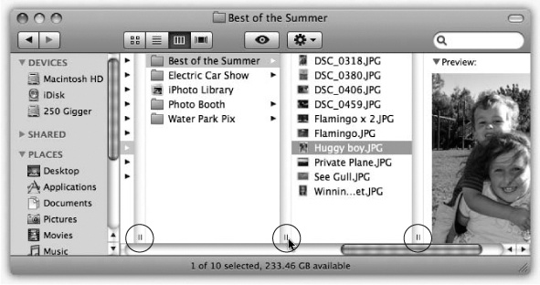
Scroll bars appear automatically in any window that isn’t big enough to show all its contents. Without scroll bars in word processors, for example, you’d never be able to write a letter that’s taller than your screen. You can manipulate a scroll bar in three ways, as shown in Figure 1-10.
Ordinarily, when you click in the scroll bar track above or below the gelatinous handle, the window scrolls by one screenful. But another option awaits when you choose →System Preferences→Appearance and turn on “Scroll to here.” Now when you click in the scroll bar track, the Mac considers the entire scroll bar a proportional map of the document and jumps precisely to the spot you clicked. That is, if you click at the very bottom of the scroll bar track, you see the very last page.
Tip
No matter which scrolling option you choose in the Appearance panel, you can always override your decision on a case-by-case basis by Option-clicking in the scroll bar track. In other words, if you’ve selected the “Scroll to here” option, you can produce a “Jump to the next page” scroll by Option-clicking in the scroll bar track.
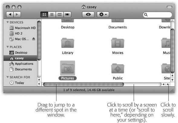
Figure 1-10. Three ways to control a scroll. The scroll bar arrows (lower right) appear nestled together when you first install Mac OS X, as shown here. And what if you, an old-time Windows or Mac OS 9 fan, prefer these arrows to appear on opposite ends of the scroll bar? Visit the Appearance panel of System Preferences and, under “Place scroll arrows,” choose “At top and bottom.” Tip: On a laptop, you can even scroll diagonally—by dragging with two fingers on the trackpad.
It’s worth noting, however, that the true speed expert eschews scroll bars altogether. Your Page Up and Page Down keys let you scroll up and down, one screen at a time, without having to take your hands off the keyboard to grab the mouse. The Home and End keys, meanwhile, are generally useful for jumping directly to the top or bottom of your document (or Finder window). And if you’ve bought a mouse that has a scroll wheel on the top, you can use it to scroll windows, too, without pressing any keys at all.
The lower-right corner of every standard Mac OS X window is ribbed, a design that’s meant to imply that you can grip it by dragging. Doing so lets you resize and reshape the window.
This little item appears when you choose View→Show Path Bar. It’s a tiny map at the bottom of the window that shows where you are in the folder hierarchy. If it says Casey→Pictures→Picnic, well, then, by golly, you’re looking at the contents of the Picnic folder, which is inside Pictures, which is inside your Home folder (assuming your name is Casey).
You can view the files and folders in a desktop window in any of four ways: as icons; as a single, tidy list; in a series of neat columns; or in Cover Flow view, where you can flip through giant document icons like they’re CDs in a music-store bin. Figure 1-11 shows the four different views.
Every window remembers its view settings independently. You might prefer to look over your Applications folder in list view (because it’s crammed with files and folders) but view the Pictures folder in icon or Cover Flow view, where the larger icons serve as previews of the photos.
To switch a window from one view to another, just click one of the four corresponding icons in the window’s toolbar, as shown in Figure 1-11.
You can also switch views by choosing View→as Icons (or View→as Columns, or View→as List, or View→as Cover Flow), which can be handy if you’ve hidden the toolbar. Or, for less mousing and more hard-bodied efficiency, press ⌘-1 for icon view, ⌘-2 for list view, ⌘-3 for column view, or ⌘-4 for Cover Flow view.
The following pages cover each of these views in greater detail.
Note
One common thread in the following discussions is the availability of the View Options palette, which lets you set up the sorting, text size, icon size, and other features of each view, either one window at a time or for all windows.
Apple gives you a million different ways to open View Options. You can choose View→Show View Options, or press ⌘-J, or choose Show View Options from the  menu at the top of every window.
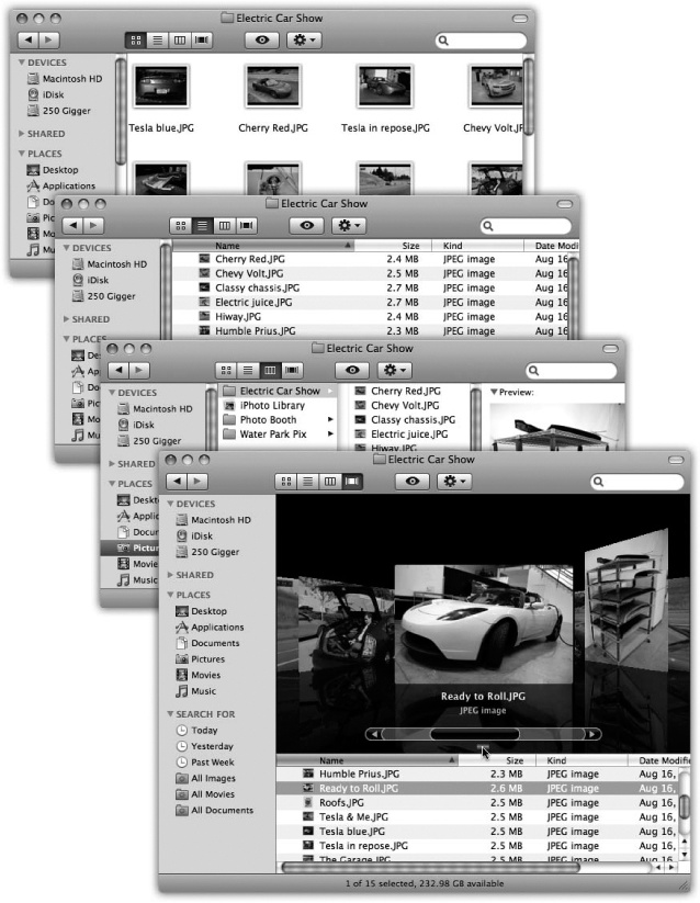
Figure 1-11. From the top: the same window in icon view, list view, column view, and Cover Flow view. Very full folders are best navigated in list or column views, but you may prefer to view emptier folders in icon or Cover Flow views, because larger icons are easier to preview and click. Remember that in any view (icon, list, column, or Cover Flow), you can highlight an icon by typing the first few letters of its name. In icon, list, or Cover Flow view, you can also press Tab to highlight the next icon (in alphabetical order), or Shift-Tab to highlight the previous one.
In icon view, every file, folder, and disk is represented by a small picture—an icon. This humble image, a visual representation of electronic bits and bytes, is the cornerstone of the entire Macintosh religion. (Maybe that’s why it’s called an icon.)
Mac OS X draws those little icons using sophisticated graphics software. As a result, you can scale them to almost any size without losing any quality or clarity. And now, in Snow Leopard, doing so is almost pitifully easy.
That’s because any icon-view window now sprouts a size slider, shown in Figure 1-12. Drag it to the right or left to make that window’s icons larger or smaller. (For added fun, make little cartoon sounds with your mouth.)
Tip
Got a laptop? Then you can also make the icons larger or smaller by pinching or spreading two fingers on the trackpad, which may be quicker than fussing with the slider. Details on this feature (and the location of the on/off switch for it) are revealed on Two Fingers.

Figure 1-12. The new slider (bottom right) lets you choose an icon size to suit your personality. For picture folders, it can often be very handy to pick a jumbo size, in effect creating a slide-sorter “light table” effect. In Snow Leopard, icons can be four times as large as before—an almost ridiculously large 512 pixels square.
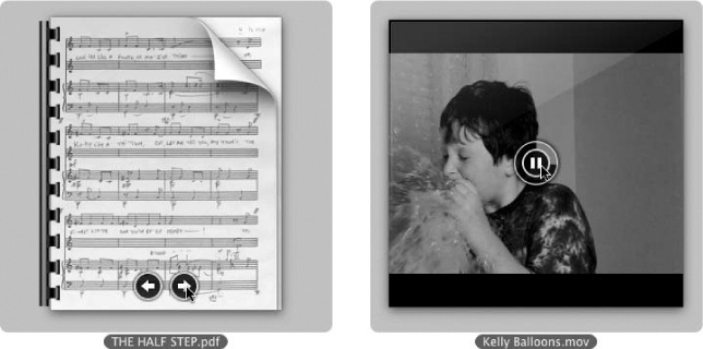
Snow Leopard expands the notion of “an icon is a representation of its contents” to an impressive extreme. As you can see in Figure 1-13, each icon actually looks like a miniature of the first page of the real document.
Because you can make icons so enormous, you can actually watch movies, or read PDF and text documents, right on their icons.
To check out this feature, make the icons at least about an inch tall (64 pixels square). A Play button ( ) appears on any movie or sound file; as shown in Figure 1-13, and page buttons appear on a multipage document (like PDF, Pages, or even presentation documents like PowerPoint and Keynote). You can actually page through one of these documents right there on its icon, without having to open the program!
Mac OS X offers a number of useful icon-view options, all of which are worth exploring. Start by opening any icon view window, and then choose View→Show View Options (⌘-J).
It’s easy—almost scarily easy—to set up your preferred look for all folder windows on your entire system. With one click on the Use as Defaults button (described below), you can change the window view of 20,000 folders at once—to icon view, list view, or whatever you like.
The Always open in icon view option lets you override that master setting, just for this window.
For example, you might generally prefer a neat list view with large text. But for your Pictures folder, it probably makes more sense to set up icon view, so you can see a thumbnail of each photo without having to open it.
That’s the idea here. Open Pictures, change it to icon view, and then turn on “Always open in icon view.” Now every folder on your Mac is in list view except Pictures.
Note
The wording of this item in the View Options dialog box changes according to the view you’re in at the moment. In a list-view window, for example, it says, “Always open in list view.” In a Cover Flow—view window, it says, “Always open in Cover Flow.” And so on. But the function is the same: to override the default (master) setting.
As noted, Snow Leopard makes it super easy to make all your icons bigger or smaller; just drag the Icon size slider in the lower-right corner of the window.
But for the benefit of old-timers who expect to find that slider here, in the View Options window, well, there’s an identical slider here.
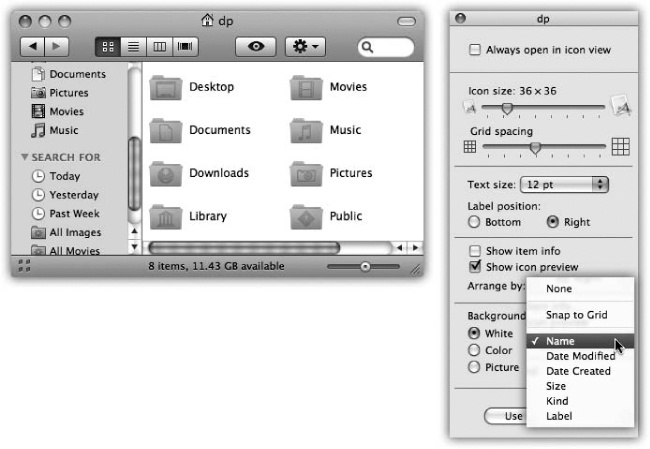
Listen up, you young whippersnappers! When I was your age, back when computers used Mac OS 9, you could control how closely spaced icons were in a window. Why, if I wanted to see a lot of them without making the window bigger, I could pack ’em in like sardines!
That feature disappeared—for seven years. But it finally returned to Mac OS X. Figure 1-14 shows all.
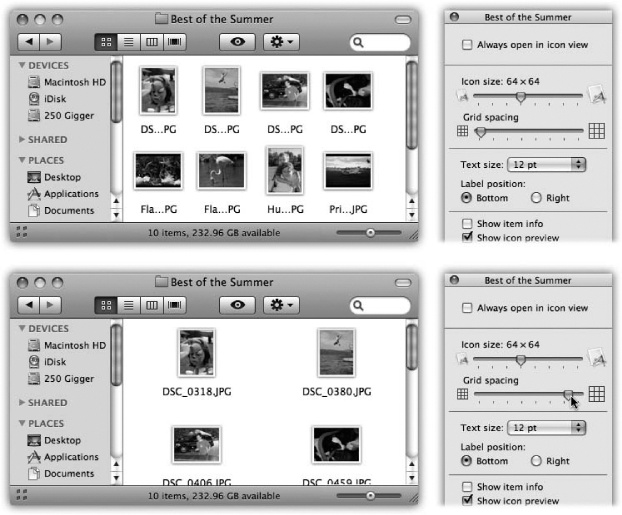
Figure 1-14. Drag the “Grid spacing” slider to specify how tightly packed you want your icons to be. At the minimum setting (top), they’re so crammed it’s almost ridiculous; you can’t even see their names. But sometimes, you don’t really need to. At more spacious settings (bottom), you get a lot more “white space.”
Your choices range only from 10 to 16 points, and you still can’t choose a different font for your icons’ names. But using this slider, you can adjust the type size. And for people with especially big or especially small screens—or for people with aging retinas—this feature is much better than nothing.
In fact, you can actually specify a different type size for every window on your machine. (Why would you want to adjust the point size independently in different windows? Well, because you might want smaller type to fit more into a crammed list view without scrolling, while you can afford larger type in less densely populated windows.)
Click either Bottom or Right to indicate where you want an icon’s name to appear, relative to its icon. As shown in Figure 1-15, this option lets you create, in effect, a multiple-column list view in a single window.
Figure 1-15. The View Options dialog box for an icon view window offers the chance to create colored backgrounds for certain windows or even to use photos as window wallpaper (bottom). Using a photo may have a soothing, annoying, or comic effect—like making the icon names completely unreadable. (Note, by the way, how the icons’ names have been set to appear beside the icons, rather than underneath. You now have all the handy, freely draggable convenience of an icon view, along with the more compact spacing of a list view.
While you’ve got the View Options palette open, try turning on “Show item info.” Suddenly you get a new line of information (in tiny blue type) for certain icons, saving you the effort of opening up the folder or file to find out what’s in it. For example:
Folders. The info line lets you know how many icons are inside each without having to open it up. Now you can spot empties at a glance.
Graphics files. These display their dimensions in pixels.
Sounds and QuickTime movies. The light-blue bonus line tells you how long the sound or movie takes to play. For example, an MP3 file might say “03:08″,” which means 3 minutes, 8 seconds.
.zip files. On compressed archives like .zip files, you get to see the archive’s total size on disk (like “48.9 MB”).
You can see some of these effects illustrated in Figure 1-12.
This option is what makes icons display their contents, as shown in Figure 1-12 and 1-13. If you turn it off, then icons no longer look like miniature versions of their contents. Photos no longer look like tiny photos, PDF and Word documents no longer display their contents, and so on. Everything takes on identical, generic icons (one for all text documents, one for all JPEG photos, and so on).
You might prefer this arrangement when, for example, you want to be able to pick out all the PDF files in a window full of mixed document types. Thanks to the matching icons, it’s easy now.
Here’s a luxury that other operating systems can only dream about: You can fill the background of any icon view window on your Mac with a certain color—or even a photo.
Color-coordinating or “wallpapering” certain windows is more than just a gimmick. In fact, it can serve as a timesaving visual cue. Once you’ve gotten used to the fact that your main Documents folder has a sky-blue background, you can pick it out like a sharpshooter from a screen filled with open windows. Color-coded Finder windows are also especially easy to distinguish at a glance when you’ve minimized them to the Dock.
Once a window is open, choose View→View Options (⌘-J). The bottom of the resulting dialog box offers three choices, whose results are shown in Figure 1-15.
Color. When you click this button, you see a small rectangular button beside the word Color. Click it to open the Color Picker (Uninstalling Software), which you can use to choose a new background color for the window. (Unless it’s April Fool’s Day, pick a light color. If you choose a dark one—like black—you won’t be able to make out the lettering of the icons’ names.)
Picture. If you choose this option, a “Drag image here” square appears. Now find a graphics file—one of Apple’s in the Desktop Pictures folder, or one of your own, whatever—and drag it into that “well.” (Alternatively, double-click the empty square; an Open dialog box appears so you can navigate to a folder.)
When you click Select, you see that Mac OS X has superimposed the window’s icons on the photo. As you can see in Figure 1-15, low-contrast or light-background photos work best for legibility.
Incidentally, the Mac has no idea what sizes and shapes your window may assume in its lifetime. Therefore, Mac OS X makes no attempt to scale down a selected photo to fit neatly into the window. If you have a high-res digital camera, therefore, you see only the upper-left corner of a photo in the window. For better results, use a graphics program to scale the picture down to something smaller than your screen resolution.
This harmless-looking button can actually wreak havoc on—or restore order to—your kingdom with a single click. It applies the changes you’ve just made in the View Options dialog box to all icon-view windows on your Mac (instead of only the frontmost window).
If you set up the frontmost window with a colored background, big icons, small text, and a tight grid, and then you click Use as Defaults, you’ll see that look in every disk or folder window you open.
You’ve been warned.
Fortunately, there are two auxiliary controls that can give you a break from all the sameness.
First, you can set up individual windows to be weirdo exceptions to the rule; see Always open in icon view on page 35.
Second, you can remove any departures from the default window view—after a round of disappointing experimentation on a particular window, for example—using a secret button. To do so, choose View→Show View Options to open the View Options dialog box. Now hold down the Option key. The Use as Defaults button magically changes to say Restore to Defaults, which means “Abandon all the changes I’ve foolishly made to the look of this window.”
In general, you can drag icons anywhere in a window. For example, some people like to keep current project icons at the top of the window and move older stuff to the bottom.
If you’d like Mac OS X to impose a little discipline on you, however, it’s easy enough to request a visit from an electronic housekeeper who tidies up your icons by aligning them neatly to an invisible grid. You can even specify how tight or loose that grid is.
Mac OS X offers an enormous number of variations on the “snap icons to the underlying rows-and-columns grid” theme:
Aligning individual icons to the grid. Press the ⌘ key while dragging an icon or several highlighted icons. (Don’t press the key until after you begin to drag.) When you release the mouse, the icons you’ve moved all jump into neatly aligned positions.
Aligning all icons to the grid. Choose View→Clean Up (if nothing is selected) or View→Clean Up Selection (if some icons are highlighted). Now all icons in the window, or those you’ve selected, jump to the closest positions on the invisible underlying grid.
These same commands appear in the shortcut menu when you Control-click or right-click anywhere inside an icon-view window, which is handier if you have a huge monitor.
Tip
If you press Option, then the Mac swaps the wording of the command. Clean Up changes to read Clean Up Selection, and vice versa.
Note, by the way, that the grid alignment is only temporary. As soon as you drag icons around, or add more icons to the window, the newly moved icons wind up just as sloppily positioned as before you tidied up.
If you want the Mac to lock all icons to the closest spot on the grid whenever you move them, then choose View→Show View Options (⌘-J); from the “Arrange by” pop-up menu, choose Snap to Grid.
Even then, though, you’ll soon discover that none of these grid-snapping techniques moves icons into the most compact possible arrangement. If one or two icons have wandered off from the herd to a far corner of the window, then they’re merely nudged to the grid points closest to their current locations. They aren’t moved all the way back to the group of icons elsewhere in the window.
To solve that problem, use one of the sorting options described next.
If you’d rather have icons sorted and bunched together on the underlying grid—no strays allowed—then make a selection from the View menu:
Sorting all icons for the moment. If you choose View→Arrange By→Name, all icons in the window snap to the invisible grid and sort themselves alphabetically. Use this method to place the icons as close as possible to one another within the window, rounding up any strays.
The other subcommands in the View→Arrange By menu work similarly (Size, Date Modified, Label, and so on), but sort the icons according to different criteria. (Note that Snow Leopard offers keyboard shortcuts for these sorting commands.)
As with the Clean Up command, View→Arrange By serves only to reorganize the icons in the window at this moment. If you move or add icons to the window, they won’t be sorted properly. If you’d rather have all icons remain sorted and clustered, read on.
Sorting all icons permanently. You can tell your Mac to maintain the sorting and alignment of all icons in the window, present and future. Now if you add more icons to the window, they jump into correct alphabetical position; if you remove icons, the remaining ones slide over to fill in the gaps. This setup is perfect for neat freaks.
To make it happen, open the View menu, hold down the Option key, and choose from the Keep Arranged By submenu (choose Name, Date Modified, or whatever sorting criterion you like). As shown at left in Figure 1-16, your icons are now locked into sorted position, as compactly as the grid permits.
Figure 1-16. Use either the View menu or the View Options window (right) to turn on permanent cleanliness mode. From now on, you’re not allowed to drag these icons freely. You’ve told the Mac to keep them on the invisible grid, sorted the way you requested, so don’t get frustrated when you try to drag an icon into a new position and then discover that it won’t budge.
(This Option-key trick is a shortcut for choosing View→Show View Options and then, in the resulting dialog box, choosing from the “Arrange by” submenu.)
Tip
The Option key is up to its usual tricks here; as happens so often in the Finder, it means “reverse the usual logic.”
For example, when you open the View menu, you see either Arrange By (which temporarily sorts the current batch of icons) or Keep Arranged By (which locks present and future icons into a sorted grid). The wording depends on whether or not you’ve already turned on permanent sorting.
But the point here is that pressing the Option key once the View menu is open changes the command—from Arrange By to Keep Arranged By, or vice versa.
Although it doesn’t occur to most Mac fans, you can also apply any of the commands described in this section—Clean Up, Arrange, Keep Arranged—to icons lying loose on your desktop. Even though they don’t seem to be in any window at all, you can specify small or large icons, automatic alphabetical arrangement, and so on. Just click the desktop before using the View menu or the View Options dialog box.
Note
There’s only one View Options dialog box. Once it’s open, you can adjust the icon sizes or arrangement options of other windows just by clicking them. Each time you click inside a window, the View Options dialog box remains in front, changing to reflect the settings of the window you just clicked.
Incidentally, you can get rid of the View Options box the same way you summoned it: by pressing ⌘-J.
In windows that contain a lot of icons, the list view is a powerful weapon in the battle against chaos. It shows you a tidy table of your files’ names, dates, sizes, and so on. Very faint alternating blue and white background stripes help you read across the columns.
You get to decide how wide your columns should be, which of them should appear, and in what order (except that Name is always the first column). Here’s how to master these columns:
Most of the world’s list-view fans like their files listed alphabetically. It’s occasionally useful, however, to view the newest files first, largest first, or whatever.
When a desktop window displays its icons in a list view, a convenient new strip of column headings appears (Figure 1-17). These column headings aren’t just signposts; they’re buttons, too. Click Name for alphabetical order, Date Modified to view the newest first, Size to view the largest files at the top, and so on.
It’s especially important to note the tiny, dark-gray triangle that appears in the column you’ve most recently clicked. It shows you which way the list is being sorted.
When the triangle points upward, the oldest files, smallest files, or files beginning with numbers (or the letter A) appear at the top of the list, depending on which sorting criterion you have selected.
Tip
It may help you to remember that when the smallest portion of the triangle is at the top ( ), the smallest files are listed first when viewed in size order.
To reverse the sorting order, click the column heading a second time. Now the newest files, largest files, or files beginning with the letter Z appear at the top of the list. The tiny triangle turns upside-down.
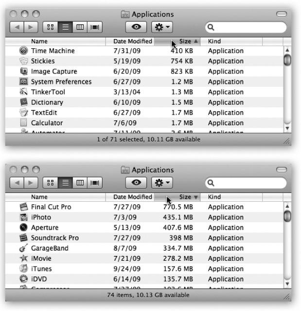
Figure 1-17. You control the sorting order of a list view by clicking the column headings (top). Click a second time to reverse the sorting order (bottom). You’ll find the identical or  triangle—indicating the identical information—in email programs, in iTunes, and anywhere else where reversing the sorting order of the list can be useful.
One of the Mac’s most attractive features is the tiny triangle that appears to the left of a folder’s name in a list view. In its official documents, Apple calls these buttons disclosure triangles; internally, the programmers call them flippy triangles.
When you click one, the list view turns into an outline, showing the contents of the folder in an indented list, as shown in Figure 1-18. Click the triangle again to collapse the folder listing. You’re saved the trouble and clutter of opening a new window just to view the folder’s contents.
Note
Snow Leopard Spots: A subtle but nifty touch: When you’ve expanded a folder’s flippy triangle, the tiny folder icon itself changes to look like an open folder. (Unless it’s a “special” folder like Pictures, that is.)
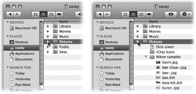
Figure 1-18. Click a “flippy triangle” (left) to see the list of the folders and files inside that folder (right). Or press the equivalent keystrokes: → (to open) and ← (to close).
By selectively clicking flippy triangles, you can in effect peer inside two or more folders simultaneously, all within a single list view window. You can move files around by dragging them onto the tiny folder icons.
Tip
Once you’ve expanded a folder by clicking its flippy triangle, you can even drag a file icon out of its folder so that it’s loose in the list view window. To do so, drag it directly upward onto the column headings area (where it says Name, for example). When you release the mouse, you see that the file is no longer inside the expanded folder.
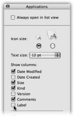
Choose View→Show View Options. In the dialog box that appears, you’re offered on/ off checkboxes for the different columns of information Mac OS X can show you, as illustrated in Figure 1-19.
Date Modified. This date-and-time stamp indicates when a document was last saved. Its accuracy, of course, depends on the accuracy of your Mac’s built-in clock.
Note
Many an up-to-date file has been lost because someone spotted a very old date on a folder and assumed that the files inside were equally old. That’s because the modification date shown for a folder doesn’t reflect the age of its contents. Instead, the date on a folder indicates only when items were last moved into or out of that folder. The actual files inside may be much older, or much more recent.
Date Created. This date-and-time stamp shows when a document was first saved.
Size. With a glance, you can tell from this column how much disk space each of your files and folders is taking up in kilobytes, megabytes, or gigabytes—whichever the Mac thinks you’ll find most helpful.
Figure 1-19. The checkboxes you turn on in the View Options dialog box determine which columns of information appear in a list view window. Many people live full and satisfying lives with only the three default columns—Date Modified, Kind, and Size—turned on. But the other columns can be helpful in special circumstances; the trick is knowing what information appears there.
Tip
For disks and folders, you see only a dash—at first. You can, however, instruct the Mac to reveal their sizes, as described on Adjusting Column Widths.
Kind. In this column, you can read what kind of file each icon represents. You may see, for example, Folder, JPEG Image, Application, and so on.
Version. This column displays the version numbers of your programs. For folders and documents, you just see a dash.
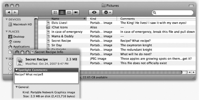
Comments. This rarely seen column can actually be among the most useful. Suppose you’re a person who uses the Comments feature (highlight an icon, choose File→Get Info, type notes about that item into the Spotlight Comments box). The option to view the first line of comments about each icon can be very helpful, especially when tracking multiple versions of your documents, as shown in Figure 1-20.
Label. Labels are colors and identifying phrases that you can slap onto icons, wherever they appear, to help you categorize and group them. For details, see Broken Aliases.
Even with this column turned off, you can still see an icon’s color, of course. But only by turning on this column do you get to see the text phrase you’ve associated with each label.
The View Options for a list view include several other useful settings; choose View→ Show View Options, or press ⌘-J.
Always open in list view. Turn on this option to override your system-wide preference setting for all windows. See Always open in icon view on page 35 for details.
Icon size. These two buttons offer you a choice of icon sizes for the current window: either standard or tiny. Unlike icon view, list view doesn’t give you a size slider.
Fortunately, even the tiny icons aren’t so small that they show up blank. You still get a general idea of what they’re supposed to look like.
Text size. As described on Text size, you can change the type size for your icon labels, either globally or one window at a time.
Show columns. Turn on the columns you’d like to appear in the current window’s list view, as described in the previous section.
Use relative dates. In a list view, the Date Modified and Date Created columns generally display information in a format like this: “Tuesday, March 9, 2010.” (The Mac uses shorter date formats as the column gets narrower.) But when the “Use relative dates” option is turned on, the Mac substitutes the word “Yesterday” or “Today” where appropriate, making recent files easier to spot.
Calculate all sizes. See the box on Calculate All Sizes.
Show icon preview. Exactly as in icon view, this option turns the icons of graphics files into miniatures of the photos or images within.
Use as Defaults. Click to make your changes in the View Options box apply to all windows on your Mac. (Option-click this button to restore a wayward window back to your defaults.)
You’re stuck with the Name column at the far left of a window. However, you can rearrange the other columns just by dragging their gray column headers horizontally. If the Mac thinks you intend to drop a column to, say, the left of the column it overlaps, you’ll actually see an animated movement—indicating a column reshuffling—even before you release the mouse button.
If you place your cursor carefully on the dividing line between two column headings, you’ll find that you can drag the divider line horizontally. Doing so makes the column to the left of your cursor wider or narrower.
Note
Best tip ever: If you double-click that little dividing line, the column to its left gets exactly wide enough to accommodate the longest bit of text within it. It’s a quick way to make sure nothing gets truncated—while still keeping the column as narrow as possible.
What’s delightful about this activity is watching Mac OS X scramble to rewrite its information to fit the space you give it. For example, as you make the Date Modified (or Created) column narrower, “Tuesday, March 9, 2010, 2:22 PM” shrinks first to “Tue, Mar 9, 2010, 2:22 PM,” then to “3/9/10, 2:22 PM,” and finally to a terse “3/9/10.”
If you make a column too narrow, Mac OS X shortens the file names, dates, or whatever by removing text from the middle. An ellipsis (…) appears to show you where the missing text would have appeared. (Apple reasoned that truncating the ends of file names, as in some other operating systems, would hide useful information like the number at the end of “Letter to Marge 1,” “Letter to Marge 2,” and so on. It would also hide the three-letter extensions, such as Thesis .doc, that may appear on file names in Mac OS X.)
For example, suppose you’ve named a Word document “Ben Affleck—A Major Force for Humanization and Cure for Depression, Acne, and Migraine Headache.” (Yes, file names can really be that long.) If the Name column is too narrow, you might see only “Ben Affleck—A Major…Migraine Headache.”
Tip
You don’t have to make the column mega-wide just to read the full text of a file whose name has been shortened. Just point to the icon’s name without clicking. After a moment, a yellow, floating balloon appears—something like a tooltip in Microsoft programs—to identify the full name.
In fact, now you can move your mouse up or down a list over truncated file names; their tooltip balloons appear instantaneously. (This trick works in list, column, or Cover Flow views—and in Save and Open dialog boxes, for that matter.)
The goal of column view is simple: to let you burrow down through nested folders without leaving a trail of messy, overlapping windows in your wake.
The solution is shown in Figure 1-21. It’s a list view that’s divided into several vertical panes. The first pane (not counting the Sidebar) shows whatever disk or folder you first opened.
When you click a disk or folder in this list (once), the second pane shows a list of everything in it. Each time you click a folder in one pane, the pane to its right shows what’s inside. The other panes slide to the left, sometimes out of view. (Use the horizontal scroll bar to bring them back.) You can keep clicking until you’re actually looking at the file icons inside the most deeply nested folder.
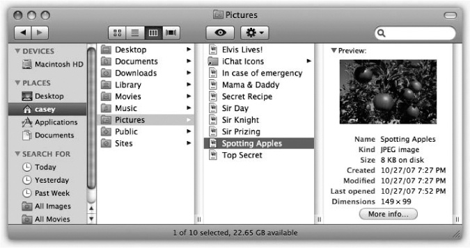
Figure 1-21. If the rightmost folder contains pictures, sounds, Office documents, or movies, you can look at them or play them, right there in the Finder. You can drag this jumbo preview icon anywhere—into another folder or to the Trash, for example.
If you discover that your hunt for a particular file has taken you down a blind alley, it’s not a big deal to backtrack, since the trail of folders you’ve followed to get here is still sitting before you on the screen. As soon as you click a different folder in one of the earlier panes, the panes to its right suddenly change, so that you can burrow down a different rabbit hole.
The beauty of column view is, first of all, that it keeps your screen tidy. It effectively shows you several simultaneous folder levels but contains them within a single window. With a quick ⌘-W, you can close the entire window, panes and all. Second, column view provides an excellent sense of where you are. Because your trail is visible at all times, it’s much harder to get lost—wondering what folder you’re in and how you got there—than in any other window view.
Note
Snow Leopard Spots: You can change how Column view is sorted; it doesn’t have to be alphabetical. Press ⌘-J to open the View Options dialog box, and then choose the sorting criterion you want from the “Arrange by” pop-up menu (like Size, Date Created, or Label).
Efficiency fans can operate this entire process by keyboard alone. For example:
You can jump from one column to the next by pressing the ← or → keys. Each press highlights the first icon in the next or previous column.
You can use any of the commands in the Go menu, or their keyboard equivalents, or the icons in the Sidebar, to fill your columns with the contents of the corresponding folder—Home, Applications, Pictures, and so on.
The Back command (clicking the
button on the toolbar, pressing ⌘-[, or choosing Go→Back) works as it does in a Web browser: It retraces your steps backward. You can repeat this command until you return to the column setup that first appeared when you switched to column view. Once you’ve gone back, in fact, you can then go forward again; choose Go→Forward, or press ⌘-].Within a highlighted column, press the ↑ or ↓ keys to highlight successive icons in the list. Or type the first couple of letters of an icon’s name to jump directly to it.
When you finally highlight the icon you’ve been looking for, press ⌘-O or ⌘-↓ to open it (or double-click it, of course). You can open anything in any column; you don’t have to wait until you’ve reached the rightmost column.
POWER USERS’ CLINIC: The Fine Points of the Column-View Triangle
This is really tweaky and geeky, but take a look: there’s a tiny triangle () to the right of every folder’s name in column view. It can be either solid dark or hollow.
If you click a folder, that triangle is dark. But if you highlight a folder by typing a couple letters of its name, or by pressing the ↑ or ↓ keys, the triangle remains hollow. (At that point, pressing Tab makes it darken.)
Who cares? Well, it actually makes a difference here and there. When the triangle is dark, the Mac is trying to tell you that the next column to the right is actually selected. Pressing ⌘-A (Select All) at this point, for example, highlights all the icons in that next column. If you press the ↑ or ↓ keys, you walk up and down the list in that next column.
But when the triangle is hollow, you haven’t left the original column. Pressing the arrow keys walks you up and down this list, and ⌘-A highlights everything in this list.
It’s subtle. But cool.
The number of columns you can see without scrolling depends on the width of the window. In no other view are the zoom and resize controls so important.
That’s not to say, however, that you’re limited to four columns (or whatever fits on your monitor). You can make the columns wider or narrower—either individually or all at once—to suit the situation, according to this scheme:
To make a single column wider or narrower, drag its right-side handle (circled in Figure 1-22).
To make all the columns wider or narrower simultaneously, hold down the Option key as you drag that right-side handle.
To make a column precisely as wide as necessary to reveal all the names of its contents, double-click a right-side handle.
To make all columns as wide as required—when you absolutely, positively don’t want any names truncated—Option-double-click a column’s right-side handle.
Just as in icon and list view, you can choose View→Show View Options to open a dialog box—a Spartan one, in this case—offering additional control over your column views.
Always open in column view. Once again, this option lets you override your systemwide preference setting for all windows. See Always open in icon view on page 35 for details.
Text size. Whatever point size you choose here affects the type used for icons in all column views.
Show icons. For maximum speed, turn off this option. Now you see only file names—not the tiny icons next to them—in all column views. Weird!
Show icon preview. Turn off this option if you don’t want the tiny icons in column view to display their actual contents—photos showing their images, Word and PDF documents showing their first pages, and so on. You get generic, identical icons for each file type (text, photo, or whatever).
Show preview column. The far-right Preview column can be handy when you’re browsing graphics, sounds, or movie files. Feel free to enlarge this final column when you want a better view of the picture or movie; you can make it really big.
The rest of the time, though, the Preview column can get in the way, slightly slowing down the works and pushing other, more useful columns off to the left side of the window. If you turn off this checkbox, the Preview column doesn’t appear.
Cover Flow is a visual display that Apple stole from its own iTunes software, where Cover Flow simulates the flipping “pages” of a jukebox, or the albums in a record-store bin (Figure 1-23). There, you can flip through your music collection, marveling as the CD covers flip over in 3-D space while you browse.
The idea is the same in Mac OS X, except that now it’s not CD covers you’re flipping; it’s gigantic file and folder icons.
To fire up Cover Flow, open a window. Then click the Cover Flow button identified in Figure 1-23, choose View→as Cover Flow, or press ⌘-4.
NOSTALGIA CORNER: Everything Old Is New Again
To many observers, Mac OS X’s column view was one of the most radical new features of the operating system. The truth, however, is that it’s not new at all.
In fact, column view’s most recent ancestor appeared in the NeXT operating system, which Apple bought (along with Steve Jobs, its CEO) in 1997. But column view is even older than that.
As you can see in this sketch from May 1980, the idea of a single-window, multiple-column view has been kicking around at Apple long before the Macintosh debuted.
In the end, this view was deemed too complex for the original Mac, which finally appeared (with only list and icon views) in 1984. It took 17 more years to find its way into the standard Mac OS.
Now the window splits. On the bottom: a traditional list view, complete with sortable columns, exactly as already described.
On the top: the gleaming, reflective, black Cover Flow display. Your primary interest here is the scroll bar. As you drag it left or right, you see your files and folders float by and flip in 3-D space. Fun for the whole family!
Figure 1-23. The bottom half of a Cover Flow window is identical to list view. The top half, however, is an interactive, scrolling “CD bin” full of your own stuff. It’s especially useful for photos, PDF files, Office documents, and text documents. And when a movie comes up in this virtual data jukebox, you can point to the little button and click it to play the video, right in place.
The effect is spectacular, sure. It’s probably not something you’d want to set up for every folder, though, because browsing is a pretty inefficient way to find something. But in folders containing photos or movies (that aren’t filled with hundreds of files), Cover Flow can be a handy and satisfying way to browse.
And now, notes on Cover Flow:
You can adjust the size of the Cover Flow display (relative to the list-view half) by dragging up or down on the grip strip area just beneath the Cover Flow scroll bar.
Multipage documents, presentation files, movies, and sounds are special. When you point to one, you get either the
button (to play a movie or sound) or left/ right arrow buttons (to flip through a PDF, Pages, PowerPoint, or Keynote document), exactly as you can with icons in Icon view (Figure 1-24).You can navigate with the keyboard, too. Any icon that’s highlighted in the list view (bottom half of the window) is also front and center in the Cover Flow view. Therefore, you can use all the usual list-view shortcuts to navigate both at once. Use the ↑ and ↓ keys, type the first few letters of an icon’s name, press Tab or Shift-Tab to highlight the next or previous icon alphabetically, and so on.
Cover Flow shows whatever the list view shows. If you expand a flippy triangle to reveal an indented list of what’s in a folder, then the contents of that folder become part of the Cover Flow.
The previews are actual icons. When you’re looking at a Cover Flow minidocument, you can drag it with your mouse—you’ve got the world’s biggest target—anywhere you’d like to drag it: another folder, the Trash, whatever.
As the preceding several thousand pages make clear, there are lots of ways to view and manage the seething mass of files and folders on a typical hard drive. Some of them actually let you see what’s in a document without having to open it—the Preview column in column view, the giant icons in Cover Flow, and so on.
Quick Look takes this idea to another level. It lets you open and browse a document nearly at full size—without switching window views or opening any new programs. You highlight an icon (or several), and then do one of these things:
Press the space bar. This is by far the best technique to learn. After all, unless you’re editing a file’s name, what’s the space bar ever done for you in the Finder? Nothing. But in Mac OS X, you can highlight any icon and then tap the space bar for an instant preview.
Press ⌘-Y. Another keystroke for the same function. The space bar is still better, though.
Click the
 button at the top of the window. But who uses the mouse anymore?
Choose File→Quick Look.
Choose Quick Look from the Action menu (
) at the top of every Finder window.Control-click (or right-click) an icon; from the shortcut menu, choose Quick Look.
You exit Quick Look in any one of these same ways.
Note
Whenever Quick Look appears in a menu or a shortcut menu, its wording changes to reflect the name of the icon. For example, it might say, “Quick Look ‘Secret Diary.doc.’”
In any case, the Quick Look window now opens, showing a nearly full-size preview of the document (Figure 1-25). Rather nice, eh?
Figure 1-25. Once the Quick Look window is open, you can play a file (movies and sounds), study it in more detail (most kinds of graphics files), or even read it (PDF, Word, and Excel documents). You can also click another icon, and another, and another, without ever closing the preview; the contents of the window simply change to reflect whatever you’ve just clicked. Supertip: Quick Look even works on icons in the Trash, so you can figure out what something is before you nuke it forever.
The idea here is that you can check out a document without having to wait for it to open in the traditional way—at full size. For example, you can read the fine text in a Word or PowerPoint document without actually having to open Word or PowerPoint, which saves you about 45 minutes.
You might wonder: How, exactly, is Quick Look able to display the contents of a document without opening it? Wouldn’t it have to somehow understand the internal file format of that document type?
Exactly. And that’s why Quick Look doesn’t recognize all documents. If you try to preview, for example, a Final Cut Pro video project, a sheet-music file, a .zip archive, or a database file, all you’ll see is a six-inch-tall version of its generic icon. You won’t see what’s inside.
Over time, people will write plug-ins for those nonrecognized programs. Already, plug-ins that let you see what’s inside folders and .zip files await at www.qlplugins.com. In the meantime, here’s what Quick Look recognizes right out of the box:
Graphics files and photos. This is where Quick Look can really shine, because it’s often useful to get a quick look at a photo without having to haul iPhoto or Photoshop out of bed. Quick Look recognizes all common graphics formats, including TIFF, JPEG, GIF, PNG, Raw, and Photoshop documents (except really huge Photoshop files).
PDF and text files. Using the scroll bar, you can page through multipage documents, right there in the Quick Look window.
Audio and movie files. These begin to play instantly when you open them into the Quick Look window. Most popular formats are recognized (MP3, AIFF, AAC, MPEG-4, H.264, and so on). A scroll bar appears so that you can jump around in the movie or song.
Pages, Numbers, Keynote, and TextEdit documents. Naturally, since these are Apple programs, Quick Look understands the document formats.
Saved Web pages from Safari. That’s a new one in Snow Leopard.
Microsoft Word, Excel, and PowerPoint documents. Because these formats are so common, Mac OS X comes with a Quick Look plug-in to recognize them. Move through the pages using the vertical scroll bar; switch to a different Excel spreadsheet page using the Sheet tabs at the bottom.
Fonts. Totally cool. When you open a font file in Quick Look, you get a crystal-clear, huge sampler that shows every letter of the alphabet in that typeface.
vCards. A vCard is an address-book entry that people can send each other by email to save time in updating their Rolodexes. When you drag a name out of Apple’s or Microsoft’s address books and onto the desktop, for example, it turns into a vCard document. In Quick Look, the vCard opens up as a handsomely formatted index card that displays all the person’s contact information.
HTML (Web pages). If you’ve saved some Web pages to your hard drive, here’s a great way to inspect them without firing up your Web browser.
Here are some stunts that make Quick Look even more interesting:
Zoom in or out. Option-click the preview of a photo to magnify it; drag inside the zoomed-in image to scroll; Shift-Option-click to zoom back out. Or press Option as you turn your mouse’s scroll wheel. (PDF documents have their own zoom in/ zoom out keystrokes: ⌘-plus and ⌘-minus.)
Full screen. When you click the Full Screen arrows (identified in Figure 1-26), your screen goes black, and the Quick Look window expands to fill it. Keep this trick in mind when you’re trying to read Word, Excel, or PDF documents, since the text is usually too small to read otherwise. (When you’re finished with the closeup, click the Full Screen button again to restore the original Quick Look window, or the
 button to exit Quick Look altogether.)
Tip
How’s this for an undocumented shortcut?
If you Option-click the
icon in any Finder window, or press Option-space bar, you go straight into Full Screen mode without having to open the smaller Quick Look window first. Kewl.(OK, this is actually part of the slideshow feature described below, but it’s also good for super-enlarging a single icon.)
Add to iPhoto. This icon appears in the Quick Look windows of graphics files that you’re examining. Click it to add the picture you’re studying to your iPhoto photo collection.
Keep it going. Once you’ve opened Quick Look for one icon, you don’t have to close it before inspecting another icon. Just keep clicking different icons (or pressing the arrow keys to walk through them); the Quick Look window changes instantly with each click to reflect the new document.
Mac OS X is supposed to be all about graphics and other visual delights. No wonder, then, that it offers a built-in, full-screen slideshow feature.
It works like this: Highlight a bunch of icons, and then open Quick Look. The screen goes black, and the documents begin their slideshow. Each image appears on the screen for about 3 seconds before the next one appears. (Press the Esc key or ⌘-period to end the show.) It’s like a slideshow, except that it plays all documents it recognizes, not just graphics.
Note
If you press the Option key as you start Quick Look—for example, as you hit the space bar, or as you click the Quick Look button—you get a full-screen version of that slideshow.
It’s a useful feature when you’ve just downloaded or imported a bunch of photos or Office documents and want a quick look through them. Use the control bar shown in Figure 1-26 to manage the playback.
Note
This same slideshow mechanism is available for graphics in Preview and Mail; Preview even offers crossfades between pictures.

Figure 1-26. Once the slideshow is underway, you can use this control bar. It lets you pause the slideshow, move forward or backward manually, enlarge the current “slide” to fill the screen, or end the show. (The iPhoto button appears only when displaying photos.) The Index view is especially handy. (You can press ⌘-Return to “click” the Index View button.) It displays an array of labeled miniatures, all at once—a sort of Exposé for Quick Look. Click a thumb-nail to jump directly to the Quick Look document you want to inspect.
If you’re the only person who uses your Mac, finishing up a work session is simple. You can either turn off the machine or simply let it go to sleep, in any of several ways.
If you’re still shutting down your Mac after each use, you may be doing a lot more waiting than necessary. Sleep mode consumes very little power, keeps everything you were doing open and available, and wakes up almost immediately when you press a key or click the mouse.
To make your machine sleep, do one of the following:
Close the lid. (Hint: This tip works primarily on laptops.)
Press Control-
(or Control-F12, if you don’t have a key). In the dialog box shown in Figure 1-27, click Sleep (or type S).Press the power button (
 ) on your machine. On desktop models, doing so makes it sleep immediately; on laptops, you get the dialog box shown in Figure 1-27.
Hold down the Play/Pause button on your remote for 3 seconds. Many Mac models come, or used to come, with Apple’s tiny white remote control.
Just walk away, confident that the Energy Saver setting described on Energy Saver will send the machine off to dreamland automatically at the specified time.
You shouldn’t have to restart the Mac very often—only in times of severe troubleshooting mystification, in fact. Here are a few ways to do it:
Choose
Restart→. A confirmation dialog box appears; click Restart (or press Return).Press Control-⌘-
. (If you don’t have that key, substitute F12.)Press Control-
to summon the dialog box shown in Figure 1-27; click Restart (or type R).
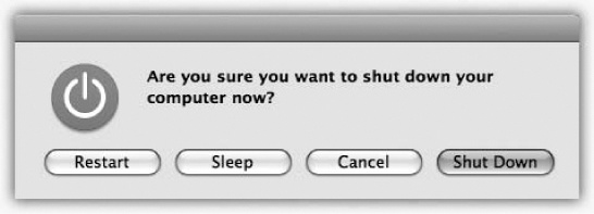
To shut down your machine completely (when you don’t plan to use it for more than a couple of days, when you plan to transport it, and so on), do one of the following:
Choose
→Shut Down. A simple confirmation dialog box appears; click Shut Down (or press Return).Press Control-Option-⌘-
. (It’s not as complex as it looks—the first three keys are all in a tidy row to the left of the space bar.)Press Control-
(or Control-F12) to summon the dialog box shown in Figure 1-27. Click Shut Down (or press Return).Wait. If you’ve set up the Energy Saver preferences (Energy Saver) to shut down the Mac automatically at a specified time, then you don’t have to do anything.
If you share your Mac, then you should log out when you’re done. Doing so ensures that your stuff is safe from the evil and the clueless even when you’re out of the room. To do it, choose →Log Out Chris (or whatever your name is). Or, if you’re in a hurry, press Shift-⌘-Q.
When the confirmation dialog box appears, click Log Out (or press Return), or just wait for 2 minutes. The Mac hides your world from view and displays the Log In dialog box, ready for its next victim.
Tip
Last time: If you press Option as you release the mouse on the →Log Out command, you squelch the “Are you sure?” box.
Logging out is described in much more detail in Chapter 12.
It’s a good thing you’ve got a book about Mac OS X in your hands, because the only user manual you get with it is the Help menu. You get a Web browser—like program that reads a set of help files that reside in your System→Library folder.
You’re expected to find the topic you want in one of these three ways:
Use the search box. When you click the Help menu, a tiny search box appears just beneath your cursor (Figure 1-28). You can type a few words here to specify what you want help on: “setting up printer,” “disk space,” whatever.
Tip
You can also hit ⌘-Shift-/ (that is, ⌘-?) to open the help search box. And you can change that keystroke, if you like, in System Preferences→Keyboard.
After a moment or two, the menu becomes a list of Apple help topics pertaining to your search. Click one to open the Help browser described next; you’ve just saved some time and a couple of steps.
Drill down. Alternatively, you can begin your quest for assistance the old-fashioned way: by opening the Help browser first. To do that, choose Help→Mac Help. (This works only in the Finder, and only when nothing is typed in the search box. To empty the search box, click the
button at the right end.)After a moment, you arrive at the Help browser program shown in Figure 1-29. The starting screen offers several “quick click” topics that may interest you. If so, keep clicking text headings until you find a topic that you want to read.
You can backtrack by clicking the
button at the top of the window. And you can always return to the starting screen by clicking the little Home icon at the top.Tip
Annoyingly, the help window still insists on floating in front of all other windows; you can’t send it to the back like any normal program. Therefore, consider making the window tall and skinny, so you can put it beside the program you’re working in. Drag the ribbed lower-right corner to change the window’s shape.
Figure 1-28. You don’t have to open the Help program to begin a search. No matter what program you’re in, typing a search phrase into the box shown here produces an instantaneous list of help topics, ready to read.
GEM IN THE ROUGH: Menu Help in the Help Menu
Mac OS X contains a weird, wonderful little enhancement to its online help system. It helps you find menu commands you can’t find.
You’re floundering in some program. You’re sure there’s a page numbering command in those menus somewhere. But there are 11 menus and 143 submenus hiding in those menus, and you haven’t got time for the pain.
That’s when you should think of using the Help menu. When you type page number (or whatever) into its search box, the results menu lists, at the top, the names of any menu commands in that program that contain the words you typed. Better still, it actually opens that menu for you, and displays a big, blue, animated, floating arrow pointing to the command you wanted. You’d have to have your eyes closed to miss it.
Slide your cursor over, click the menu command, and get on with your life.
Supertip: This feature is especially helpful in Web browsers like Safari and Firefox, because it even finds entries in your Bookmarks and History menus!
In Safari, for example, you can pluck a recently visited site out of the hundreds in the daily History submenus, like the “Wednesday, January 9” submenu. You’ve just saved yourself a lot of poking around menus, trying to find the name of a site you know you’ve seen recently.
Ultratip: If you think about it, this feature also means that you have complete keyboard power over every menu in every program in the world. Hit ⌘-Shift-/ (⌘-?) to open the help search box, type a bit of the command’s name, and then use the arrow keys to walk down the results. Hit Return to trigger the command you want.
Use the Search box. Type the phrase you want, such as printing or switching applications, into the search box at the top of the window, and then press Return. The Mac responds by showing you a list of help-screen topics that may pertain to what you need; see Figure 1-29 for details.
This search box usually gives you a more complete list of results than you’d have gotten by using the search box in the Help menu, as described above.
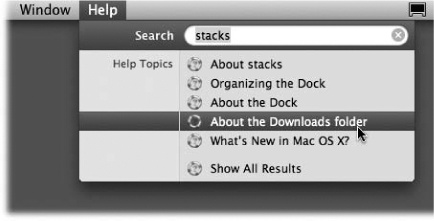
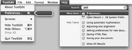
Note
Actually, there’s one more place where Help crops up: in System Preferences dialog boxes. Click the blue, circled question-mark button in the lower-right corner of most System Preferences panels to open a help page that identifies each control.
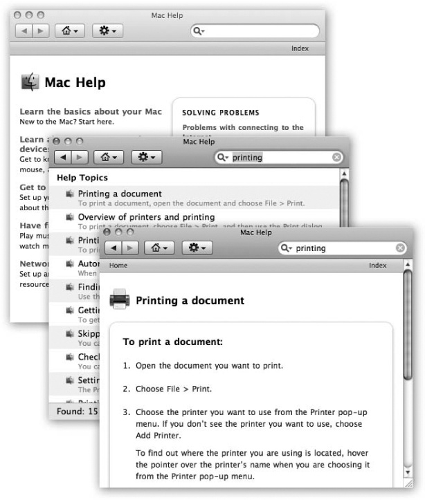
Figure 1-29. The Mac OS X help system doesn’t bunch together the help pages from every program on your Mac. When you’re in the Finder, you get the general Macintosh help screens. When you’re in iPhoto, you get only iPhoto help screens. And so on. But using the Home pop-up menu, you can switch to another program’s help system even if that program isn’t open. Double-click a topic’s name to open the help page. If it isn’t as helpful as you hoped, click the button at the top to return to the list of relevant topics. Click the little Home button to return to the Help Center’s welcome screen.