A necessary first step in any engineering situation is an investigation of available data to assess the nature and the degree of the uncertainty. An unorganized list of numbers representing the outcomes of tests is not easily assimilated. There are several methods of organization, presentation, and reduction of observed data which facilitate its interpretation and evaluation.
It should be pointed out explicitly that the treatment of data described in this chapter is in no way dependent on the assumptions that there is randomness involved or that the data constitute a random sample of some mathematical probabilistic model. These are terms which we shall come to know and which some readers may have encountered previously. The methods here are simply convenient ways to reduce raw data to manageable forms.
In studying the following examples and in doing the suggested problems, it is important that the reader appreciate that the data are “real” and that the variability or scatter is representative of the magnitudes of variation to be expected in civil-engineering problems.
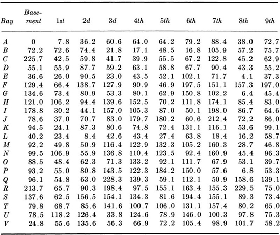
Histograms A useful first step in the representation of observed data is to reduce it to a type of bar chart. Consider, for example, the data presented in Table 1.1.1. These numbers represent the live loads observed in a New York warehouse. To anticipate the typical, the extreme, and the long-term behavior of structural members and footings in such structures, the engineer must understand the nature of load distribution. Load variability will, for example, influence relative settlements of the column footings. The values vary from 0 to 229.5 pounds per square foot (psf). Let us divide this range into 20-psf intervals, 0 to 19.9, 20.0 to 39.9, etc., and tally the number of occurrences in each interval.
Plotting the frequency of occurrences in each interval as a bar yields a histogram, as shown in Fig. 1.1.1. The height, and more usefully, the area, of each bar are proportional to the number of occurrences in that interval. The plot, unlike the array of numbers, gives the investigator an immediate impression of the range of the data, its most frequently occurring values, and the degree to which it is scattered about the central or typical values. We shall learn in Chap. 2 how the engineer can predict analytically from this shape the corresponding curve for the total load on a column supporting, say, 20 such bays.
Table 1.1.1 Floor-load data*

* Observed live loads (in pounds per square foot); bay size: 400 ± 6 ft2.
Source: J. W. Dunham, G. N. Brekke, and G. N. Thompson [1952], “Live Loads on Floors in Buildings,” Building Materials and Structures Report 133, National Bureau of Standards, p. 22.
Fig. 1.1.1 Histogram and frequency distribution of floor-load data.
If the scale of the ordinate of the histogram is divided by the total number of data entries, an alternate form, called the frequency distribution, results. In Fig. 1.1.1, the numbers on the right-hand scale were obtained by dividing the left-hand scale values by 220, the total number of observations. One can say, for example, that the proportion of loads observed to lie between 120 and 139.9 psf was 0.10. If this scale were divided by the interval length (20 psf), & frequency density distribution would result, with ordinate units of “frequency per psf.” The area under this histogram would be unity. This form is preferred when different sets of data, perhaps with different interval lengths, are to be compared with one another.
The cumulative frequency distribution, another useful graphical representation of data, is obtained from the frequency distribution by calculating the successive partial sums of frequencies up to each interval division point. These points are then plotted and connected by straight lines to form a nondecreasing (or monotonic) function from zero to unity.
In Fig. 1.1.2, the cumulative frequency distribution of the floor-load data, the values of the function at 20, 40, and 60 psf were found by forming the partial sums 0 + 0.0455 = 0.0455, 0.0455 + 0.0775 = 0.1230, and 0.1230 + 0.1860 = 0.3090.† From this plot, one can read that the proportion of the loads observed to be equal to or less than 139.9 psf was 0.847. After a proper balancing of initial costs, consequences of poor performance, and these frequencies, the designer might conclude that a beam supporting one of these bays must be stiff enough to avoid deflections in excess of 1 in. in 99 percent of all bays. Thus the design should be checked for deflections under a load of 220 psf.
Some care should be taken in choosing the width of each interval in these diagrams, † A little experimentation with typical sets of data will convince the reader that the choice of the number of class intervals can alter one’s impression of the data’s behavior a great deal. Figure 1.1.3 contains two histograms of the data of Table 1.1.1, illustrating the influence of interval size. An empirical practical guide has been suggested by Sturges [1926]. If the number of data values is n, the number of intervals k between the minimum and maximum value observed should be about
Fig. 1.1.2 Cumulative frequency distribution of floor-load data.
in which logarithms to the base 10 should be employed. Unfortunately, if the number of values is small, the choice of the precise point at which the interval divisions are to occur also may alter significantly the appearance of the histogram. Examples can be found in Sec. 1.2 and in the problems at the end of this chapter. Such variations in shape may at first be disconcerting, but they are indicative of a failure of the set of data to display any sharply defined features, a piece of information which is in itself valuable to the engineer. This failure may be because of the inadequate size of the data set or because of the nature of the phenomenon being observed.
Fig. 1.1.3 Influence of interval size on appearance of histogram (data of Table 1.1.1).
Central value measures The single most helpful number associated with a set of data is its average value, or arithmetic mean. If the sequence of observed values is denoted x1, x2, . . ., xn, the sample mean ![]() is simply
is simply
Fifteen reinforced-concrete beams built by engineering students to the same specifications and fabricated from the same batch of concrete were tested in flexure. The observed results of first-crack and ultimate loads, recorded to the nearest 50 lb, are presented in Table 1.2.1. Their cumulative frequency distributions are shown in Fig. 1.2.1. (They were plotted by the method suggested in the footnote on page 7.)† The scatter of the data might be attributed to unrecorded construction and testing differences, inconsistent workmanship, human errors, and inherent material variability as well as observation and measurement errors. The mean value of the failure loads is computed to be
Table 1.2.1 Tests of identical reinforced concrete beams
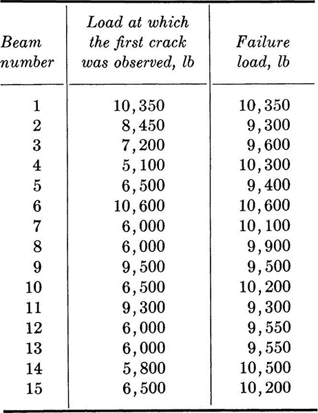
Fig. 1.2.1 Cumulative frequency distributions; beam data.

The sample mean is frequently interpreted as a typical value or a central value of the data. If required to give only a single number, one would probably use this sample mean as his “best prediction” of the load at which a nominally identical beam would fail.
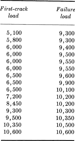
Other measures of the central tendency of a data set include the mode, the most frequently occurring value in the data set, and the median, the middle value in an ordered list (the middle value if n is odd, or the average of the two middle values if n is even) (see Table 1.2.2). The order of observing the values is usually not important, and they may be arranged in any way which is convenient. The median of the failure data is 9900 lb; the mode is not unique, since several values appear twice and none appears more times. These two terms occur commonly in the literature of other fields and consequently should be understood, but they only infrequently prove meaningful in engineering problems.
Table 1.2.2 Ordered first-crack and ordered failure-load data
Measures of dispersion Given a set of observed data, it is also desirable to be able to summarize in a single number something of the variability of the observations. In the past the measure most frequently occurring in engineering reports was the range of the data. This number, which is simply the difference between the maximum and minimum values observed, has the virtue of being easy to calculate, but certain obvious weaknesses have led to its being replaced or supplemented. The range places too much emphasis on the extremes, which are often suspected of experimental error, and neglects the bulk of the data and experimental effort which lies between these extremes. The range is also sensitive to the size of the sample observed, as will be demonstrated in Sec. 3.3.3.
A far more satisfactory measure of dispersion is found in the sample variance. It is analogous to the moment of inertia in that it deals with squares of distances from a center of gravity, which is simply the sample mean. The sample variance s2 is defined here to be
To eliminate the dependence on sample size, the squared distances are divided by n to yield an average squared deviation. There are sound reasons favoring division by n – 1, as will be shown in Chap. 4, but the intuitively more satisfactory form will not be abandoned until the reader can appreciate the reasons. Similarly, small computational changes in other definitions given in this chapter may be found desirable in the light of later discussions on the estimation of moments of random variables (Secs. 2.4 and 4.1).
Expansion of Eq. (1.2.2a) yields an expression which will be found far more convenient for computation of s2:

But, by Eq. (1.2.1),

Therefore,
The positive square root s of the sample variance of the data is termed the sample standard deviation. It is analogous to the radius of gyration of a structural cross section; they are both shape- rather than size-dependent parameters. The addition of a constant to all observed values, for example, would alter the sample mean but leave the sample standard deviation unchanged. This number has the same units as the original data, and, next to the mean, it conveys more useful information to the engineer than any other single number which can be computed from the set of data. Roughly speaking, the smaller the standard deviation of the sample, the more clustered about the sample mean is the data and the less frequent are large variations from the average value.
For the beam-failure data the sample variance and sample standard deviation are computed as follows:

(Notice that, owing to the required subtraction of two nearly equal numbers, many significant digits must be carried in the sums to maintain accuracy.) In this example, the sample standard deviation might be used to compare the variability of the strength of lab beams with that of field-constructed beams.
When comparing the relative dispersion of more than one kind of data, it is convenient to have a dimensionless description such as the commonly quoted sample coefficient of variation. This quantity υ is defined as the ratio of the sample standard deviation to the sample mean.
The sample coefficient of variation of the beam-failure data is
![]()
while that of the first observed crack is much larger, being
![]()
The engineer might interpret the difference in magnitudes of these coefficients as an indication that first-crack loads are “more variable” or more difficult to predict closely than failure loads. Such information is important when appearance as well as strength is a design criterion.
Measure of asymmetry One other numerical summary† of observed data is simply a logical extension of the reasoning leading to the formula for the sample variance. Where the variance was an average second moment about the mean, so the sample coefficient of skewness is related to the third moment about the mean. To make the coefficient nondimensional, the moment is divided by the cube of the sample standard deviation.
The coefficient of skewness g1 provides a measure of the degree of asymmetry about the mean of the data:
The coefficient is positive for histograms skewed to the right (i.e., with longer tails to the right) and negative for those skewed to the left. Zero skewness results from symmetry but does not necessarily imply it.
For the beam-failure data of Table 1.2.1,
![]()
indicating mild skewness to the right. The implication is that there were fewer but larger deviations to the high side than to the low side of the average value. (The sample coefficient of skewness should be calculated using ![]() since an expansion similar to Eq. (1.2.2b) for the sample variance does not prove useful.)
since an expansion similar to Eq. (1.2.2b) for the sample variance does not prove useful.)
In this case, if the students reported their experimental results in the form of only three numbers, ![]() , s, and g1, it would already be sufficient to gain appreciation for the shape of the histogram. The economy in the use of such sample averages to transmit information about data becomes even more obvious as the amount of data increases.
, s, and g1, it would already be sufficient to gain appreciation for the shape of the histogram. The economy in the use of such sample averages to transmit information about data becomes even more obvious as the amount of data increases.
If paired samples of two items of related interest, such as the first-crack load and the failure load of a beam (Table 1.2.1), are available, it is often of interest to investigate the correlation between them. A graphical picture is available in the so-called scattergram, which is simply a plot of the observed pairs of values. The scattergram of the reinforced-concrete–beam data is shown in Fig. 1.3.1, where the xi are values of first-crack loads and the yi are values of failure loads. There is no clearly defined functional relationship between these observations, even though an engineer might expect larger-than-average values of one load generally to pair with larger-than-average values of the other, and similarly with low values.
A numerical summary of the tendency towards high-high, low-low pairings is provided by the sample covariance sXY, defined by
Clearly, if larger (smaller) than average values of x are frequently paired with larger (smaller) than average values of y, most of the terms will be positive, while small-large pairings will tend to yield negative values of sX, Y.
Fig. 1.3.1 Beam-data scattergram; plot shows lack of linear correlation.
It is common to normalize the sample covariance by the sample standard deviations, denoted now with subscripts, sX and sY. The result is called the sample correlation coefficient rX,Y:
It can be shown that rX,Y is limited in value to – 1 ≤ rX,Y ≤ 1 and that the extreme values are obtained if and only if the points in the scattergram lie on a perfectly straight line, that is, only if
![]()
the sign of rX,Y depending only on the sign of b. In this case the factors are said to be perfectly correlated. For other than perfectly linear relationships |rX,Y| is less than 1, the specific value rX,Y = 0 being said to indicate that the x’s and y’s are uncorrelated. The x’s and y’s may, in fact, lie on a very well-defined nonlinear curve and hence be closely, perhaps functionally, related (for example, yi = bxi2); in this case, the absolute value of the sample correlation coefficient will be less than one. The coefficient is actually a measure of only the linear correlation between the factors sampled.
For the beam data of Table 1.2.1, the sample covariance is while the sample correlation coefficient is

Fig. 1.3.2 Scattergram of MLVS against MLSS.
![]()
The small value of this coefficient summarizes the qualitative conclusion reached by observing the scattergram, that is, that the first-crack loads and failure loads are not closely related. To the engineer who must judge the ultimate strength of a (moment) cracked beam, the implications are that the crack does not necessarily mean that (moment) failure is imminent, and also that he cannot successfully use the first-crack load to help predict the ultimate load better (Sec. 4.3).
Illustration: Large correlation As a second example consider a problem in mixed-liquor analysis. Suspended solids (MLSS) can be readily measured, but volatile solids (MLVS) prove more difficult. It would be convenient if a measure of MLSS could be interpreted in terms of MLVS. A scattergram between MLVS and MLSS is shown in Fig. 1.3.2. The sample correlation coefficient for the data shown is rX,Y = 0.92. This relatively large value of the correlation coefficient follows from the nearly linear relationship between the two factors in the scattergram. It also suggests that the value of the MLVS could be closely estimated given a measurement of MLSS. Methods for carrying out and evaluating this prediction will be investigated in Sec. 4.3.
Discussion In addition to providing efficient summaries of groups of numbers, the data-reduction techniques discussed in this chapter play an important role in the formulation and implementation of probability-based engineering studies. The data in the illustrations and problems in this chapter might be interpreted by the engineer as repeated observations of a random or probabilistic mathematical model that he formulated to aid him in describing and predicting some natural physical phenomenon of concern.
The concepts introduced in Chap. 2 are fundamental to the construction and manipulation of these probabilistic models. In Chap. 4 we shall be concerned with the use made of physical-world observed data, such as that seen in this chapter, in fitting the mathematical models, and in verifying their appropriateness.
The importance of the histogram in choosing and in verifying the mathematical model will become evident in Chaps. 2 to 4. Parameters of the mathematical models which are analogous to the sample mean, sample variance, and sample correlation coefficient will be discussed in Sec. 2.4. The relationship between sample averages and these model parameters will be treated in detail in Chap. 4.
In Chap. 1 we introduced graphical and numerical ways to reduce sets of observed data. The former include various forms of relative frequency and cumulative frequency diagrams. The latter include measures of central tendency, dispersion, skew, and correlation. The most commonly encountered are the sample mean ![]() , the sample standard deviation s, the sample coefficient of variation υ, and the sample correlation coefficient r.
, the sample standard deviation s, the sample coefficient of variation υ, and the sample correlation coefficient r.
The student will find it desirable to refer to other texts to amplify this chapter. In particular, Hald [1952] will prove most useful.
Bowker, A. H. and G. J. Lieberman [1959J: “Engineering Statistics,” Prentice-Hall, Inc., Englewood Cliffs, N.J.
Bryant, E. C. [I960]: “Statistical Analysis,” McGraw-Hill Book Company, New York.
Hahn, G. J. and S. S. Shapiro [1967]: “Statistical Models in Engineering,” John Wiley & Sons, Inc., New York.
Hald, A. [1952]: “Statistical Theory with Engineering Applications,” John Wiley & Sons, Inc., New York.
Neville, A. M. and J. B. Kennedy [1964]: “Basic Statistical Methods for Engineers and Scientists,” International Textbook Company, Scranton, Pa.
Wine, R. L. [1964]: “Statistics for Scientists and Engineers,” Prentice-Hall, Englewood Cliffs, N.J.
Sturges, H. A. [1926]: The Choice of a Class Interval, J. Am. Statist. Assoc, vol. 21, pp. 65–66.
1.1. Ten timber beams were tested on a span of 4 ft by a single concentrated load at midspan. The Douglas fir beams were 2 by 4 in. in nominal section (actual section: 1.63 by 3.50 in.). The purpose of the study was to compare ultimate load and load allowable by building code (394 lb), to compare actual and calculated deflection (E = 1,600,000 psi), and to determine if a relationship exists between rigidity and ultimate strength.
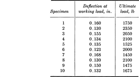
Compute the sample mean and variance for each set of data. Construct histograms and relative frequency distributions for each set. Plot the scatter diagram and compute the correlation coefficient. What are your conclusions?
1.2. Ten bolted timber joints were tested using a ½-in. bolt placed in double shear through three pieces of 2 by 4 in. (nominal size) Douglas fir. The results of the tests were:
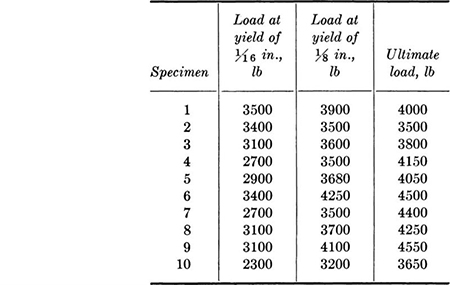
Calculate the sample standard deviations and coefficients of variation. Plot a scatter diagram and compute the sample correlation coefficient between load at yield of ⅛ in. and ultimate load. Might this simpler, nondestructive test be considered as a prediction of ultimate joint capacity?
1.3. Jack and anchor forces were measured in a prestressed-concrete lift-slab job for both straight and curved cables. The objective of the study was to obtain estimates of the influence of friction and curvature. The data are given in terms of the ratio of jack to anchor force.
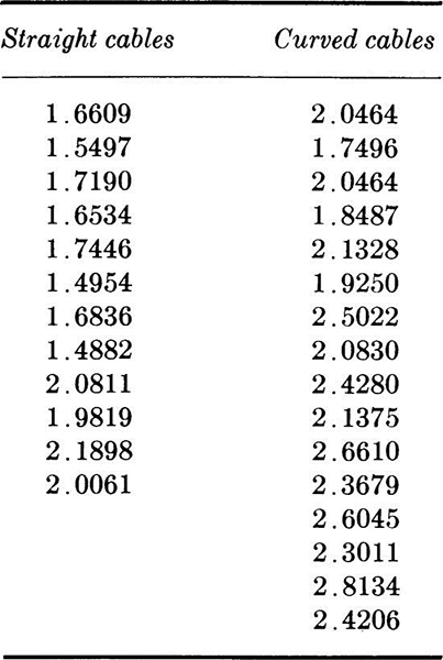
Compute the sample mean and variance of each set of data. Construct histograms, frequency distributions, and cumulative frequency distributions. Assuming that the jack forces are constant, what can be said about the influence of nominal curvature on friction loss?
1.4. The following values of shear strength (in tons per square foot) were determined by unconfined compression tests of soil from Waukell Creek, California. Plot histograms of this data using four, six, and eight intervals. In the second case consider three different locations of the interval division points. With a few extreme points, as here, it may be advantageous to consider unequal intervals, longer in the right-hand tail.

1.5. Compute the individual sample means, standard deviations, and coefficients of variation for the basement, fourth floor, and ninth floor of the floor-load data in Table 1.2.1. How do they compare with each other? Why might such differences arise?
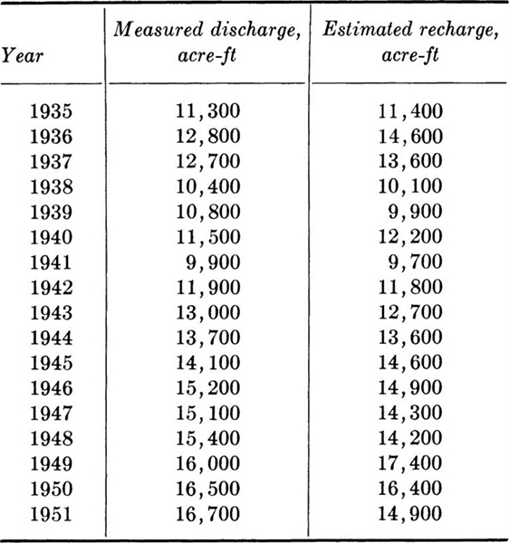
1.6. The following data for the Ogden Valley artesian aquifer have been collected over a period of years. Find the sample means, variances, standard deviations, and correlation coefficient.
1.7. The maximum annual flood flows for the feather River at Oroville, California, for the period 1902 to 1960 are as follows. The data have been ordered, but the years of occurrence are also given.
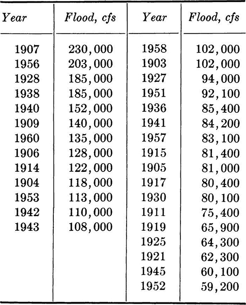
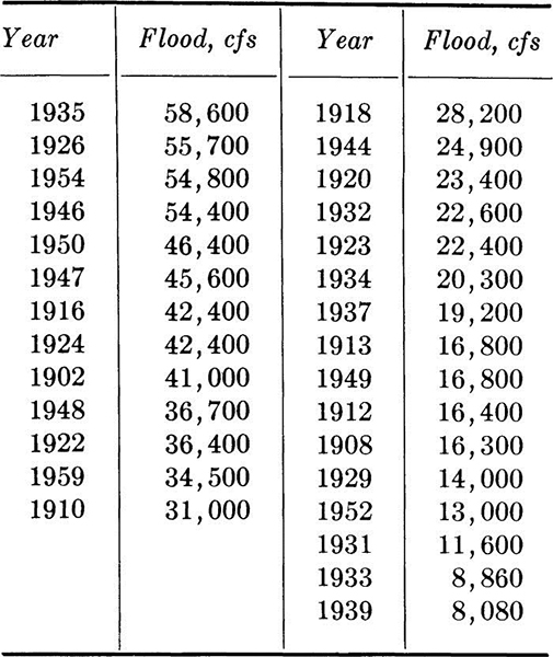
Compute sample mean and variance. Plot histogram and frequency distribution. If a 1-year construction project is being planned and a flow of 20,000 cfs or greater will halt construction, what, in the past, has been the relative frequency of such flows?
1.8. The piezometer gauge pressures at a critical location on a penstock model were measured under maximum flow conditions as follows (ordered data in inches of mercury).

Compute sample mean, variance, and skewness coefficient. Use a histogram with the mean at an interval boundary to answer the question: did values above and below the mean occur with equal frequency? Were very low readings as common as very high readings?
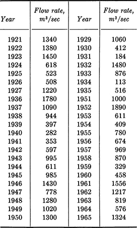
1.9. Embankment material for zone 1 of the Santa Rosita Dam in Southern Chihuahua, Mexico, will come from a borrow pit downstream from the dam site at a location that is frequently flooded. A cofferdam 800 m long is needed and the contractor needs to know the optimum construction height. Normal flow (200 m3/sec) requires a height of 3 m. Flooding will involve a 3-week delay in construction. Maximum flow rates from 1921 to 1965 were:
The contractor’s options are:

The cost of a 3-week delay from flooding of the borrow pit is estimated as $30,000.
Compute the sample mean and variance. Will a histogram be useful in the analysis of the contractor’s decision? Why? How would you structure the decision situation? How does time enter the problem?
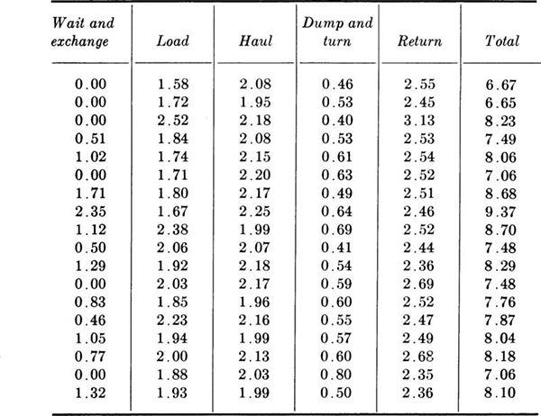
1.10. In heavy construction operations the variation in individual vehicle cycle times can cause delays in the total process. Find the sample means, standard deviations, and coefficients of variation for each of the following specific steps in a cycle and for the total cycle time. Which steps are “most variable?” Which contribute most seriously to the variations in the total cycle time? Is there an indication that some vehicle/driver combinations are faster than others? (Check by calculated haul and return time correlation.) How does the standard deviation of the sum compare to those of the parts? How does the coefficient of variation of the sum compare to those of the parts?
1.11. Total cycle times of trucks hauling asphaltic concrete on a highway project were observed and found to be (in minutes):

Find the sample mean, standard deviation, skewness coefficient, and coefficient of kurtosis of this set of data. Plot its histogram.
1.12. Fifteen lots of 100 sections each of 108-in. concrete pipe were tested for porosity. The number of sections in each lot failing to meet the standards were:

Compute the sample mean, variance, and coefficient of variation.
If the plant continues to manufacture pipe of this quality, can you suggest a possible technique for quality control of the product? What cost factors enter the problem?
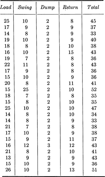
1.13. The times (in seconds) for loading, swinging, dumping, and returning for a shovel moving sandstone on a dam project were measured as shown in table at top of p. 24.
Compute sample mean, variance, and coefficient of variation of each set of data. If the variability in total time is causing hauling problems, which operation should be studied as the primary source of variability in the total? Which of the summary statistics would be most useful in such a study?
1.14. The San Francisco–Oakland Bay Bridge provides an interesting opportunity for the study of highway capacity as a random phenomenon. A device located at the toll booth summarizes traffic flow by direction in 6-min increments. Maximum flow each day has been recorded as follows for a survey duration of 2 days.
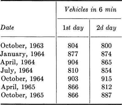
(a) Check for growth trend.
(b) Plot the histogram and compute the numerical summaries using all 14 data points.
(c) What trends will become apparent if the bridge is approaching its maximum daily capacity? Consider the influence of variation in demand associated with users’ knowledge of congestion periods.
1.15. The traffic on a two-lane road has been studied in preparation for the start of a construction project during which one lane will be closed. The problem is whether to use an automatic signal with a fixed cycle, a flagman, or go to the expense of constructing a new temporary lane. The data are:
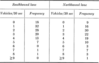
Compute sample mean and variance of each set. What can you say about the traffic pattern that tends to discriminate between an automatic signal with a fixed cycle and a flagman who can follow the traffic demand? How would you make a study of the possible demand for a new temporary lane? Hint: How does the detour travel time influence the problem? What data are needed?
1.16. Soil resistivity is used in studies of corrosion of pipes buried in the soil. For example, a resistivity of 0 to 400 ohms/cm represents extremely severe corrosion conditions; 400 to 900, very severe; 900 to 1500, severe; 1500 to 3500, moderate; 3500 to 8000, mild; and 8000 to 20,000, slight risk. There were 32 measurements of soil resistivity made at a prospective construction site.
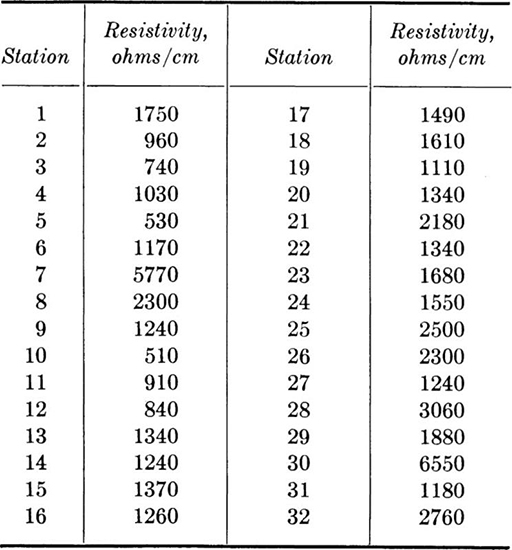
Compute sample mean and variance. Construct a histogram using the classification bands above as intervals. Illustrate the same relations on the cumulative frequency distribution and indicate the observed relative frequency of occurrence. Note that the mean represents a spatial mean and that the variance is a measure of lack of homogeneity of the resistivity property over the site.
1.17. The water-treatment plant at an air station in California was constructed for a design capacity of 4,500,000 gal/day (domestic use). It is nearly always necessary to suspend lawn irrigation when demand exceeds supply. There are, of course, attendant losses. Measured demands during July and August 1965 (weekdays only) were (in thousands of gallons per day, ordered data):

Compute sample mean and variance. Construct a cumulative histogram in which 4,500,000 gal/day is one of the interval boundaries. On a relative frequency basis, how often did demand exceed capacity?
1.18. The Stanford pilot plant attempts to treat the effluent of an activated sludge sewage-treatment plant alternating between a diatomite filter and a sand filter.
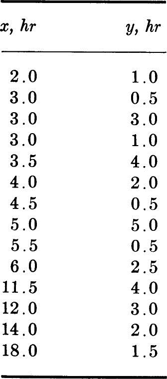
The diatomaceous earth filter fouls quickly if the raw water contains too many suspended solids. The sand filter is then used during periods in which the diatomite filter is inoperative. If x is the time of operation of the diatomite filter and y the operating time of the sand filter during cleaning of the diatomite filter, the data are a typical sample of paired observations.
Compute the sample mean and variance of each set and the correlation coefficient. Plot a scatter diagram. Does the plot verify the calculated correlation coefficient?
1.19. Show that the following alternate, more easily computed form of the sample covariance is equivalent to Eq. (1.3.1).
1.20. The percentage frequencies of wind direction and speed on an annual basis for a 10-year study at the Logan Airport, Boston, Massachusetts, are:
Hourly observations of wind speed, mph*
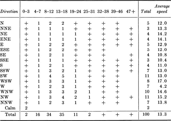
* + indicates frequency less than 1 percent.
(a) Make a scatter diagram for direction versus average speed, one point for each 1 percent. Make a similar study for direction versus 8 to 12 and versus 13 to 18 mph wind speeds. Why is the first diagram different from the other two?
(b) Compute the sample mean and sample variance of the average speed.
(c) Compute the mean and variance of direction (in degrees from N). What should you do with the two percent of calm days?
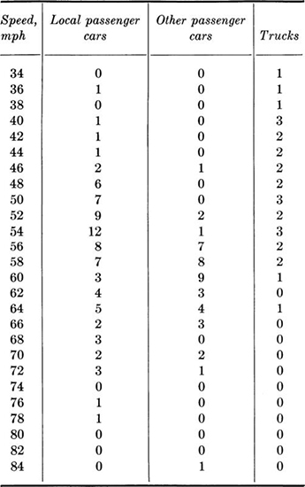
1.21. One procedure for setting the allowable speed limit on a highway is to assume that the proper limit has a 15 percent chance of being exceeded based on a spot speed study. If this decision rule is used, what speed limit do you recommend for U.S. Route 50 and Main Street? No limit existed when these data were observed:
U.S. Route 50
Main street
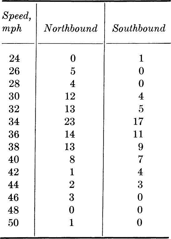
(a) Plot the histograms for speed of passenger cars, trucks, and all vehicles on U.S. Route 50 and on Main Street. On U.S. Route 50, is a dual speed limit for passenger cars and trucks reasonable?
(b) Compute the mean, variance, and coefficient of variation of speed for all vehicles on U.S. Route 50 and for those on Main Street.
(c) If you were presenting your study to the City Council, what would you recommend as the speed limits? Why? If the council is very sensitive to local political pressure, would your recommendation change, assuming that the quoted decision rule is only a rough guide? The Main Street traffic is primarily local traffic.
1.22. Show that in situations such as that in Prob. 1.10, where interest centers on both the parts and their sum, the sample variance sT2 of the sum of two variables equals:
![]()
where s12, s22, and r12 are, respectively, the sample variances and sample correlation coefficient of variables 1 and 2. Show, too, that:
![]()
In general, for a number n of variables and their sum,

Notice that if the rij’s are small in absolute value,

But in general sT2 may be larger or smaller than this sum. See Prob. 1.10.
1.23. One of the factors considered when determining the susceptibility to liquefaction of sands below a foundation during earthquake motions is their penetration resistance as measured by blow counts (number of blows per foot of penetration). These measurements show marked dispersion, especially in soils whose liquefaction susceptibility might be in question. Therefore histograms of blow-count tests made at different depths and locations in the soil layer are compared in shape with histograms of blow counts at sites where liquefaction has or has not occurred during earthquakes. At a site under investigation the following data are made available:
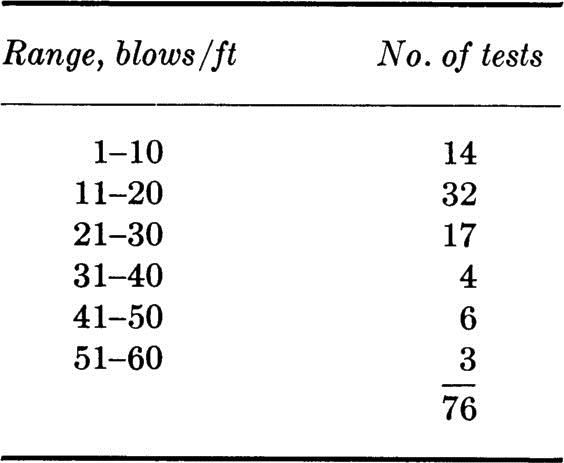
(a) Prepare a histogram of this data. Use three different vertical axes with scales: “Number of tests per 10-blow interval,” “frequency of tests per 10-blow interval,” and “frequency of tests per 1-blow interval.”
(b) The following histograms are presented as shown in a report on the large 1964 Niigata Earthquake in Japan. As is all too frequently the case in engineering reports, it is not clear how the histograms were constructed. Assume that the vertical axis is “frequency per five-blow interval” and that the dots represent the midpoints of the intervals –2.4 to +2.5, 2.6 to 7.5, 7.6 to 12.5, etc. In order to aid in judging the susceptibility to liquefaction of the present site, replot these two histograms on the histogram prepared in part (a) above. Which of the three vertical scales should be used to avoid most easily the difficulties caused by the different numbers of tests and different interval lengths?
(c) Instead of comparing entire histograms, what sample averages might one compute for the various sets of data to aid in this judgment? Do you think the average is sufficient? Is the skewness coefficient helpful?
Fig. P1.23 Histograms of data from Niigata earthquake.
1.24. In a study of rainstorms, the following data were observed at a number of recording stations.
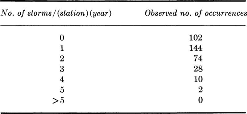
Source: E. L. Grant [1938], Rainfall Intensities and Frequencies, ASCE Trans., vol. 103, pp. 384–388.
(a) Plot a histogram and a cumulative frequency polygon for this data. Compute the sample mean and sample standard deviation.
(b) How do these data differ in character from stream flow data?
† When constructing the cumulative frequency distribution, one can avoid the arbitrariness of the intervals by plotting one point per observation, that is, by plotting i/n versus x(i), where x(i) is the ith in ordered list of data (see Fig. 1.2.1).
† If advantageous, unequal interval widths may be preferable (see Sec. 4.4).
† The reader would do well to plot a number of different histograms of this failure-load data, both to judge the value of this means for data interpretation in this example and to illustrate the remarks about histogram intervals made in Sec. 1.1.
† A fourth numerical summary, the coefficient of kurtosis, may also be employed. Without large sample sizes, however, its use is seldom recommended.
The sample coefficient of kurtosis g2 is related to the “peakedness” of the histogram:

Traditionally the value of this coefficient is compared to a value of g2 = 3.0, the kurtosis coefficient of a commonly encountered bell-shaped continuous curve which we shall learn to call the normal curve (Sec. 3.3.3). For the data here,
![]()