Local Field Potentials
Pascal Wallisch
Here we will examine the local field potential. We will also look at encoding and decoding by making use of frequency analysis. Finally, we will introduce Chronux, an open-source software package written in MATLAB®, which can be used to analyze neural data.
Keywords
local field potential; Chronux; filtering; Butterworth filter; mean
23.1 Goals of This Chapter
Thus far, we have analyzed data in the form of neural spike times, in the context of how neurons encode the state of the outside world, and in the context of how the state of the world can be decoded from neuronal spiking. Here, we will examine a different neuronal signal, the local field potential. We will look at encoding and decoding by making use of frequency analysis (covered in Chapters 11 and 12). Finally, we will introduce Chronux, an open-source software package written in MATLAB®, which can be used to analyze neural data.
23.2 Background
An extra-cellular electrode placed in the brain registers the activity of nearby neurons as a change in the voltage across the electrode. Action potentials are very fast, and so they cause very quick changes to the voltage trace. In an attempt to isolate the activity of just one neuron (or perhaps a few neurons), the voltage trace is high-pass filtered (for frequencies above 250 Hz) before spikes are detected by threshold crossings. However, the lower frequencies have information about neurons as well. When the voltage trace is low-pass filtered (for frequencies below 250 Hz), the result is known as the local field potential, or LFP. LFPs reflect the summed activity of thousands of neurons near the electrode. “Near” is an imprecise term, but one paper looking an orientation tuning in visual cortex concluded that LFPs reflected the activity of neurons within 250 microns of the electrode tip (Katzner et al., 2009). Because unsynchronized neural activity should cancel out, LFPs are thought to reflect synchronous or oscillatory firing of the neuronal population.
What does the LFP look like? In the dataset for this chapter, the variable lfp contains the raw LFP recorded from the dorsal premotor cortex, sampled at 1 kHz and in units of microvolts (μV). However, instead of looking at the raw data, neuroscientists usually subdivide the LFP by band-pass filtering it. We will follow the methodology of a paper by O’Leary and Hatsopoulos (2006), which examined directional tuning in LFPs recorded in motor cortex. This paper divided the LFP into high (25–45 Hz), medium (10–25 Hz), and low (<10 Hz) frequency bands. The high and medium bands are sometimes referred to as gamma and beta oscillations, respectively, though the usage varies among authors.
Filtering is basically a way to smooth data by computing a weighted, moving average. For example, in Chapter 20 we smoothed binary spike data with a Gaussian kernel to produce a spike density function. MATLAB has several built-in functions to help with filtering, including filter and filtfilt. If we have a vector x and want to create a filtered vector y, we can do this by calling y=filter(B,A,x). Here, the vector B specifies the coefficients that are applied to raw signal x. The vector A specifies coefficients applied to the filtered signal, but we will ignore that for now, and set A equal to 1. Let’s take an example where the raw signal x is a ramp from 1 to 10 over 10 seconds, plus some amount of corruption from noise. We can create a filtered signal by taking a three-point moving average. We do this with filter by setting the vector of coefficients B to be [1/3 1/3 1/3]. The function filter only uses current and past data, so this means the third element of y is the average of the first three elements of x. The function will ignore the missing paste values in the beginning, so here the first element of y will just be one-third the first element of x.
| x=[1:10]+rand(1,10)*2; | %Raw signal X, plus some noise |
| y=filter([1/3 1/3 1/3],1,x); | %Filter x with a three point moving average |
However, there is one issue with the function filter. If we ignore the noise, the third element of y will be the mean of the vector [1 2 3], or 2. But the original value (before the noise) was 3, so our filtered value is one off. To put it another way, the filtered signal lags the raw signal by 1 second because it won’t reach the value of 3 until 4 seconds in, not at 3 seconds. Thus filtering in this manner introduces a time-delay. One way to fix this is to filter the data again, but to do the process in reverse order so that the two time-delays cancel. That is what the function filtfilt does (see code below). If you plot the raw signal x and the two filtered versions y and z from the two different functions, you will end up with something like Figure 23.1. This figure makes it clear that while the output of filter lags the raw data, the output of filtfilt does not.
| z=filtfilt([1/3 1/3 1/3],1,x); | %Filter x forwards and backwards, to avoid a time lag. |
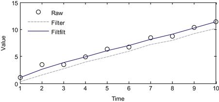
Figure 23.1 A comparison of a raw signal and the filtered version using the filter and filtfilt commands.
To filter our LFP signal, we will use a more complicated filter called the Butterworth filter. The mathematics of filter design is beyond our scope here, but a relevant discussion can be found in the book Signal Processing for Neuroscientists by Wim van Drongelen. In short, we can specify the frequency range we want to focus on, and then use the MATLAB command butter to create the appropriate coefficients of a Butterworth filter that we can then apply to our data using filtfilt. There are many other choices for a band-pass filter, such as the Elliptic filter (MATLAB command ellip) or the Chebyshev filter (cheby1), but the Butterworth filter is commonly used and will serve our purposes here. The Butterworth is an auto-regressive filter, meaning it acts on past filtered values as well, so the coefficient A won’t be 1 like in the previous example. For function butter, you need to specify the order, which is how many past samples the filter will look at. For example, the earlier three-point moving average is order two, because it looked at the current and two past values of the raw signal. You can use the code ahead to filter the raw LFP into the three frequency bands we want:
| Fs=1000; | %Sampling frequency |
| n=4; | %Controls the order of the filter |
| fpass=[0 10; 10 25; 25 45]; | %Frequency bands |
| [b,a]=butter(n,2*fpass(1,2)*2/Fs,‘low’); | %Low-pass filter |
| lfp(:,2)=filtfilt(b,a,lfp(:,1)); | |
| for ii=2:3 | |
| [b,a]=butter(n,fpass(ii,:)*2/Fs); | %Band-pass filter |
| lfp(:,ii+1)=filtfilt(b,a,lfp(:,1)); | %Run forwards and backwards |
| end |
In this code, we also specified the sampling rate Fs, which is 1000 times per second for these data. Also, the frequency range is given as a number between 0 and 1, where 1 is the Nyquist limit (Fs/2). Recall that the Nyquist limit (see Chapter 11) specifies that we cannot faithfully capture a frequency greater than the sampling rate divided by 2. Thus it doesn’t make sense to target a frequency above the Nyquist limit.
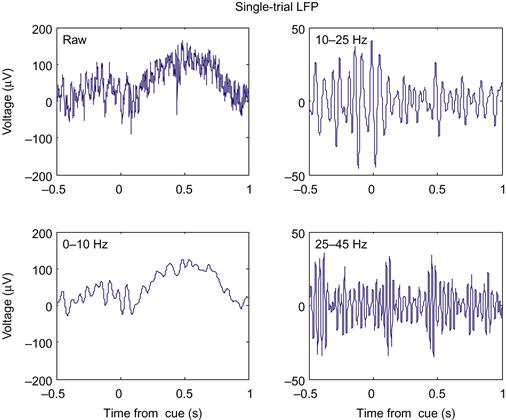
The previous code filters the LFP recorded over the entire experiment. However, we will want to examine the LFP when something behaviorally interesting is going on. These data were collected during a center-out reaching task with an instructed delay, just like the neural spiking data from Chapter 17. The dataset contains the time (in seconds) that the target first appeared (instruction), the time the go cue was triggered (go), and the time the research participant actually left the center target (startMove). To convert the time of a cue to the indices of the LFP, just multiply it by the sampling rate, and round off. The code ahead plots the raw LFP in a window centered on the first instruction cue. If you plot the filtered LFPs as well, you will get something like Figure 23.2.
| cueInd=round(instruction(1)*Fs); | %First instruction cue |
| indTrial=cueInd-Fs/2:cueInd+Fs; | %-500 ms to +1000 ms around cue |
| time=[-500:1000]/Fs; | |
| plot(time,lfp(indTrial, 1)); |
23.2.1 Evoked Potentials
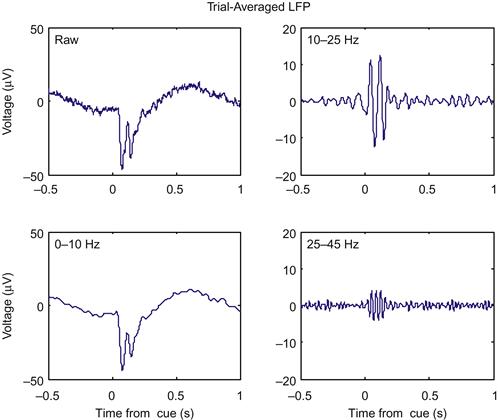
While it is clear from Figure 23.2 that the amplitude of the signals are changing as a function of time, it is not clear how much of that change is related to the onset of the instruction cue. This is because, like any physiological signal, the LFP is partially corrupted by noise. We can help eliminate the noise by averaging across trials to create an evoked potential. The code ahead will average the LFPs across trials in a window centered on the instruction time. If you plot these averaged evoked potentials, you will get something like Figure 23.3.

Now it is clear that something is happening around the instruction cue. First, both the raw and the low-pass filtered LFP show a sharp downward deflection after the instruction appears, before returning to baseline. Second, both the high and medium frequency bands show an increase in the amplitude (peak-trough distance of the oscillations), which starts at the instruction cue and lasts for around 200 ms.
23.2.2 Directional tuning
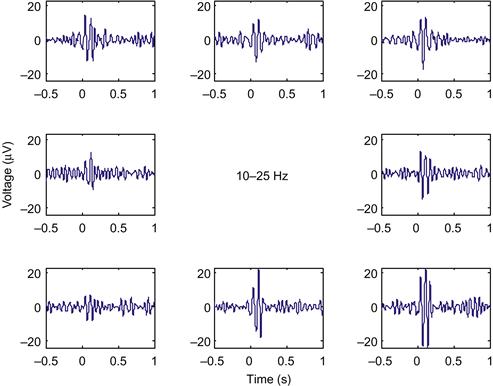
This LFP was recorded from motor cortex during a center-out task, and we saw in Chapter 17 that single units in motor cortex encode the direction of the upcoming reach. What about LFPs? The simplest way to examine directional tuning is to look at evoked potentials averaged across trials in the same direction. The direction of each trial is stored in the variable direction, where 1 is 0 degrees (movement to the right), 2 is 45 degrees, and so on up to 8, which is 315 degrees. If you average the LFPs on the instruction cue for the 10–25 Hz frequency band (using the find command to isolate trials in a given direction), and plot the evoked LFPs in subplots corresponding to the direction of movement, you will get Figure 23.4.
The evoked LFP for each direction looks like a scaled version of the evoked LFP across all trials. However, the LFP response is strongest for movement down and to the right. How do we quantify this response? Our signal here consists of oscillations, thus both the positive and negative deviations indicate a response. The simplest thing to do is to square the measured voltage, and then average it over a time window of interest, similar to O’Leary and Hatsopoulos (2006). Taking the square root of this number is helpful, as it yields a measure in the original units (μV). The following code will compute the LFP response in a 200 ms window following the instruction cue:
| for ii=1:length(instruction) | |
| cueInd=round(instruction(ii)*Fs); | %Find index of instruction cue |
| temp=lfp(cueInd:cueInd+199,3); | %Take 200 ms window after cue |
| lfpResponse(ii)=sqrt(mean(temp.^2)); | %Root-mean square of voltage |
| end |
Now we want to look at how this LFP response varies as a function of direction. We can take the mean of the response for trials of each direction, but we want to have a sense of the variability of the data as well, so we will also compute the standard deviation of the data. However, directional tuning implies that the mean of the response will vary as a function of the direction of movement. We therefore want to know how good our estimate of the mean is. This is captured by the standard error of the mean, which is the standard deviation of the expected values of our sample mean. The standard error can be estimated by dividing the sample standard deviation by the square root of the number of samples. The following MATLAB code computes the mean, standard deviation, and standard error of the LFP response we just computed.
| for jj=1:8 | |
| ind=find(direction==jj); | %Find trials in given direction |
| lfpMean(jj)=mean(lfpResponse(ind)); | %Mean |
| lfpStd(jj)=std(lfpResponse(ind)); | %Standard deviation |
| lfpErr(jj)=lfpStd(jj)/sqrt(length(ind)); | %Standard error |
| end |
If the data are assumed to follow a normal distribution, then the sample mean should follow a normal distribution with the standard error as its standard deviation. Thus we can use the standard error to calculate a confidence interval. A random variable drawn from a normal distribution has a 95% chance of being within 1.96 standard deviations of the mean (you might verify that with a simulation using the function randn). A 95% confidence interval computed on our data implies that if we were to repeat our experiment 100 times, in 95 of them the true mean would fall within the confidence interval we compute. It is not quite correct to say that there is a 95% chance that the confidence interval contains the true mean, but the precise meaning of a confidence interval is tricky. For our purposes, it is sufficient to know that it is a measure that indicates the reliability of an estimate (in this case, the mean).
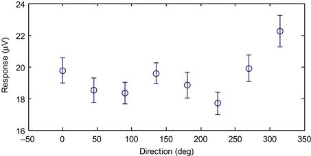
For practical purposes, confidence intervals are used to visually display how much variability there is in the data, and to give an approximation as to whether two variables are significantly different (their confidence intervals should not overlap). In MATLAB, we can plot data with error bars corresponding to plus or minus one standard error using the function errorbar. Plotting our data this way confirms our suspicion that the data vary by direction (Figure 23.5).
It does not appear that the data are cosine tuned, as there are two local maxima in the figure, and a sharp drop-off from the maximal value. However, we can perform a test of whether the means are significantly different by performing a one-way analysis of variance, as covered in Chapter 7, by using the following code:
| anova1(lfpResponse,direction) | %Are means significant different? |
Another way to explore whether the LFP responses really are related to direction is to compare the response vector to a randomized vector of directions, instead of the actual directions. In a sense, this is a negative control; if you repeat the analysis and it still shows the relationship with the random data, there is likely a mistake somewhere. The code below stores the random vector in the variable “dirRand.” You can then go back to the last for-loop, and replace the variable “direction” with variable “dirRand.” When you plot the response as a function of direction, the responses should be flat, and the analysis of variance should show that they are not significantly different.
| dirRand=ceil(rand(length(go),1)*8); | %A random vector of 8 directions |
23.2.3 Spectrograms
We introduced the concept of a spectrogram in Chapter 12, which shows the power of a time-varying signal at different frequencies. Looking at a spectrogram is useful here, because it might allow us to make a better choice of frequency bands and time windows used to examine directional tuning. We will analyze the data in a similar manner as the evoked potential, by computing a spectrogram on the single trials and then averaging all trials in a given direction.
We will start as we did in Chapter 12, using the built-in function spectrogram. We will compute the spectrogram of the first trial that we plotted in Figure 23.2. We also need to decide on how many data points to use in our window to compute the spectrum (we will use 128, or 0.128 seconds of data) and what frequencies we are interested in (we will look between 6 Hz and 60 Hz). Then you can run the code ahead to plot the spectrogram (shown in the left-hand panel of Figure 23.6).

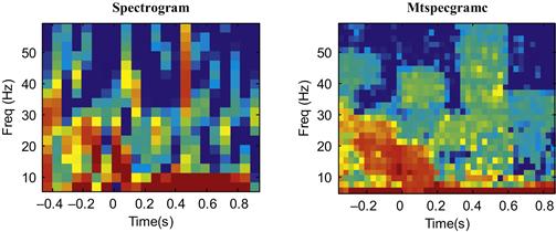
Figure 23.6 A comparison of a single-trial spectrogram using the built-in function spectrogram and the Chronux function mtspecgramc.
Note that what we are actually plotting is the power of the spectrogram (stored in “P”), and that we are plotting power in units of decibels (dB). We converted to dB by taking the base-10 logarithm and multiplying it by 10. This means that something valued at 10 dB is 10 times greater than a reference value at 0 dB, while 20 dB is 100 times greater than the reference value at 0 dB. Such a logarithmic scale is useful for things that vary widely in scale (such as sound, where decibels are most often used). We also adjusted the time axis (“T-.5”) to reflect that fact that time starts 0.5 s before the cue.
To compute an average spectrogram, we could repeat this code for all trials, store the power spectrogram, and average them all before plotting them. That is the procedure we used before for evoked potentials. However, this is a bit cumbersome here, and it turns out we can compute spectrograms faster and more accurately by using an open-source software package for neural data analysis known as Chronux, developed for MATLAB by the laboratory of Partha Mitra at Cold Spring Harbor. It can be downloaded for free from the web site http://chronux.org/. This software package can be used for a variety of purposes, such as generating raster plots and peri-event time histograms as covered in Chapter 17, but we will focus here on the frequency analysis code. After downloading the package you will need to add two sub-directories to your current path (under File then Set Path): “chronux\spectral_analysis\continuous” and “chronux\spectral_analysis\helper.”
This software package makes use of a mathematical technique for computing the power spectrum known as multitaper spectral analysis. Discussion of multitaper analysis can be found in the book Observed Brain Dynamics, and an example of its application to LFP data can be found in Pesaran et al. (2002). In short, the “multi” in multitaper refers to the fact that it is possible to get several different, statistically independent estimates of the spectrum of a signal. These can then be averaged together, which gives a more precise estimate (and error bars, if desired) of the spectrum than is possible using the function spectrogram. Using the frequency analysis code in Chronux involves setting a number of parameters, including the number and resolution of the tapers. However, for now you can just use the parameters ahead, which work well for these data, and plot the spectrogram for a single trial using the Chronux function mtspecgramc. The output of the two functions (spectrogram and mtspecgramc) are compared in Figure 23.6.

There are a few parameters here you can play with. The first element of the moving window (0.3) specifies how much data (in seconds) you use to compute the spectrum, analogous to the number of data points used earlier. The first element of “params.tapers” specifies the time-bandwidth product TW. This is a constant, so if you shrink the moving window, you will increase the corresponding frequency window. The second element of “params.tapers” specifies the number of tapers, which must be less than or equal to 2TW-1. See Observed Brain Dynamics for further discussion of the interpretation of these parameters.
You can see in Figure 23.6 that the output of the built-in function is noisier than that of the Chronux function, though they do show the same overall pattern. However, what we want to compute is an average spectrum over many trials, not just one. We can do this using the Chronux function mtspecgramtrigc, as demonstrated in the code ahead. This code will compute the average spectrum for just one direction, but the average spectrograms for each of the eight directions of movement are shown in Figure 23.7.

In Figure 23.7, high power is indicated by the color red, and low power is indicated by the color blue, with yellow in between (use the function colorbar for details on the scale). You can see that there is an increase in power between 5 and 30 Hz from the instruction cue to 200 ms afterwards. This increase is directionally tuned, and it is maximal for movement to the right and down. This is consistent with what we saw in the evoked LFP in the 10–25 Hz range (Figure 23.4).
Unlike the evoked potential, there is a second increase in power from 500 ms to 700 ms after the instruction cue. This increase is also directionally tuned, but now it is maximal for movement to the left. This did not show up in the evoked potential of the same data previously shown. This is because the evoked potential will only pick up an increase in amplitude where the responses across trials have a similar phase, which they do immediately after the instruction cue (see O’Leary and Hatsopoulos, 2006). If the responses are not phase-locked, they will cancel out even if the amplitude is increased if one averages across trials. Thus, for these data, the spectrogram has more information than the evoked potential.
23.3 Exercises
1. Compute evoked potentials for each direction in both the 10–25 Hz and 25–45 Hz bands for all three behavioral cues: the instruction cue, the go cue, and the start of movement. Compute an LFP response for the window from 0 to 200 ms after each event. Does the LFP response show directional tuning in all conditions? If so, what are the preferred directions for each condition? Do any conditions show cosine tuning (see Chapter 17)?
2. Compute an LFP response in the time window from 500 ms to 700 ms for the 10–25 Hz and 25–45 Hz bands. Is the direction tuning different from the time window from 0 to 200 ms? If so, what are the preferred directions for each band?
3. Compute evoked potentials for the <10 Hz band. We saw that this band shows a downward deflection after the instruction cue (Figure 23.2). Compute a baseline for each single trial by averaging the voltage for the 500 ms period preceding the instruction cue. Then integrate the filtered LFP from 0 to 200 ms after each behavioral cue. Does the low-pass filtered LFP show directional tuning for each condition? If so, what are the preferred directions?
23.4 Project
Devise a decoder to map the single-trial LFP data to an estimate of the direction of movement for that trial. Train the decoder on the first 300 trials of data, and when you are done tweaking your decoder, apply it to the remaining 163 trials. Try not to test multiple decoders on the last 163 trials, as that will lead to over-fitting. Report the accuracy (percentage of trials correctly identified) of your decoder separately for the 300 training trials and 163 test trials. Since there are eight discrete movement directions, the baseline percentage correct should be 12.5%. You should be able to build a decoder which gets around 30% of test trials correct.
One approach is to record the mean and standard deviation of the LFP response for a handful of frequency bands and time windows. Then, assuming the responses are independent and normally distributed, you can compute the likelihood of data given each movement direction, and then pick the direction corresponding to the highest likelihood (see Chapter 21 for more on this approach). However, you may try a different decoder if you wish.
