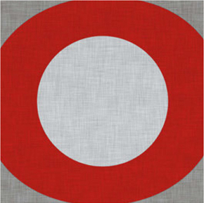
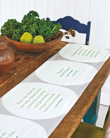
Memorable quotes about dining well inspired our table runner (this page).
READ ALL ABOUT IT
SKILLS LEARNED IN THIS CHAPTER
+ Using the Text tool
+ Using the Spoonflower Color Map
+ Using Layers
Words and numbers have intrinsic artistic and communicative value and can inspire very cool designs. They can be hand-drawn or computer-generated. They can be used to tell a story and personalize a design (see Kim’s Simple Quilt Label on this page) or they can be used to create abstract patterns (as on the Typographic Wrapping Paper on this page).
In this chapter, we introduce the idea of working in layers, which means creating the different parts of a design (such as background, type, or motifs) as separate elements so that you can manipulate each piece independently of the others.
Memorable quotes about dining well inspired our table runner (this page).
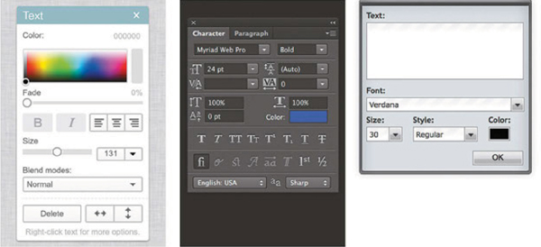
The Text tool has a lot of different looks, but the icon is usually something alphabetical, such as a T. As you might guess, the Text tool is used to add text to your designs.
To add text, select the Text tool, click and hold down your mouse, and drag it across the canvas to create a text box in the document. Then type the text into the box. There are generally lots of options for changing text, so it usually has its own panel or palette (a set of additional functions) with the choices for font, size, color, etc. (Figure 1). The best way to change the text is to select the part of the text to style—click and drag to highlight it—and then choose the options you want to change. For instance, you can make your type bold or italic, change the color, or switch to an entirely different font. Once you have added text, you can use many tools to manipulate it. You can select the text box and move it around, and you can also rotate it; look for arrows or a handle in the selection box to change its direction. In your graphics program, look for additional ways to transform text, as they can vary quite a bit from program to program. There are likely a variety of options built into your software, such as making the text flow in wavy lines or follow a shape that you specify.
Adjusting Color
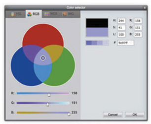
You can choose text colors in a variety of ways. Use the Text tool palette, as just described; use the Eyedropper tool (as explained on this page); and don’t forget the Spoonflower Color Map (this page). To use the Color Map, select a color from the map, click on the color palette for the Text tool, then type the code on the Color Map into the box labeled # or HEX (Figure 2).
A design can be built out of many separate layers (for example, one layer can be a background color, another layer can be motifs, and another layer can be text). When the layers are combined, the whole design comes together. At first, working in layers might seem complicated, but before long, you’ll see that it is easy and can actually simplify the design process a lot.
What can you do with layers?
+ Change the order of layers to easily rearrange elements that overlap one another. If you’re composing a design with leaves on one layer and daisies on the other, you can quickly experiment with the composition to decide if you want the leaves in front of—or behind—the daisies.
+ Duplicate layers to make copies of an element. For example, draw a single daisy and then make many copies of it to scatter all over the design. Instead of copying and pasting many daisies, which can leave a hole in your background and can put them in a permanent position in your design, you can have the individual images on layers to move or manipulate independently without affecting the other layers in your design. It’s also easy to delete a daisy or two if you decide you don’t want them!
FIGURE 2 If you have the Spoonflower Color Map (this page), you can type in the code for your desired color in the palette for your Text tool.
+ Change the placement of an entire layer without having to select each individual element. Back to our daisies and leaves example for a moment; suppose you wanted all the daisies to shift to the left? It’s a breeze to move the entire layer at once rather than working on each element separately.
+ Make layers visible or invisible to test out variations on your design. Let’s imagine that you are working on your daisies and leaves composition but wonder about the distribution of the daisies. To work on that element only, you can make the leaves layer invisible so you can concentrate on the flowers.
+ Add or delete layers or apply effects like color overlays, drop shadows, or transparency to individual layers. Layers give you the freedom to tweak your original design by adding all sorts of intriguing effects; you may recall that we added a texture to a variation of the design used in the Color Chip Lampshade project (this page).
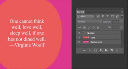
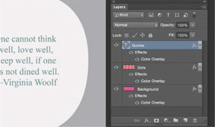
+ Create different colorways of one design by putting all of the elements that are the same color together on one layer. In Figures 3 and 4 the text, dots, and background from our Food for Thought Table Runner (this page) are each on a different layer. You can change the color of each layer by adding a “Color Overlay” and all of the elements in the selected layer change color at the same time, so you don’t have to select each element individually. It’s a quick way to experiment with color.
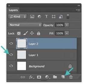
The Layers tool usually has a panel or palette that will pop up on your screen, which consists of a variety of functions as do the palettes associated with other tools. (In Photoshop, if the tool doesn’t pop up automatically, look under the “Window” menu item for “Layers.”) To add a new layer, find the symbol in the palette that looks like a blank piece of paper, or choose “New Layer” in the menu (Figure 5).
To change the order of layers, just click and drag them around in the palette in the order you like. The small eyeball symbol that is next to the layer makes it visible; click to make it become invisible.
FIGURE 3 Placing the text, dots, and background in different layers allows you to manipulate each one separately.
FIGURE 4 Note the words “Color Overlay” and the eyeball icon under each layer, telling you that an overlay was applied to the original colors.
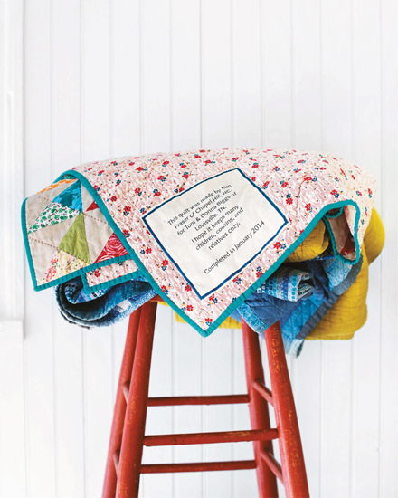
KIM FRASER / CHAPEL HILL, NC
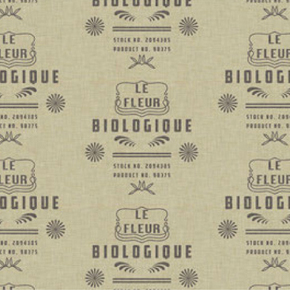
Kim Fraser (known as kimspoonflower on the site) is the wife of Spoonflower co-owner Stephen Fraser. She took a hand-quilting class at a local quilt store when she was pregnant with her second daughter and she has been quilting ever since. Making the label is always an important final step for Kim because she uses it to tell a part of the quilt’s story, and to make the quilt even more meaningful for years—maybe generations—to come. Kim created this simple yet eloquent label in PicMonkey. You can use the same technique for making labels of any size, even small ones to stitch into clothing.
MATERIALS & TOOLS
TO DESIGN THE FABRIC
Basic graphics program
1 swatch of basic cotton, poplin, or sateen, 8 × 8 inches (20 × 20 cm) (we used basic cotton)
TO ADD THE LABEL
Basic sewing tools (this page)
designing the fabric
1 Create a new canvas.
Create a new canvas in your graphics program that is 8 × 8 inches (20 × 20 cm) / 1200 × 1200 pixels.
2 Add a background frame.
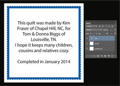
Review the instructions for working with text and layers (this page). If your graphics program has an option to add a frame to a canvas, as Kim’s did, choose a frame with scalloped edges or the frame of your choice. Kim matched the border color to the quilt, using the color tools in her graphics program. (If you don’t have an option to add a border from within your graphics program, you can find a copyright-free clip-art border online. (To find clip art, do a Google search for “free clip art” or “copyright-free imagery” online.) If you would like an exterior border of white as in Kim’s design, reduce the size of your frame to leave ½ inch (1.2 cm) on all sides (Figure 1).
FIGURE 1 This design uses three layers: one for the background, one for the border, and one for the text.
3 Add a text layer.
Add your message with the Text tool (this page). Kim chose a centered alignment and chose black for the color of her text (Figure 2). Read her text above and then decide what you want your message to be.
4 Save, upload, and print.
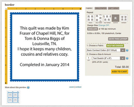
Save the file and upload it to Spoonflower (this page). Print one label on a swatch using a centered repeat. Or you can make multiple labels by choosing a different repeat layout (this page) and/or printing on 1 yard (.9 m) of fabric. Choose a smooth, tightly woven fabric like poplin if you think you might use a fabric pen to add a handwritten message on your labels.
stitching on the label
5 Add the label.
Turn under ¼ inch (6 mm) on all sides and press. Stitch the label by hand to a corner or edge of the back of your quilt.
SPOONFLOWER DESIGNERS READ ALL ABOUT IT
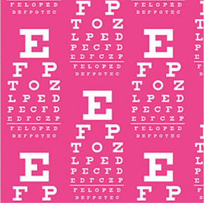
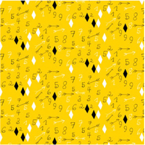
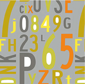
It’s easy to take letters and numbers for granted as we see and use them constantly in our everyday lives. Thinking about them as design elements creates a unique, exciting challenge. The designers whose work is featured here drew upon them as organic shapes, as branding devices, as vision tests, and as a drawing tool to create black-and-white, positive and negative space. They used computer-generated, handwritten, and typewritten letters and numbers on their own and in combination with other forms, in one-color, two-color, and multicolor designs. What’s next? That’s for you to decide. We hope you’ll upload your creations to the Spoonflower site so we can enjoy them.
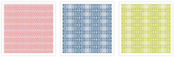
We created oversized Os that we thought looked like dinner plates and filled them with some of our favorite food- and cooking-related quotes to create this fun table runner, sure to be a conversation piece at any gathering. Of course, you can create your table runner based the theme of your choice. How about names of family members, lines from favorite poems or songs, or a word of welcome in several languages.
MATERIALS & TOOLS
TO DESIGN THE FABRIC
Basic graphics program
Ruler or measuring tape
2 yards (2 m) of linen-cotton canvas, sateen, basic cotton, or faux suede (we used linen-cotton canvas) (see Note)
TO MAKE THE TABLE RUNNER
Printed fabric
2 yards (2 m) of lightweight fabric for backing
Knitting needle, chopstick, or point turner
Basic sewing tools (this page)
Note: Because of the size of a table runner, you will need to rotate this design 90° to print lengthwise on 2 yards (2 m) of fabric. If you repeat the design, you can make 3 runners from the same 2 yards of fabric, because you’ll have plenty of width.
designing the fabric
1 Create a new canvas.
Before you create your canvas in your graphics program, decide what size to make your table runner. Measure your table if you want to create a custom-sized table runner; a standard-size runner is 70 × 14 inches (177.8 × 35.6 cm). Add 1 inch (2.5 cm) to your length and width measurements to allow for a ½-inch (1.2 cm) seam allowance. For the standard table runner, that means you need a canvas that is 71 × 15 inches (180.5 × 38 cm) / 10,650 × 2250 pixels. (We used the Pixel Equation on this page to determine the canvas size.)
2 Create the background.
Review the instructions for working with text and layers (this page). This design is created in three layers: the background, the circles, and the text. First, fill the background layer with your preferred color, using the Paint Bucket tool (this page).
Make a new layer for the large dots design. For our project, they were created using the letter O that was filled in with the same color as the font, using the Eyedropper and Paint Bucket tools from Chapter 8 (this page). You could also use the bullet (•) or asterisk (*) character to create the dots. Place them evenly across your canvas, either leaving a ½ inch (1.2 cm) margin at the edges for a seam allowance or allowing the shapes to extend off the edges of the canvas, as we did.
3 Add the quotes.
Add a third layer and use the Text tool to place your quotes. For a list of the quotes we used, see this page.
Rotate the image in your graphics program so that its long side matches the length of the fabric. To do so, select all of the layers and choose an option from the menu to rotate the canvas 90°. (You may need to combine the layers before you rotate. Look for a command called “Merge” or “Flatten.”) If you are working in Photoshop it is a good idea to save this as a .psd file before you merge layers to make it easy to edit again later.
Save the file and upload it to Spoonflower (this page). Choose a fabric—we used linen-cotton canvas—and a centered or basic repeat (this page).
making the table runner
5 Prepare your fabric.
Wash, dry, and press your fabric and backing fabric. Trim your table runner to size, being sure to include the seam allowances. Cut a piece of backing fabric that is the same size as your runner.
6 Stitch and clip.
Place your runner and backing fabric with right sides together. Match the raw edges and pin. Stitch using a ½-inch (1.2 cm) seam allowance, pivoting at the corners and leaving a 4-inch (10 cm) opening in one long side for turning. Clip the corners.
7 Turn and press.
Turn the runner right side out, using a knitting needle, chopstick, or point turner to help push out the corners. Press. Slipstitch the opening.
As an optional finish, add topstitching in a coordinating or contrasting color. Stitch around all sides ¼ inch (6 mm) from the edge with a sewing machine or stitch by hand with a running stitch and embroidery thread.
SARAH GIFFORD / MAPLEWOOD, NJ
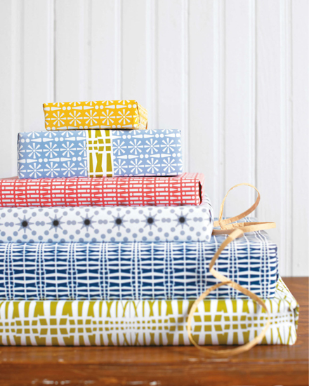
Sarah Gifford, who is sarahgdesign on our site, Daphne’s mom (this page), and the graphic designer of this book, had a lot of fun creating these wrapping papers using just one humble punctuation mark: the exclamation point. By varying the font, size, color, and style of it, she transformed it into a fascinating design motif. Any letter or number or symbol will work. Think about your initial or your lucky number, ampersands, asterisks, question marks—the sky is the limit, especially if you consider the writing systems of many different cultures.
MATERIALS & TOOLS
TO DESIGN THE PAPER
Basic graphics program
1 roll of gift wrap, 26 × 72 inches (66 × 183 cm) (see Note)
Note: Spoonflower’s gift wrap is available only in rolls. You can wrap about 4 mediumsized gifts per roll. Order more if you need it!
designing the wrapping paper
1 Make a new canvas.
Create a new canvas that is 8 × 8 inches (20 × 20 cm) / 1200 × 1200 pixels or the size you prefer. Remember that the Pixel Equation is on this page if you need to review it.
2 Create your design.
Review the instructions for working with text and layers (this page). To create your typography design, use the exclamation mark as shown here or choose a different letter, number, or symbol that you want to feature. Then search around for different fonts, if you don’t have a wide selection already; see this page for advice on finding free fonts.
As mentioned on this page, each graphics program has its own way of dealing with text. Although these designs were created in Adobe Illustrator (a vector-based program you’ll learn more about in the next chapter), you can use the Text tool and/or Layers in any program to create similar effects with text, including moving and rotating individual characters, changing colors, and so on. You can have a lot of fun designing with just one character in whichever program you have! And remember that Spoonflower has built-in repeat layouts (this page) and a Color Change tool (this page), so you could upload a design based on just a few characters and let Spoonflower do the work for you.
If you want to make Sarah’s designs, here is how she created each design shown in the photo on this page:
PINK PAPER. To create this striped effect, use two different fonts. To begin, make a background rectangle the size of your design and color it pink (or the color of your choice); choose white (or another color of your choice) for the type. Type an exclamation point in the first font; copy and paste it, then rotate the second exclamation point upside down. Align the two exclamation points, select each of their text boxes, and copy them as a unit. Paste this unit next to the first set of exclamation points, and continue in this fashion until you’ve created a row. Repeat to create a new row in the second font, alternating the placement of the upside-down exclamation point. When both rows are finished, copy the text boxes for each row and paste your rows to fill the canvas.
BLUE & GREEN DESIGNS ON WHITE PAPER. Both of these colorways are created in the same way. Choose a font that has many styles, choose a color from the Text tool palette, and type an exclamation point in every variation of the font one after the other: bold, italic, light, condensed, and so on. Depending on the graphics program you use, you may be able to adjust the space between the exclamation points, too, as was done here. Copy and paste your collection of exclamation points to fill an entire row in your canvas. When uploading to Spoonflower, choose a mirrored repeat.
LAVENDER PAPER & YELLOW PAPER. Both of these colorways are created in the same way. Create a background color and choose white type (or type in the color of your choice) as described in the instructions for the pink paper. Copy and paste an exclamation point until you have eight, then select and rotate each one individually to align the dots at the center, making a flower shape. Add an exclamation point that is the same height as the flower shape, adjusting the height or size of the flower shape as needed. Copy and paste the exclamation point and flower shape to the right of your original, then rotate one of the large exclamation points 180° so it is upside down. Copy and paste these elements to fill an entire row. Then copy and paste the row to fill the canvas.
GRAY-ON-GRAY DESIGNS ON WHITE PAPER. This design is the inverse of that used in the lavender and yellow papers, as the top of the exclamation marks are aligned instead of the dots. Build the design as for the lavender and yellow papers, filling your entire design space, making all the layers transparent so they combine to create the darker shade in the center. Look for an “opacity” setting to adjust transparency.
To make a seamless repeat (this page) for these patterns, carefully arrange your design so you can split an exclamation point in half at the edge of your canvas. If your particular design makes this a little tricky, here’s an alternative: Make your design fill the entire canvas but leave one-half the amount of space between your exclamation points (or other design elements) around all sides. For example, if there is ¼ inch (6 mm) between each of your exclamation marks, then leave a ⅛-inch (3 mm) margin of empty space around the design. When printed, the margins you left will equal the spacing between your designs—⅛ inch (3 mm) + ⅛ inch (3 mm) = ¼ inch (6 mm).
Have fun with this project! You can copy, paste, rotate, and layer your individual elements (or rows of elements) to build a design, placing them as you wish.
3 Save and upload.
Save the file and upload it to Spoonflower (this page). If a repeat layout wasn’t suggested for your particular design in Step 2, try them all to see which effect you like best.
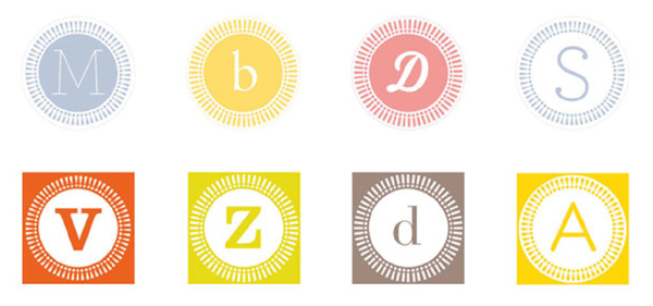
Once Sarah had finished designing the wrapping paper, she still wanted to play with the exclamation point a bit more, so she decided to add these stickers to her collection. She used the exclamation points as a frame and then placed a letter inside each frame. These can be used with or without the wrapping paper. Here we show them on packages, envelopes, and notebooks.
To make a sticker, size your canvas for a swatch of peel-and-stick wallpaper, 24 × 12 inches (61 × 30.5 cm) / 3600 × 1800 pixels. Sarah worked in Illustrator; to re-create her design, do the following: Draw a background square and fill it with your chosen color. Draw a circle within the square (we explain how to create vector shapes like a square and a circle on this page) and select the Type on a Path tool, which looks like a letter on a sloped or wavy line. Click on the circle, and type a row of exclamation points around the circle and make them white. Draw another circle to fill the center of the design and make it white. With the Text tool, type the letter of your choice inside the circle, matching the color of the square. (Of course, if desired, you can always reverse the colors.)
If you are working in another graphics program you can place and rotate the characters individually to build the frame, as was used to make the flower shape in the lavender and yellow papers (see 154), and you can use the Text tool to add the initial in the center. Use your available tools to draw shapes and add color as desired.
Add as many designs as you want to your canvas, being sure to leave a little extra space around each one to have room to cut them out.